Nolan Taing, of the Workshop Brothers hospitality group, is a difficult man to track down. No surprise – the enterprising siblings have opened two new venues in [very] recent times, and business is booming.
“I think it’s a great time to be in the industry, we really are spoilt for choice in Melbourne,” says Nolan.
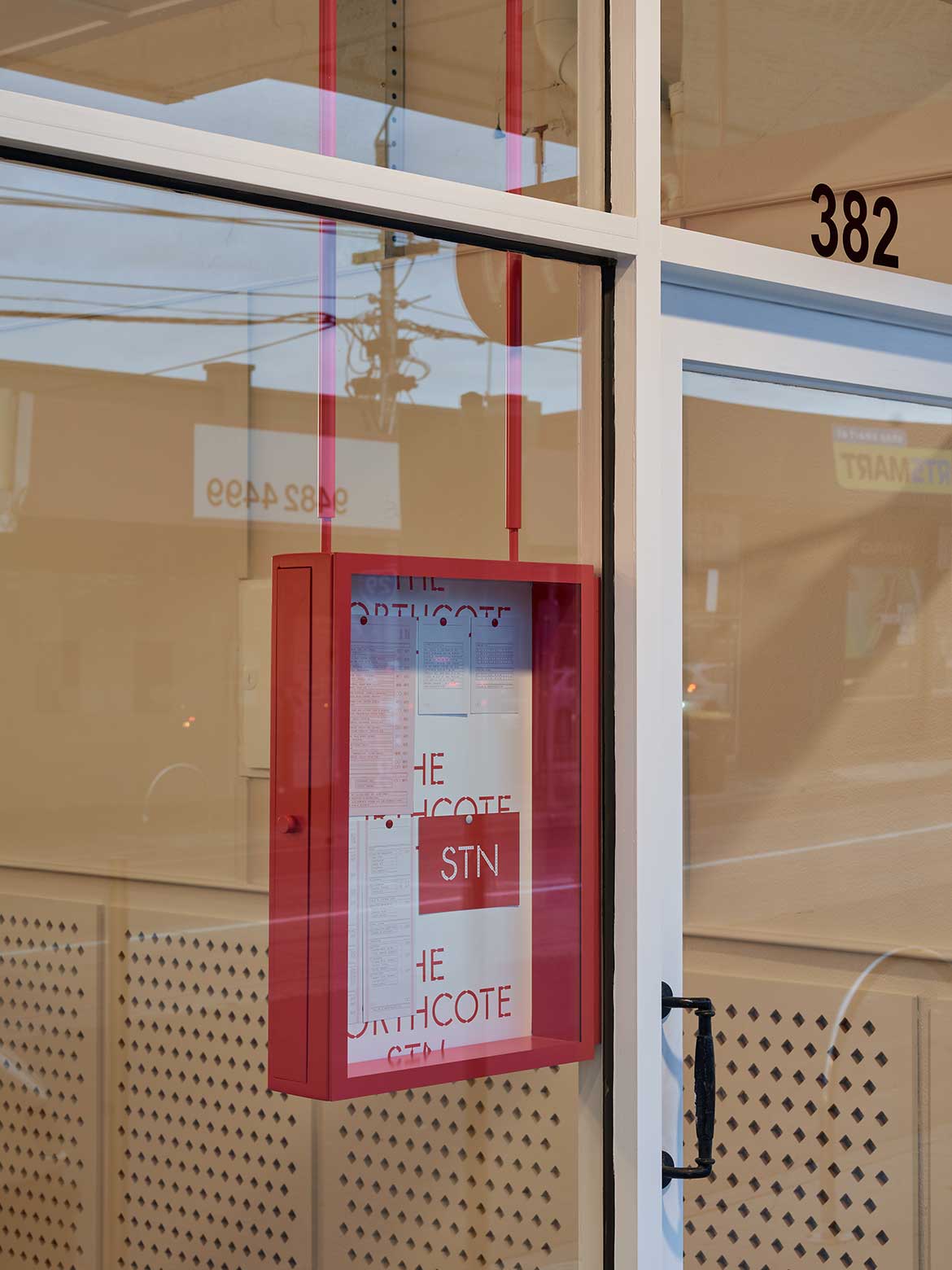
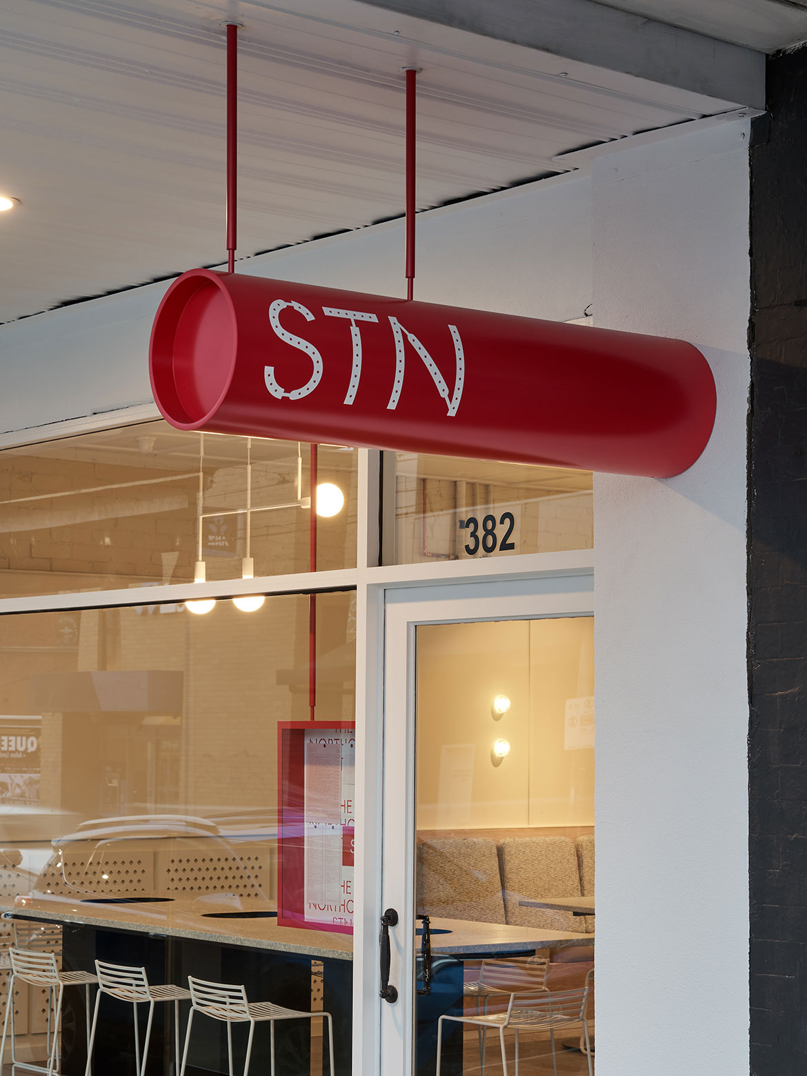
Their latest venture, Northcote STN, greets its eclectic High Street location with an unassuming frontage, a jaunty red cylinder reading ‘STN’ signalling its presence overhead. It is the first in what will be a series of STN-brand café restaurants, a concept established between Workshop and design collaborators, Pop&Pac.
“We have worked with Pop&Pac for about two years now. They helped us re-launch our brand, and they know us – not only our goals and visions as a business, but also our personalities as well,” Nolan says. “And I think it’s such a strong skill to have, to be able to capture that visually.”
Having lived in London for eight years, Nolan saw STN as an opportunity to express this personal experience through design.
“We thought about the moments of reflection that you have when you’re sitting on the train, and came up with the concept of the station being a place to stop,” says Mauris Lai, of Pop&Pac. “We tried to create a story that was and simple but robust, so that it doesn’t get lost in translation.”
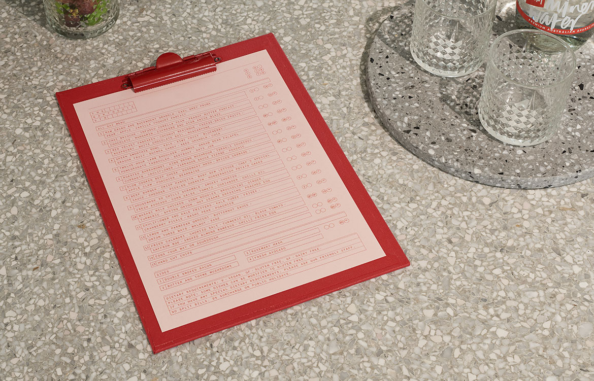
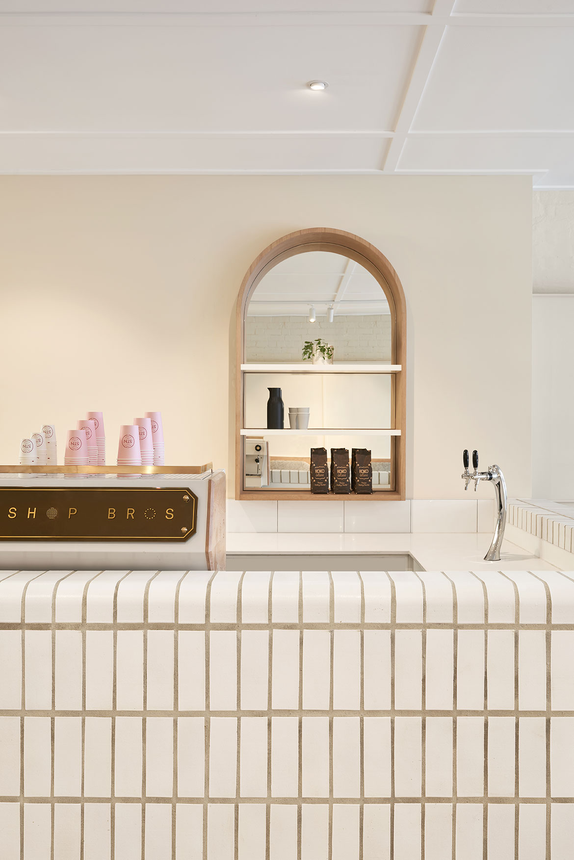
Developed in conjunction with Studio Tate, the result is a unified graphic and built response which references different boroughs of London, the visual language of the Tube, and the physical details unique to its underground network. “How we display the menu and other information in the store goes back to the posters and graphics you would see in a station,” says Pop&Pac’s David Popov.
While this subway landscape informed much of the design, it also looks locally for inspiration – STN’s signature red was derived not from the recognisable London railway signage, but from the surrounds of suburban Northcote. “It does have that primary quality that evokes the Tube, but actually we took the red from the brick houses in the area,” says Mauris. “So that colour is one way of reflecting its location.”
Pop&Pac worked closely with Studio Tate to coordinate the touchpoints between graphic and built design: testing how the menus would work in conjunction with different finishes and experimenting with the effect of graphics applied throughout the space. Between point of sale and coffee station, a tongue-in-cheek “Mind the Gap” sign on the floor divides kitchen service from dining area.
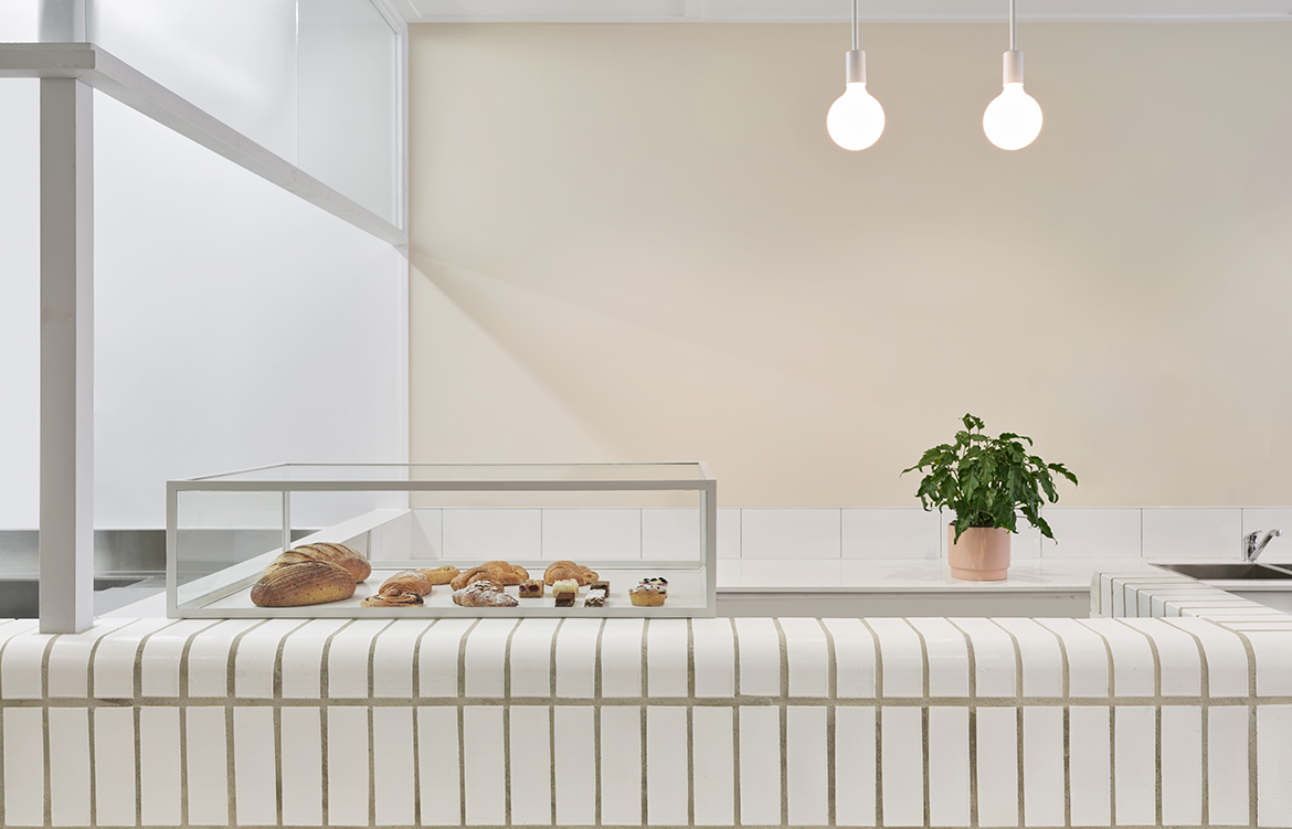
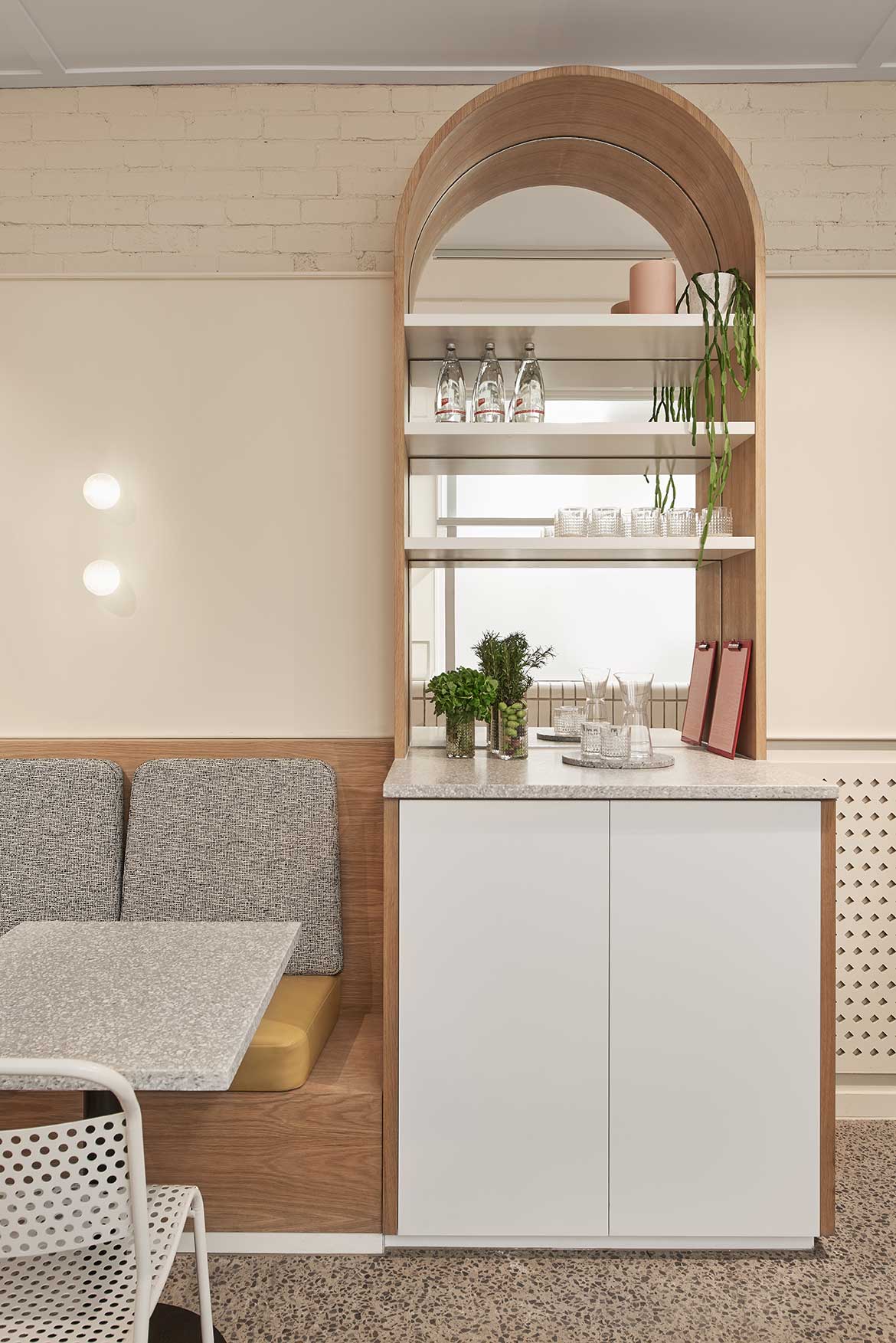
“Sometimes we don’t mind being a bit literal, it’s a bit of fun. But in other ways we were more abstract,” says Alex Hopkins, of Studio Tate. Bespoke arched shelving takes a cue from the shape of old station windows, feature lighting by Volker Haug was installed as an homage to spherical lamps once common to rail lines, terrazzo and subway tile reflect the materiality of the train network. Typically clunky plastic train seats also became a source of inspiration – though Studio Tate’s plush banquettes are significantly more refined.
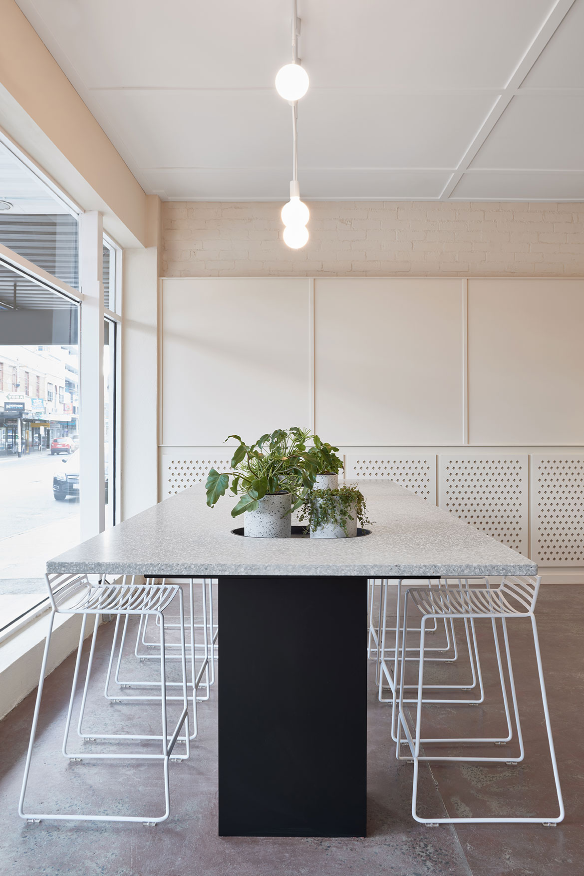
“Often clients are quite conservative and they don’t understand design. The great thing about Workshop Brothers is that they are open-minded, and trust the judgement of the consultants that they’ve selected,” says Alex. By the time the interiors and architecture practice was brought on board, Pop&Pac had already worked through the conceptual groundwork with the client, allowing Studio Tate to focus directly on translating the brand within the built environment. The resulting space is bold and unadorned, a confidently understated backdrop rich with significance.
“We like to make each collaborative project as seamless and as integrated as possible, and come up with a strong, consistent gesture,” Alex says.
“Functionality is so key for us. Designers will always want to create a good-looking space, but whether it is workable or not is a different story,” says Nolan. “Studio Tate have been fantastic in being able to deliver a simple, aesthetically beautiful space that is a joy to work in.”
The venue marks the Workshop group’s ongoing maturation, with a flavoursome menu and broad appeal that has seen it become a fast favourite in the area.
“For me, the STN offering is about incorporating more meaning and purpose to the things we do, rather than opening just another café in Melbourne,” Nolan says.
Words by Sandra Tan