
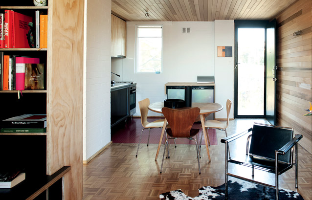
Above: Cedar wraps from the walls to the ceiling in response to the parquetry floor below to blur the lines in the apartment.
When architects and partners Marco Vittino and Katherine Ashe decided to buy an apartment, their criteria were simple: Small, cheap, close to the city and not desirable in terms of popular culture. An unconventional check-list. But there was a method to their perceived madness.
“For us, it was about showing people you can do something nice and economical with a small space,” says Katherine. “We wanted to encourage people to start valuing these blocks of flats.”
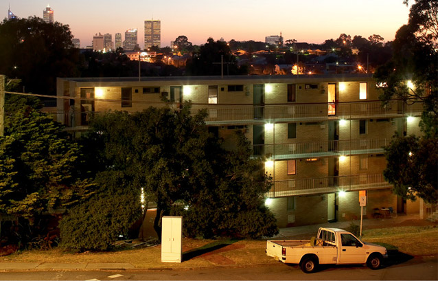
The exterior of the typical 1960s block.
The blocks of flats she speaks of are the brick monoliths that sprung up across urban Australia during the 1960s, touting more than 40 units in the one building. They emerged in red brick with timber frames, then cream brick with aluminium frames, and are a style of high density living, which both feel passionate about.
Although he can’t confirm it, Marco believes this block may be one by prolific Perth architectural firm Krantz and Sheldon, who built a lot of high density housing close to the city. “[Harold Krantz and Robert Sheldon] were both immigrants and understood the idea of density and providing affordable small housing. So, a whole number of these are scattered around Perth, and they are all similar in terms of planning,” he says.
According to Marco and Katherine, the apartment blocks are suited to our environment, are efficient in terms of spatial planning and they can be modernised quite easily. Characteristic of these designs are the large windows that provide cross-ventilation and light, a modular design and correct orientation.
The pair bought this unit in 2007 and spent 600 hours and $25,000 to renovate the interior. There were no structural changes, so Marco and Katherine did it up themselves, bringing in professionals for the electrics and plumbing only. All up, they estimate the renovation would cost someone $100,000 if they were to enlist an architect and hire trades.
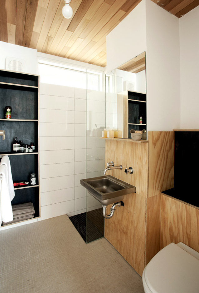
The compact bathroom features a ceiling of cedar from a sauna supplier, so it’s resilient to moisture.
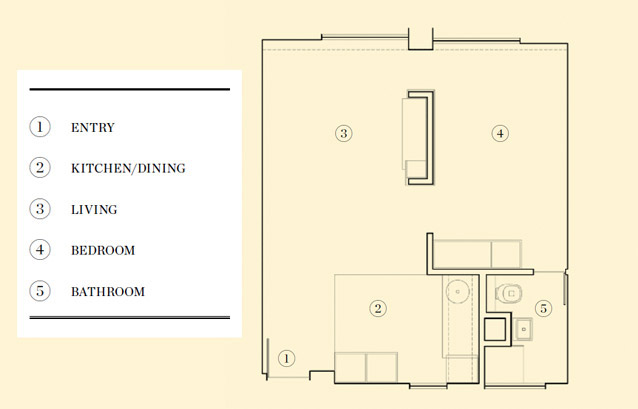
The apartment is on the top floor of the block and is a typical studio size: 37.5m2. When bought, it was clad in blue carpet and pink walls in the main areas, baby blue tiles and walls in the bathroom and had a large floor-to-ceiling kitchen cupboard and wardrobe. This cabinetry and a load-bearing brick wall between the living room and bedroom cut the space into smaller areas, with a door to the kitchen and a concertina door to the bedroom and bathroom.
“The idea was to try to open it up in order to make it feel bigger because it did feel quite pokey,” says Katherine. “So, we removed all the doorways to create the one space. Privacy wasn’t an issue because only one person or a couple would live here.”
They were confronted with myriad changes in texture and details – bricks, cabinetry, carpet, compressed painted straw ceilings, beams – and they also discovered Tasmanian Oak parquetry in the main areas of the apartment and original mosaic tiles under newer ones in the bathroom.
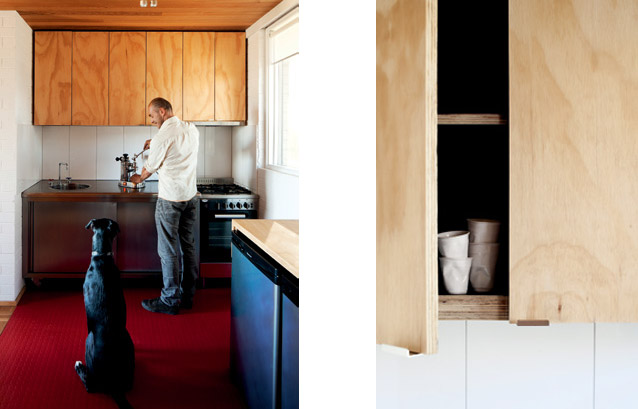
Left: White, hoop pine and stainless steel, coupled with a zone defined by Pirelli red vinyl floor, give the kitchen a pared-back, industrial feel. Shadowing from the edges of the cabinetry gives a floating feel to the built-in storage.
Right: The previous incarnation of the apartment had been a mix of materials and colours. Marco and Katherine pared back the palette to white, black and timber, with some metal, to simplify the apartment, plus used visual tricks with colour and continuity of material to give the illusion of space.
The parquetry was the catalyst for the unit’s Cedar wall and ceiling. “We wanted the timber to feel continuous when you walked in, so we carried it up the wall and across the ceiling. It takes away planes, so when you look at it you are not aware of the edges,” says Katherine. Adds Marco: “It’s also a way of simplifying the number of materials and unifying what’s happening in the space.”
Juxtaposing the wrap-around timber is a palette of white, black and Hoop Pine plywood. Existing bricks have been painted white and a gyprock panel with negative detailing installed behind the bed. “We wanted it to still be recognisable as a brick wall, but look like a white painting had been put on there,” says Katherine.
The load-bearing brick wall in the middle of the space is U-shaped and is concealed by Hoop Pine plywood. The cladding has been raised from the floor and dropped from the ceiling to give the illusion of floating cabinetry. It stores a television and has storage underneath and six open shelves down one side that are hidden from sight. “The idea was to have secret storage, so you didn’t see any clutter. I quite like having open storage, but I don’t like having to look at it,” says Katherine.
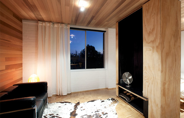
Marco and Katherine removed a wall between these two spaces and introduced a minimal palett e to give the illusion of more space. The central cabinetry hides an existing brick wall, while providing storage and a visual, ‘floating’ break between the sleeping and living zones.
A black stain from Feast Watson has been used on storage internals to blur boundaries. This trick is also used through shadowing around the negative detailing behind the bed, floating cabinetry in the kitchen and tiling in the shower – it blurs edges to soften and visually widen a space. “You get a nice black shadow, so it appears as though the ceiling keeps going through, rather than stopping and having edges,” explains Katherine.
The Hoop Pine and black stain continues from the central cabinetry into the kitchen, which is defined in the space with industrialstyle Pirelli red vinyl. Here, a level plane has been attained through removing ceiling-height cabinetry and putting in bench-level cabinetry and appliances. “Rather than a tall fridge, which would clutter the space, we put in two little ones. You end up with the same amount of space as a normal fridge,” says Katherine.
This savvy use of ‘small-scale’ extends through the kitchen – large porcelain splashback tiles with minimal joins, a 60cm Emilia oven and cooktop, Rogerseller tapware installed over a Harris Agencies sink and Dynamark lighting that can be flexed in different directions (used because there wasn’t enough room in the ceiling for recessed lights) – and into the bedroom.
Here, industrial-style lockers have been custom-designed to provide hanging and stacking space for clothing and $20 first-aid cabinets from Bunnings serve as mounted bedside storage. “We tried to ensure everything was compact,” says Katherine. And the low plane has been maintained to ensure the full width of the space is evident throughout.
Even the window treatment plays a part: extending the full length of the south wall to simplify materials and give the illusion of one wall. “It was also intended that you could have a series of different qualities of light in here,” explains Marco. “From black-out with blinds, to blackout with curtains closed, or the blinds up and the curtains drawn for filtered light, or curtains open so you get views of the city and heaps of light coming in.”
The result is a modern, light, efficient space. Although on the top floor with a roof above, airconditioning is not installed due to the breezes that flow through the space, and lighting is necessary only in the evenings due to the amount of natural light coming in. And one small heater provides adequate warmth in winter.
“They were great designs,” says Marco. “Unfortunately, most people think of these blocks of flats as ‘knock overs’. They are under-valued and they are looked down upon rather than seen as a great opportunity for living. But they are actually really well planned and really well designed.”
vittinoAshe
vittinoashe.com.au
Photography: Robert Firth
acorn.com.au