Despite the abundance of floor space available in this three-storey semi-detached house, it suffered from poor space planning and had a dated appearance. Stepping in to rejuvenate the abode and accommodate the needs of a couple in their 30s, Third Avenue Studio removed unnecessary walls and employed a contemporary palette of black and white for a sleek, yet timeless feel.
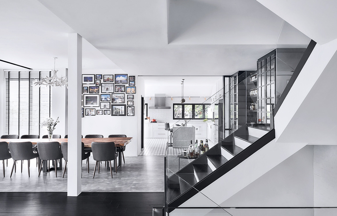
The original layout of the house segregated spaces according to their function, which wasn’t the most efficient use of space. At the same time, it created awkward pockets of unused and unnecessary zones. To enhance the flow of the home, the designers tore down various walls and made fluid the distinct areas of the common rooms, while keeping the interiors functional, with particular consideration for future family expansion.
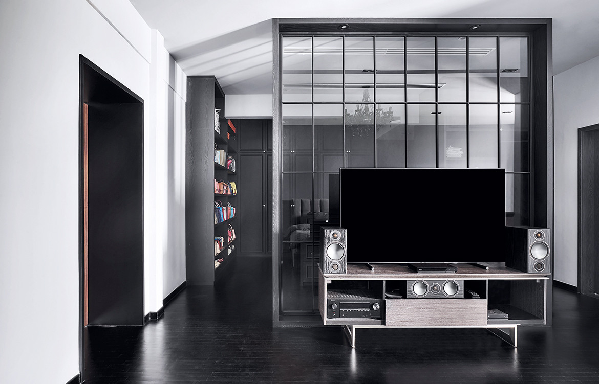
Doubling as the backdrop for the TV console, the floor-to-ceiling glass divider offers a semblance of spatial separation, without compromising visual access or closing off any part of the room completely. It boasts black frames with window-like grids – and is a simple yet chic feature that allows plenty of light through.
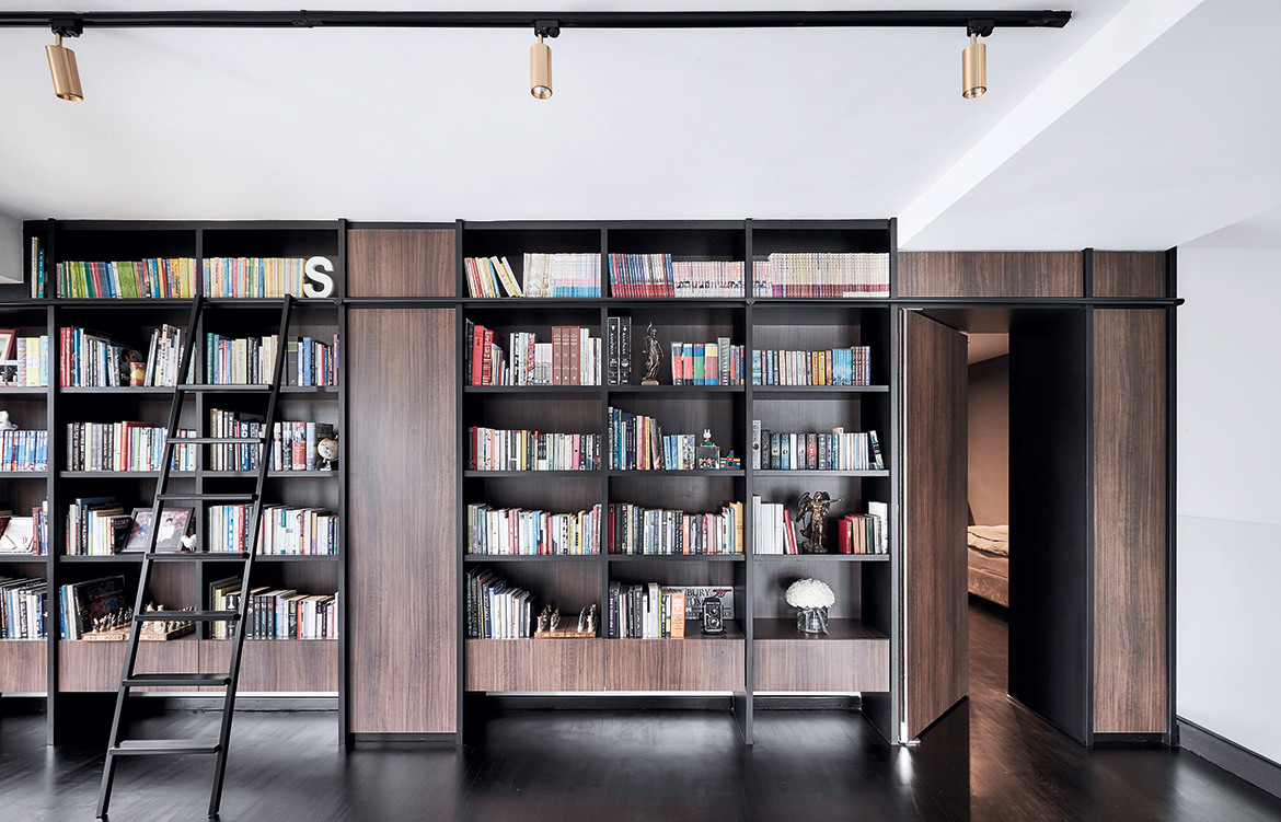
As avid readers, the homeowners needed a dedicated space to store their massive collection of books. Rather than keeping them tucked out of sight, the design team decided to turn the books into a statement, displaying them on open shelves that stretch all the way up to the ceiling. This library-like wall of books, complete with a ladder, also maximises the room’s vertical space.
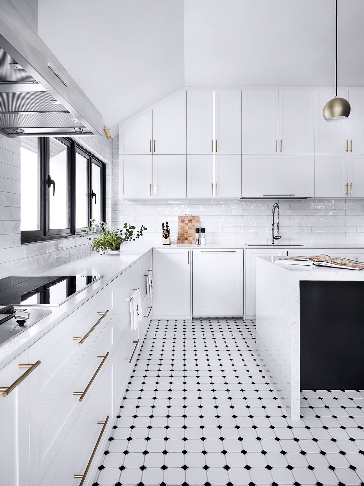
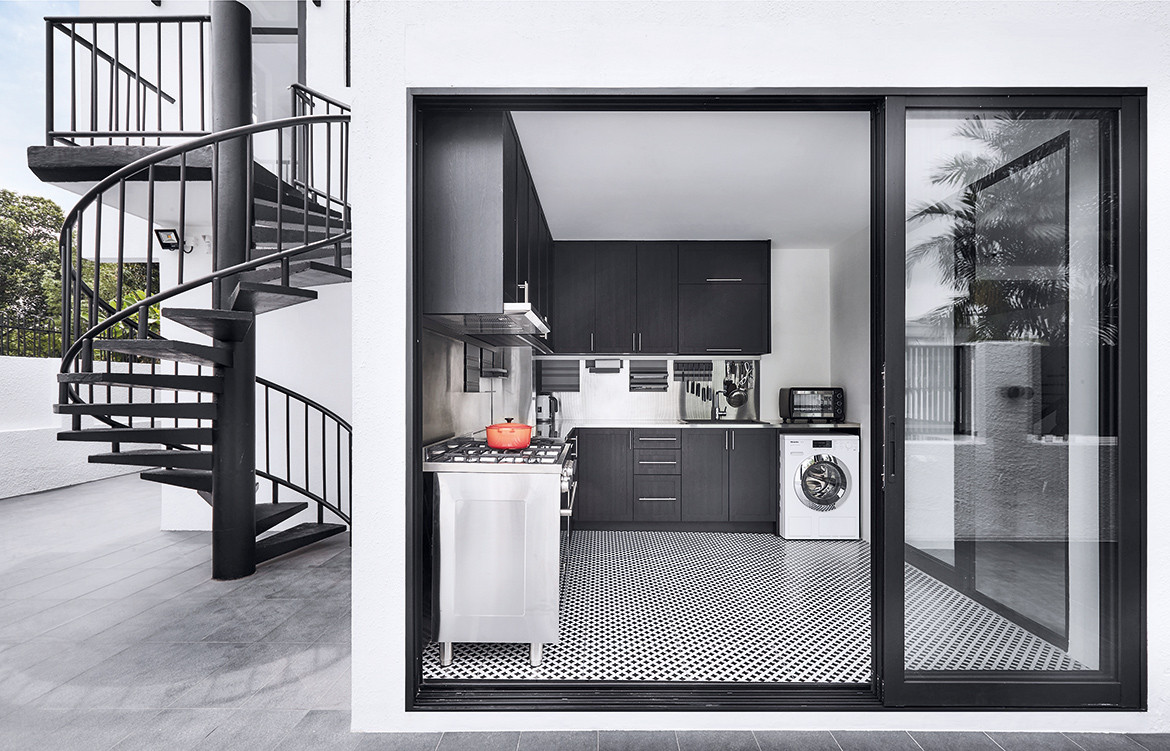
This house has both a wet and dry kitchen. While the latter (pictured above) features a kitchen island, glossy textured subway tiles and brass details, the former comprises black-and-white homogeneous tiles, stainless steel countertops, and cabinets clad in black laminates with a woodgrain texture. Glass sliding doors lead to the outdoor space with a black spiral staircase that matches the monochrome theme.
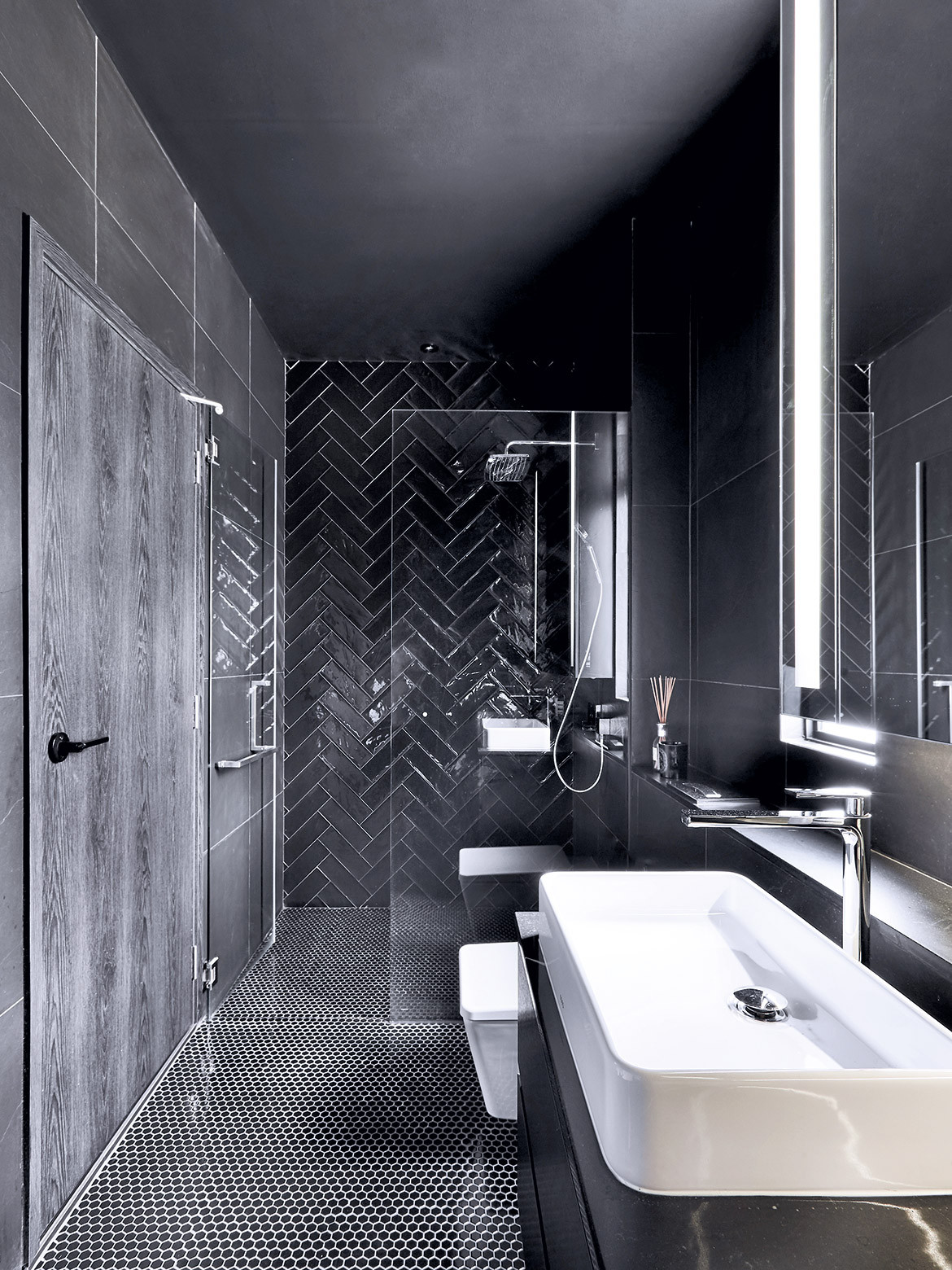
The master bathroom is sexy in ebony, save for a few white sanitary ware. The all-black space features a subtle mishmash of textures and patterns – from the herringbone feature wall of subway tiles to the hexagonal mosaic floor tiles – to bring added depth and dimension to the single toned space. Overall, the designers have managed to create a bathroom that’s both sleek and classy looking.
Third Avenue Studio
thirdave.sg