The 1930s duplex that is now my home, couldn’t have been more rudimentary when purchased in 2011. Rented out for decades, the building’s sickly pale yellow rendered façade was as unenticing as the spindly garden, comprising concrete and a few weeds.
Developers were eyeing the South Yarra block for demolition. My partner and I saw something else. Subsequently, so did architect Robert Simeoni, and furniture and lighting designer, Suzie Stanford. “It was virtually intact, with a quiet elegance to the building,” says Robert, who has been on my radar since I first covered his award-winning house at Woolamai in 2005.
It was Robert’s fine handling in bringing together two disparate buildings, an 1880s Victorian cottage with a striking contemporary wing, that left me breathless at the time. But I was equally impressed with his quiet and contemplative manner, which had led me to write about many of his other projects over the years, including his own house, a masterfully updated Italianate villa that received an award from the Victorian Chapter of the Australian Institute of Architects.
Instead of getting distracted with finishes, our discussion centred on ideas from the outset. The home that had stood out most for my partner and I on our travels was Maison de Verre in Paris, by architect and furniture designer, Pierre Chareau.
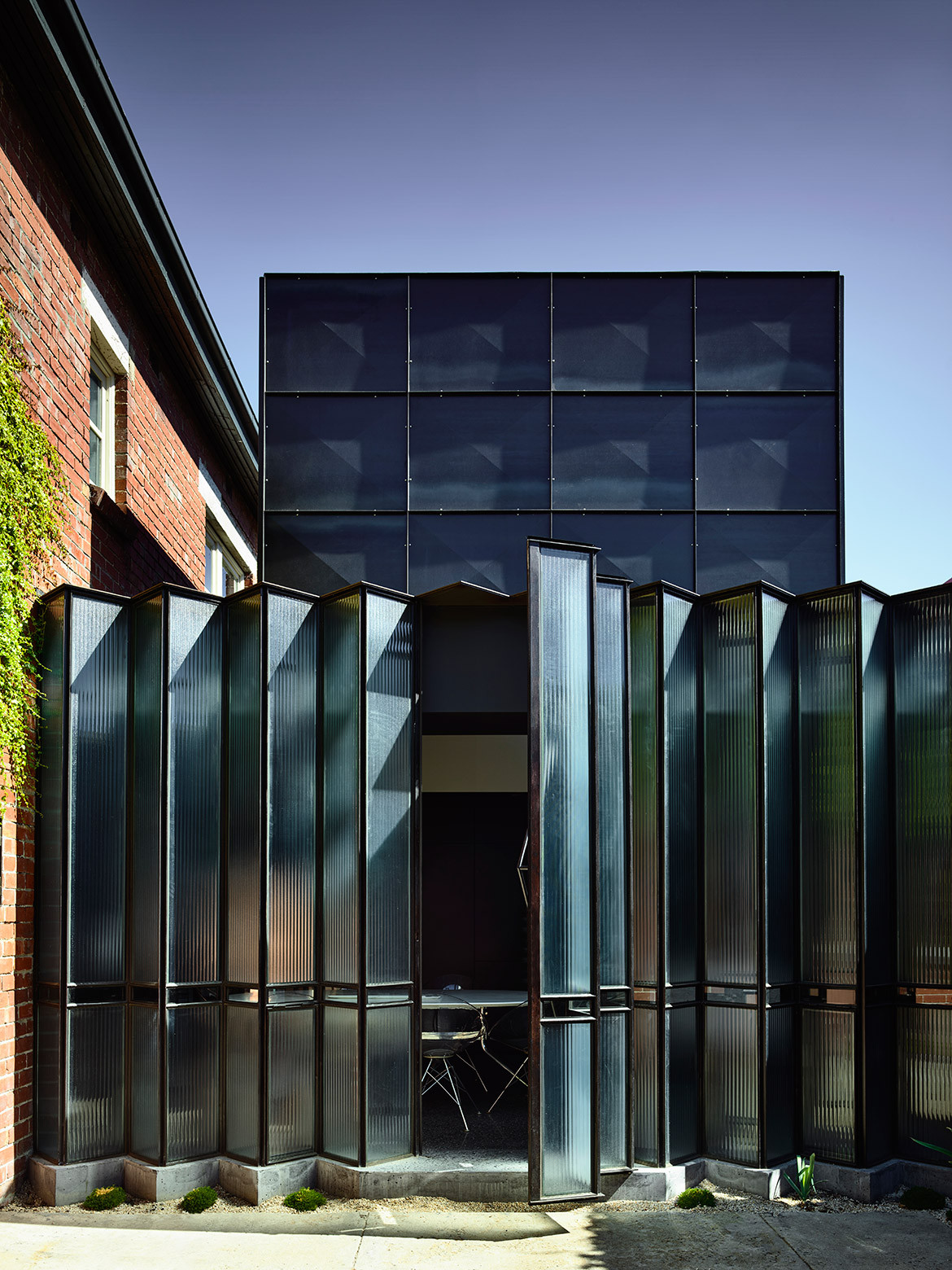
This house with a glass brick façade and strong industrial aesthetic was completed in 1932, three years before our humble duplex rose out of the dirt. But timelines mean nothing when comparing one of Europe’s most iconic homes to our extremely simple pre-war home. Fortunately, Robert saw more than a freestanding building in a quiet leafy street.
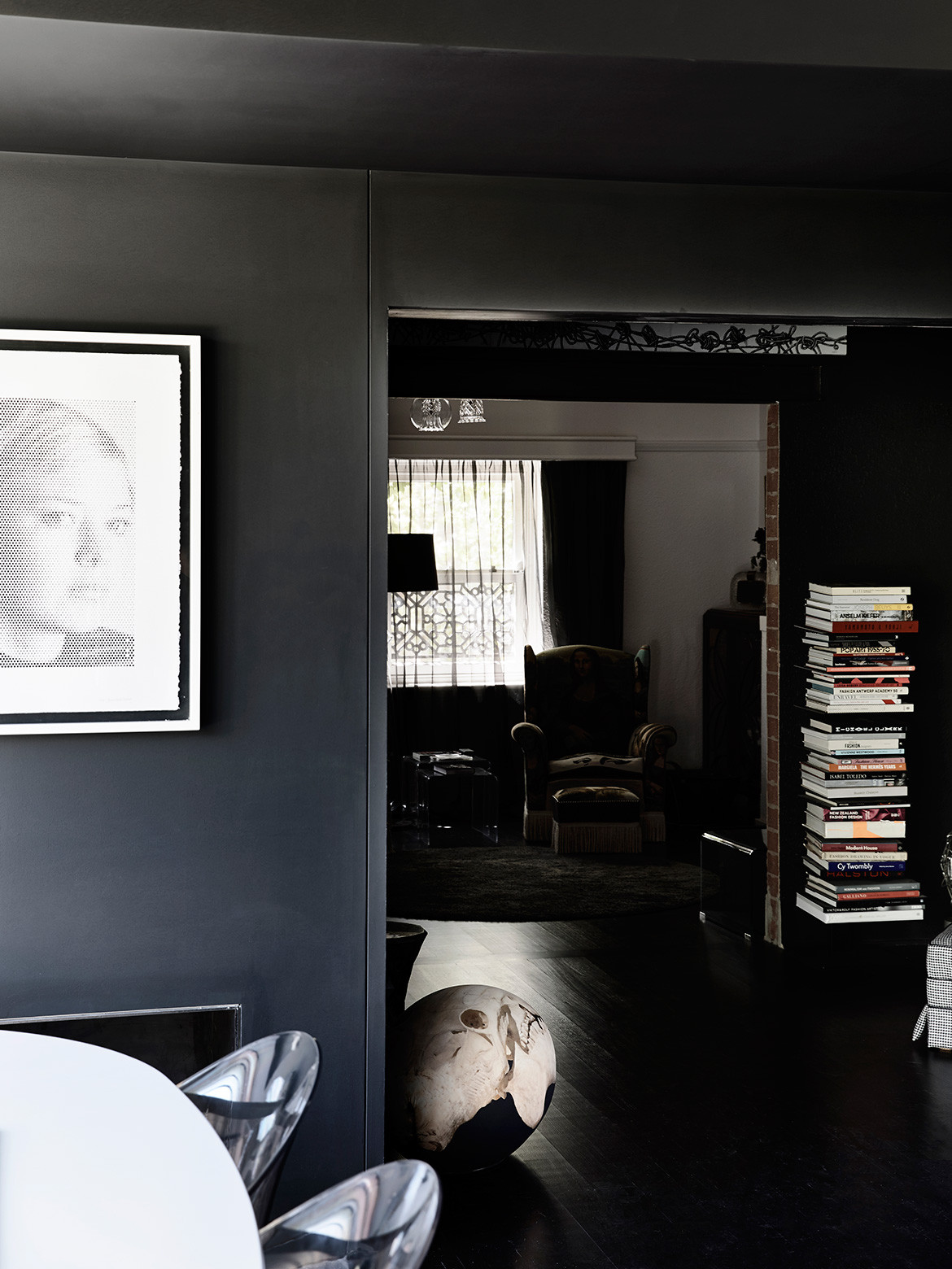
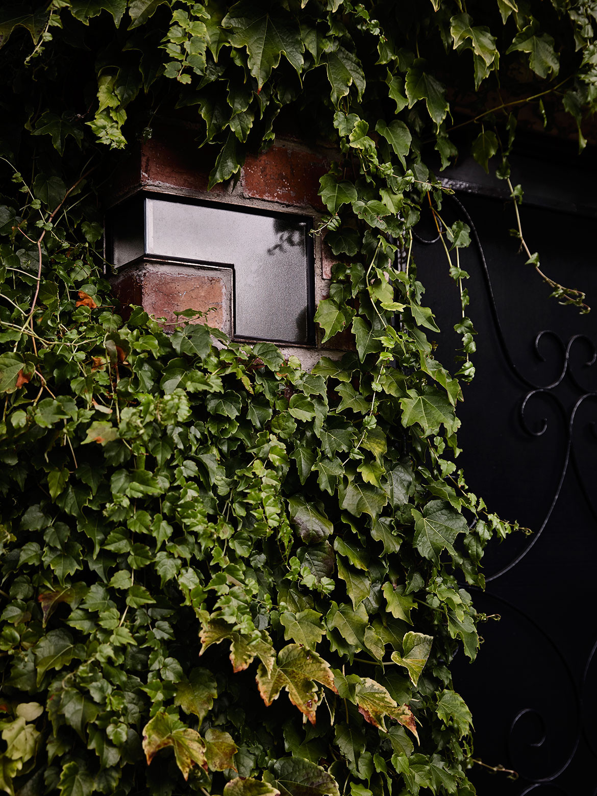
“I didn’t want to pull the place apart. It needed to be touched lightly, but I also wanted to add something that was strong enough to connect the old with the new, almost a solitary object or a piece of sculpture,” says Robert, who was as mindful of the works of art, objects and furniture we have collected over many years. “There’s a certain quietness to the spaces, particularly with the muted light. I felt the new addition also needed to include that stillness.”
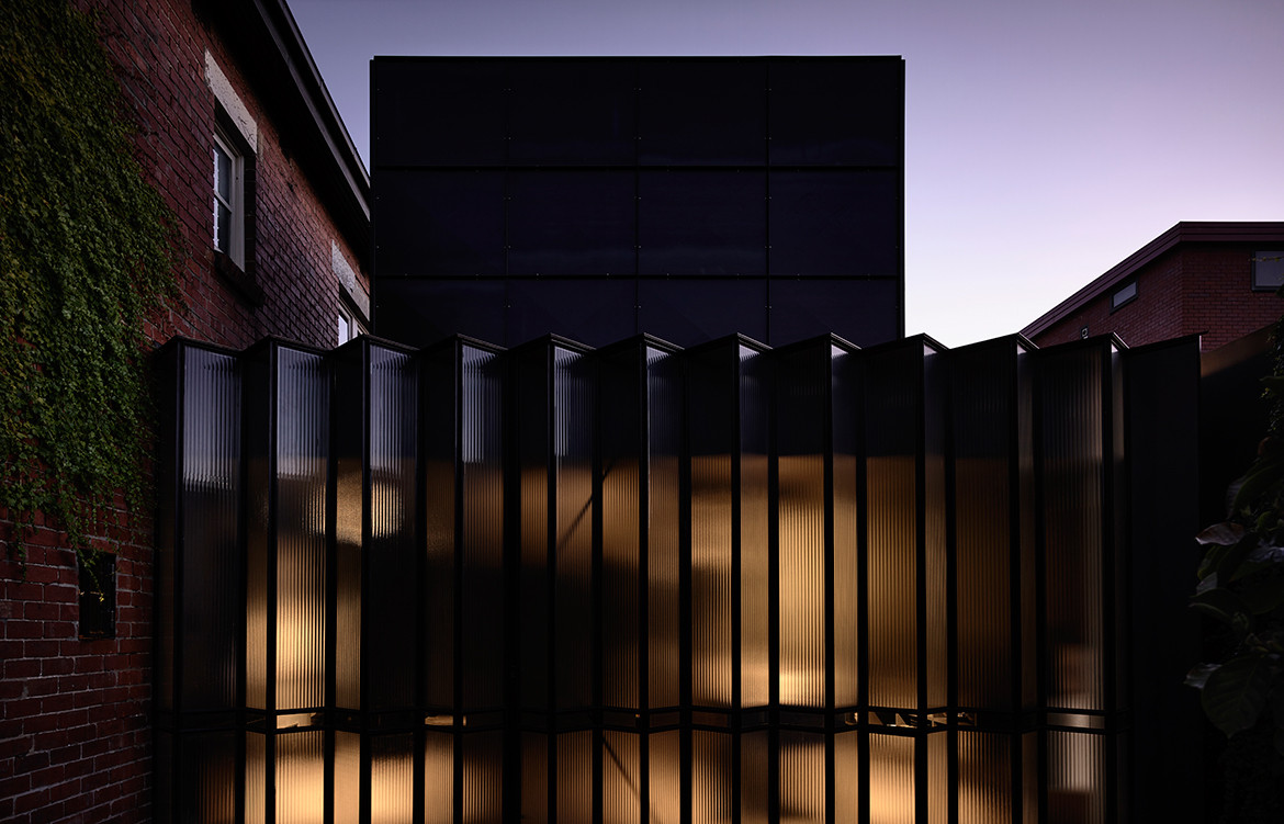
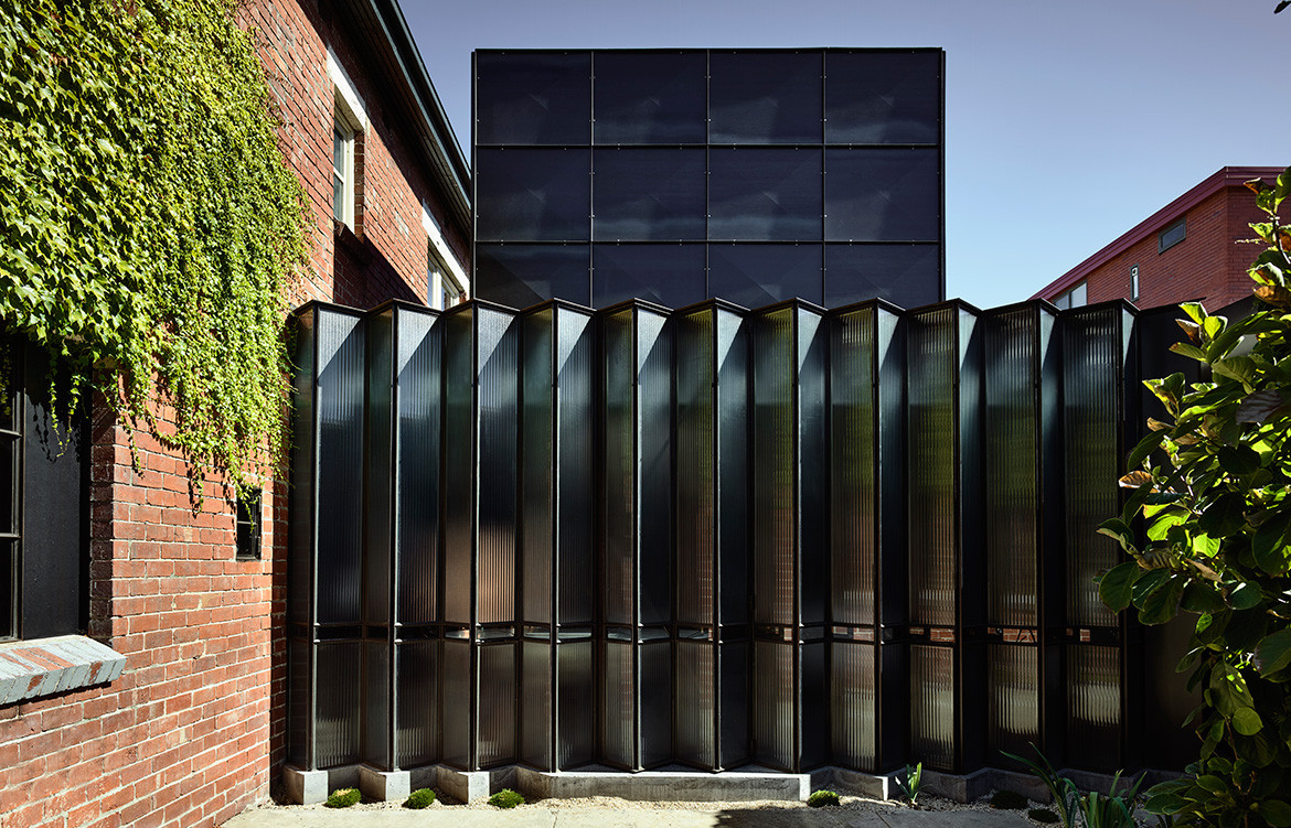
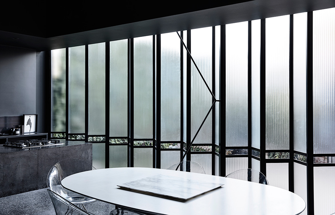
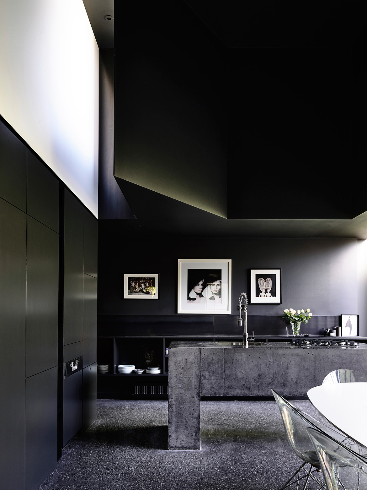
While Maison de Verre was on our minds, for Robert the image that resonated most was Bramante’s 1502 Tempietto in Rome. Ultimately, our new wing, comprising kitchen and meals area with a double-height void, features a fixed zig-zag translucent glass wall with a pivot door in the same shape reading as part of the wall.
This unique structure is unlike both influences but reflects elements of them. The cupola is re-imagined with three-dimensional steel panels that create a quilt-like effect in the sunlight. And contrary to most design practitioners where floor-to-ceiling views to a northern garden are obligatory, here, there’s only a fine slither of clear glass that allows the courtyard-style garden to be revealed when seated at the dining table.
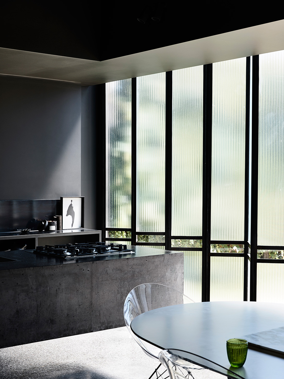
One of the other main sources of natural light is via a highlight window inserted into the dome, shedding indirect western light across a white canvas above the dark and moody kitchen joinery. I personally love watching the way the light moves across this broad expanse of white wall during the day, intensified in the outline of a window frame during the late afternoon when the light is at its strongest.
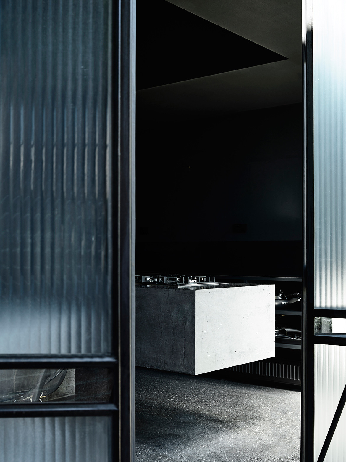
Also captivating is the insitu concrete island bench, polished to the same effect as the floor and connected on just one end as though the two were ‘joined at the hip’. My five-year-old grandson was amazed when he first saw it: “That’s crazy!”
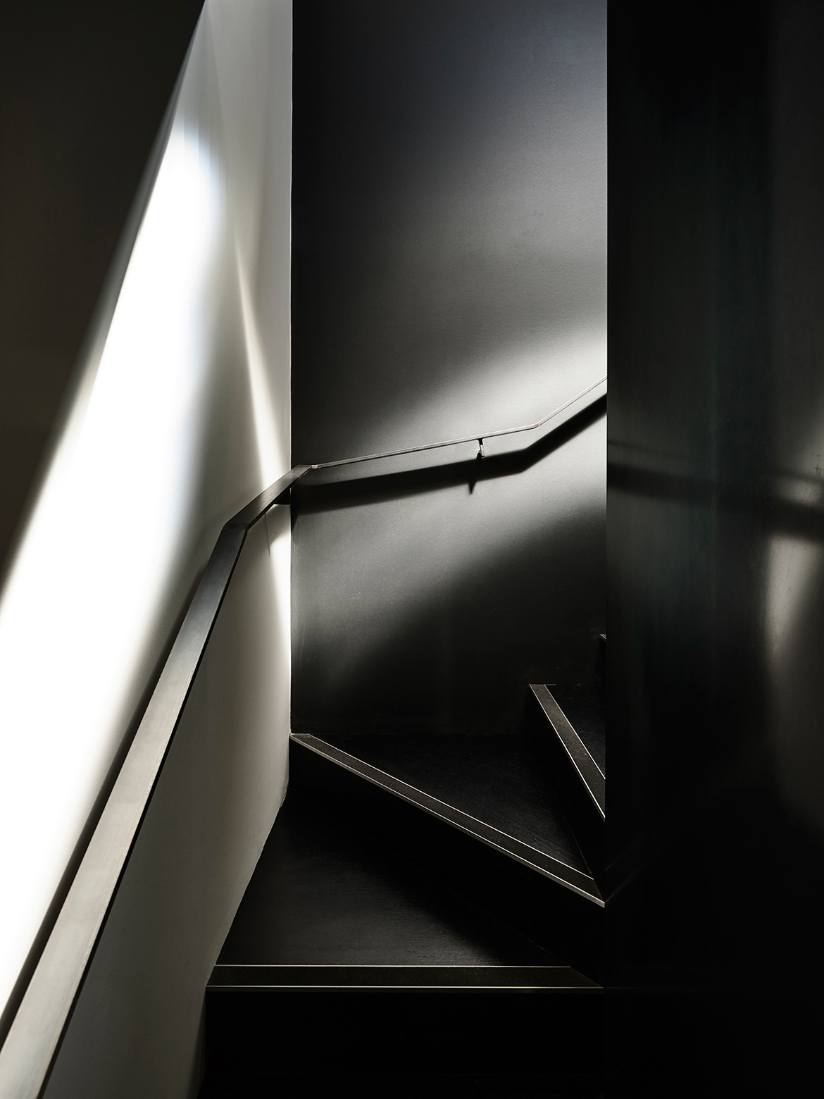
Rooms were opened up on both the ground and first floors, with the red brick incisions exposed rather than masked by new mouldings. Removing walls allowed for more fluid spaces. What was previously a bedroom is now a reading nook between the kitchen and sitting room. Upstairs, in what is now given over entirely to two empty nesters and a pampered cat, is the main and only bedroom, together with two separate dressing areas and a bathroom. The former two basic bathrooms is now an internal staircase (previously the only access between levels were two outdoor staircases on either side of the building).
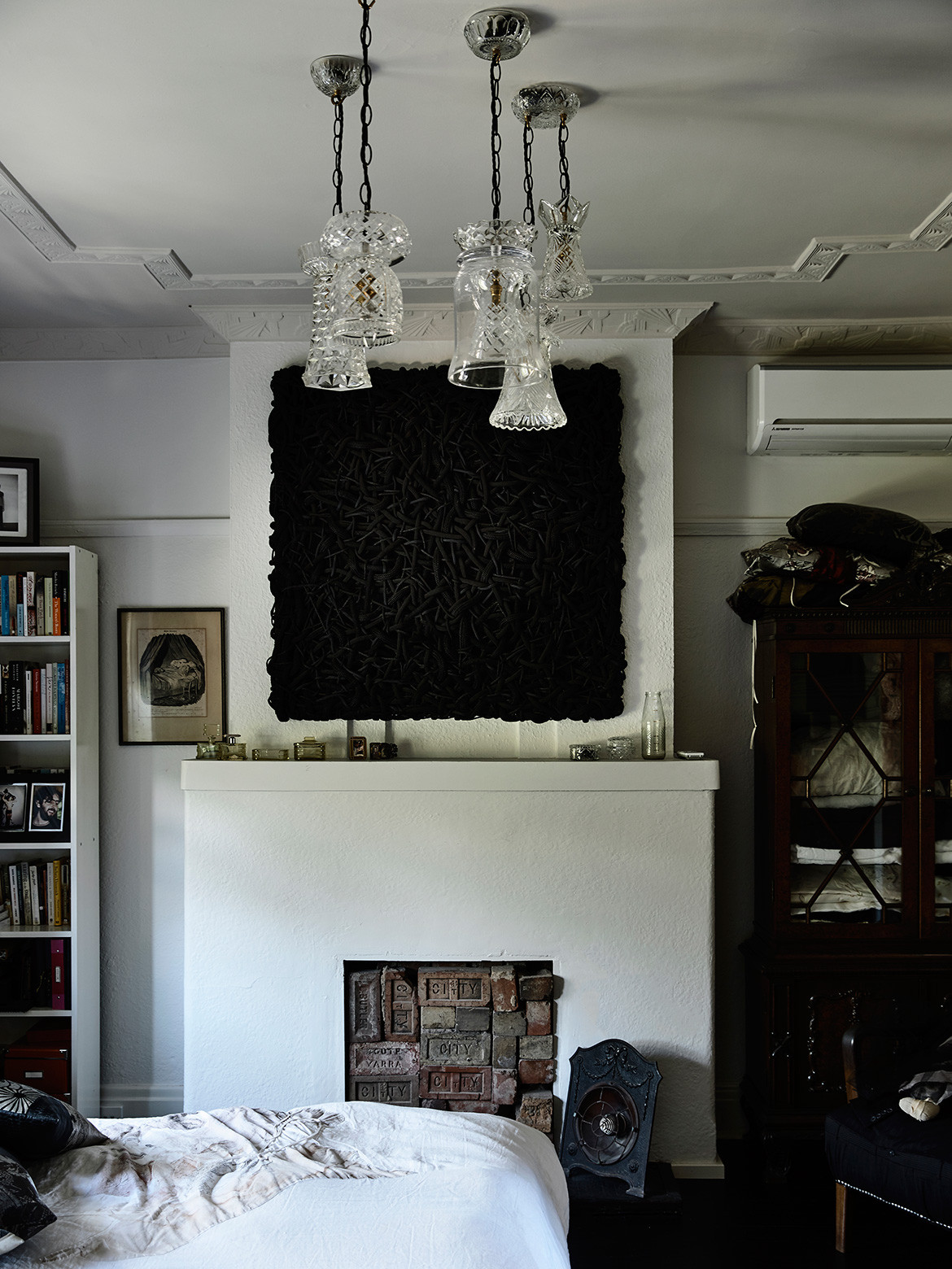
We all felt the original rooms needed to be respected, as though the building was heritage-listed. The 1930s reeded-glass doors were retained and the decorative ceilings were highlighted in a soft tea-rose shade of pink, as were the upstairs bathroom walls and ceiling that wrap around dark chocolate brown tiles. This sculptural feature, constructed from D-Tiles, is evocative of a modernist 1930s bathroom.
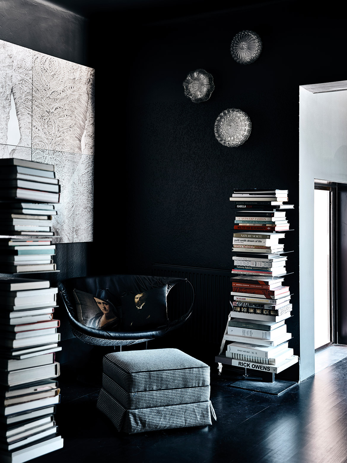
“There’s a theatricality about the spaces, partially with the way the light falls on each surface, as much as to the way the furniture and art are arranged,” says Robert. Suzie Stanford’s indelible signature tapestry chairs (Chareau coincidently designed tapestry chairs and lounges for his masterpiece), one daubed Mona Lisa, the other Blue Boy, are as cherished as the crystal chandeliers fashioned by Suzie using vases and objects that once would have been given as wedding presents when the duplex was built.
It took a couple of years, but the renovation of my home is now complete. I love it when people come to visit, as guests or participants of one of my local architecture tours, and say: “It’s so you!” Well, shouldn’t a house always capture the personality and unique qualities of its residents? It’s dark and moody in parts and warm and textured in others. It’s clearly not Maison de Verre in Paris or Bramante Tempietto in Rome. It’s simply the Craftis’ house, a place that feels tailor-made for us. What’s more, we adore it!
The Powell Street House won the Marion Mahony Award for Interior Architecture and the John and Phyllis Murphy Award for Residential Architecture – Houses (Alterations and Additions) at the 2019 Victorian Chapter of the Australian Institute of Architects.
Robert Simeoni Architects
robertsimeoniarchitects.com
Photography by Derek Swalwell
Dissection Information
Steel and steel-framed reeded glass façade for addition
Polished concrete flooring throughout addition
Concrete bench top cast insitu
Black rubber bathroom floor tiles from Pirelli
Bathroom wall, floor and integrated basin system from D-Tiles
Custom-made light fittings by Suzie Stanford
N55 Parete with DC01 glass from Viabizzuno
Dishwasher, cooktop and oven from Bosch
Integrated refrigerator from Fisher & Paykel
Tapware by Brodware
Toilet suite by Studio Bagno
We think you might also like Vodka Palace by Marcus Browne