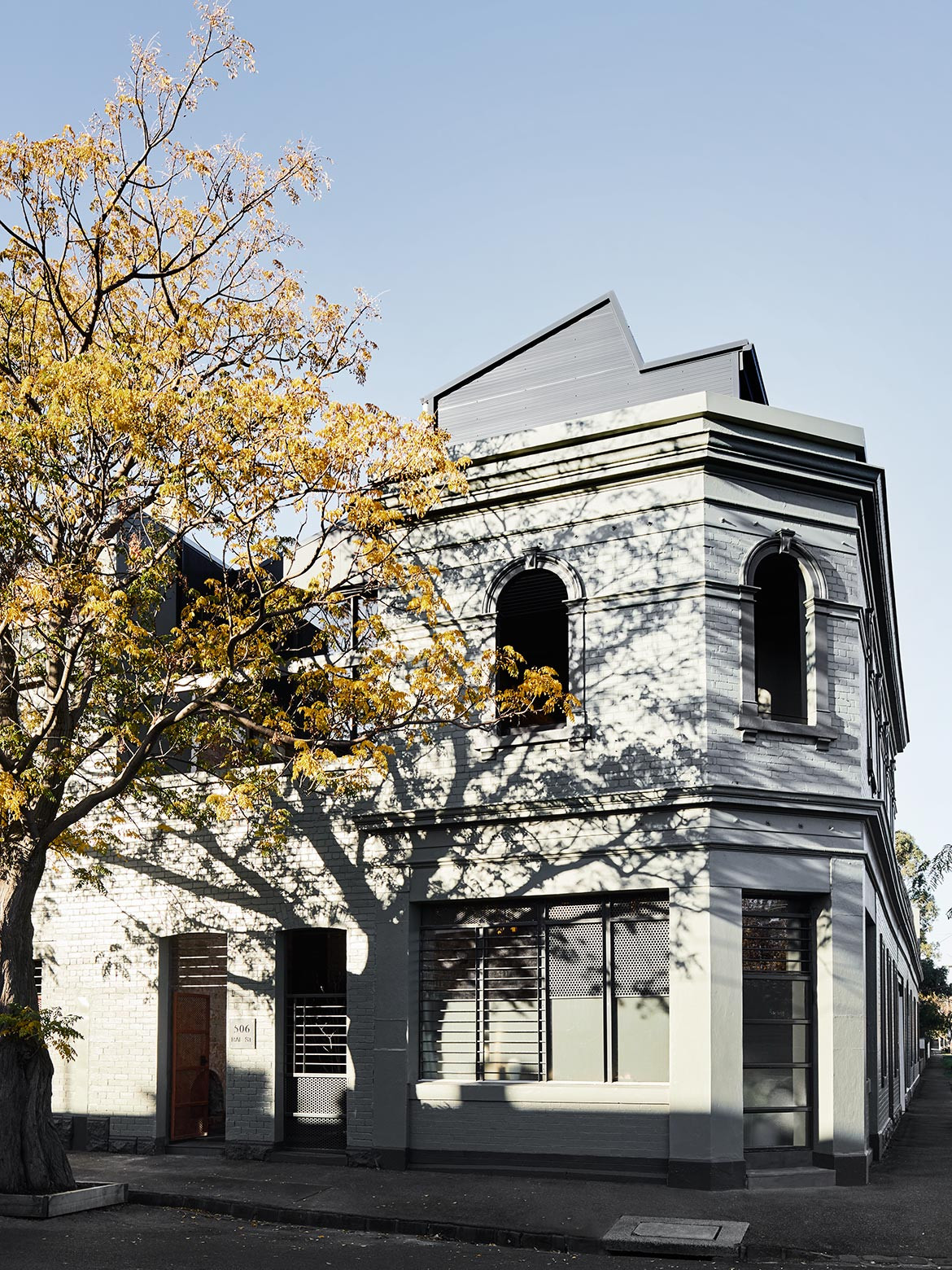
The owners of this warehouse-style home, built circa 1894, in North Fitzroy knew they would eventually renovate and extend. Given they were occupying approximately one half of their current floor space, it was a matter of waiting for the neighbour’s home (also three levels) to come onto the market.
Originally home to one of Melbourne’s grocery businesses Moran & Cato, a portion of the adjacent building included a corner store to sell produce. In the 1980s, the two became part of a larger development of 22 units. “We simply waited patiently for the ‘universe’ to be presented to us (read: ‘neighbour’s property’),” says owner Sheree Steele, a milliner, who shares this impressive home with her husband Gabriel and their two young children, Ethan and Annika.
“We’ve tried to retain as much of the original fabric as possible, while still creating a contemporary home for a family.”
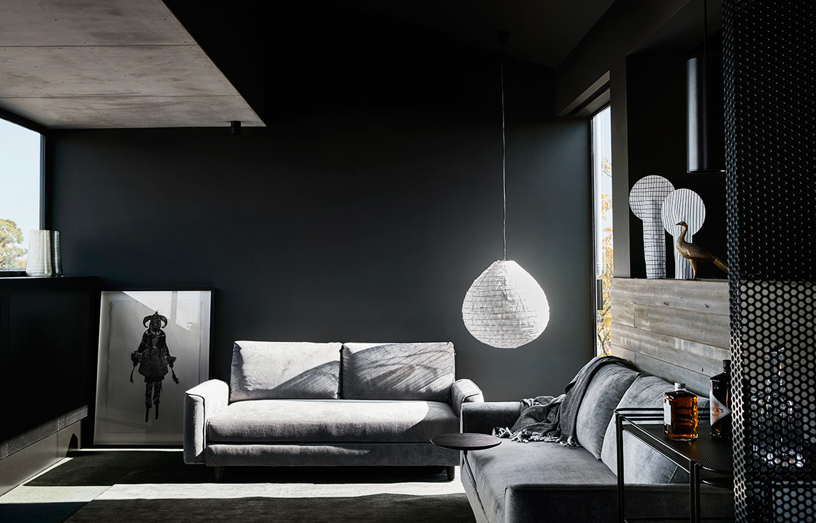
While the couple was working through cosmetic renovations on their abode, removing bright yellow 1980s laminates, two-pack paint finishes, and ad hoc additions, they knew there was a need to engage an architect to stitch the two properties together in a seamless manner (no pun intended). The Steele’s aesthetic, one that is slightly raw and industrial, perfectly correlated with that of architecture studio Splinter Society, the latter also having a penchant for the dark and moody, with a juxtaposition of both raw and luxe combined in the one palette.
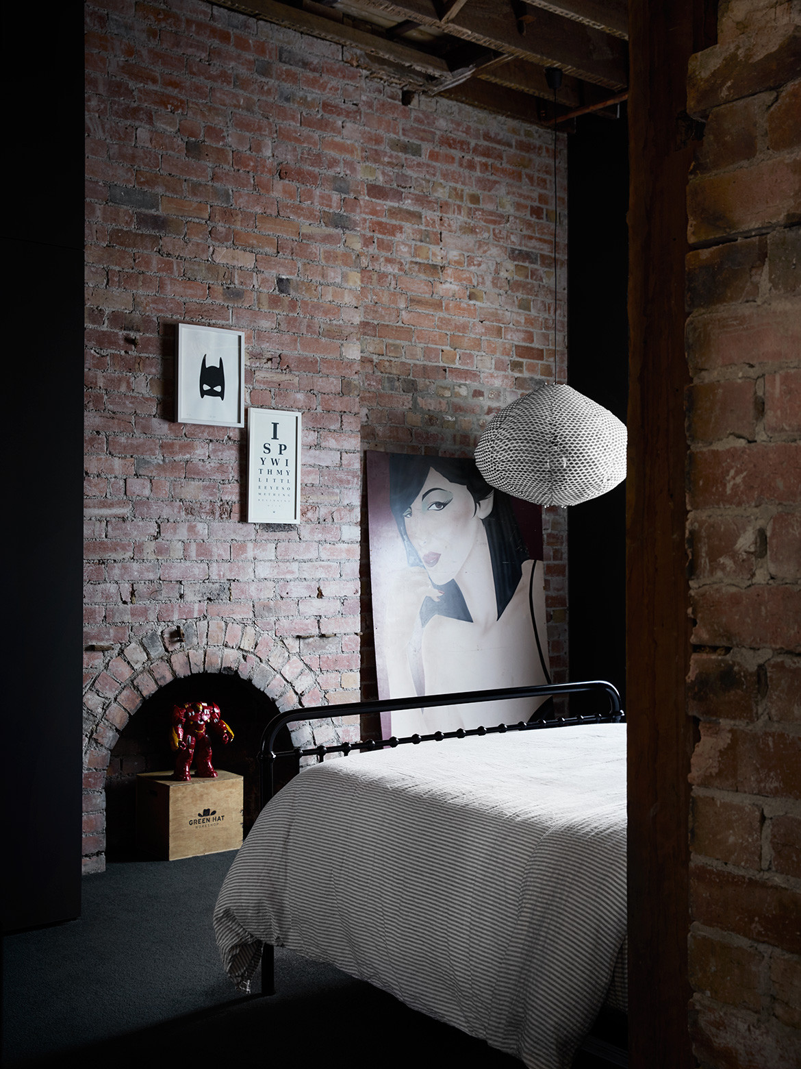
“As we were given a reasonably modest budget, we had to establish a few rules, including making as few structural changes as possible. The idea was to expose as much as the building’s original grain as possible,” says architect Chris Stanley, director of Splinter Society, pointing out the rough and exposed brick walls and timber trusses now expressed at ground level.
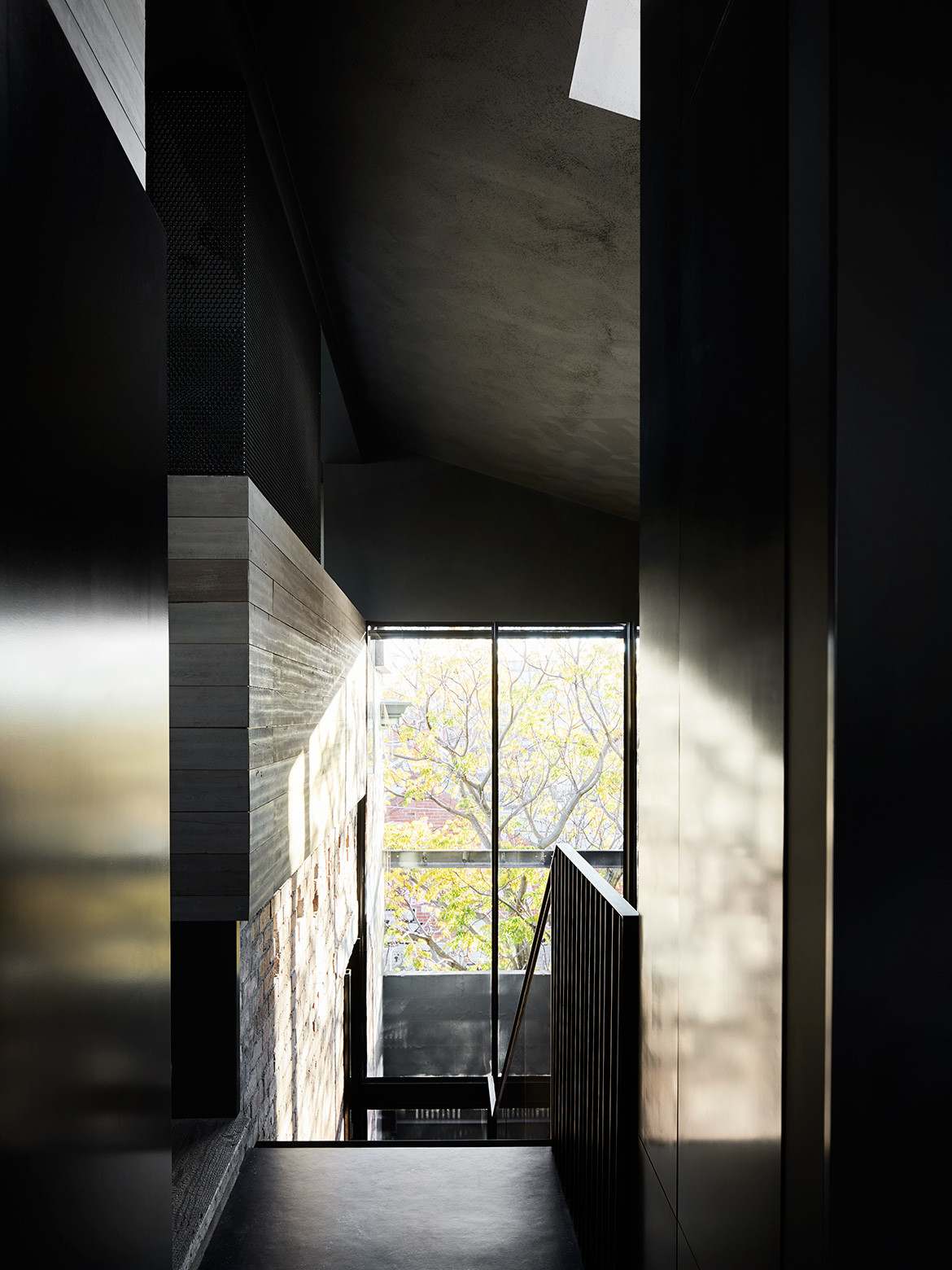
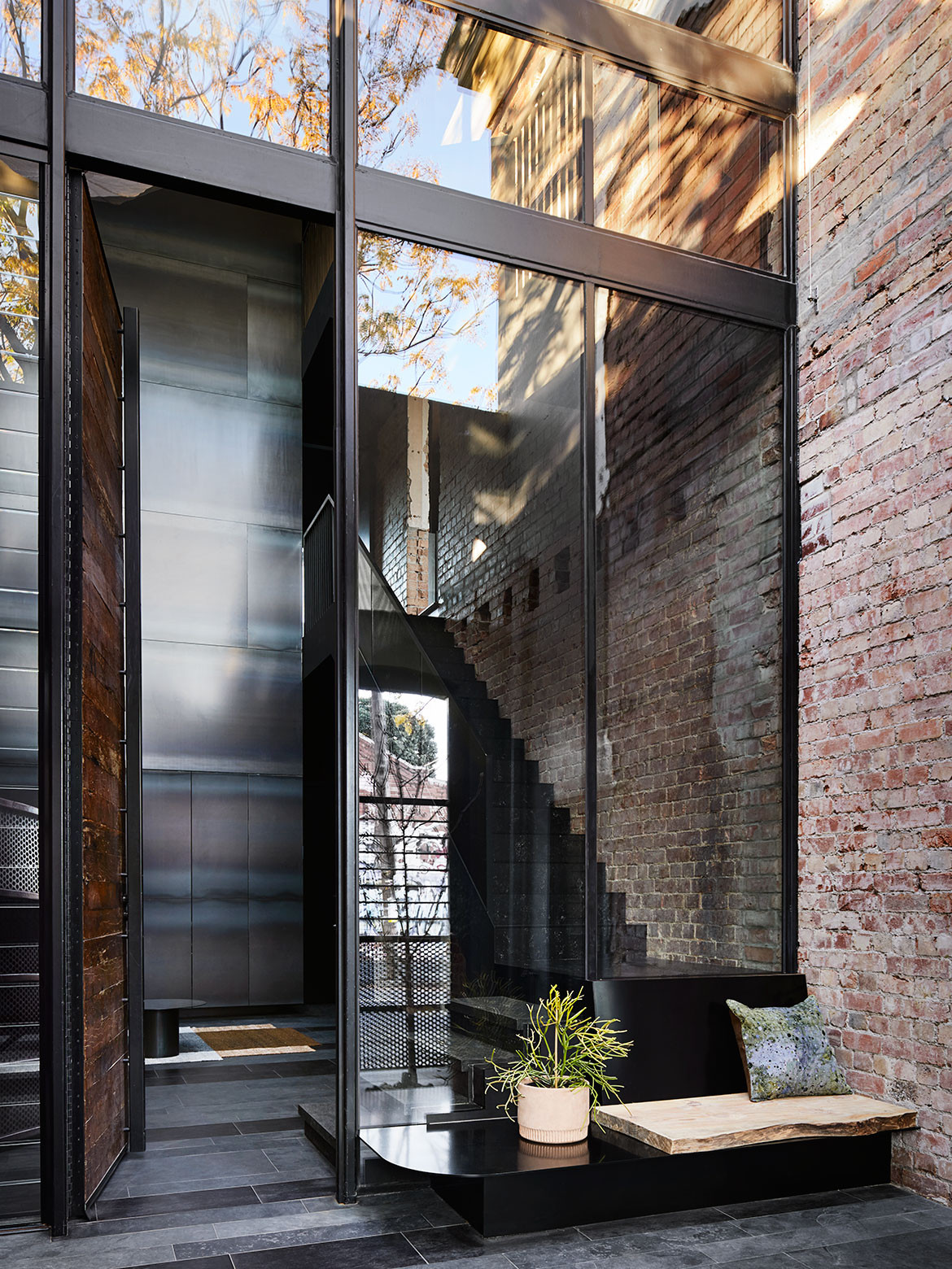
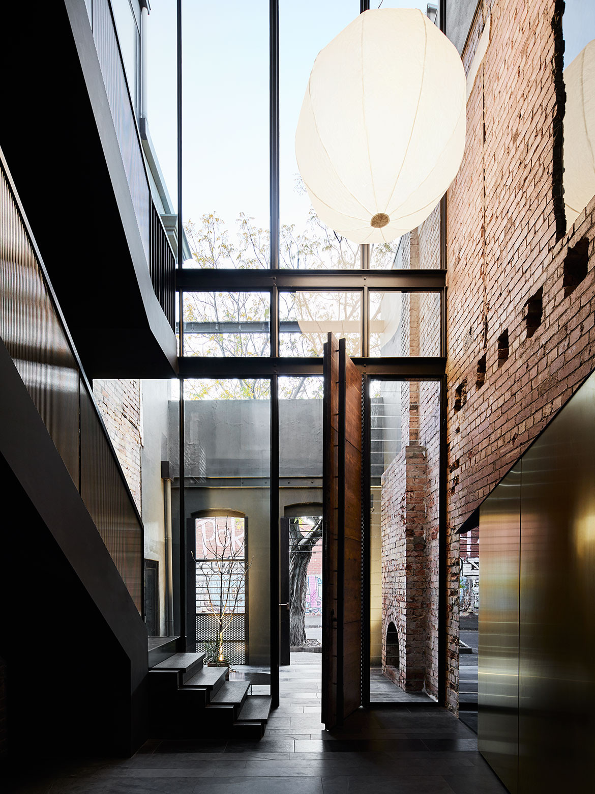
However, to create one from two required some strategic moves. A 10-metre-high void located at the main entrance was achieved by partially removing two of the upper floors, and inserting a steel and fluted glass staircase. “We were keen to have some level of separation from the children, but at the same time be able to easily keep an eye on them,” says Sheree, who wants to be able to stay in this house for the long term. “We’ve allowed space for a lift in our later years, but we also were mindful of how this place would work as the children become teenagers and young adults,” she adds. Along with three bedrooms, two living rooms and a studio, the space also now offers flexibility with areas being able to ‘mutate’ as the family grows.
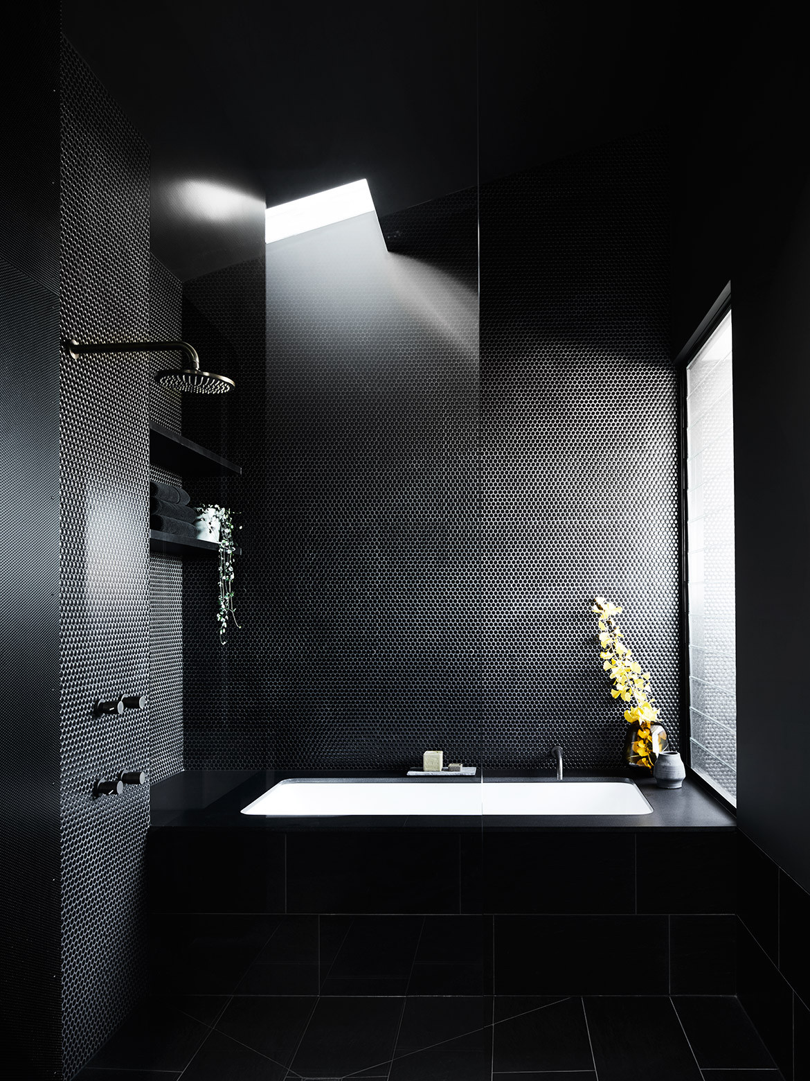
At ground level are the two children’s bedrooms, together with a shared bathroom, occupying the space of the original grocery store. There’s also Sheree’s studio, a place offering diffused western light and complete solitude. “As soon as I close that door, it’s like I’ve gone into another world,” says Sheree, who uses a billiard table as her workbench.
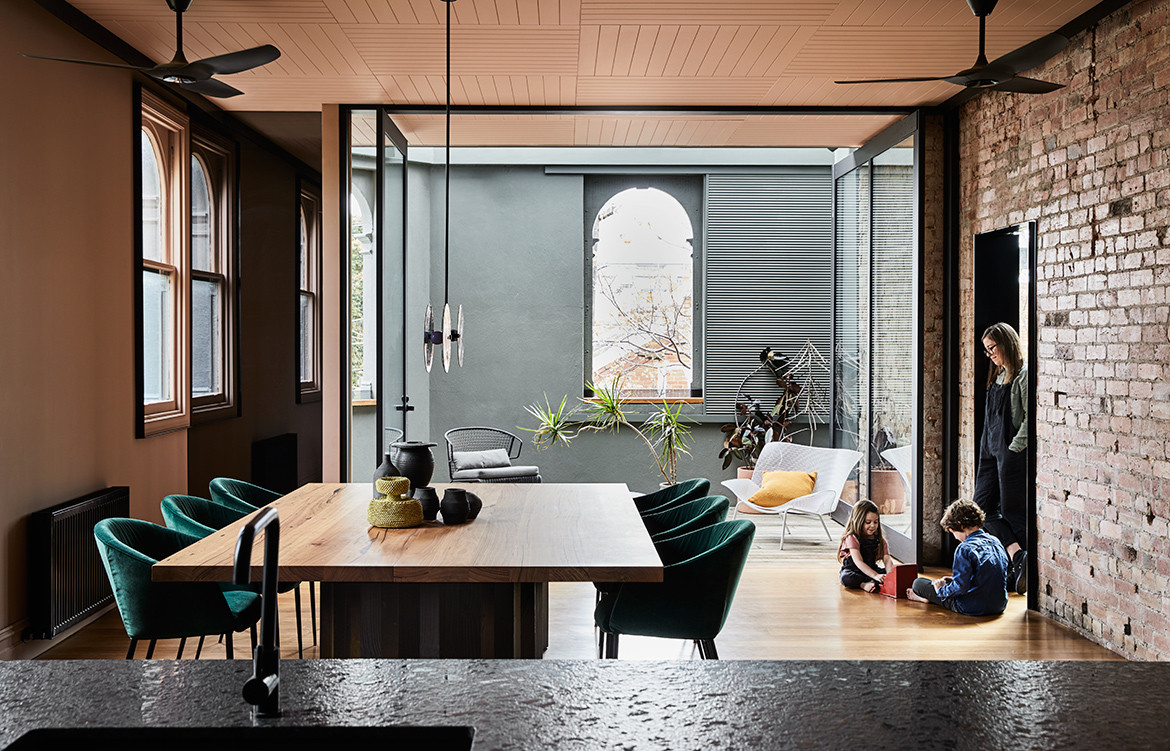
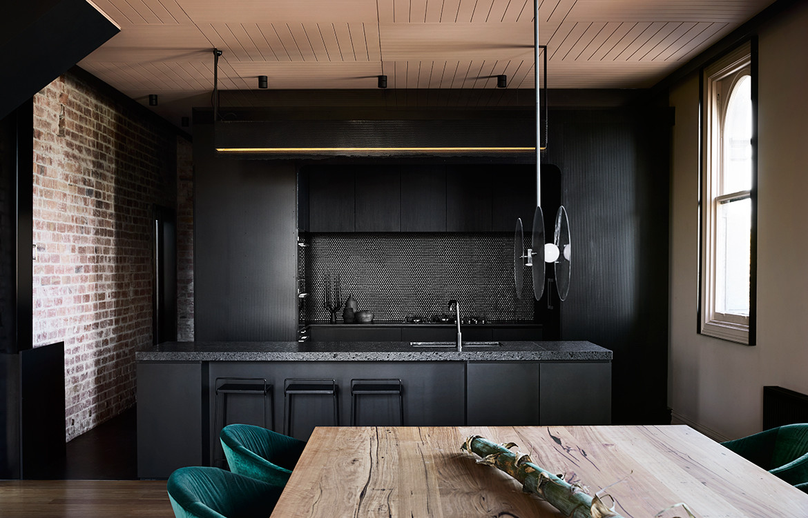
The kitchen and dining area, located on the first floor, creates a buffer for the main bedroom suite and parents’ retreat on the top level. It’s also just a few steps below the television nook, used primarily by the children. Here the brief for dark and slightly raw is beautifully expressed by Splinter Society. The kitchen island bench is made from ‘leather’-finished black granite, the effect giving the surface an appearance of water droplets.
Rather than a butler’s kitchen, Chris designed all the kitchen appliances to sit within a brooding curved alcove. With its perforated steel edge, there’s a subtle nod to Victorian lace. “As you can see, we’re not afraid to use black. It simply magnifies the leafy outlook,” says Sheree, referring to the established street trees, seen through the series of original arched windows. Reflective smoked mirrors also feature in the interior, amplifying the views of the verdant surrounds. “Eventually we want to add more indoor plants to green up this place,” she adds.
The space now offers flexibility with areas being able to ‘mutate’ as the family grows.
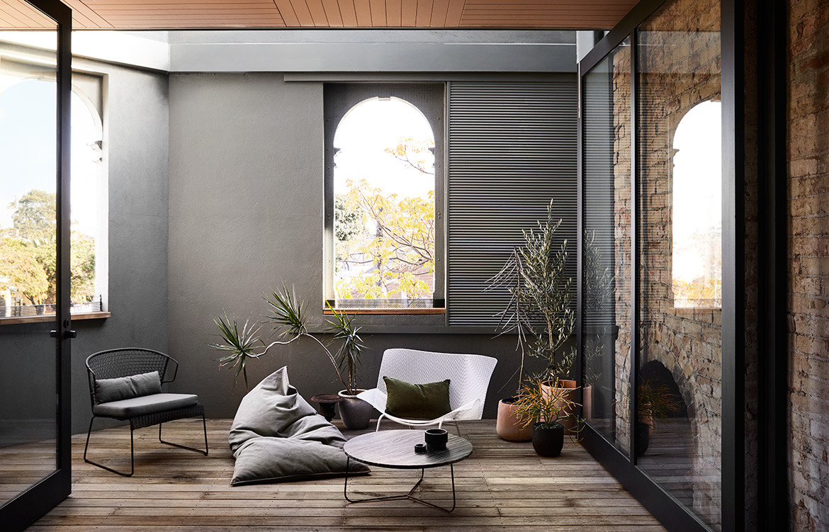
Although the house takes up most of the site, there’s a generous rooftop terrace and also a modest entry courtyard, with a newly planted magnolia tree. As with the former Victorian house that virtually abutted the pavement, there’s only a slither of space. The outdoor open fireplace would have formed part of a living room. “We’ve tried to retain as much of the original fabric as possible, while still creating a contemporary home for a family,” says Chris, who made it apparent at every turn what was original and what was added. A new brass-edged storage unit, for example, cuts a sharp swathe in the lobby, as does a Japanese-style 1.5- metre-wide paper lantern by ISM.
Rather than smooth over the original bricks and doorways, there are clear indentations of where floors have been removed. Builder’s notes scribbled on walls also denote where the recent builders have forged new openings, ones that happen to align with the building’s original use. Some doorways, such as the one opening into Sheree’s studio, are framed in bluestone, considerably shorter than doorways today. “I loved revealing the old scars, celebrating them rather than burying them. These wall cables (no longer in use in Sheree’s studio) add another layer to the renovation,” says Chris.
For Chris and his team, Sheree and Gabriel were a perfect fit. The Pinterest page presented in the initial meetings pointed to an aesthetic both architect and client could appreciate. “The images were generally dark and quite raw,” says Sheree, who loves the way natural light falls on the mild steel feature wall in the lobby, illuminated by a skylight. “There’s a continual play of light and shadow against the steel, particularly in the afternoon with the silhouette of the street trees,” she says.
Splinter Society
splintersociety.com
Photography by Sharyn Cairns
Dissection Information
Mountain Timber Products solid blackbutt decking
Mountain Timber Products solid blackbutt flooring with Loba matte finish
Forbo Resilient linoleum flooring in black
Pavers Plus Brazilian slate
Ital Ceramics rock finish porcelain tiles
SuperTuft Escape Twist carpet
CSR Barestone
Lysaght panelrib
Tongue n Groove wire brushed mixed species hardwood in smokey grey
Cerdomus black penny rounds
Resene Karaka and Rascal
Polytec thermo black natura laminate cupboards
Mark Tuckey dining table
P4 Arca Armchair
Ligne Roset Grillage Chair from Domo
Ligne Roset Oxydation low table from Domo
Halcyon Lake Nobsa rug
Ross Gardam Nebulae Vertical pendant
ISM Grapho bubble pendant
Studio Italia Strip lighting and Tommy and Arc barrel spotlights
Studio Italia Stelzen lamp
Fisher & Paykel appliances
Par Taps Lugano range tapware
Boyd Alternatives concrete basins
Anthony Lynch curtain fabric from Warwick Fabrics
We think you might also like Powell Street House by Robert Simeoni Architects