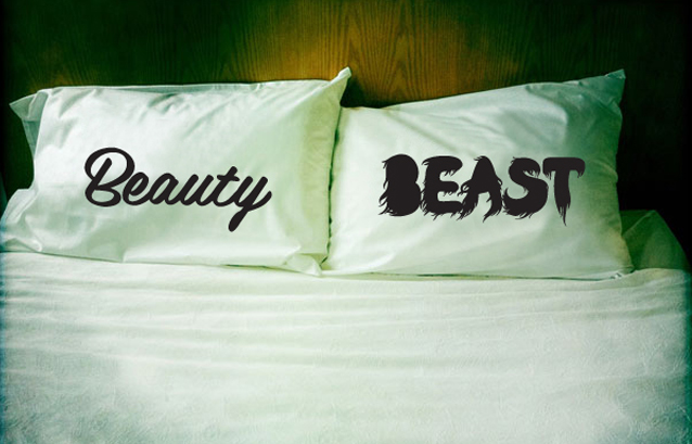
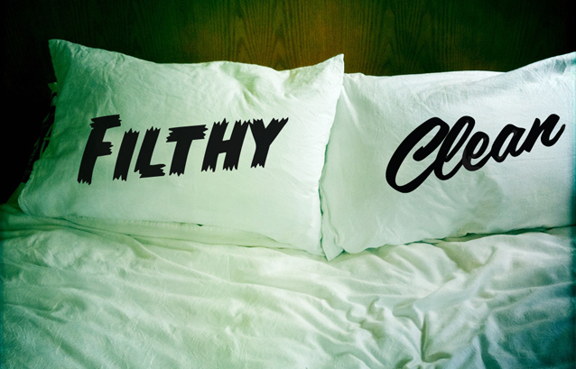
The ideal bed is covered in clean, fresh sheets, so it’s an anomaly Kiwi brand DustysandLulu called their new range ‘Dirty Linen’.
“Dirty Linen is inspired by our love of words, with a big fat dose of naughtiness,” says Lindie Sleyer, aka Lulu. Each pillowcase pair comes adorned with graphic wording, examples including Mr/Mrs, Beauty/Beast, Chick/Bloke, Pretty/Ugly, Love/Lust, Naughty/Nice, Yeah/Nah, Fork/Spoon and Filthy/Clean. “We love a bit of mischief and making people laugh with our twisted take on making life pretty,” she adds.
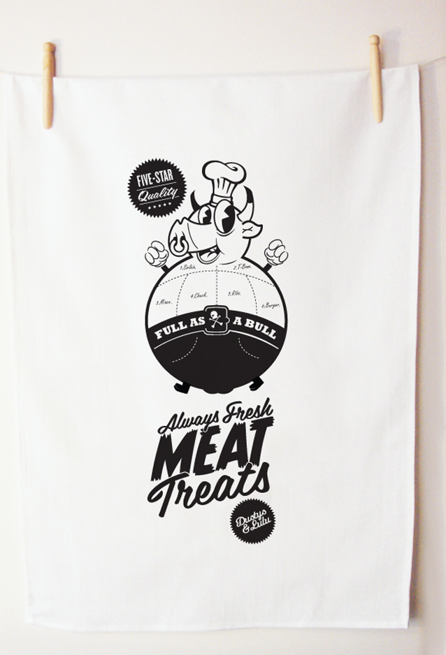
Lindie met husband Mike Sleyer – known as Dustys because of his love of Americana – while both working at a design agency in Wellington, New Zealand. As their relationship became more than just professional, they launched their own design company under the combined moniker DustysandLulu, devising a range of clothing, tea towels, prints, and now, pillowcase sets.
“Designed for newlyweds or old lovers, lovers of linen, or just plain lovers, these 100 percent cotton pillowcases help get you in the mood, or not, as the case may be,” says Lindie.
Screenprinting by hand is part of the DustysandLulu ethos. “We love screen printing, getting ink in your finger nails, feeling it squish through the screen as you drag over the squeegee,” says Lindie. “There’s a magic in hand screen printing; it has an amazing ability to bring prints to life. Each one is ever so slightly different to the next, and this creates the beautiful uniqueness of limited editions.”
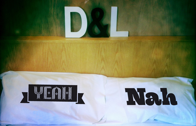
The pretty/ugly juxtaposition was the key design concept for the Dirty Linen range, Mike explains. “Pretty is such a girlie, soft and romantic word and we were inspired by delicate script fonts that were filled with flourishes and beauty,” he says. “But the most inspiring part was pairing that with a dirty, bold font. It makes the pretty ‘prettier’ and the ugly ‘uglier’, while still being a design that customers would want on their beds.”
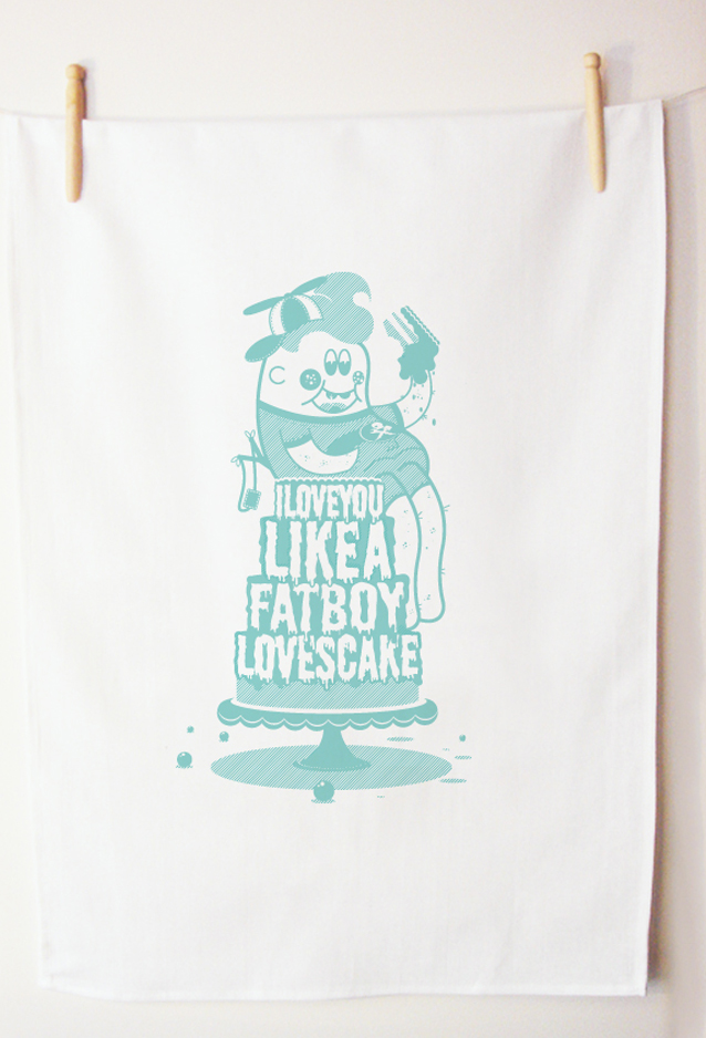
The range caters for “all levels of dirtiness and humour” and the fonts are a reflection of this, Mike says.
“We use fonts to seduce and evoke an emotional response. We believe that imagination is more important than knowledge, and that the purpose of design to make the ordinary the extraordinary.”
Dusty&Lulu
www.dustysandlulu.com
