
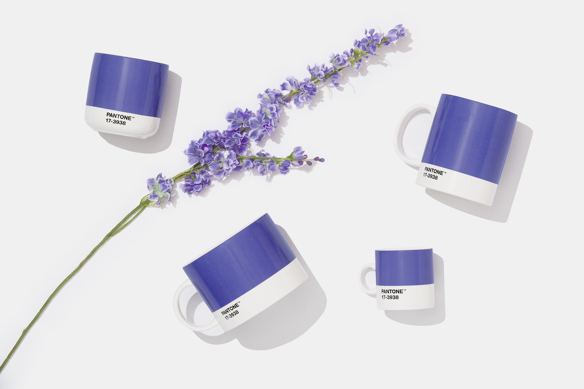
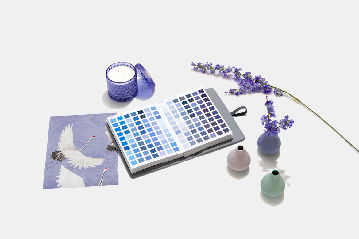
Moving on from its 2021 colours Ultimate Gray (the name says it all) and Illuminating (a stunningly bright yellow), Pantone has once more announced its iconic Color of the Year, revealing next year’s colour to be Very Peri – a deep, periwinkle blue.
Pantone’s annual colour forecast is a calendar event for all creative industries, signalling the colour that will influence the coming year of fashion, interior and product design, and art.
The tone merges blue (symbolic of trust and calm) with an undertone of red (which brings playful energy) to present a dynamic and digitally inspired violet-periwinkle.
Pantone has harnessed – or perhaps shaped – the zeitgeist since 2000. Who could forget Pantone’s Rose Quartz and Serenity colours of the year in 2016, a combo of soft pink and baby blue around the same time that the term Millennial Pink was coined.
Very Peri is reminiscent of the Pantone Color of the Year 2008, Blue Iris, which was released during the GFC, a time of international struggle and societal upheaval. It harnessed a deep blue for the colour’s “dependable aspect”, alongside a “strong, soul-searching purple cast” to present a colour which would give reassurance alongside a hint of mystery and excitement.
In a similar mentality, Very Peri is a reaction to the trials and tribulations of the last few years.
“As we move into a world of unprecedented change, the selection of Pantone 17-3938 Very Peri brings a novel perspective and vision of the trusted and beloved blue colour family,” says Leatrice Eiseman, The Pantone Color Institute’s executive director.
The colour, says Eiseman, encompasses “the qualities of the blues yet at the same with its violet red undertone, Pantone 17-3938 Very Peri displays a spritely, joyous attitude and dynamic presence that encourages courageous creativity and imaginative expressions”.
The shade aims to reflect the rapid merging of our digital and physical worlds, after an intense period of isolation. It is reflective of how “colour trends in the digital world are being manifested in the physical world and vice versa”.
Photography courtesy of Huge.