
Guilio, you’ve an impressive client list including Vitra, Fritz Hansen, Maharam and Kvadrat – and you live and work in Udine alongside Moroso. Obviously, your eye is trusted. How much is your work based on learning, how much on intuition?
I am not an academic, nor a pharmacist but I am able to understand colour. My background is as a painter, and that’s where I first began to learn about colour. I’d say that my work method is somewhere between intuition and anthropolgy.
So you studied as a painter?
No, I studied as a fashion designer in Milan at the Domus academy and then I worked with Gianfranco Ferre for two years then I went on a trip to India which is where I really began to learn about colour. The Indian use of colour can appear so exuberant, even extravagant or gaudy to Western eyes, but it is in fact highly nuanced. But my interest in cloth really began at an early age, when I got a job in a very beautiful boutique in Udine where I gained hands on knowledge of texture and colour, the interaction of the two elements.
Is a day without colour simply drab?
I’m not obsessed by colour. I am certainly not chromophobic, but I’d confess to being chromophiliac. That said, it’s not as if I have to be surrounded by colour 24 hours a day.
Is texture still important?
I can’t develop a sense of colour in isolation from texture. It’s just not possible – at least not in the furniture business – to work colour without texture. It is of course possible if one is a painter, but even then the sense of texture of the paint itself has a role to play in the finished work.
I can imagine texture and fabric is extremely important when working with Patrizia and the team at Moroso.
Very. When Patrizia and I begin to consider upholstering a new design, first we meet the designers and the Moroso team members who will be involved in the manufacture. The designer walks us through his or her concept, and my role along with Patrizia is to create a skin for the project. I love working with people who have strong personalities – and Patrizia is definitely one such person! Elaborating a piece of furniture is a dialogue the result of which is to ‘dress’ the design and get it ready for its admirers.
When you approach a new furniture project is your agenda to push your new colour palette to the fore?
No, never. It’s not about me pushing a certain idea of colour I may have to the foreground. It is about proposing the appropriate colour or colours for a particular piece. Sometimes a company will apply certain colours to certain designs to which they’re really not appropriate, just as a means of capturing the attention of the media. You see a lot of this at the Salone del Mobile in Milan.
The furniture industry doesn’t adhere to a strict seasonality in the way the fashion industry does. How do you organize your timing in order to respond most efficiently to market requirements?
I work incessantly! No, seriously, in my job you can never switch off, ideas and influences are all around, every day and a big part of my success is the fact that I am extremely attuned to the many varied forms of input on a daily basis. My goal is normally to create an ongoing colour scale.
An ‘ongoing colour scale’ is intriguing. Tell me about that.
Okay, so if you consider Chanel for example, compare bottles of Chanel Nº5 from the past 20 years you will see very slight changes, gradations of the house style which enable the graphic design to always be contemporary whilst retaining its classic allure. Our perception of colour and form is constantly evolving so the things around us need to change slightly too in oder to continue to intrigue us.
What if a client asked you to create an entire collection in white?
I would be delighted! The shades and nuance of white are many and varied. It’s not al about blaring, vomit colours all the time.
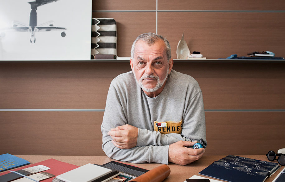
Guilio Ridolfo was In Conversation With… Stephen Todd
Portrait by Charlie Kinross