Timothy Alouani-Roby: Can you tell me about the site context?
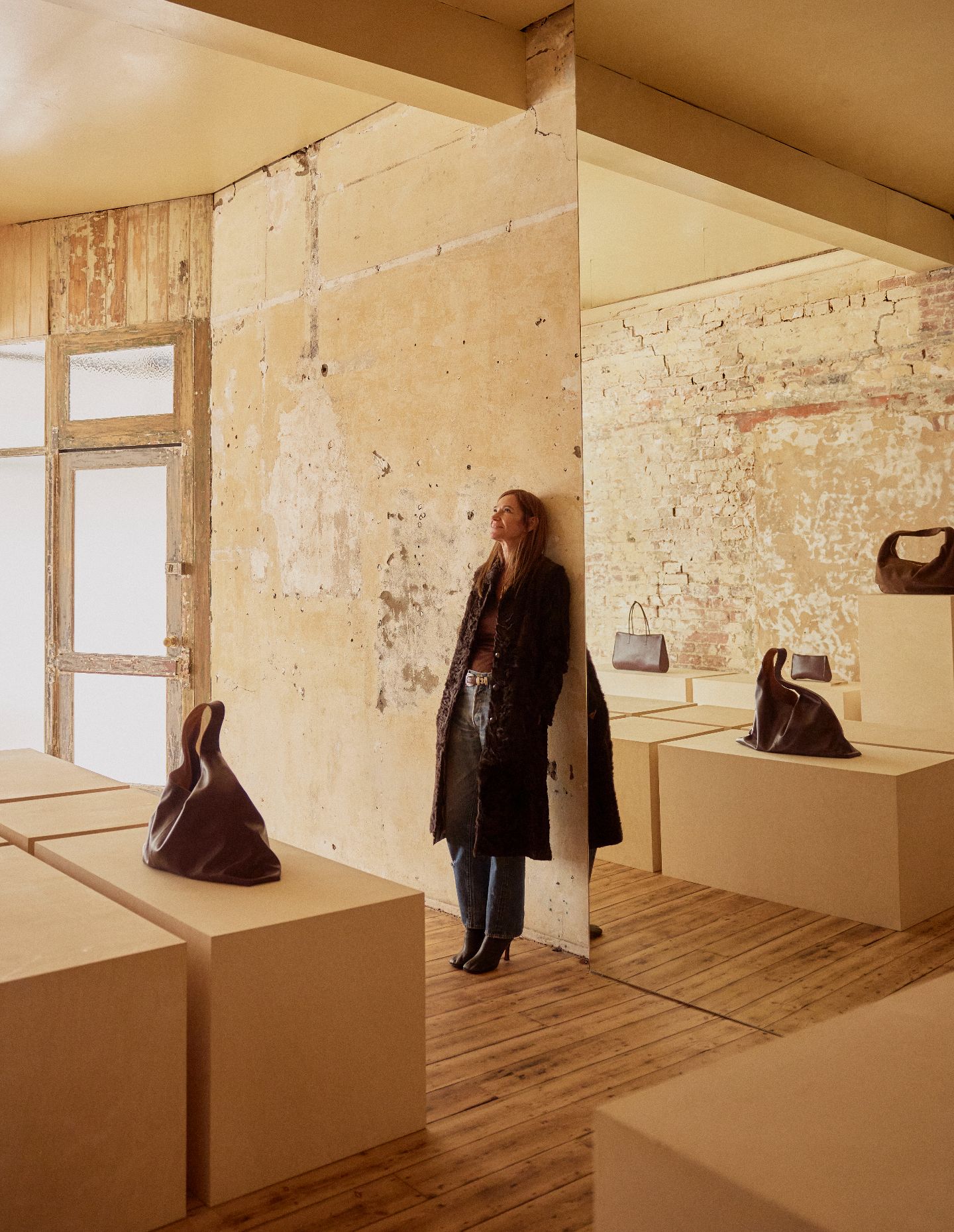
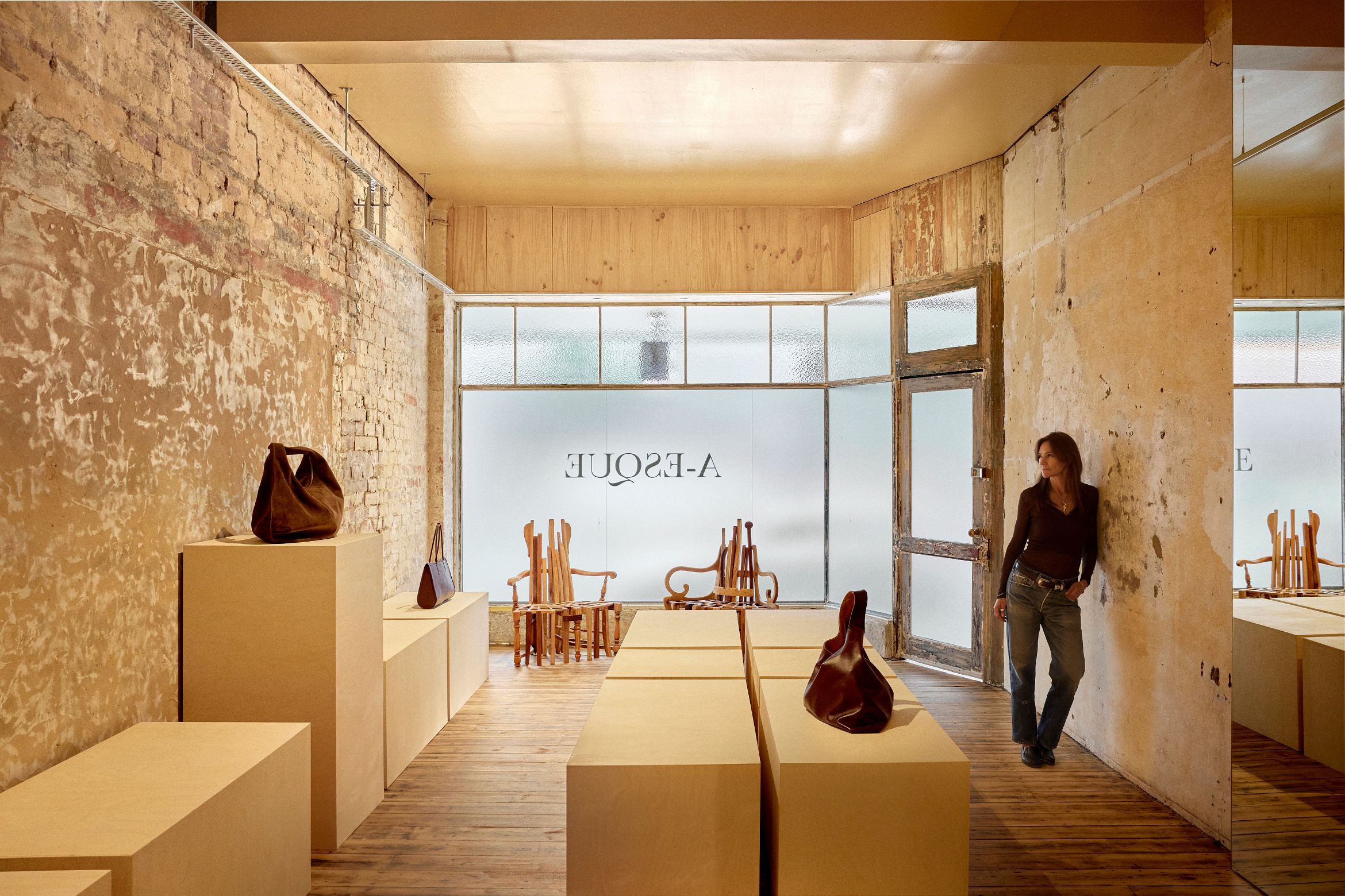
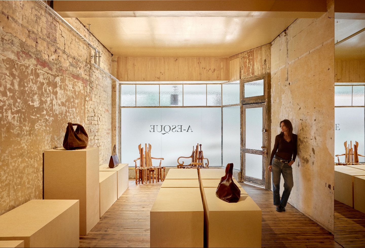
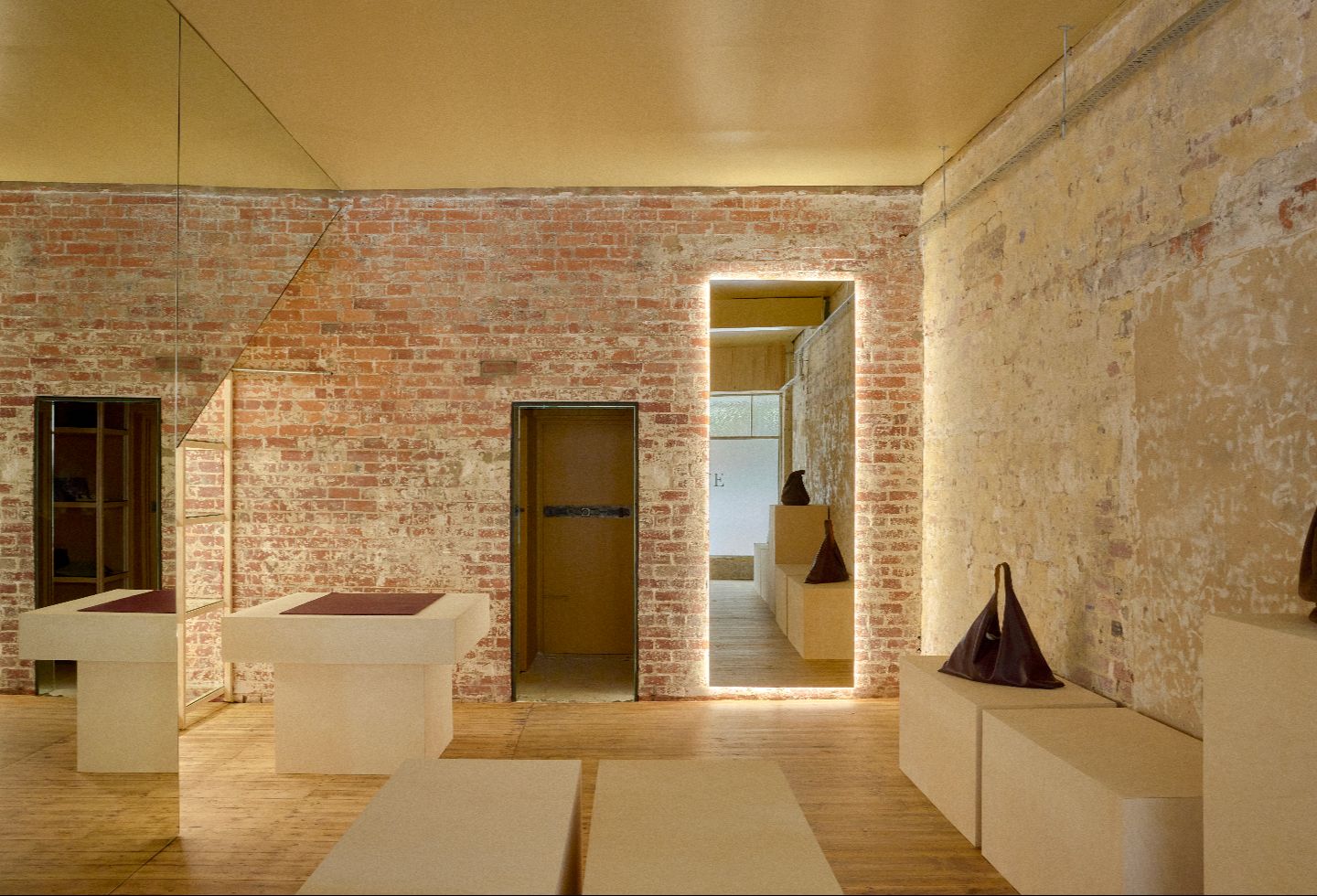
Amanda Rettig: The space sits within the Kings Arcade building on High Street in Armadale — a heritage property originally constructed in 1893 that has undergone many interior iterations over the decades. It’s a red brick structure, though successive layers of fitout had long concealed the bones beneath. Part of what drew me to this location was the opportunity to uncover that history and let it breathe again.
The street context is equally compelling. We’re positioned close to the café precinct, opposite Victor Churchill’s and the new Christofle flagship — a stretch of High Street that has a real sense of intention and curation about it.

What functional needs are addressed with this design?
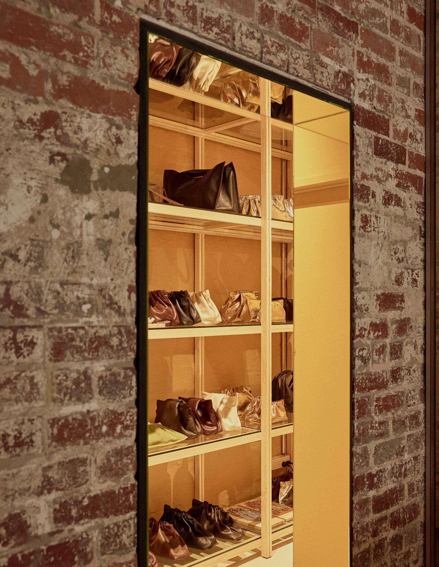
The most pertinent functional need was a considered retail experience — one that allows us to service clients within an environment that is dynamic, ever-changing and genuinely inspiring, rich in craftsmanship and materiality. Every practical element — point of sale, storage, customer flow, windows, signage — has been absorbed into the overall atmosphere, which has been designed to feel gallery-like throughout.
How will the space be used?
This is an outpost of our Melbourne Atelier, though I was deliberate about not simply replicating it. I wanted to take a fresh approach to what a brand flagship can be — something intimate and genuinely active on the street. The space will be used to present new releases, collaborations and artworks, functioning as much as a cultural destination as a retail environment. Its identity will be built over time, through the people, ideas and objects that move through it.
How did your experiences in Milan shape the concept?
Milan has a particular fluency in dissolving the boundaries between retail, gallery and installation. The best spaces there don’t announce what they are — you simply find yourself inside something considered and alive. That sensibility was very much at the back of my mind here. I wanted to create a space that resists easy categorisation; somewhere that can hold a product launch as naturally as it holds an artwork.
Related: Roberto Palomba in Australia
What are the important material and textural considerations?
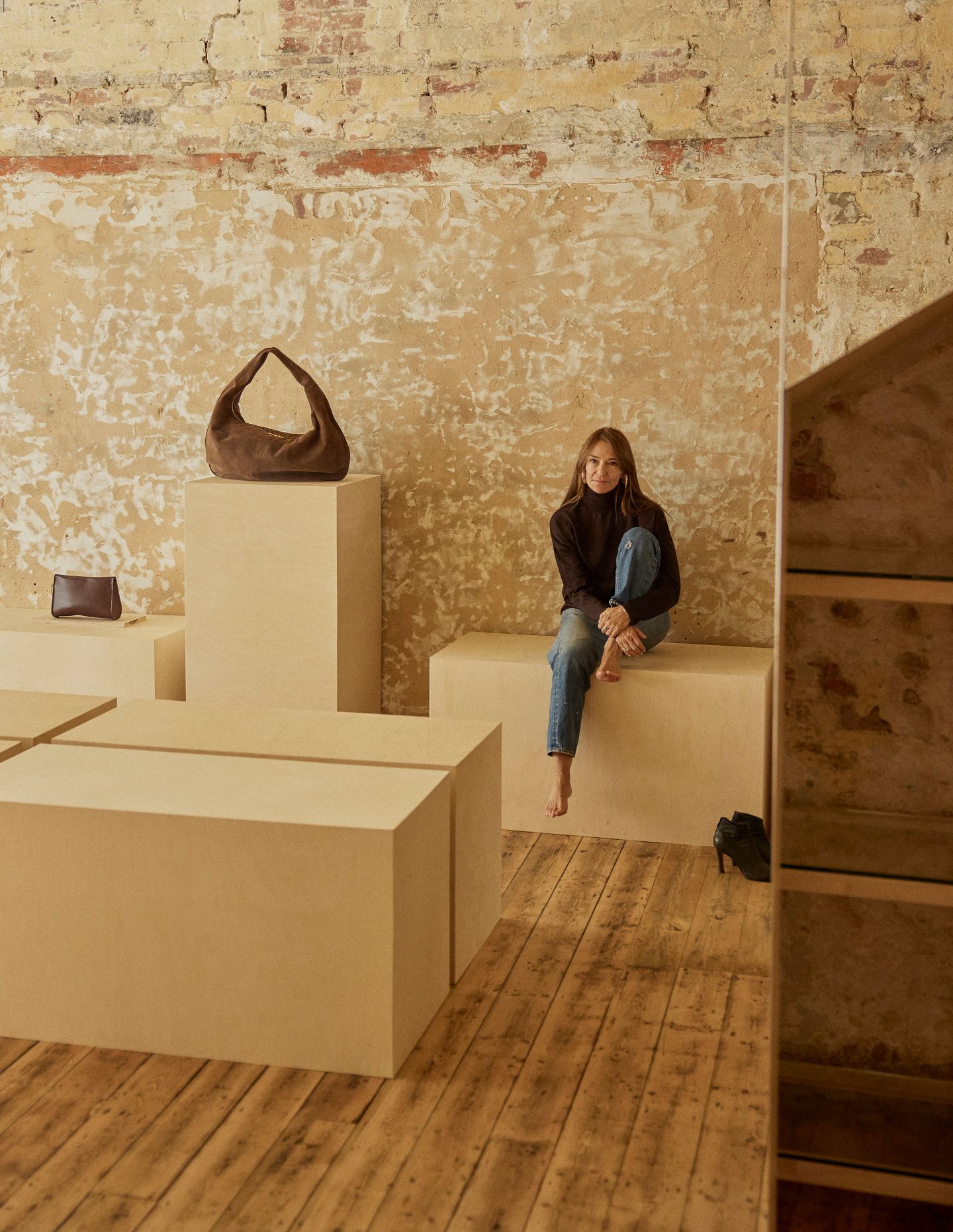
The material palette is intentionally authentic and restrained, working in soft, quiet tones that let the space itself do the talking. There was a commitment throughout to materials that are honest about what they are — nothing decorative for its own sake — and the palette was entirely guided by what already existed within the building.
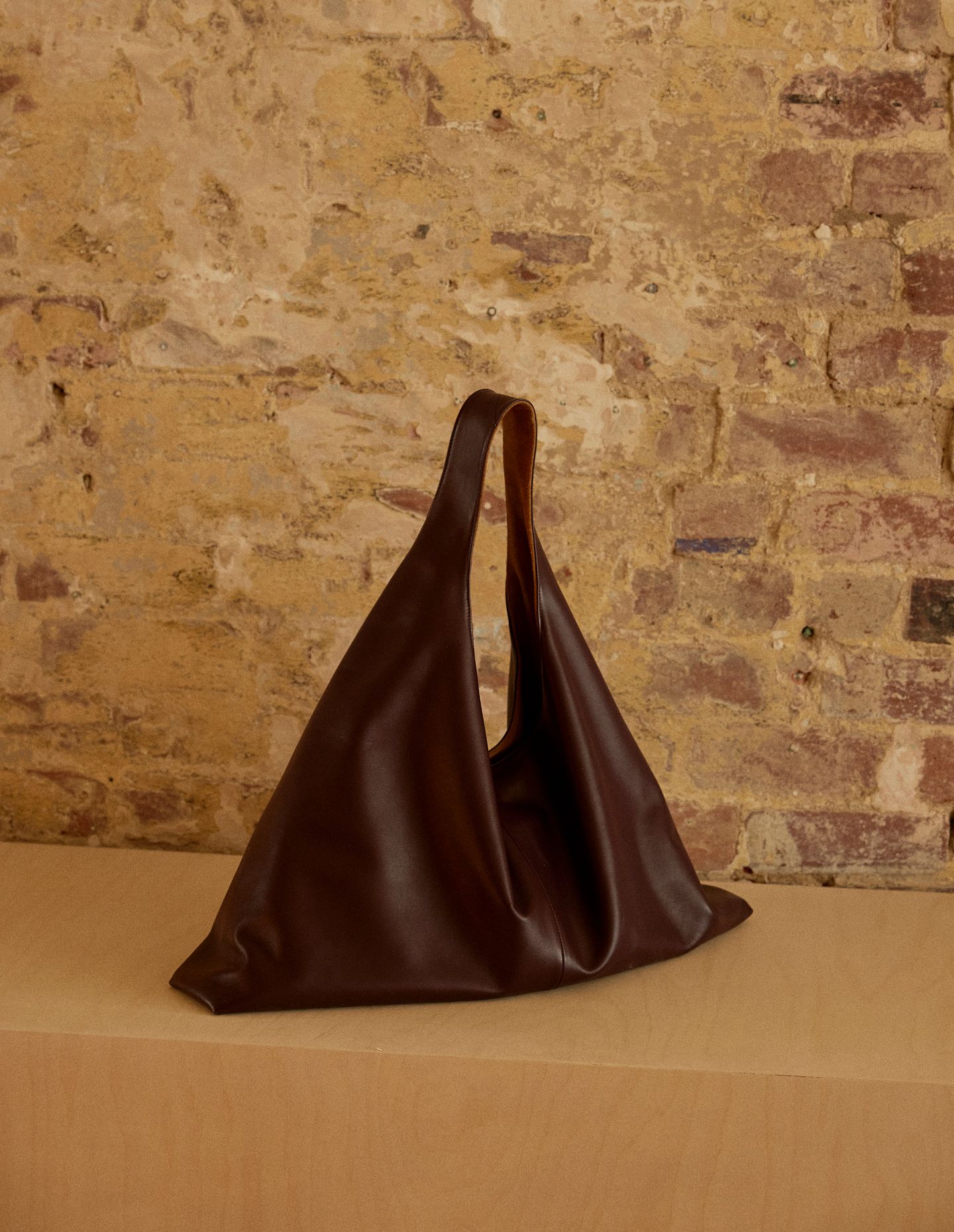
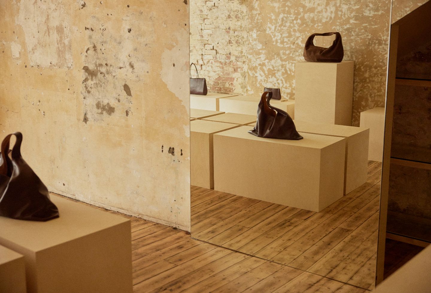
Premium ply is the only new addition; every other material was already there. It brings a modern, egalitarian quality while retaining a sense of luxury throughout. I intentionally steered clear of stone this time — my usual go-to for surfaces — and instead let ply, glass and lighting do the work of adding polish to the surfaces upon which the pieces are displayed.
What is your favourite detail or moment?
The space is very much a sum of its parts, with the stripped brick and plaster walls as the anchor — they carry the history of the building in a way that no applied finish ever could. The sanded floors have a quietness and warmth that grounds the whole space. And then there are the mirror moments — carefully positioned to expand the room and catch the light — alongside the premium ply plinths, which bring a refined, tactile quality to how the objects are presented.
Together, they form a kind of conversation between the raw and the refined that I find endlessly satisfying.