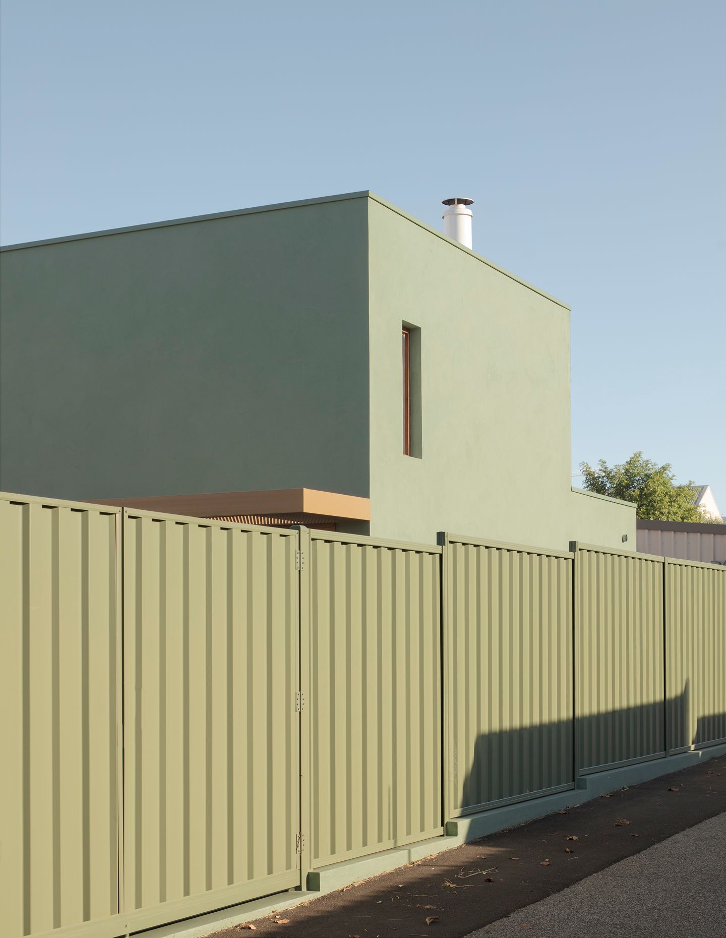
Brunsdon Studio may comprise a small team, but its diverse portfolio of work across Australia and South-East Asia has made a big impact. The practice’s most recent project, an extension to a heritage 1920s cottage in inner-city Perth, is particularly memorable and it’s not difficult to see why. Minimalist maximalism is the perfect term to describe its deliciously choreographed play of light, colour and form, all of which balance a strongly pared-back aesthetic with curious textures and rich materiality.
The house itself occupies a site that was once a market garden (significant in Perth’s history of immigration as many of them were established and run by immigrants) and this is where the studio’s principal and creative director Nic Brunsdon took inspiration. “This project is cognisant of its context, deep in the heartland of an interwar housing expansion,” he explains. “As such, the new extension innocently assumes a green palette, becoming the new ‘green’ plot situated in the backyard… verdant, alive and referential. In this way, it pays homage to increasingly lost inner-city market gardens.”
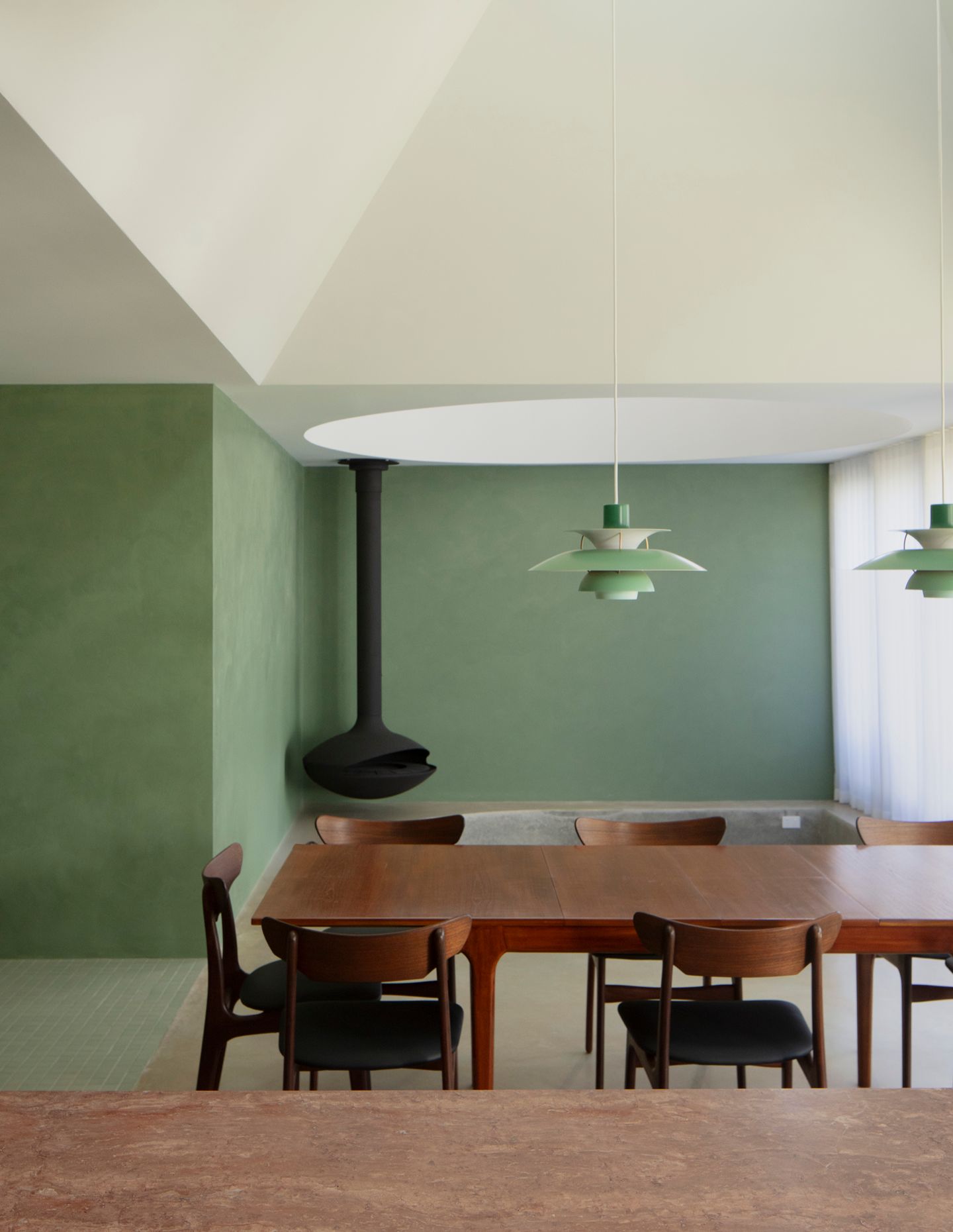
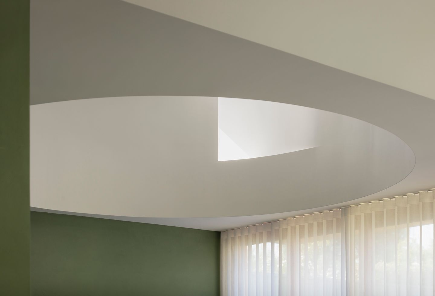
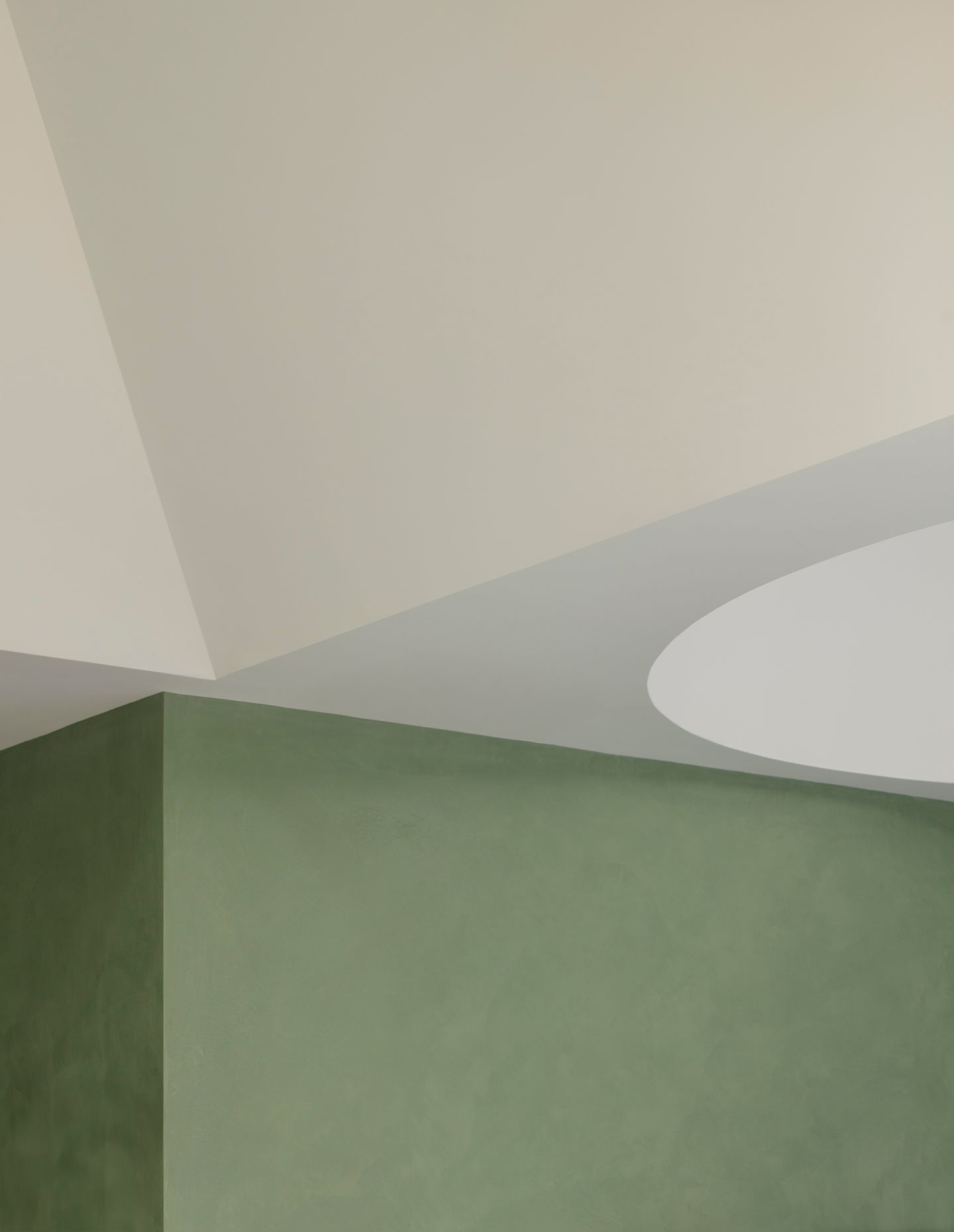
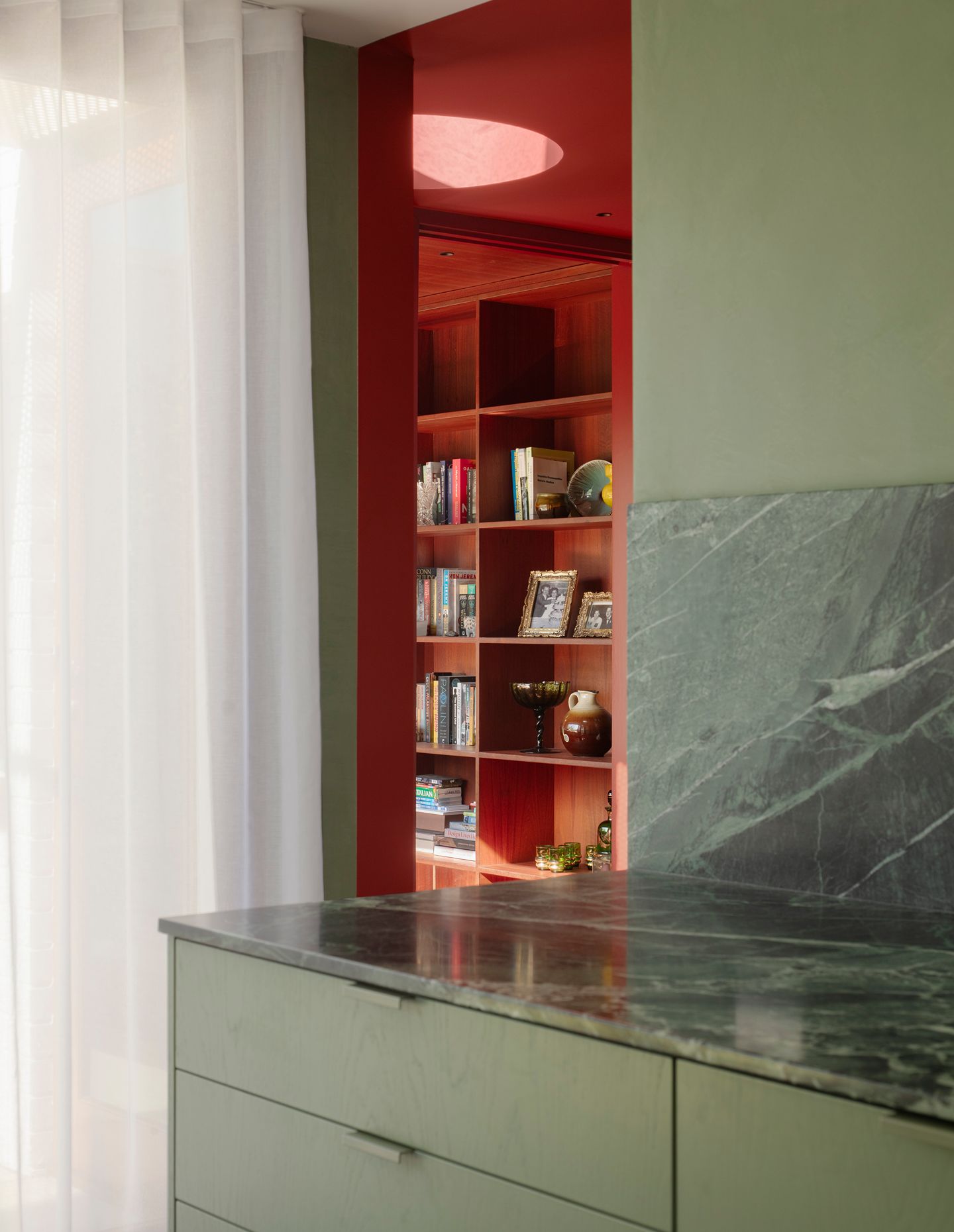
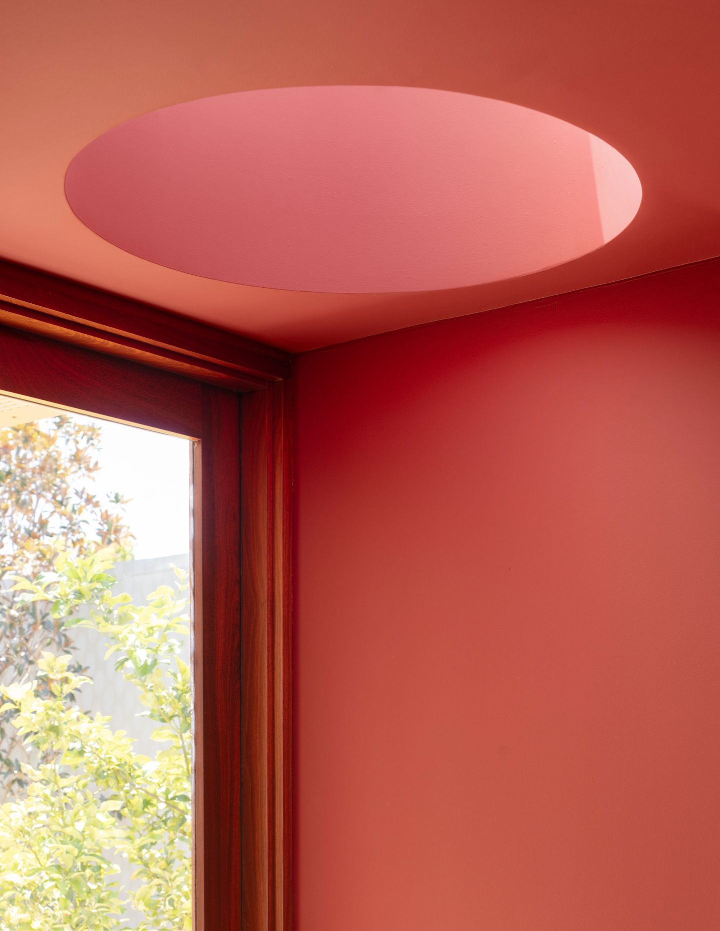
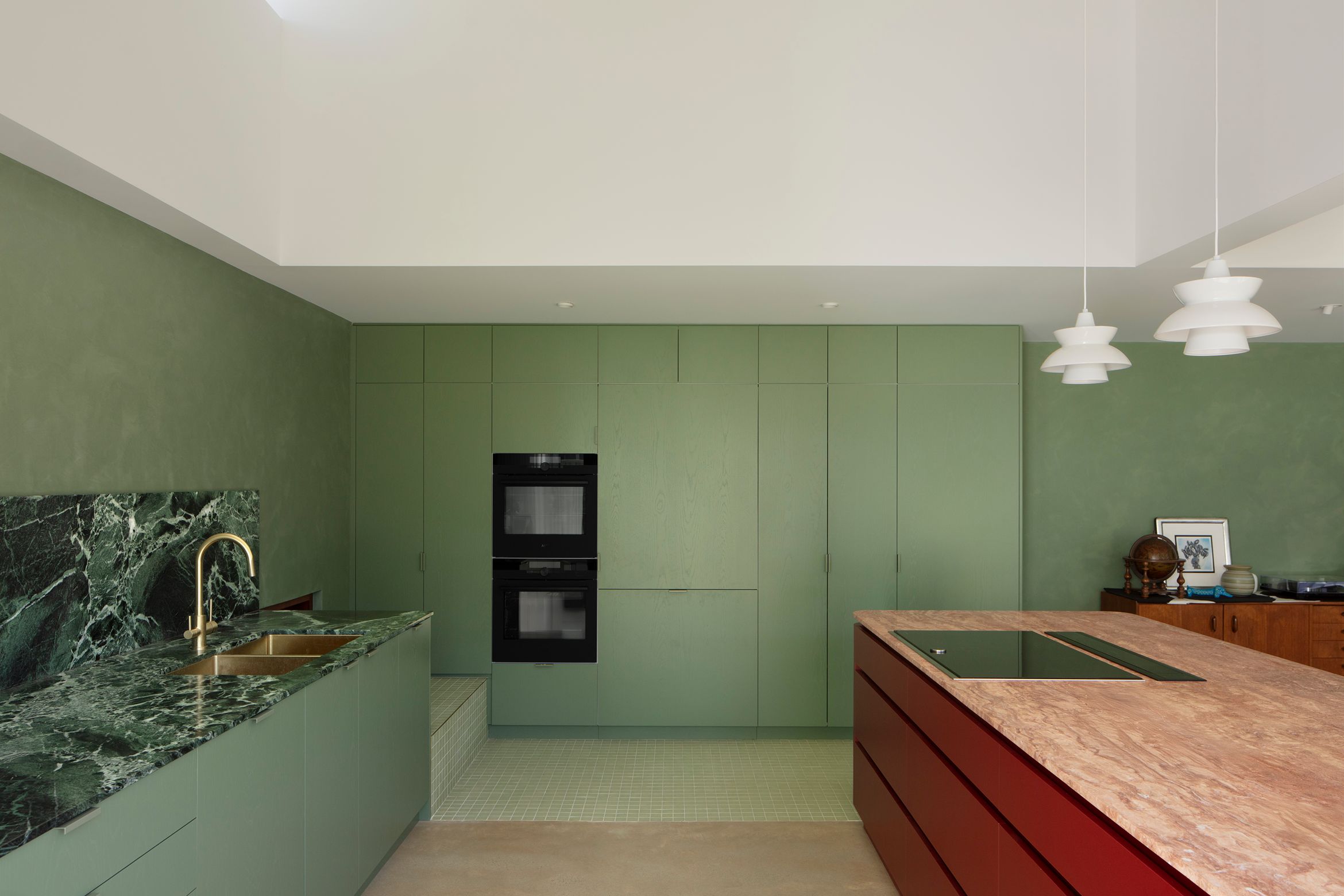
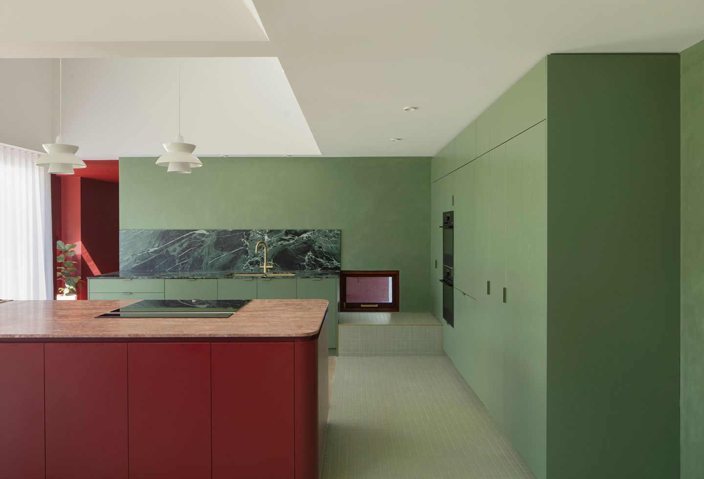
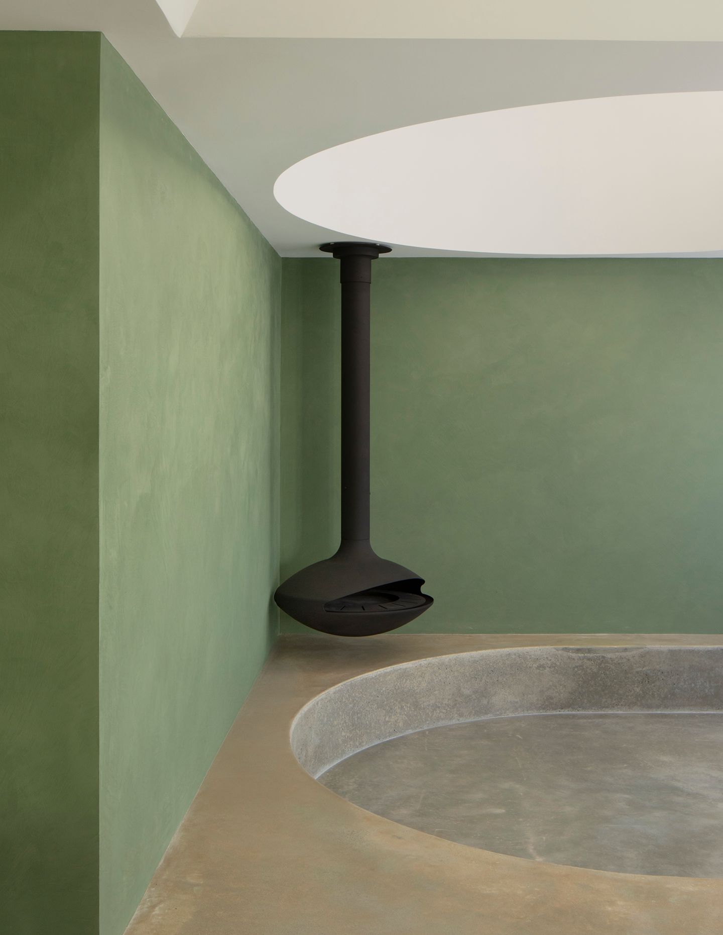
Positioning the extension at the property’s southern boundary allowed Brunsdon and his team to let as much natural light into the open plan scheme as possible. Its double height interior was then organised into three distinct spaces, each with their own unique form, in order to maximise the light. As a result, the kitchen volume is square, with a window that points east, capturing the morning light, while the dining room’s pyramid shape rises to a small skylight that acts as a sundial. And in the cylindrical shaped living room, complete with sunken lounge, a west-facing window lets in the late afternoon light. The overall effect is incredibly deft, not to mention dynamic, with an effortless simplicity that actually belies the complexity of its planning.
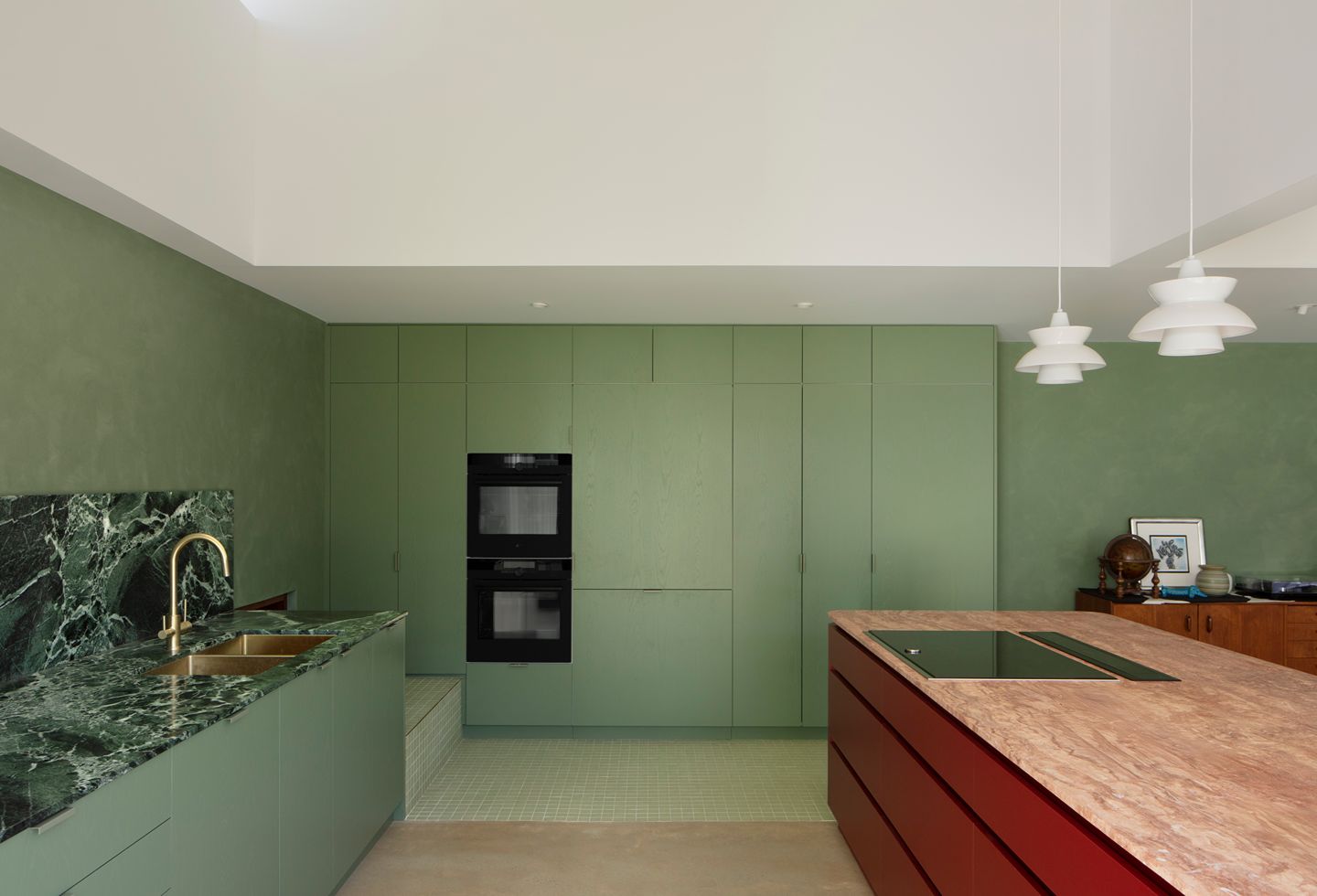
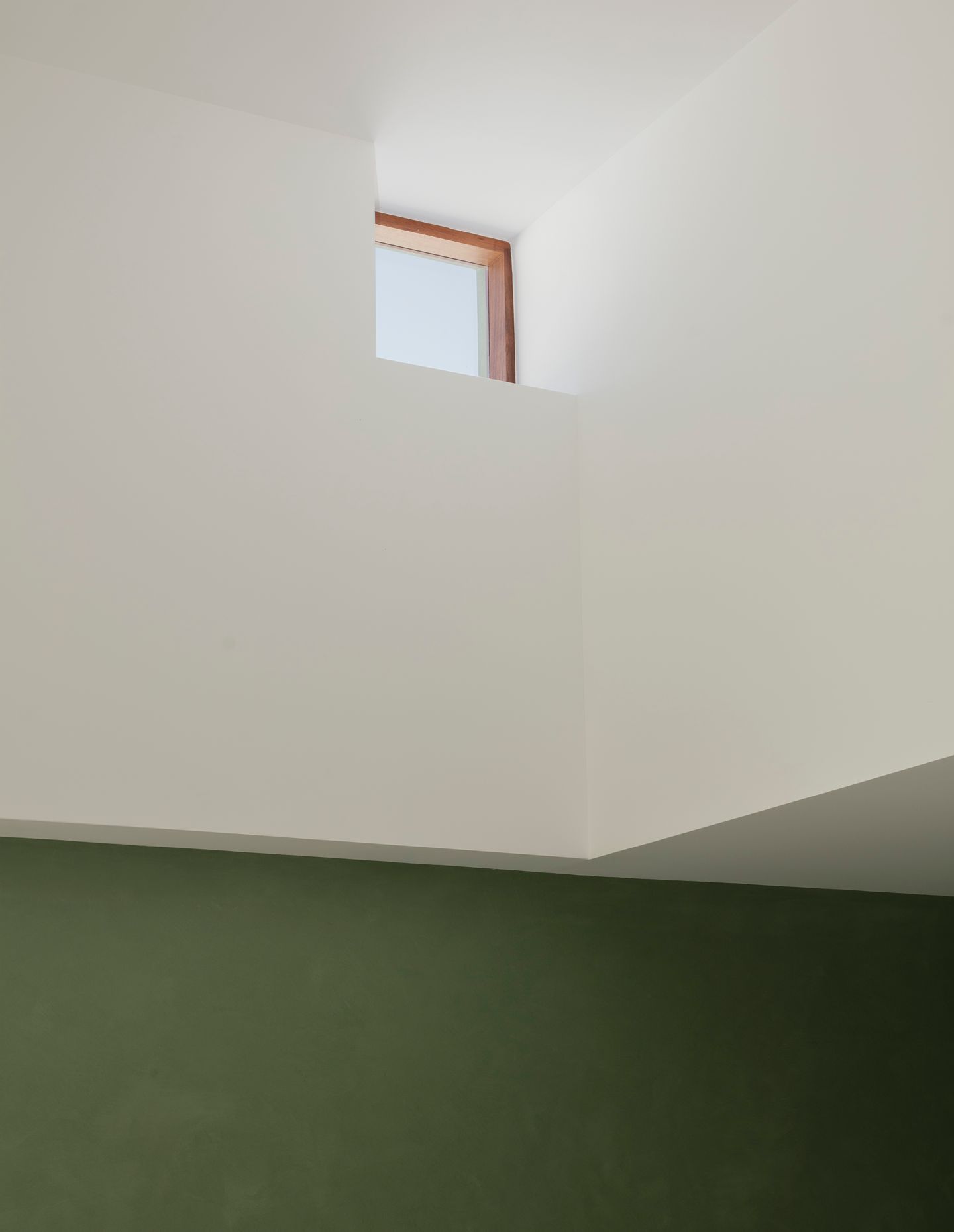
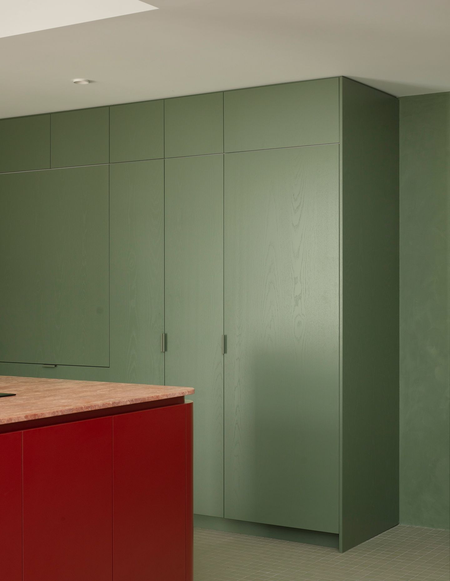
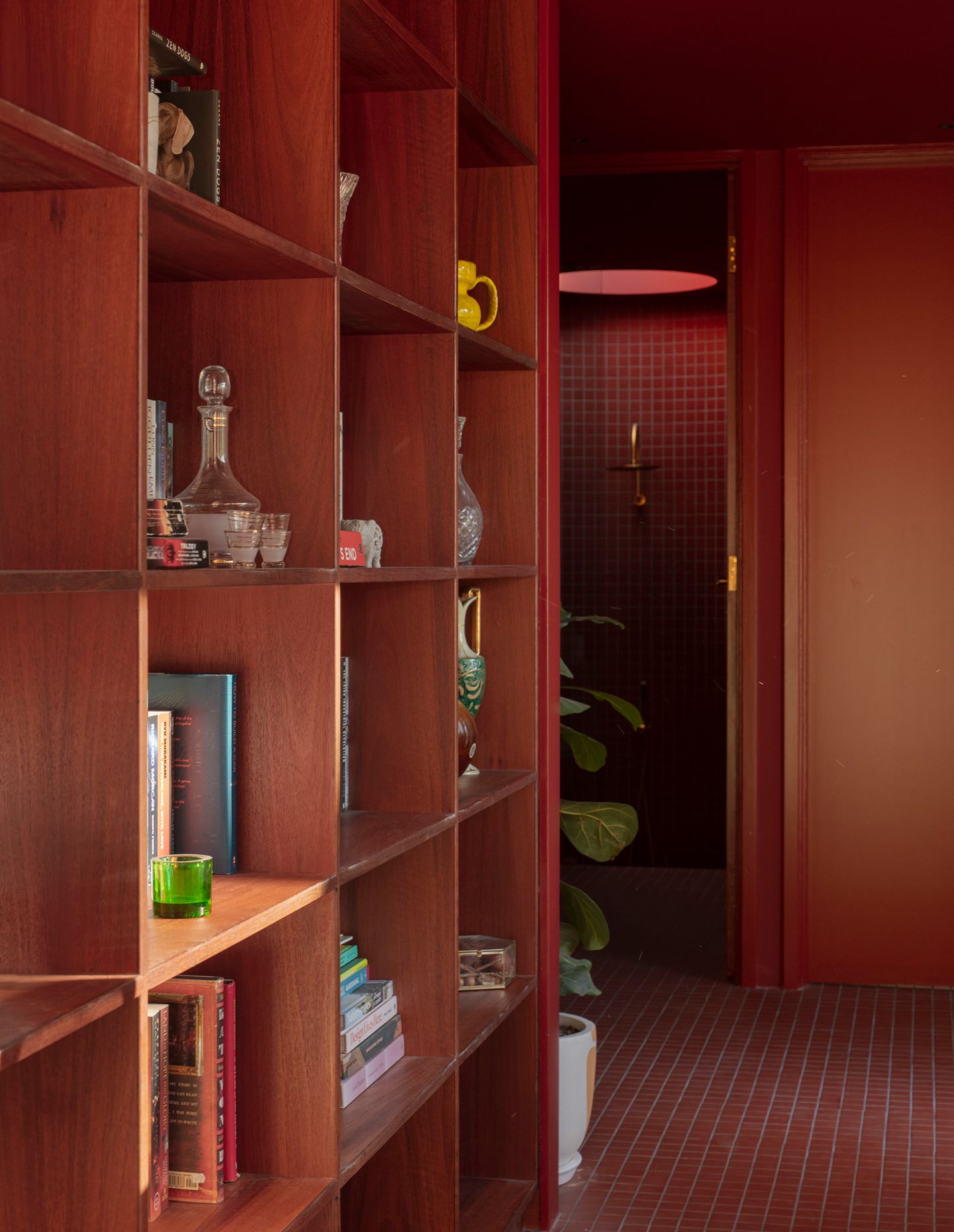
But while this clever composition of form and light is striking, it’s the colour palette that immediately catches the eye and holds greatest appeal. Brunsdon’s choices are bold, beginning with the living areas’ green walls and joinery, highlighted by the kitchen’s deep green marble splashback and benchtop. The red of the island pops, matching the extension’s entry, which is flanked by a new bathroom and a study (with a café-style window that flips up) that faces the property’s northern garden.
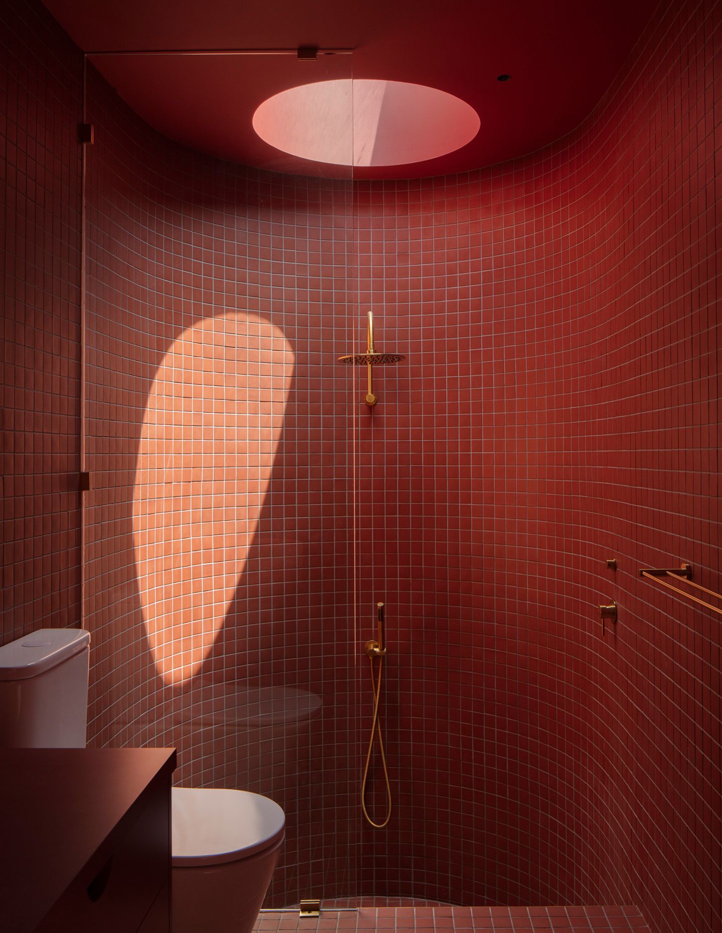
As Brunsdon notes, “The new extension is stitched into the existing structure and expressed through a quarter-round moment where the floorboards of the old hallway and the tiles of the new meet. Here, the ox blood colour palette sits in the knuckle between the two, deliberately darker and quieter, punctuated by two skylights that bring in more natural light.” In contrast, the new ensuite is yellow; a sunny, bright choice that brings a fresh, youthful exuberance to the design.
The saturation of colour and strategic light filtrations makes this home a wonder to live in. And rather than overwhelm as could be expected, every element comes together to instil a sense of calm within a space that is essentially minimalist in layout. Brunsdon Studio has successfully delivered a contemporary extension that stands out yet is ultimately about serving the needs of the family for whom it was designed.