
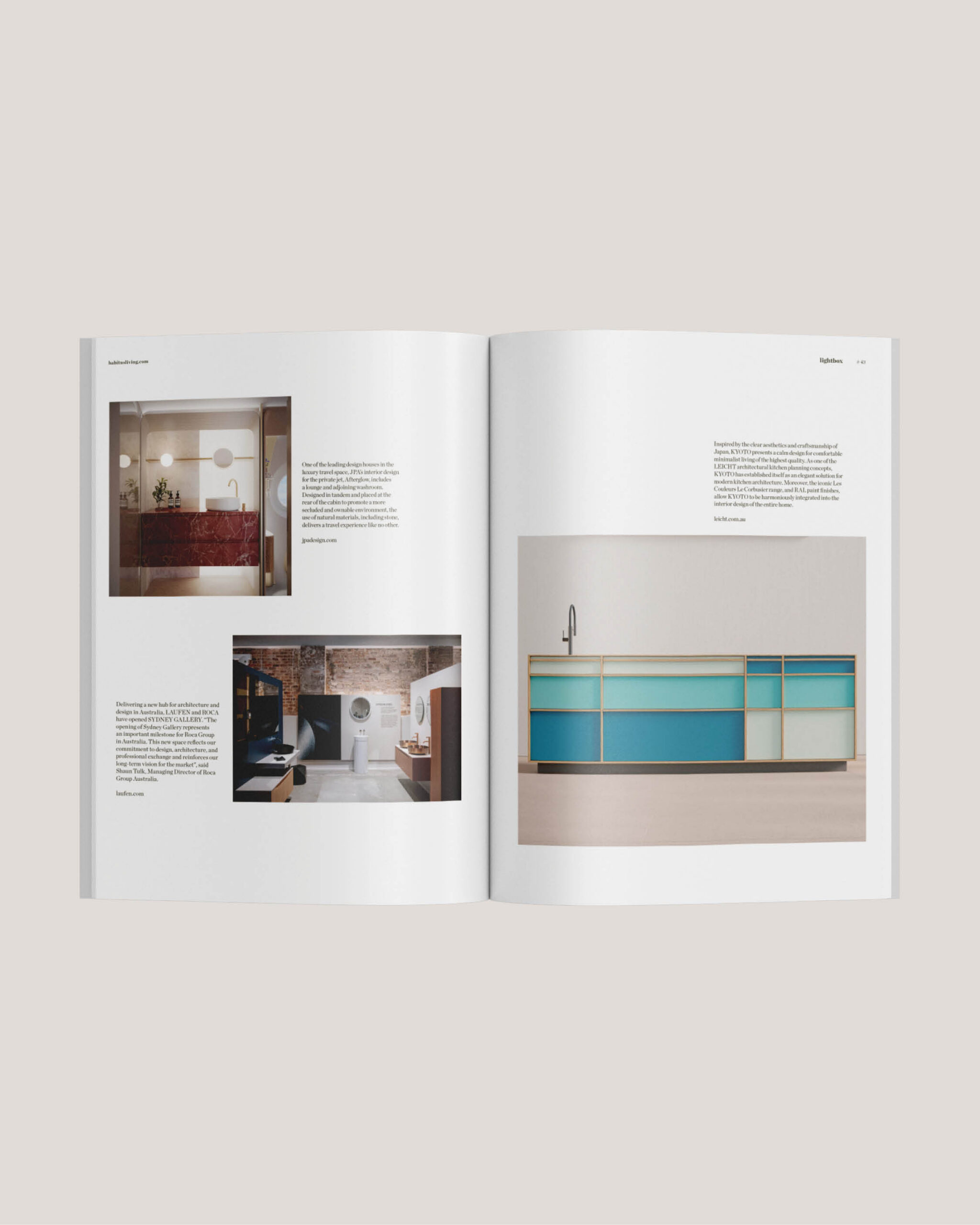
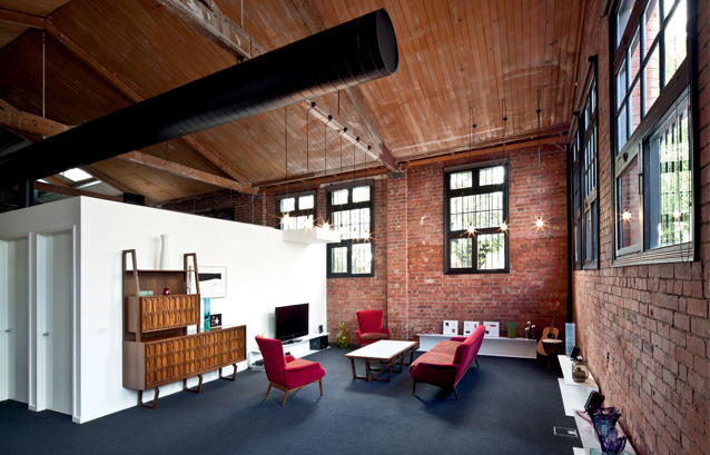
Hero Image: To expose the original trusses and exposed pipes, Kister kept internal walls to a minimum height. High-level windows ensure privacy and to add texture to the living area, Kister included post-war classics, such as the sideboard (circa late 1960’s) from Dario Zoureff.
Architect, Ilana Kister and partner Eytan Mazza were living in a city apartment with their two young daughters, Jade and Emily. Although the Melbourne home was relatively spacious, newly born Emily was left with a corridor as her bedroom. “Her cot was on wheels,” says Kister, who knew it was time for the next move.
While the couple knew they needed more space, they were at odds about what they were looking for. Mazza was searching for a house with a garden. Kister preferred something urban, like an inner-city warehouse. Miraculously, a warehouse in Fitzroy came on the market, complete with generous back garden (on a site of just under 600m2). “It’s almost impossible to find both in the inner city,” says Kister, after spending nearly two years on the hunt.
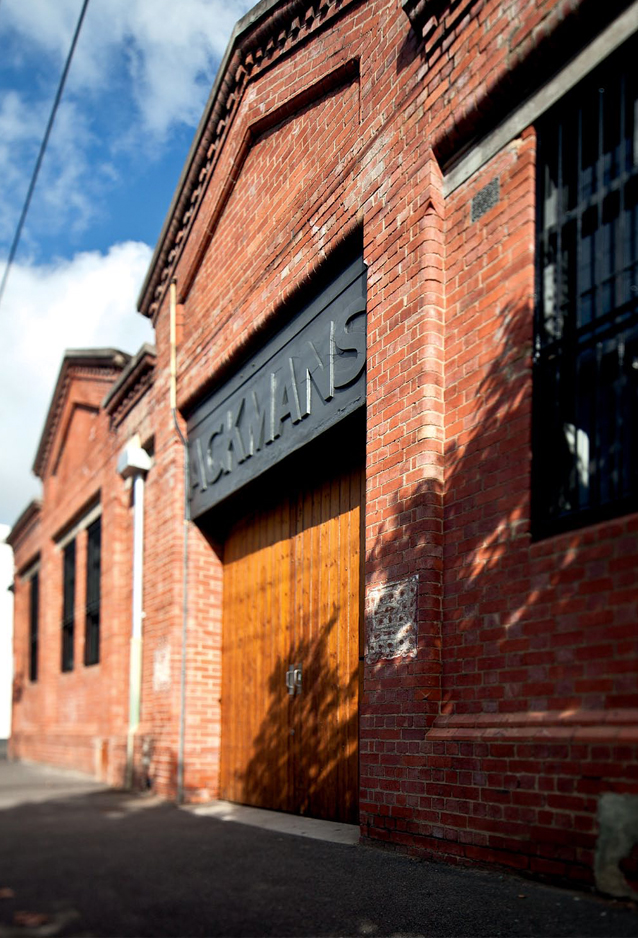
Once a mechanic’s workshop, the 1920’s warehouse style was previously used as an office.
The warehouse, in a wide, leafy street, was originally built at the turn of the last century. Used as a storeroom for a nearby supermarket, the red brick building was converted into a mechanic’s workshop in the 1920s. When Kister purchased the building, it had been used as offices since the mid-1980s.
“I loved the rawness of the space, as well as the generous volumes,” Kister says, pointing out the 4.5-metre ceiling height in the open plan kitchen and living area. “And Eytan could see a garden in the making. He’s in the process of building the girls a cubby house,” she adds.
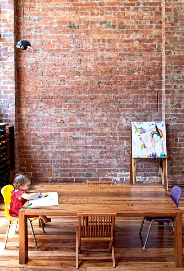
The building’s exposed brick walls add a rustic finish to the sleek, contemporary interior.
The only major structural alteration made to the Fitzroy warehouse over this time was the addition of a mezzanine. The previous owners had also raised the floors to ensure unimpeded views to the street. Although this arrangement was ideal for employees, creating a home with privacy required a different response.
“One of the main changes we made was lowering all the floor levels. You can still see the trees from every room. But, you don’t feel like a goldfish in a glass bowl,” says Kister, who was still able to create different levels in the warehouse to delineate the spaces.
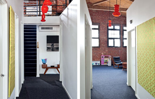
Retro light fittings and vintage wallpapers in the corridors add a personal touch to the industrial aesthetic.
As well as the generous voids and spaces (the warehouse is 325m2 in area), the owners appreciate the rich textures in the building. Exposed timber beams and bluestone and red brick interior walls are highly valued. “People get used to plasterboard, but there’s something quite magical about these rough walls,” Kister says. On the downside, many required filling with mortar to eliminate draughts.
Kister’s client for this project was Mazza. And her parents also provided feedback on her initial schemes. “Initially, Eytan gave me this substantial wish list. I was able to oblige in most instances. But there were a few cutbacks,” Kister says, pointing out a cantilevered plaster beam in the living room, designed eventually to provide a landing for an additional stair to the mezzanine. “The budget also didn’t allow glass balustrades on the mezzanine,” adds Kister, who simply added steel wire to the original steel balustrades.
Left: the main corridor receives natural light from the generous windows.
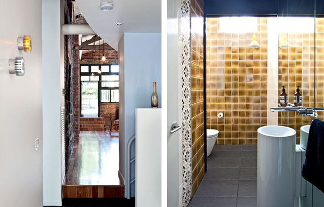
Right: the bathrooms feature a combination of both contemporary and vintage finishes, such as tiles from the 1960’s and 70’s.
While Kister was keen to retain the open plan feel of the warehouse, she had to include two children’s bedrooms, a main bedroom, ensuite and walk-in robe, together with a second living area. The mezzanine space also had to be large enough for Kister’s office.
One of the largest spaces in the warehouse is the living area, loosely divided between a lounge for the parents and play area for the children. On one side of the room is a beautifully crafted late 1960s sideboard by Dario Zoureff, together with one of his coffee tables. Murano glassware frames this space. The other side of the room is filled with toys, including a miniature toy car. “The room isn’t strictly divided between adults and children. We’re quite relaxed about the girls and their friends riding their bikes around the place. It’s far from precious,” Kister says.
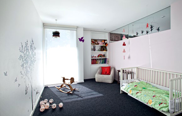
The walls of the children’s bedrooms are enlivened by wall graphics.
One of the most challenging aspects for Kister was ensuring that ample natural light entered the core of the building. Fortunately, she discovered a concealed highlight window in what’s now the powder room. Likewise, Jade’s bedroom lacked sufficient light. Kister created a highlight glass window between the two children’s bedrooms, borrowing light from Emily’s bedroom for her sister.
The kitchen also lacked sufficient light and required new skylights. To increase the light in the kitchen further, Kister included mirrored splashbacks and black stone benchtops. The 2-pac painted joinery also creates a lighter feel to the kitchen even though it is all black. “I didn’t want the kitchen to detract from the texture of the bluestone walls,” Kister says.

Black laminate joinery is juxtaposed with original red brick walls to create an industrial aesthetic. Exposed light bulbs add to the rawness of the warehouse.
Although Kister has created a contemporary response to this fit-out, she has included elements from the past. Wall tiles in the powder room, for example, were found in the 1970s apartment of a friend who was renovating.
“I’ve always enjoyed re-working elements from the past. If it’s done selectively, it can create quite an interesting layer,” Kister says. She also enjoys seeing how spaces in the warehouse change with the light in the course of a day.
“The light is continually changing. It always makes you look at the spaces quite differently,” she adds.

Exposed bluestone walls are a feature of the main bedroom, and to increase natural light, Kister included highlight windows.

Kister Architects
kisterarchitects.com.au
Photography: Justin Bernhaut
bernhaut.com