
These kitchens are not only the heart of the home, but the central spine, too. They have been designed in a way that caters to multiple people in the kitchen, or, allows residents occupying different communal spaces to feel connected and close.
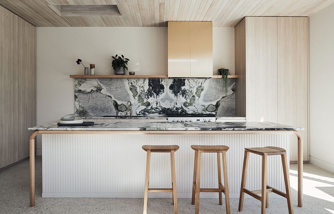
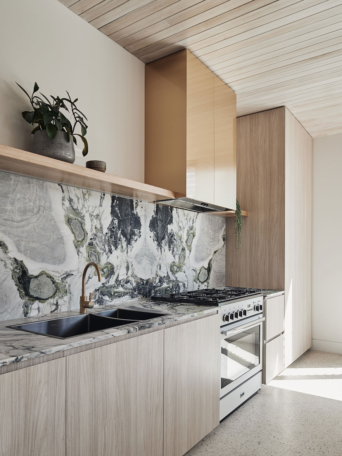
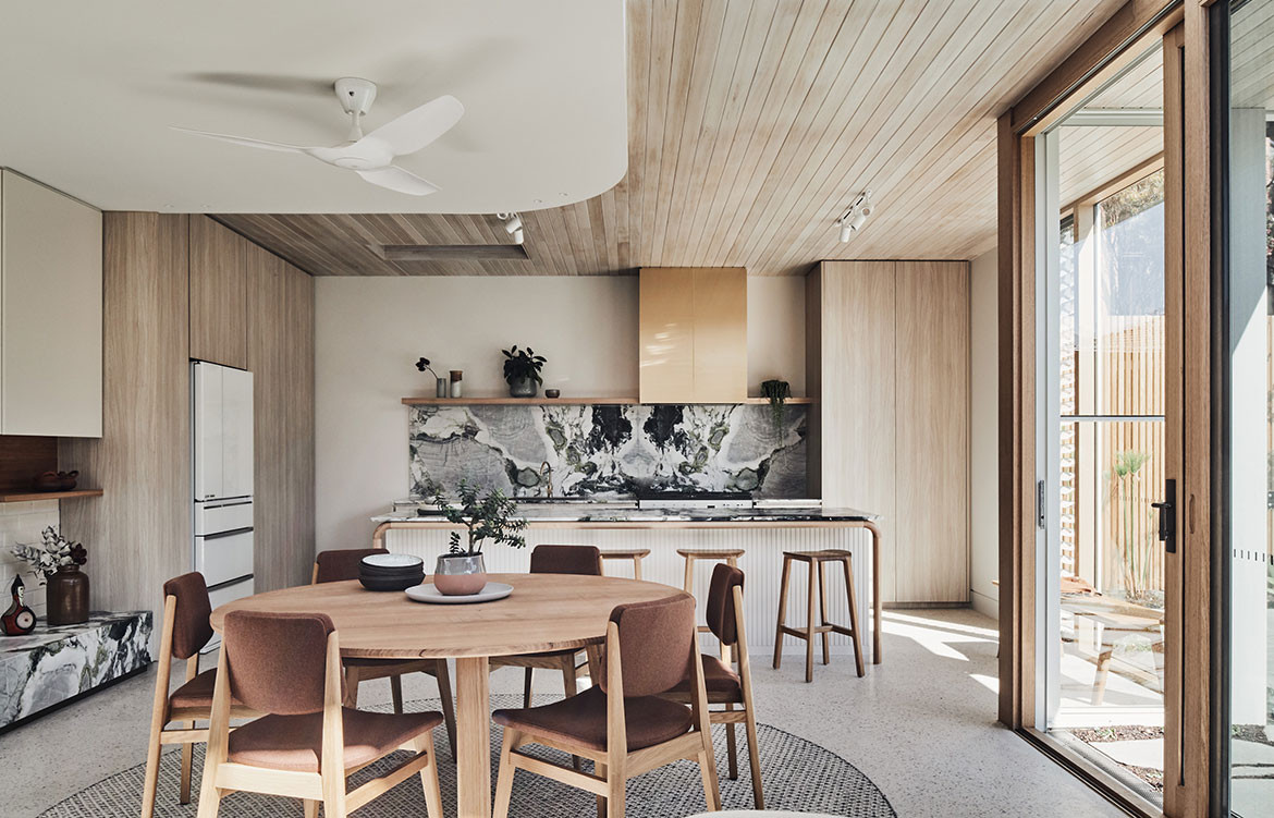
Wallis Lake House, Matthew Woodward
Words by Vicki Wilson | Photography by Brett Boardman
At a time in which kitchen designs seem to be assimilating living spaces, the humble kitchen has a renewed sense of self in Wallis Lake House by Matthew Woodward Architecture.
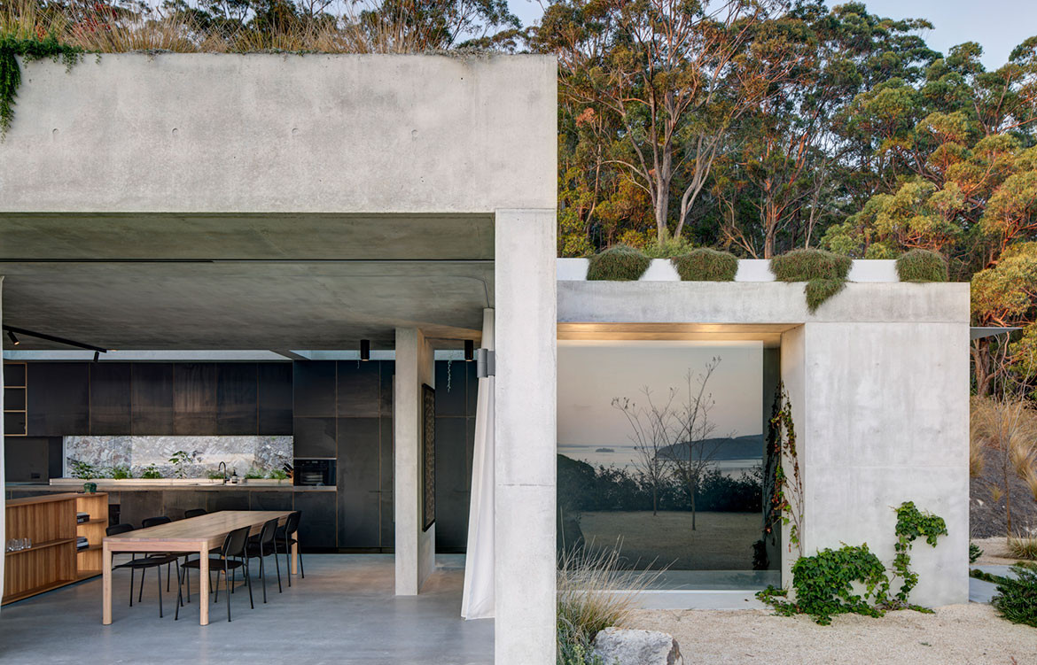
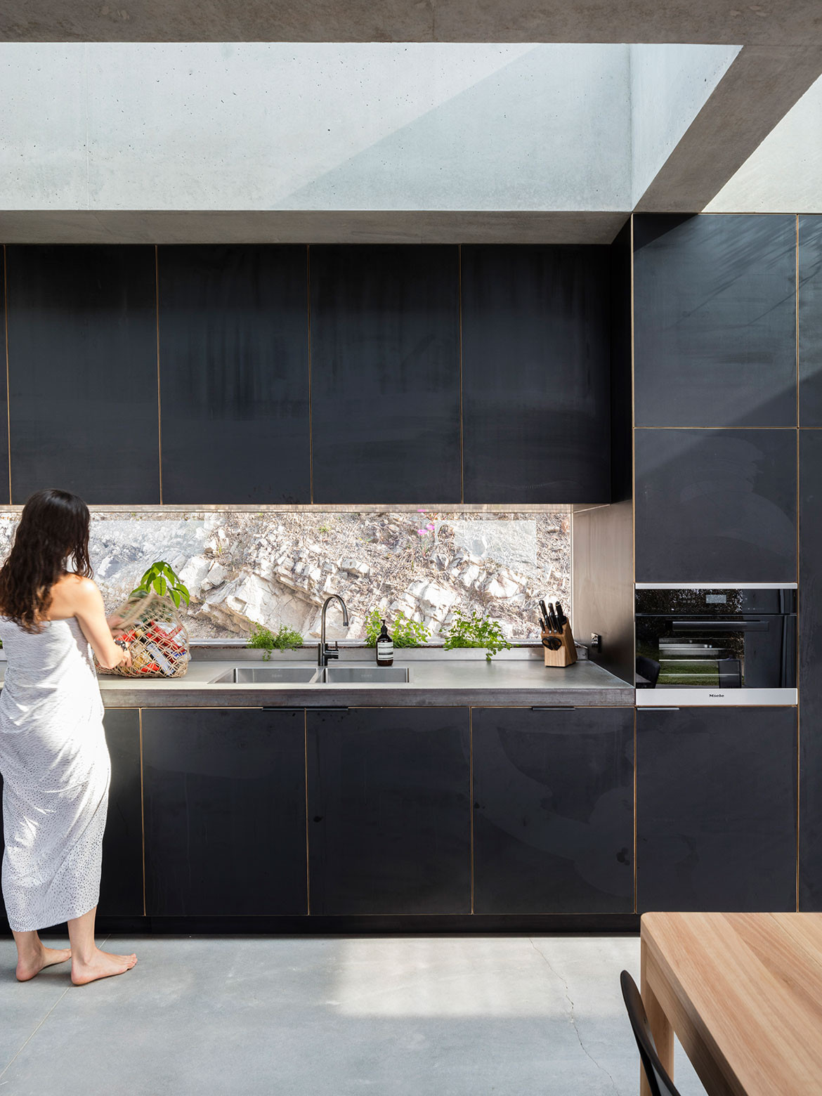
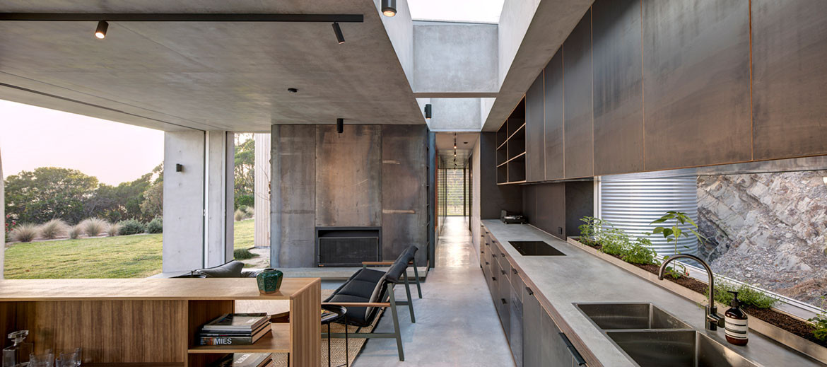
Running almost the entire length of the length of the ground floor, Wallis Lake House’s kitchen passes up its stereotypical role as the heart of the home, to instead form the backbone of the open plan public spaces. Pragmatic and unpretentious, the linear kitchen design connects seamlessly with the living and dining areas, providing ample storage and acting as a ‘working wall’ for both spaces.
A glazed splashback window provides a peek out onto the natural rock face of the escarpment into which Wallis Lake House is nestled. A sunken planter box at the rear of the concrete bench top cultivates fresh herbs for cooking, while adding splashes of greenery to the muted colour palette. Overhead, ribbed skylights invite natural light into the working area and glimpses to a green roof atop walls of black joinery.
As architect Matthew Woodward eloquently describes, “to be inside the kitchen but feel as though you are outside and in tune with the natural environment fosters a powerful sense of place.”
Tama House, Carla Middleton
Words by Holly Cunneen | Photography by Tom Ferguson
Home to an architect, her husband and their two young children, Tama House Kitchen feels open and free-flowing despite a long and narrow plot in Sydney’s east.
“With a young family I find the kitchen is the centre of our world,” says architect Carla Middleton. Much of the family’s day, she says, is spent around the kitchen island bench or at the adjacent dining table. Although it was important that the kitchen had space to gather, it wasn’t to hinder a natural progression down to the living area and backyard.
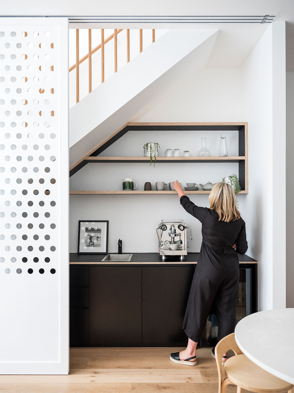
The all-important coffee zone, the sole request of Carla’s husband, proved tricky to place. Although she had initially imagined it at the rear of the kitchen – where a small pantry now resides – it was ultimately positioned under the stairs where it doubles as a bar or catering station. Out of the main kitchen area means extra hands can help without causing congestion.
Sliding steel screens can conceal this space when necessary, while the golf ball-sized perforations allow light from above to stream down unrestricted into the kitchen.
The doorless pantry enables Carla to “whiz in and out” while the integrated Fisher & Paykel refrigerator/freezer sits at the end of the inbuilt joinery, bridging the kitchen and dining zones. “Putting it there was a big decision, but I think it works quite well,” says Carla.
“All the houses that I do are self portraits of the people that live in them,” she continues. And in the way that the coffee station reflects her husband’s hobby, the architectural details hint at her life’s passion, and the programme caters to a family who love to spend time with and around each other, Tama House Kitchen is exactly that, an architectural imprint of Carla Middleton’s family.
Ohtsuka Kitchen, Timmins and Whyte
Words by Sandra Tan | Photography by Peter Bennetts
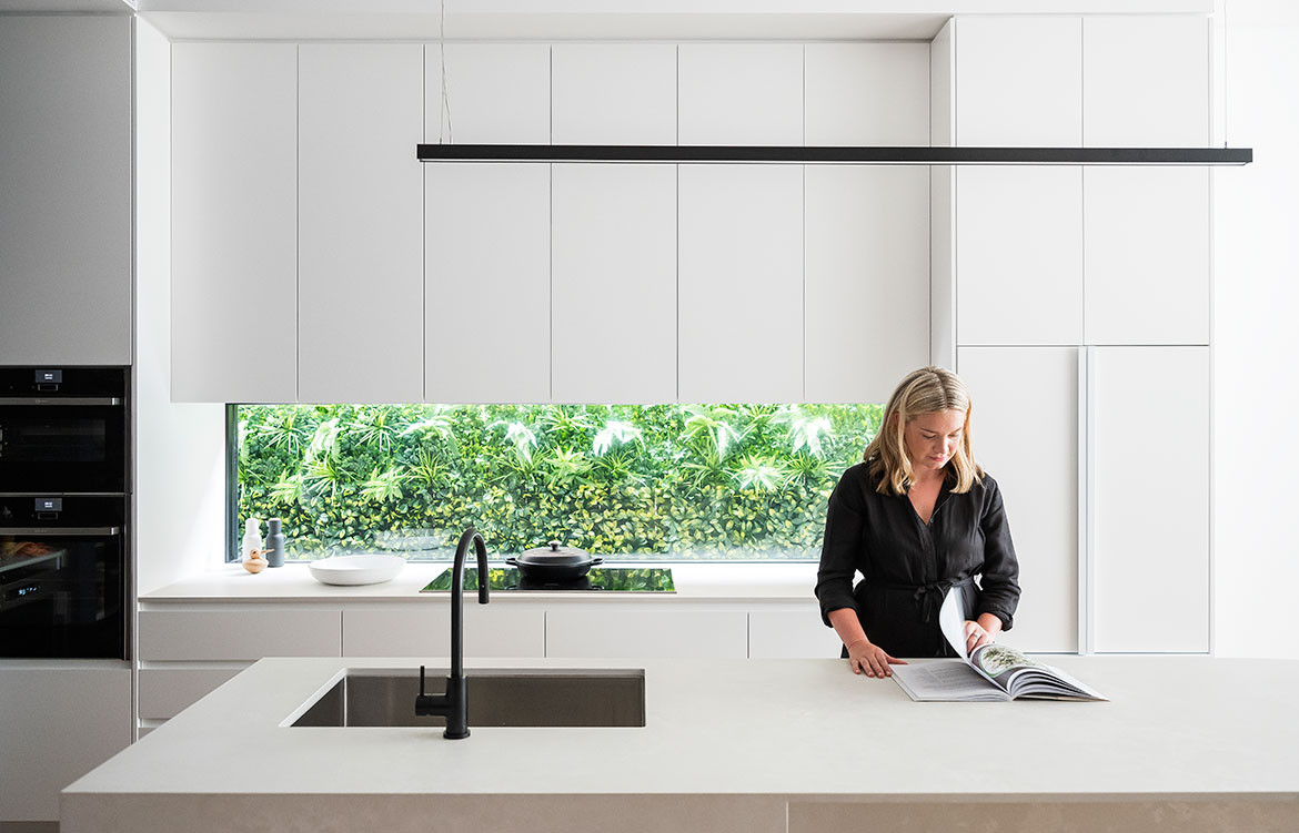
A healthy, beautiful home is a vital respite for a couple who work in mental health. “They wanted the house to feel calm,” says their architect, Sally Timmins of Timmins+Whyte Architects.
In place of a 1980s extension to a walled-up Victorian home, Timmins+Whyte designed a serene kitchen, expressed through a sensitively composed palette of warm timber and neutral tones.
Overhead, a ceiling features slim Tasmanian Oak slats, whitewashed to achieve a chalky softness. Natural light streams in from expansive timber-lined windows onto an island bench and splashback in rich green marble. Chosen for its intricate mineral variegations, the stone creates continuity with the colours of foliage and masonry features in the adjacent landscaped garden.
“We wanted to create a space that was well-insulated and quiet, but open at the same time,” says Sally. “Somewhere the family could sit and enjoy, that felt like part of the outdoors.”
Importantly, Ohtsuka Kitchen is hardworking for a family who loves to cook. Custom benches sit slightly lower than standard, specially tailored to the height of the client. A bank of louvres and an operable skylight enable easy ventilation. Purpose-built joinery ensures things are exactly where one might need them, including storage for large utensils and woks. Generous proportions accommodate the clients’ extended family of enthusiastic eaters, with ample bench space for the many bowls and containers used in Japanese cooking.
Sun Breeze Apartment, Three D Conceptwerke
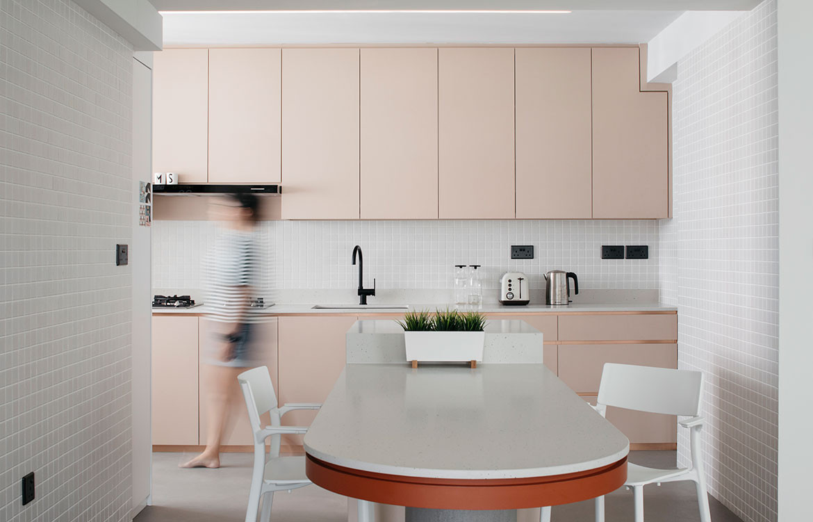
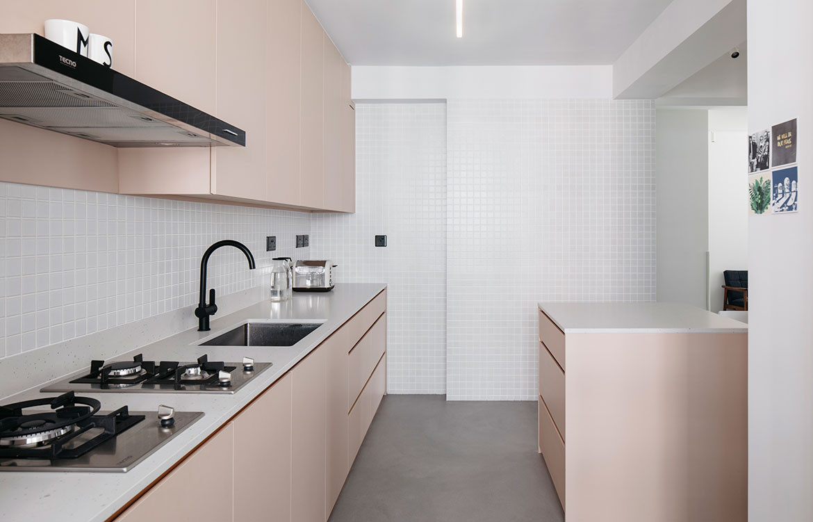
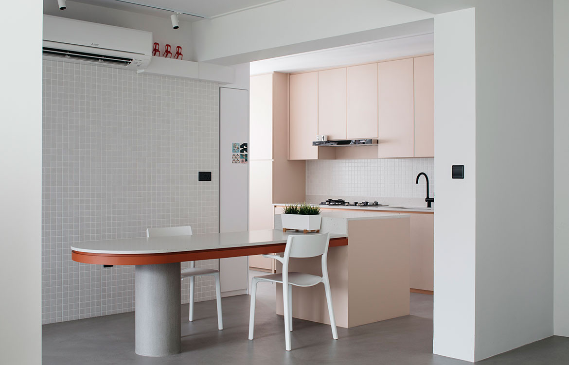
Words by Luo Jingmei | Photography by Marc Tan
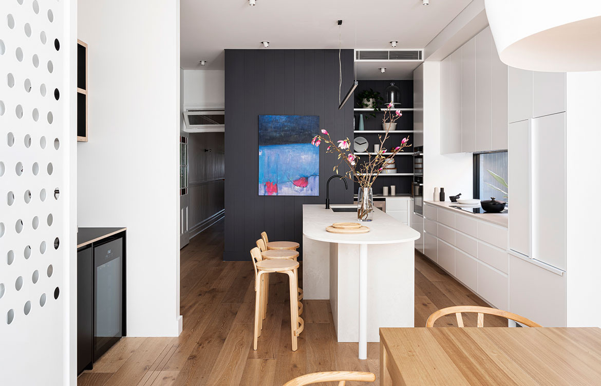
Island counters bring much to kitchens in enhancing usability, circulation and connectivity. For interior designer Li Meiyi of Three-d Conceptwerke, it is the anchor of her own apartment.
The kitchen island sits at the nexus of the communal areas, poised at the open kitchen’s entrance as a short counter with a built-in table aligned toward the living and play areas. This gesture extends the kitchen’s social possibilities. The rounded edge invites gathering and its width facilitates dialogue across the table.
Incidentally, the island also forms a natural running and biking path for Li’s young son. A centrally located sink enables whoever is doing the dishes to participate in mealtime conversations or watch the children playing outside. Tucking away the refrigerator and stove frames a less utilitarian view into the kitchen.
The Poacher and Hound café by Technē Architecture Li had visited in Melbourne inspired the earthy, industrial palette.
Underfoot, micro-cement flooring unites the common spaces, embedded with gold mica that bounces light. Alabaster mosaic tiles at the dining wall and backsplash aids visual continuity. This is matched with a practical, white, matte terrazzo-like quartz countertop.
Against this neutral foil, the dining table’s rusty accent and the kitchen’s beige-pink joinery doors referencing bleached rattan pops. The joinery’s rose-gold metal finger pulls provide depth and gloss while black light switches and sockets inject graphic character.
This kitchen is a fine example of how in considered design even the most utilitarian situations can be elevated and induce delight.
Chiaroscuro Kitchen, Rowson Kitchen
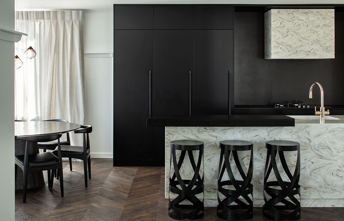
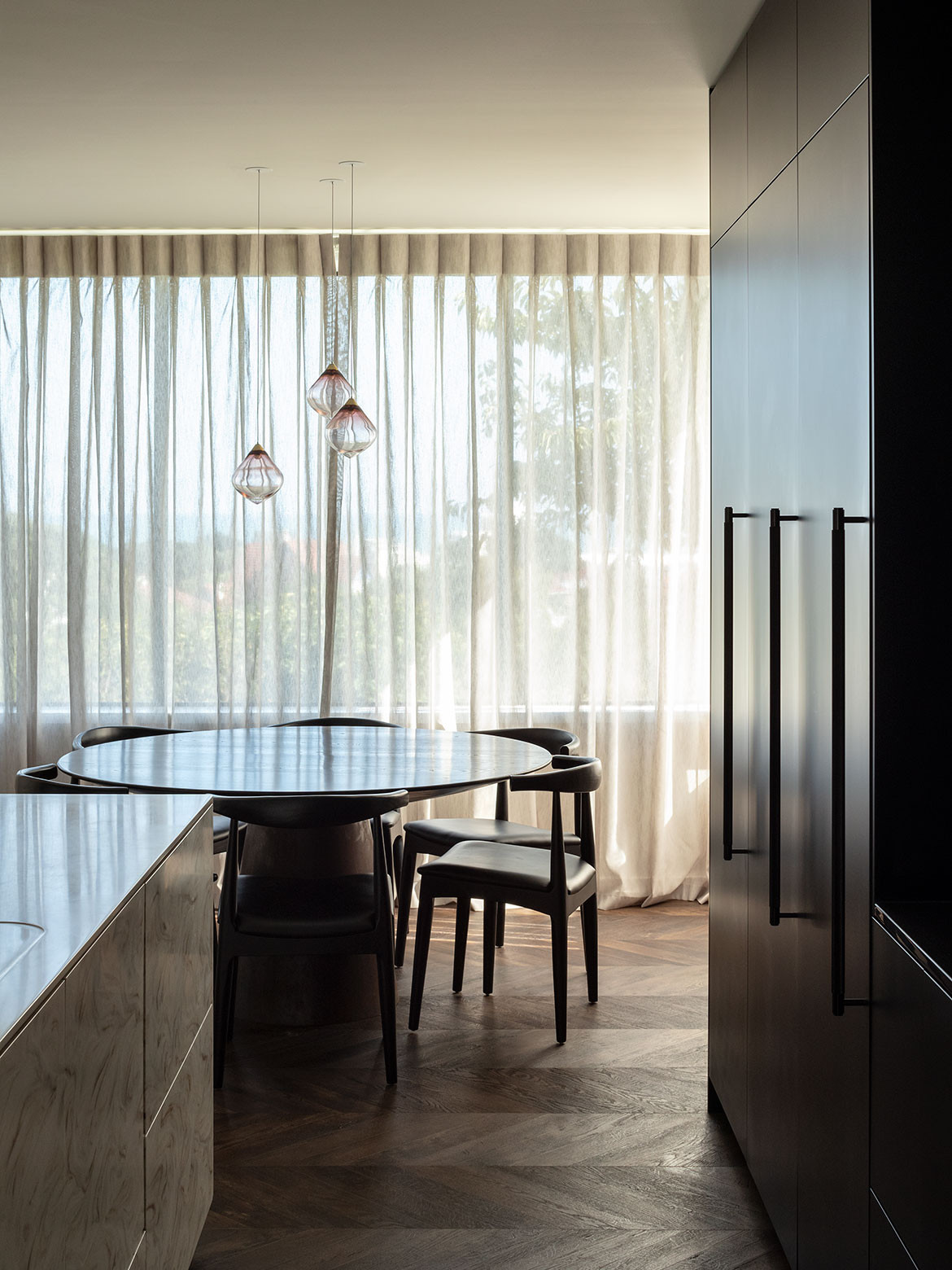
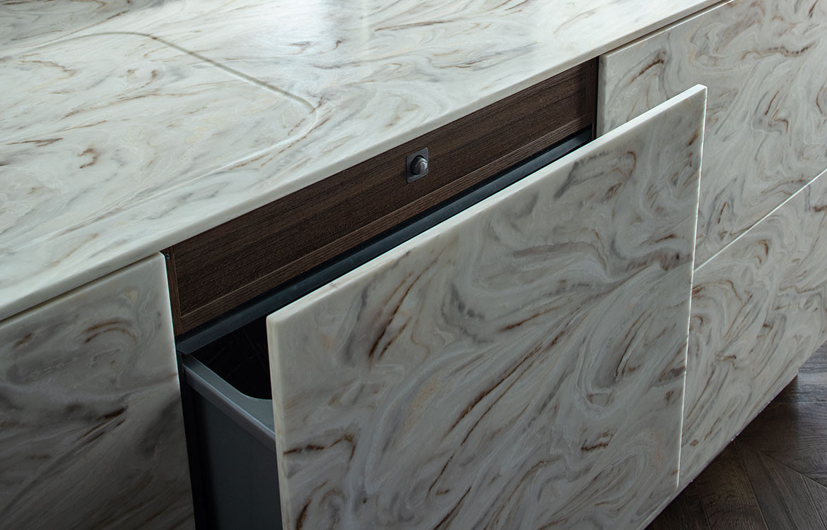
Words by Olha Romaniuk | Photography by Simon Devitt
For the design of her family kitchen, director of Rowson Kitchens, Annika Rowson, took full advantage of being her own client. “While my clients are all very trusting and generally allow me an open brief, there were no restrictions for my own kitchen and I could go a little bit wild and push the limits of the project,” says Annika.
An unconventional approach for the Chiaroscuro Kitchen reveals itself in the experimental application of materials extending the character of the 1940s house into the kitchen space while modernising it to suit a growing family. Selecting dark tones for the cabinetry, splashback and benching creates a sense of drama and highlights the centrepieces of the space: the rangehood unit and central kitchen island with reversed Corian in an eye-catching pattern. Adding a subtle touch of luxury, Annika incorporated pops of rose gold via the elegant Zenith G4 Hydrotap and added subtle texture to the matte black cabinets with Buster + Punch closet bar handles.
By removing the nib walls and a sliding door previously separating the kitchen and the dining areas, and installing a large structural steel beam to support the upper level of the home, Annika has created one open layout. Given the narrowness of the space, a galley kitchen was the most functional layout with a raised oak bar to allow seating for three and offer a visual break to the island. An overall integrative approach was essential to allow the back wall of the kitchen to meld back into the space and create a sleek and seamless aesthetic that felt in tune with the rest of the house.