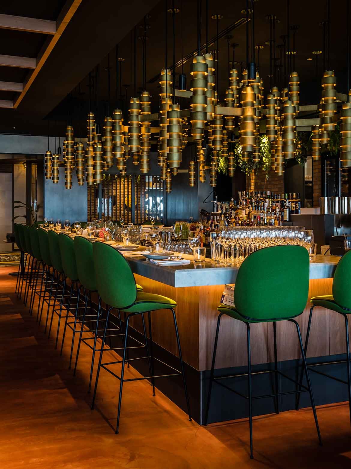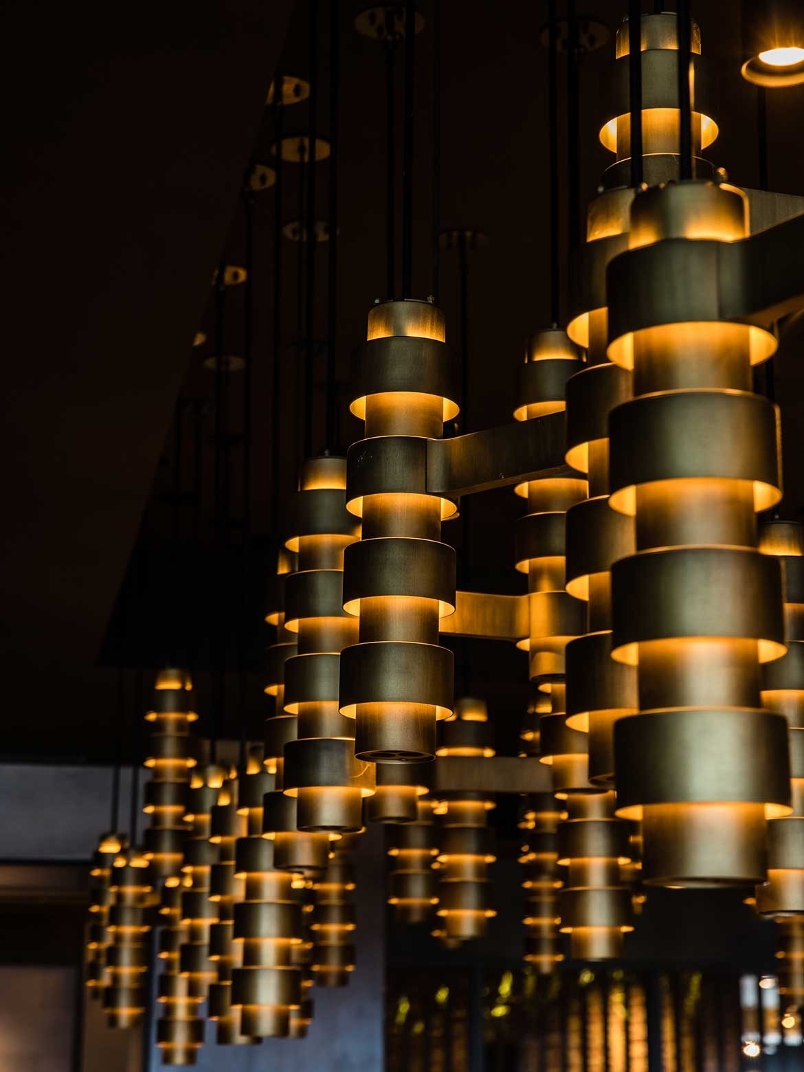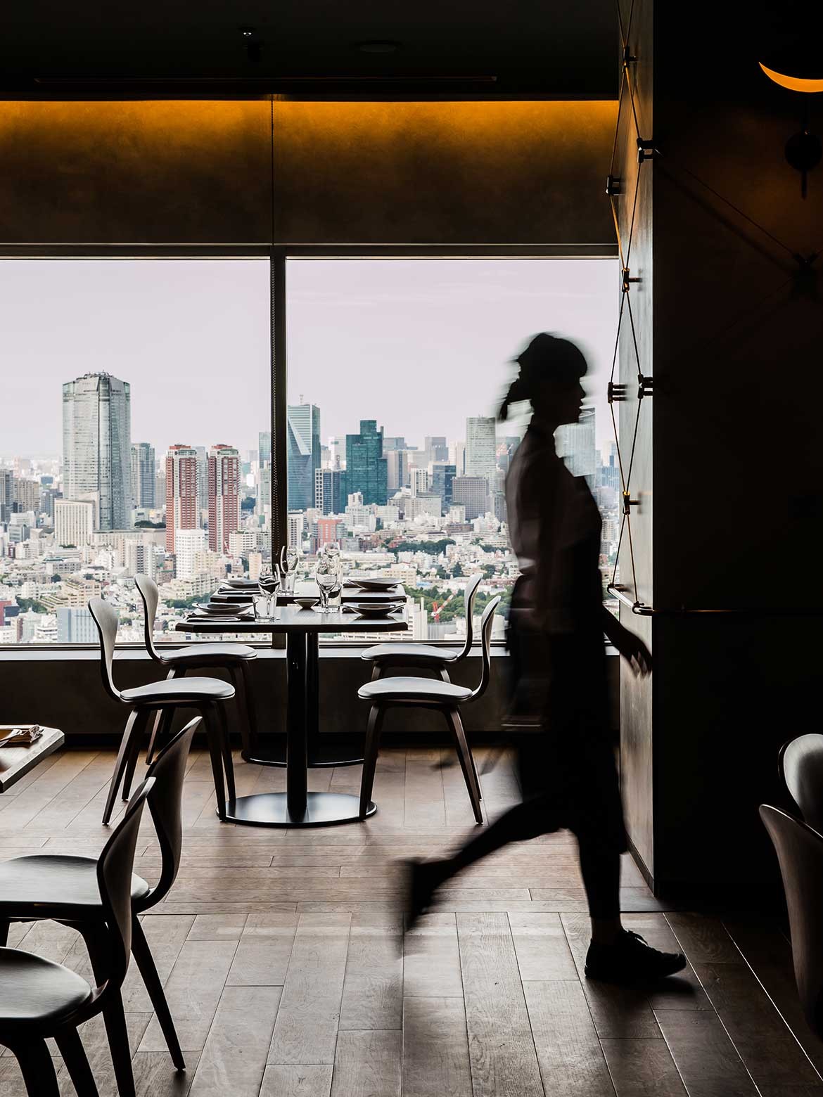
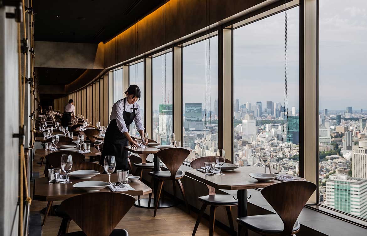
As you enter Longrain Tokyo, there’s a warmth that echoes its Australian sisters restaurants. A certain familiarity to the interior design. The big differences that jump out are one large bespoke lighting feature over the bar, and the panoramic views of Tokyo below.
Luchetti Krelle recently unveiled Longrain Tokyo, sitting on the 39th floor of Yebisu Garden Place; their first project in Japan. The 160-seater restaurant has a contemporary yet classic feel, with a bespoke lighting feature at the bar bringing a sense of occasion to the high-rise space.
The interior design studio won the project in March 2016, their small, hands-on team chosen because Longrain’s founder and owner Sam Christie is a long-time admirer of their work, such as on Momofuku in Pyrmont, Sydney.
At the beginning on the project, lead designer Stuart Krelle remembers using the Melbourne and Sydney restaurants as a starting point.
“Our brief was to capture the essence of Longrain, not reinvent it. At Longrain Sydney, we were inspired by the cross bracing of the warehouse ceiling joists, and the ‘Woven Wall’ pattern. At Longrain Melbourne, it was the red brick of the heritage building on Little Bourke Street China Town, and the green fish scale tiles.
To mark the idea of cultural crossover Luchetti Krelle also used a subtle ‘X’ symbol through the Longrain Tokyo venue. This not only references the Australian warehouse framework, but represents an intersection of cultures: Australian, Japanese and Thai.
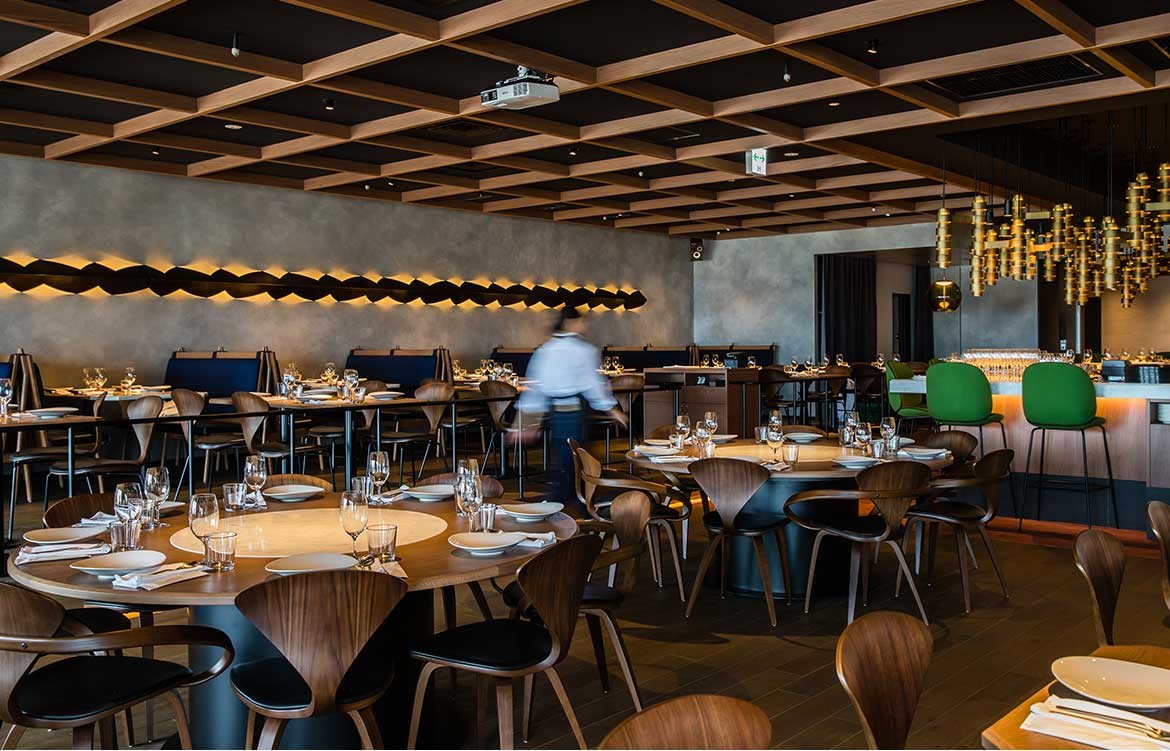
“Like its Australian sisters, there are Mid-Century Modern references in the new Longrain Tokyo, with a subtle nod to the post-WW2 period when Western and traditional Japanese styles and techniques were mixed,” Stuart says.
“From Australia we have the artwork supplied by Christopher Hodges, and the iconic tiles from the Melbourne restaurant make another appearance. These come from South Australia. The dining chairs are from the US, bar stools from Denmark, and lighting from Italy.
Interestingly, when the Tokyo-based tradespeople lay the green fish scale tiles above waiter’s stations and in the private dining room, they turned them up side down in the shape of a fan, the emblem of Tokyo. In Melbourne fans of Longrain will note that the tails point up.
Quirky elements like this are just one outcome that you could say got ‘lost in translation’.
“The opportunity to design Longrain’s new restaurant in Tokyo was very exciting. It did however pose a challenge,” admits Stuart. “How do you export a Sydney and Melbourne institution that’s an Australian take on Thai food in Japan? Neither the Sydney or Melbourne restaurant aesthetic hints toward a Thai inspired venue. So we had to navigate how to maintain this design direction while communicating to the Japanese clientele what’s beyond the front façade.
“Another design challenge related to the site itself: unlike its Australian counterparts that are housed within lovely voluminous ground level warehouse settings, Longrain Tokyo is perched 39 floors above the Tokyo skyline inside a commercial tower.”
To give the feeling of back home Luchetti Krelle worked with materials.
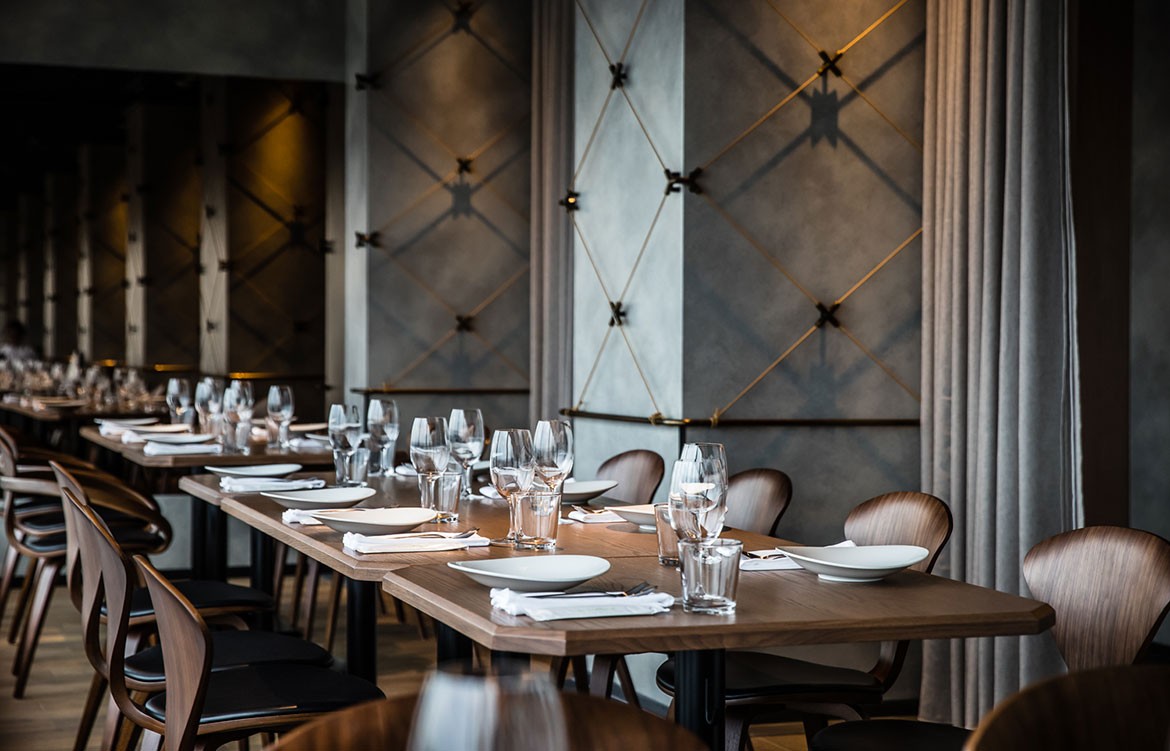
“Timber has played a big part of the palette as in all the venues. We have combined walnut with bronze metal detailing, concrete and white marble. Brickwork has been introduced, paired with sharp, blackened steel details around the apertures,” continues Stuart.
The colour palette is classic and muted with plenty of concrete grey, red brick, pond green, timber and black.
Tokyo guests gravitate toward the spectacular views. While guests from Australia will be drawn toward the comfortable bar dining.
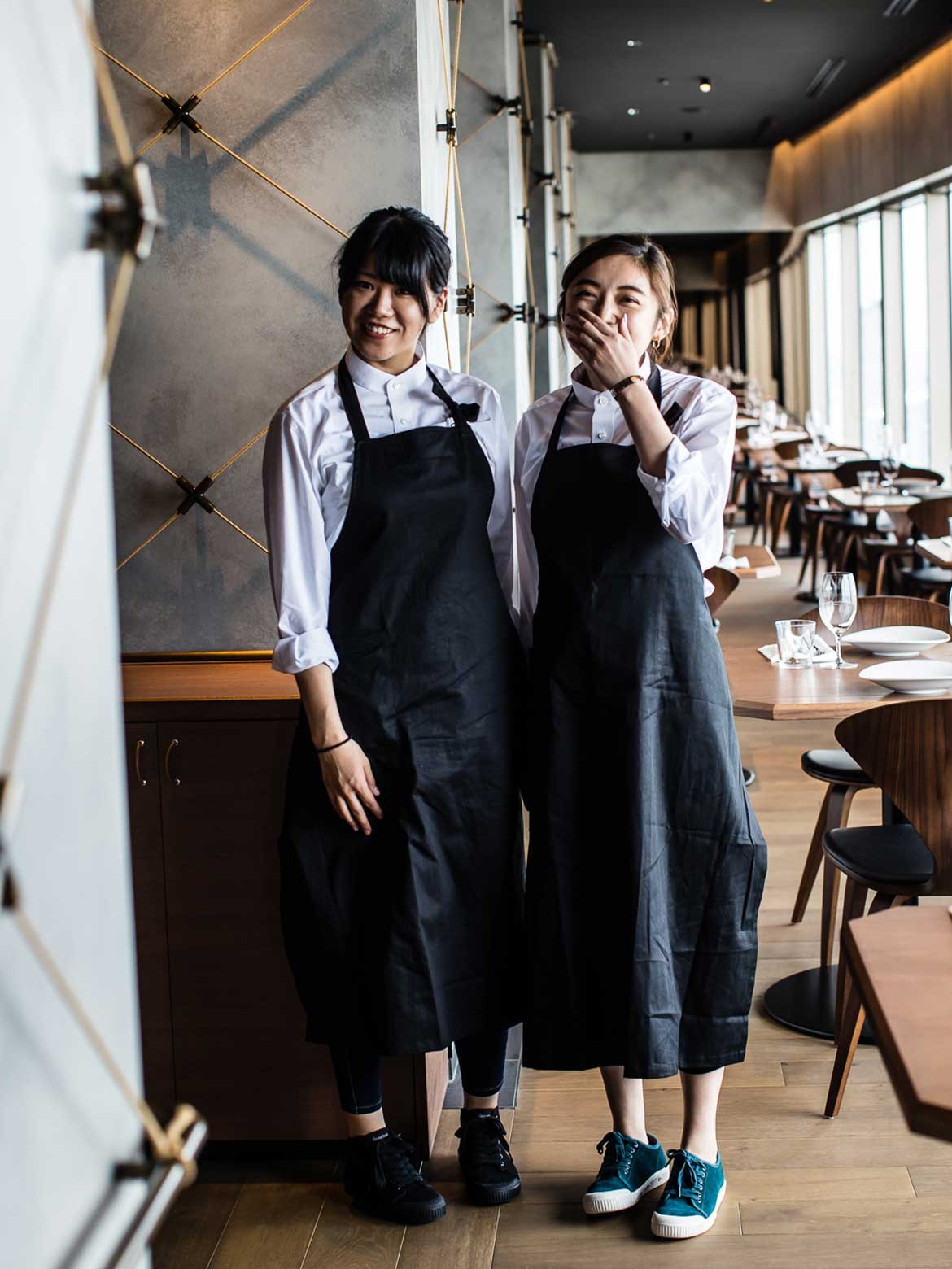
The white ceramics and lighting lift the rich palette and balance the space. While the bright colours of the food, rare groove sound track and friendly service make it feel very Surry Hills.
Luchetti Krelle
luchettikrelle.com
Photography by Nikki To