
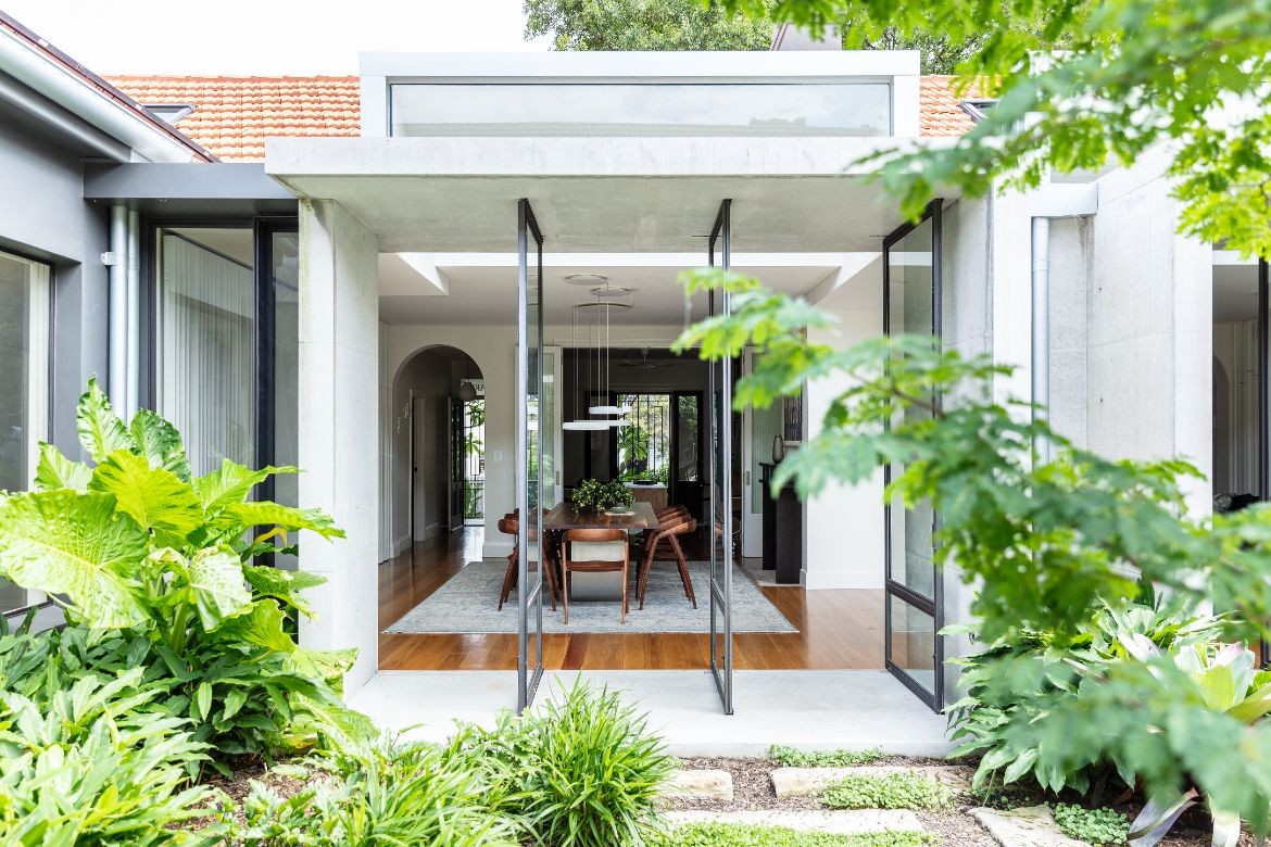
What makes this home lovely is the way the architects have articulated the idea of a semi as a twin. That said, while they have played with the idea through repeated forms, it has not constrained the overall design with spaces being expanded as pavilions and volumes that articulate the previous iteration.
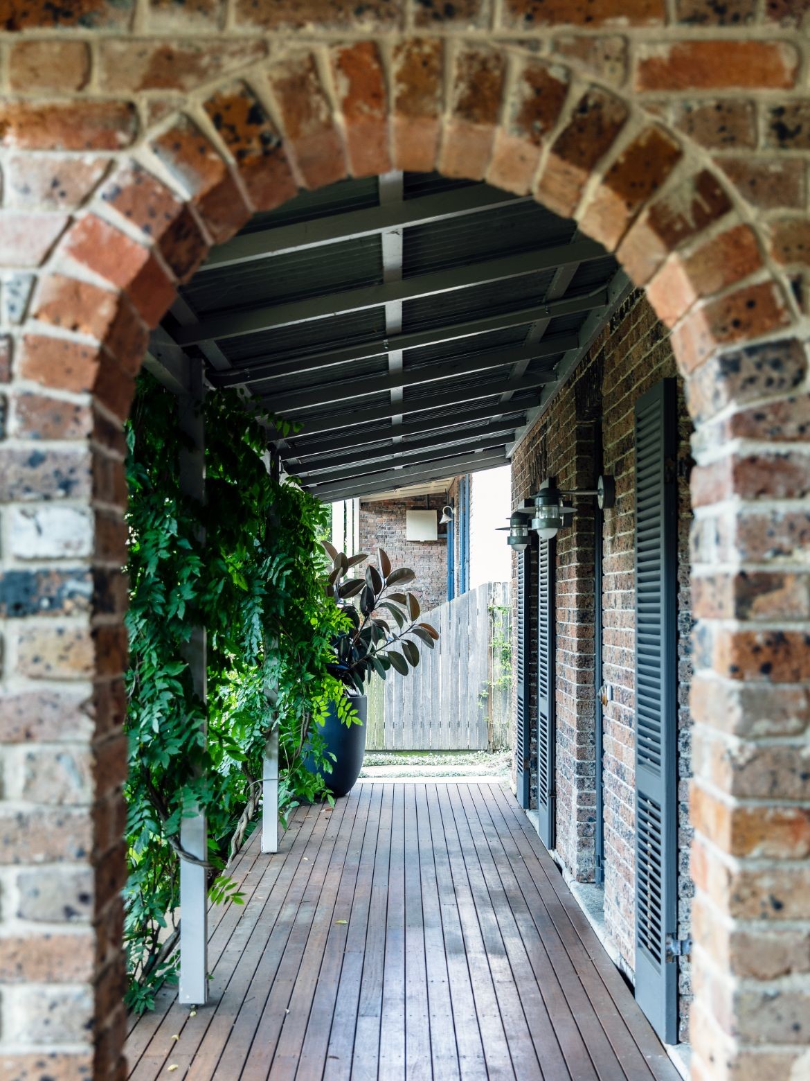
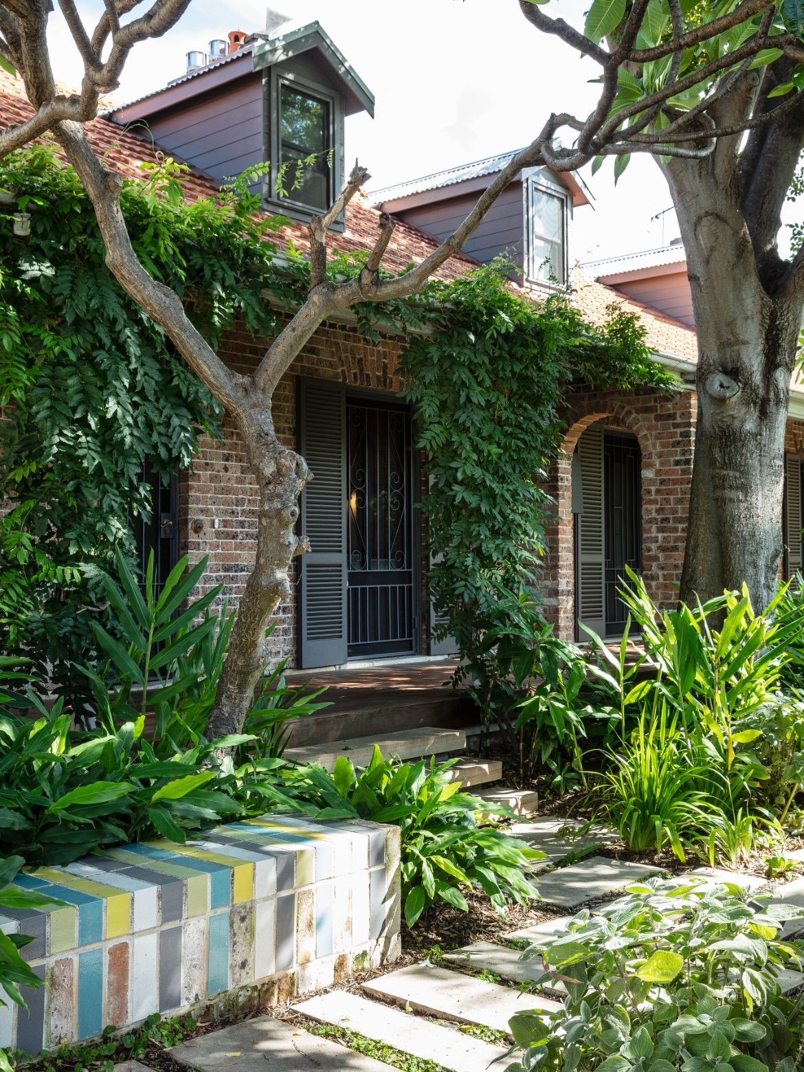
Moreover, the expansion is discreet, maintaining the original streetscape and scale. The extension, also allows for a time where the house may become two once again. It is a clever move that gives the owners a unique opportunity to downsize in the future without moving.
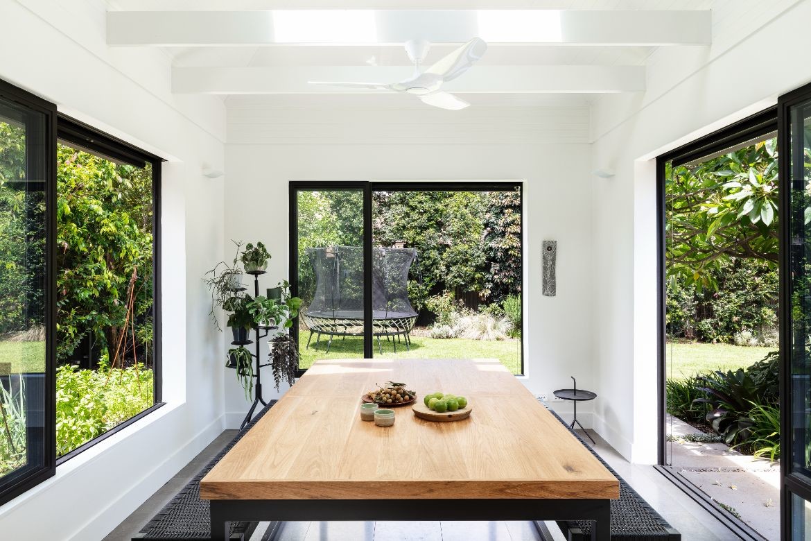
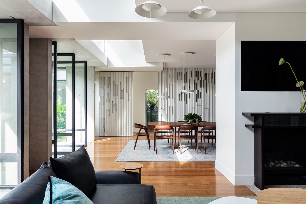
Though the façade has remained the same, the house alters immediately on entry. Here, the whole expands to an open plan scheme with an unexpected scale that seems at odds with the exterior. It is however a delight of shifting interior ceiling heights and interesting geometric insertions.
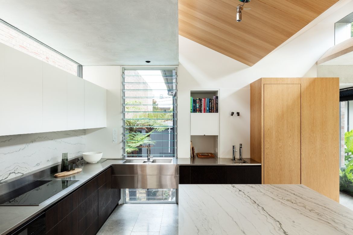
A timber V, for example, dips down above the kitchen with twin skylights set into the higher angles at each side. Large concrete cassettes additionally frame the skylights. These robust ceiling platforms are tapered on the inside edge to add another geometric line and work to frame the views into the courtyard, channel light within and screen out the neighbours. They also act as a transitional material between inside and out.
The reduced material palette of the interior, stone, timber and concrete, is realised as large swathes of material that are allowed to be decorative in their own right. The large island of the kitchen for example, is executed in a beautiful expanse of gently veined stone.
The same stone is used from the long line of the splashback which sits below white cabinetry and another skylight, but above a stainless bench and cabinets. A large timber storage room sits at the corner to create both a continuation of the hallway leading to the courtyard and the kitchen itself. It does not however, extend to the ceiling and in doing so becomes a standalone piece of furniture bringing the warmth of timber to the whole.
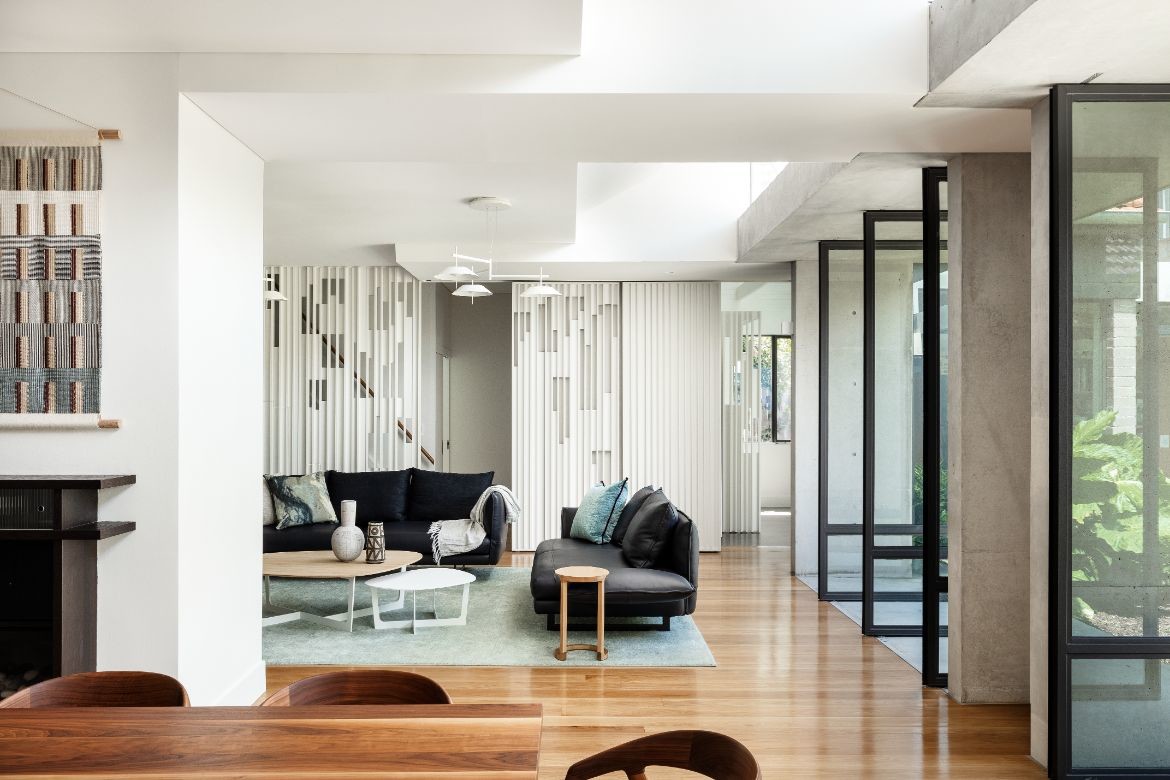
White is used beautifully to allow the introduced geometric shapes and existing arches legibility. It similarly allows the sculptural forms of the white pendant lights, again exploring simple geometries, to sit elegantly within the space.
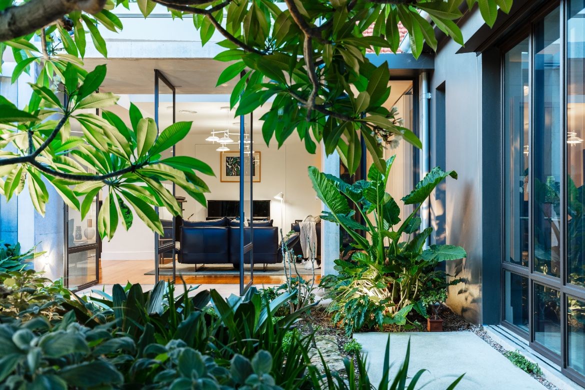
A wall of white timber screens is simply incredible in both its simplicity and introduction of unobtrusive pattern. Additionally, in providing glimpses of tree ferns in the internal courtyard, whether opened or closed, it continues the engagement with nature the house as a whole, embraces.
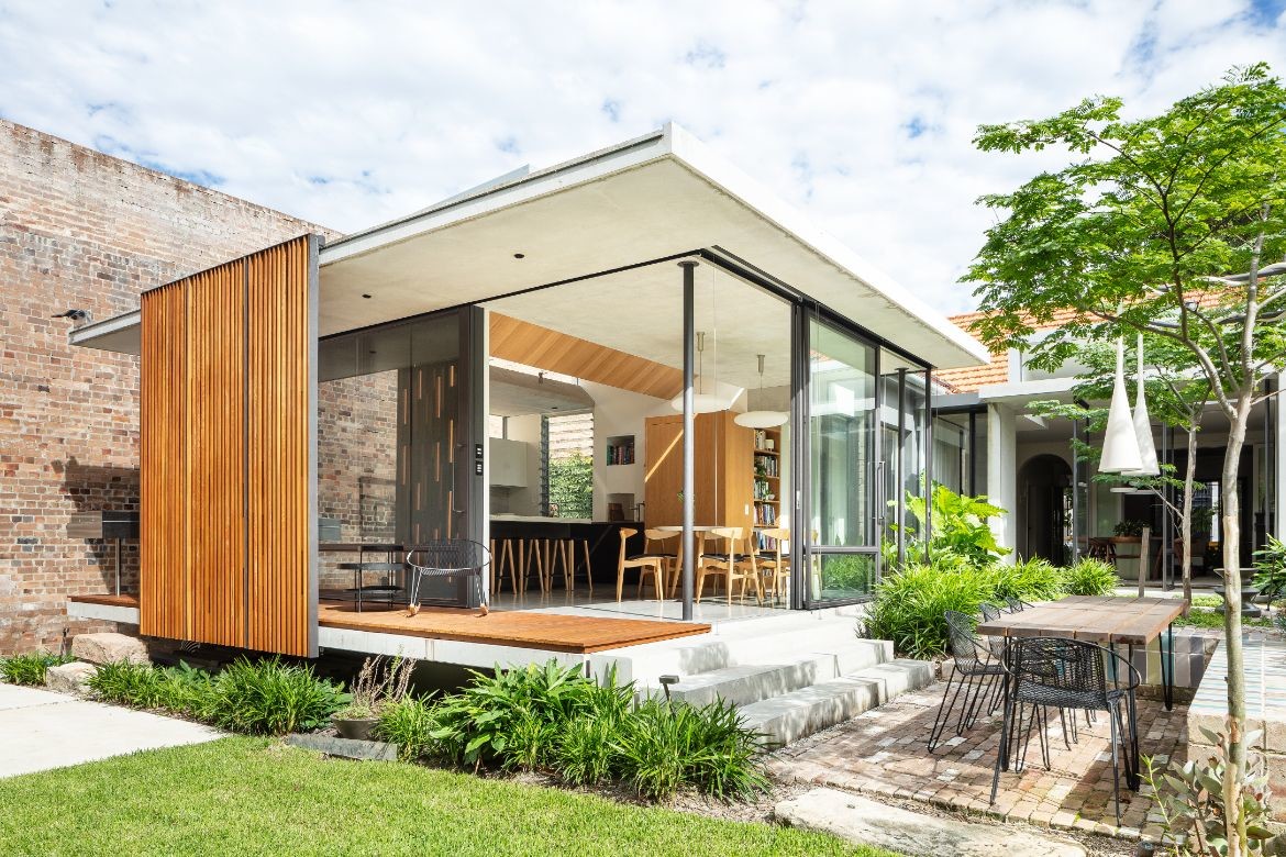
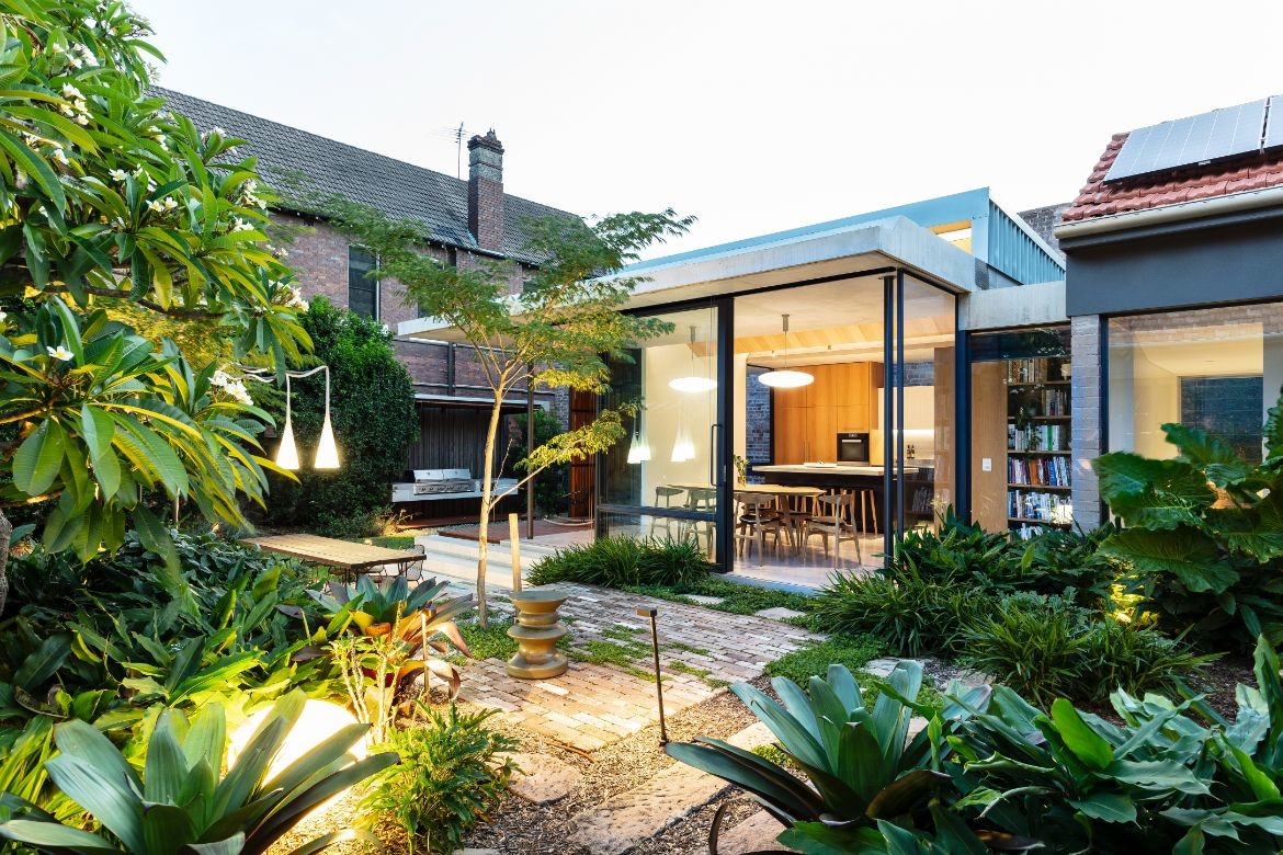
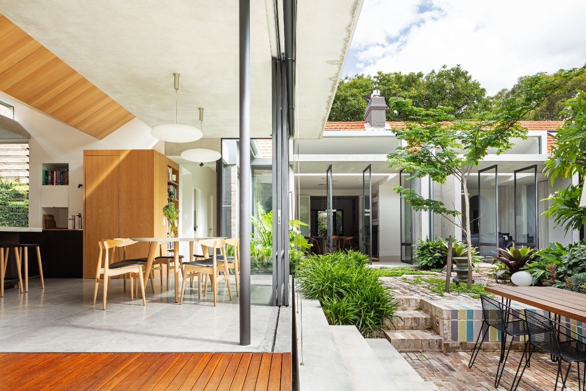
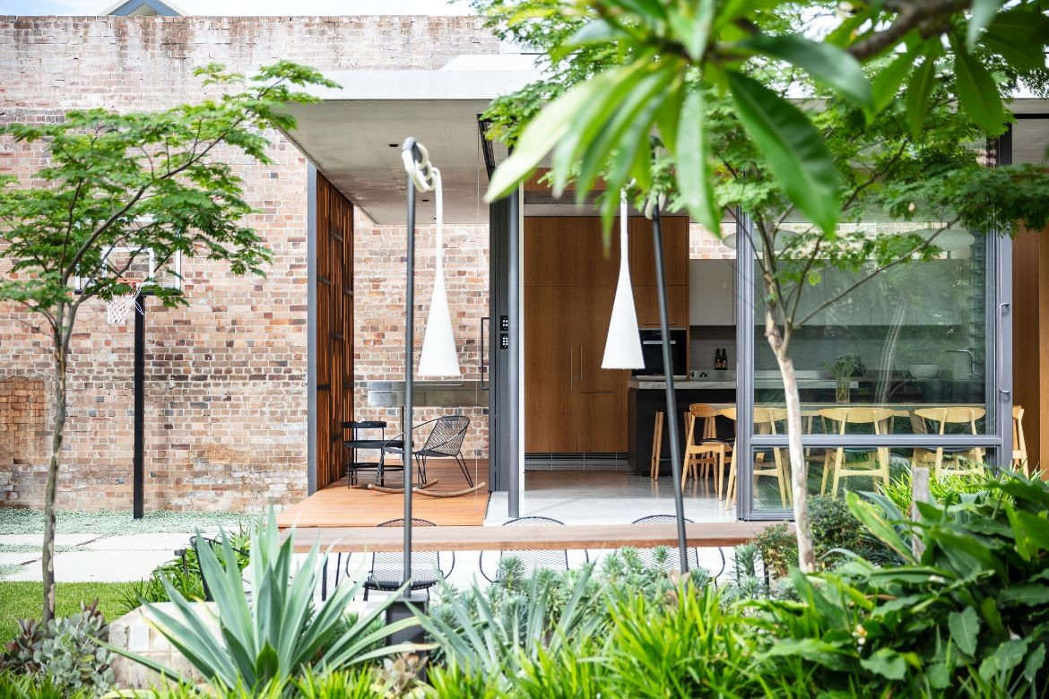
The pavilion housing the kitchen extends fully into the courtyard with glass walls to two sides and a surrounding veranda to fully embrace a continuous indoor/outdoor experience. A sliding screen of slatted vertical timber provides privacy, solar mitigation, and visual interest with a short horizontal line introduced to the internal side. This interstitial space between the glass wall and screen houses the outdoor cooking area and a protected spot for relaxing.
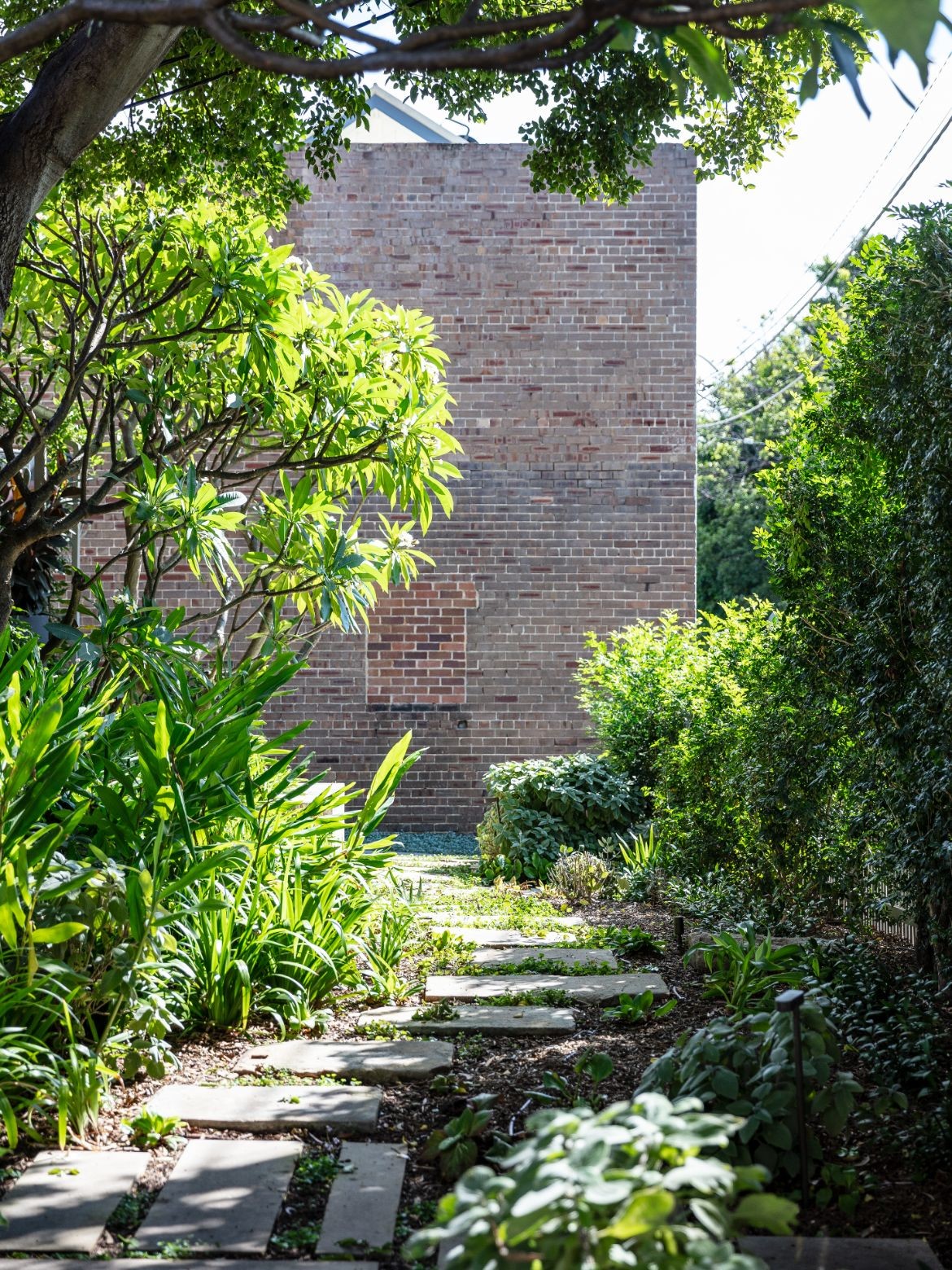
A large back courtyard attracts the eye immediately with unusual combinations of plantings by landscape architect Emily Simpson. Lawns dotted with small sculptural trees such as frangipani and Japanese maple are plumped with plants of quite a large variety, including bromeliads which introduce a deep purple to the scheme. It is an excellent domestic garden that feels right with the house.
Established in 2004 by David Welsh and Chris Major, Welsh + Major has a reputation for creating delightful, practical and inspiring architecture. With a wide range of work across architecture, planning and urban design, this is a practice that is passionate about designing places, objects and spaces that are great places to be, feel wonderful to be around and that work flexibly and sustainably into the future.
Project Details
Architecture and Interiors – Welsh + Major
Photography – Tom Ferguson
We think you might like this story about the Hat Factory by Welsh + Major.