
Colour’s extraordinary capacity to visually alter an interior, emphasise a room’s charm and unique quirks, and respectfully reveal the idiosyncrasies of the inhabitants make it one of the most intricate, consequential and impactful spatial devices in any design practice.
However, what might seem to be a predominantly visual medium, is a multidimensional influence that penetrates human experience well beyond the delicate surface of the iris. Colour can stimulate circulation, increase appetite, lift the mood – and even make us feel cold or unwelcome. More than that, deciding on one’s favourite colour can be a profound personal decision – and a long-term commitment that brings a firm sense of what this affinity says about our personality. How is it that colour has such a strong hold on us?
The rainbow of physiology
“Similar to sound, colour travels in waves,” explains Deborah de Jong, Caroma’s Education and Engagement Manager for architects and designers, and an interior designer by trade. “The iris processes the colour which affects our hypothalamus and changes the way we feel from a physiological perspective. Whether we realise it or not, our physiology is greatly affected by the colours we surround ourselves with.”

“Red, for example, screams ‘Look at me,’” de Jong shares, adding, “It’s energising but it will make you angry and irritable, and increase your blood pressure.” De Jong also adds that red is the most difficult colour for the eye to digest, which is why – in a spatial context – it appears much closer than it really is. Not the most fitting colour for a bathroom then?
“Not necessarily,” she says. “If the intention for the space is to be invigorating, and get the heartbeat up, then it can work.” In that, she brings up the crucial dimension of residential bathrooms: they are incredibly personal.
The sanctums of privacy
When it comes to our homes, bathrooms extend well beyond their practical functions, doubling as our very own personal retreats. While white continues to be a popular colour in these spaces, it’s more often used in combination with other shades – like black, lavender, beige or duck egg blue – accentuating their qualities.
“Most people use bathrooms as their sanctuaries,” De Jong explains. “They go to the bathroom to destress and relax, whether in preparation for the day, or winding down at the end of one.” She says that in most cases this calls for an inviting palette that’s conducive to joy and passivity – emotions often associated with shades of blues, greens as well as adjacent harmonies along this side of the palette. “These hues tend to evoke a sense of calm and a serene feeling.”
Green, according to De Jong – in contrast to red, for instance – strikes the iris in a way that requires no adjustment, which makes it a very restful and relaxing shade. On a primitive level, it’s associated with an abundance of water, safety and balance. “It’s the easiest colour to live with,” she concludes.
However, she points out, the pandemic has certainly augmented the individual character of our residences, and this subtle shift altered them into highly intimate environments that reflect who we are more so than ever before.
Bathroom and individual identity
Of course, colour can be an essential expression between space, identity and self-expression. With brands like Caroma boasting diverse colour ranges from gentle neutrals and traditional whites, to contemporary pastels, rich timbers and bold metallics, designers and homeowners can create purposeful spaces that encapsulate the style and personality of their users.
Amalgamating consumer research, Australia’s unique environmental considerations, as well as European and global inspiration, Caroma’s colour philosophy is anchored by the premise of timeless versatility – and inspired by the need for limitless expression.
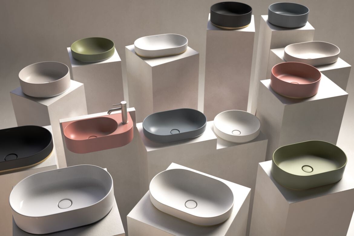
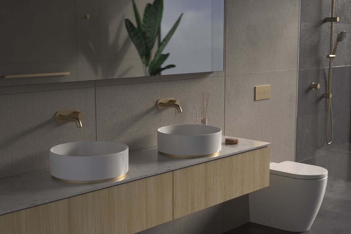
Designed by Caroma’s Senior Industrial Designer, Luke Di Michiel, the highly coveted Liano II basin Collection is a modern fusion of organic shapes, gentle edges, and carefully curated colours and finishes. The range has been devised to be mixed and matched, in the bid to generate an endless plethora of unique combinations. This flexibility puts the notion of self-expression at the very centre, allowing designers and renovators to be intentional about how much colour they’re introducing into the space.
The palette features gentle shades of green, powder pink and slate grey as well as the more neutral hues like white or speckle, leaning into the calm, relaxing, neutral and balanced spectrum of emotions.
It’s not always black and white
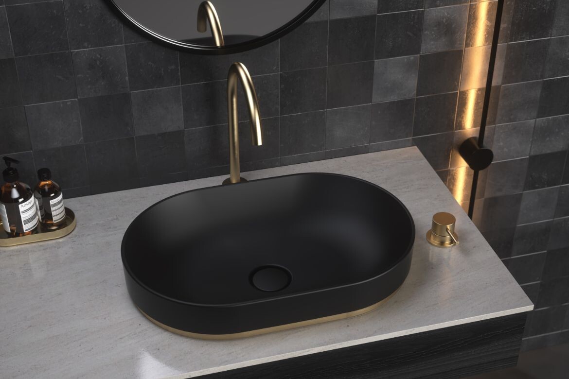
“If you walk into a black bathroom, the space will feel naturally cooler,” she says. “It’s something you might want to specify in a tropical environment, or a warmer climate. In places that are slightly cooler, the south of NSW or Victoria, you might want to go with a palette that creates a sense of warmth and cosiness.”
However, De Jong points out that this sophisticated hue is a timeless chameleon in the bathroom when used as an accent colour. “A black tap is like a little black dress of the bathroom,” she says with a smile.
Not all that shines
One of the qualities that can give black – and any other colour – a more gentle expression is a finish. “Gloss will always highlight the colour, make it protrude more and appear higher in chroma,” De Jong explains. “It’s more confronting. Matte, on the other hand, is more gentle, softer.”
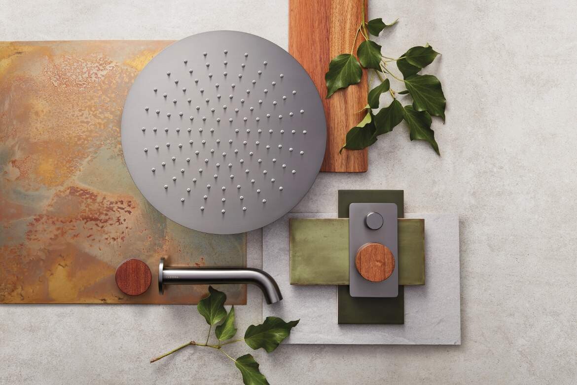
In Caroma’s Liano II basin product range, the textural quality of matte surfaces has been incorporated on a multitude of levels. The Collection’s organic colours are accentuated by the opaque quality of the fire clay the basins are made with, while a selection of bath fillers, taps and shower mixers in subdued yet striking finishes, like brushed nickel or brass, can be found in the Urbane II Collection.
On top of that, Liano II basins provide an innovative line of metal dress rings, which can be installed at the base of the basin. These beautifully crafted devices have been designed to complement other elements of the collection, allowing designers and homeowners to explore the correlation between different colours and finishes, adding another element of unexpected delight.
The shades of biophilia
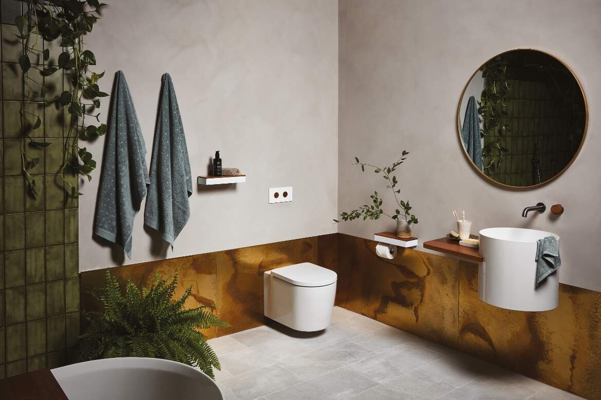
Another stunning fusion of colours and textures can be seen in the Elvire collection. This range features a selection of locally grown and sustainably sourced Tasmanian timbers, paired with a refined, somewhat cool, gunmetal finish. Inherently associated with both the natural and the neutral, the warm hues of Tasmanian Oak and Tasmanian Blackwood that define Elvire’s biophilic character, conjure up feelings of wholesomeness and intimacy, while the subtle sheen of the cool gunmetal finish adds a touch of understated luxury.
This tactile fusion of organic and sophisticated hues most certainly fits the idea of a bathroom as a relaxing retreat, with beautifully crafted timber accents establishing a clear connection to nature, and adding an element of visual gratification to objects like taps, bathtub fillers, shower mixers and even toilet roll holders.
The multidimensional character of colours – the subtle relationships between them, their impact on an interior and a human experience – can undoubtedly make the home’s most intimate space even more distinctive. And whether the intent behind the room is to be bright and spacious, dynamic and invigorating or gentle and enveloping, Caroma’s palette can transform any bathroom into an intimate sanctuary, and instil a sense of uniquely personal delight along the way.
Caroma
caroma.com.au