A spectre is haunting design – the spectre of monochrome. Across our homes and offices, restaurants and hotels, black and white is the new black (as it were), and with its ongoing preeminence, we appear to have become oddly suspicious of one of our most vital of design principles: colour.
For some, this predilection for the unabashedly neutral heralds a new form of sophistication. In a world full of riotous activity and clashing, diverse perspectives, the quietness of black and white offers respite far beyond merely visual phenomena. As such, it is believed to evoke calmness, resoluteness and the lack of prevarication – after all, in a world full of shades of grey, it is refreshing that some things can (at least) appear black and white. But for others, the return of black and white as the tonality du jour is more redolent of the growing influence of fashion colouring (pun intended) other design disciplines. Crisp white shirts and little black dresses continue to rule the runway – thanks, largely, to the ongoing prevalence of greats such as Rei Kawakubo, Rick Owens, Jil Sander (by way of Raf Simmons), Hedi Slimane and Yohji Yamamoto in particular – proving that black and white aren’t going to be bumped from the style firmament any time soon.
But what is it, precisely, about the pairing of these two colours that so captures our imagination? Well firstly, ‘colour’ needs to be addressed here. Sitting on opposite ends of the spectrum, neither black nor white can be considered a ‘colour’ per se. White (a tint) registers colour’s absence, while black (a shade) registers its overabundance to a point of colourless-ness. Between the two ends of this spectrum, whole universes await.
I. “They should generate possibilities…”
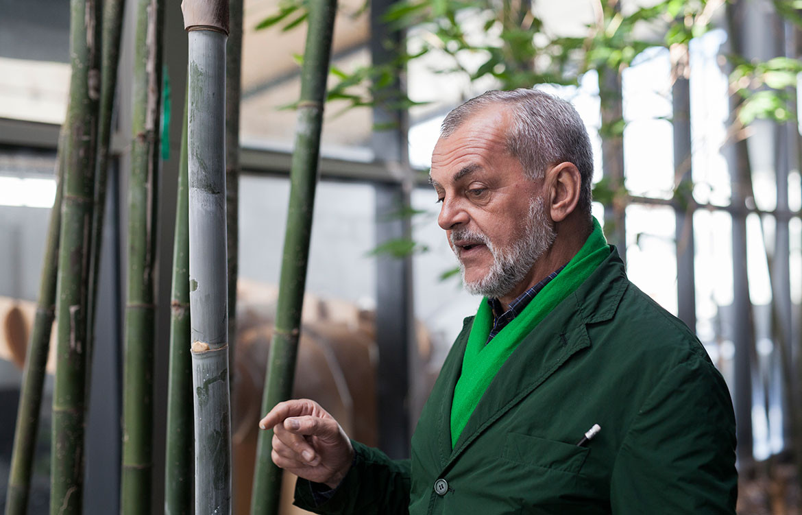
Earlier this year I had the pleasure of learning the complexity inherent in using colour from Giulio Ridolfo firsthand. And during our conversation, I found it impossible not to catch his infectious enthusiasm. For Ridolfo, working with colour is one and the same as playing God – the truest articulation of the human spirit’s desire to create.
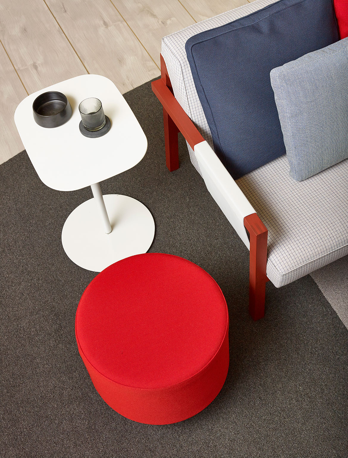
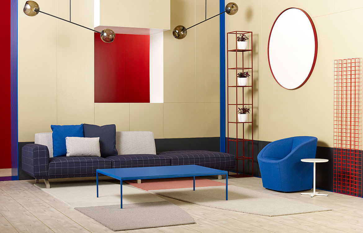
As such, it isn’t difficult to see why he has been recognised by our A+D community as the maestro di colore. It’s an accolade that has followed him from Kvadrat to Tod’s, Vitra to studio Heinle and, now, it has followed him to Australian shores in the form of a recent collaboration with Schiavello. Working alongside the Australian brand to develop the new suite of palettes for ColourLab, Ridolfo and Schiavello both understand the wealth of possibilities in design direction that can be achieved through expert use of colour.
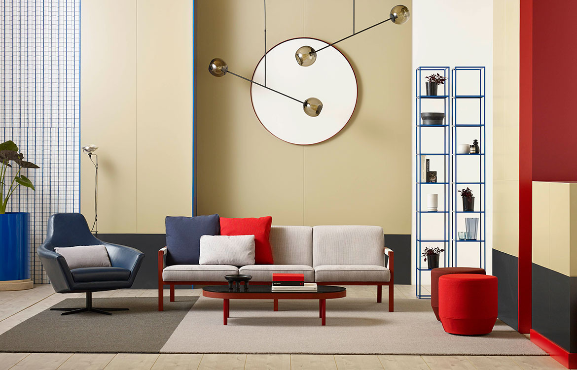
And although hailing from Italy, it is clear that Ridolfo was influenced by the beauty of the Australian climate in creating these new palettes for ColourLab. Proving in very real terms that not only “should [colour] generate possibilities”, but also that it can evoke entire worlds, ColourLab instantly conjures everything that is unequivocally Australian. A pallid spearmint swatch sits alongside a robust ochre, and instantly my mind is thrown back to road trips through Australia’s heartland, with a red dusty road stretching out interminably into the distance, edged on either side with a phalanx of grey-green gums. Elsewhere, washed out blues and silvers are offset by pinkish hues or oranges – suggesting the underside of galahs as they fly overhead, or the effect of the first raindrops punctuating sun-bleached tin roofs as showers begin to confuse rust setting in aluminium. Vivid yellows and antique creams, when paired together on Ridolfo’s palette boards, remind me of my Queensland childhood at the beginning of summer holidays when Erigeron glaucus (fondly known as ‘seaside daisies’) open their buds each morning as the sun hits sand dunes. Elsewhere, soft beiges, buttery fawn and rich chocolate browns suggest jersey cows dotting a hillside at the height of the February dry season. Everywhere, I have the odd feeling that I am viewing a simulacrum of my own memory, expressed solely in the visual and neuroaesthetic language of colour.
Evidently, I appear to have a highly nostalgic relationship with colour. And yet, perhaps even more evident is Ridolfo’s hand in all of this. Not only has ColourLab brought to life physical aspects of the Australian experience, but it has brought to life temporal ones too – reminding me of snapshots of my childhood and, appropriately enough, a dream-state version of this country that if not vanished already, will never be the same again.
II. “The reflective phase…”
“I’d say that my work is somewhere between intuition and anthropology”, says Ridolfo. It’s a statement that warrants further investigation. Springing partly from personal experience, the subconscious and the human creative impulse (“intuition”), Ridolfo’s design process for ColourLab is also equally influenced by community, collective expression, common identifications, the design imagination of the group, and the entire global history of ornamenting our world (“anthropology”). When one combines this with the practice of architecture and the built environment, colour then steps forth as one of the most impactful elements of design on our daily lives:
“The reflective phase of colour and texture was tempered with a constant and balanced perception of our contemporary environments. The perception of light was a strong theme that captured an awareness and intensity, and provided the focus to begin the process of finding families of colour.” – Giulio Ridolfo.
Recognising that colour is just as much a psychological miracle as it is a physical one is potentially ColourLab’s greatest strength. Wherever your eye looks at ColourLab’s array of tones, it is clear that each and every iteration represents hundreds of hours of research. Whether looking at how colour is registered by a viewer both psychologically and physically (think: the effect of certain colours on the healing process when used in hospitals, for instance), or how particular hues will react with a host of different applications – applied as dye for leathers and textiles, or hard surfaces such as laminates or timber and beyond – Schiavello and Ridolfo have ensured that ColourLab is a true resource to the practicing designer in many more ways than one.
Using red and blues as one of the prevailing pigment profiles, many have noted how Schiavello’s ColourLab is a further iteration of the company’s investment in escalating design for critical success factors in the commercial space. With this red/blue base, ColourLab investigates a recent study conducted by the University of British Columbia. Testing the output of surveyed respondents working in a room coloured largely red, and another coloured largely blue, researchers noted that while the red room instilled greater proprioception and alertness, the blue room more than doubled creative output and lateral cognition. Combine this with the increased investment for design thinking in the commercial space, and ColourLab becomes a not only a resource for practicing designers but also an important tool for commercial clients.
III. “…be open…”
The status of the individual remains central to the human-centred values of our times. As such, and in keeping with Schiavello’s activity in the commercial landscape, ColourLab recognises the power of colour to elevate the experience of our built environments. So, when Ridolfo says that one needs “to be open to accept that there is no rigid way to se colours”, his words ring true to for designer and end user alike. It is commonplace now to note that colour can have a profound effect on not only our professional output, but patient recovery time, and also effective learning behaviours.
With ColourLab, both Schiavello and Ridolfo herald a new wave of recognition for colour’s central position as a driver of good in the world. Harnessed to the pursuit of design, ColourLab ensures that the use of colour no longer remains merely decorative. And, what’s more, used in the built environments across Schiavello’s Asia Pacific market, ColourLab finally offers our A+D world the chance to not only “generate possibilities” for successful projects, but allow these projects to enter “the reflective phase” – speaking to our identities, our communities, our desires and our memories.
Schiavello
schiavello.com