
With more time indoors, it’s all about finding that balance between comfort and style. The Tint winter colour trends of 2020 suggest that earthy tones, neutral coolness and energetic hues will help keep us vibrant yet cosy through this winter in isolation. Now is the time to embrace the warm, welcoming and snug feeling that winter brings by celebrating and rejuvenating the colours in your home.
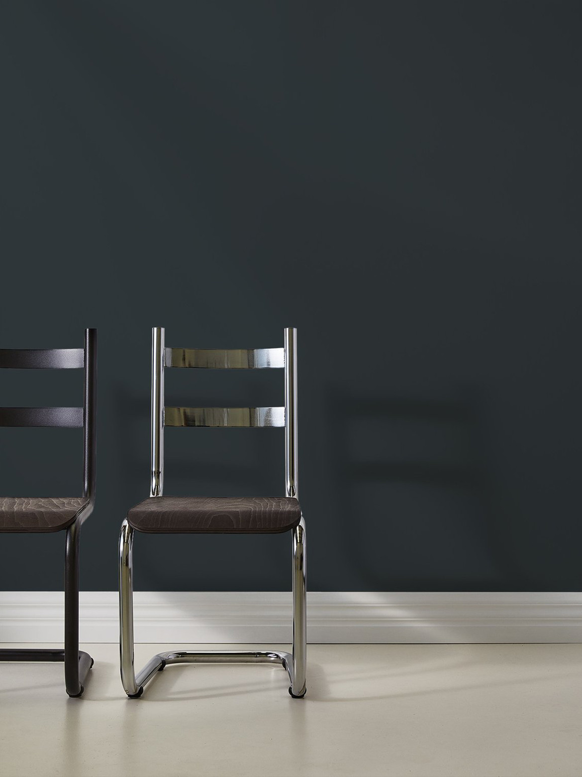
“In 2020 you should go with the moodiness of winter and embrace those rich tones, dable in deep greens, warm clays and broody browns,” says Alex Roberts, product development manager and Chief Tint Officer of Tint paint in reference to the Tint winter colour trends report. “In the past few years, our desire for comfort in the home and a return to natural materials has pushed us away from cooler, starker colours and moved us towards softer hues – but this transition will be subtle and gradual.”
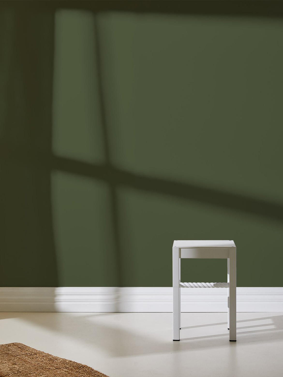
Rediscovering the home as a multi-faceted sanctuary rather than just a space to solely eat and sleep has pushed us to rethink how our lifestyles are portrayed within. Evocative of the tones of nature and the outdoors, warmer-based colours provide a sense of relief for our time spend indoors and a revitalised space to be inspired.
Reminiscent of the red, brown and green tones of the Australian landscape, the integration of these hues reprieve the dullness of the colder season – transcending us to a place of clarity, calmness and ease. In seeking a space of respite, interior colour trends are imitating the shades of earth elements such as sand, clay, leaves and wood as natural sources of inspiration to give depth of colour, a welcoming visual language and a pure elegance throughout the home.
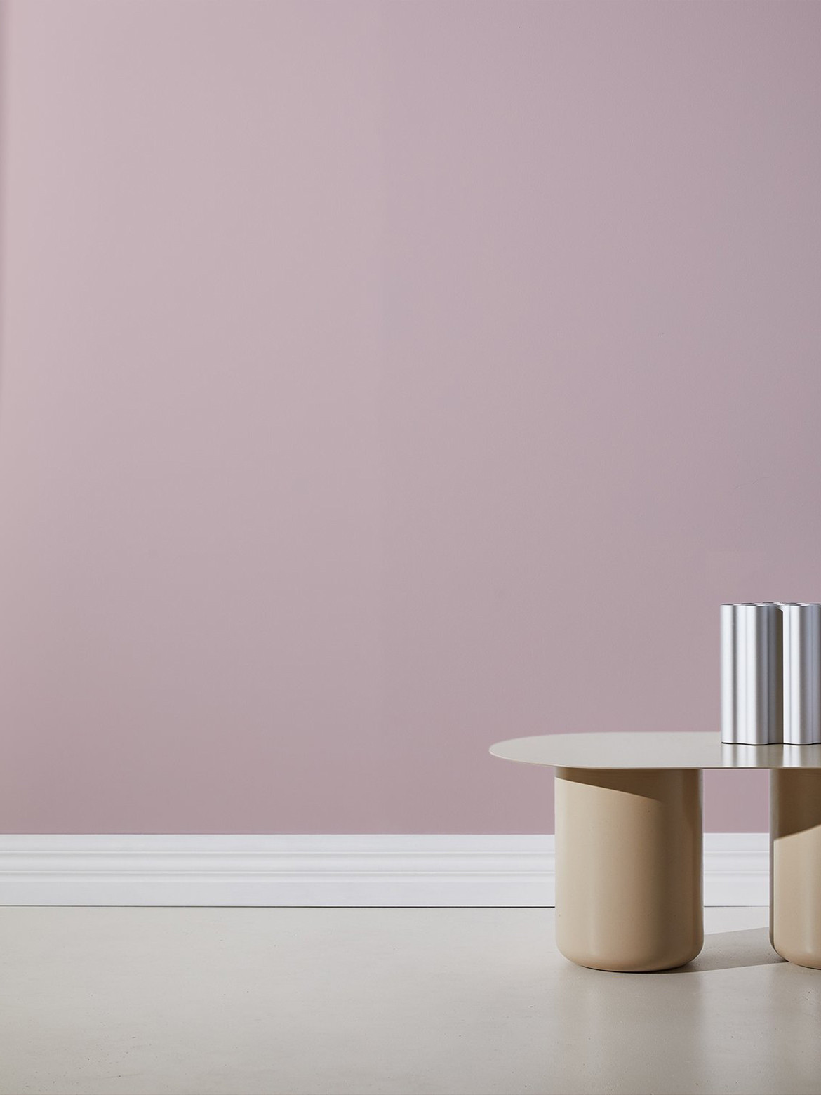
“You will notice greys are becoming more greige [grey x beige], blues are a bit dustier and greens are a little dirtier and olive based,” adds Alex. “Beiges, green and clays are the new neutral. The cooler tones we have seen over the past few years are being tweaked to reflect our natural surroundings a little better.”
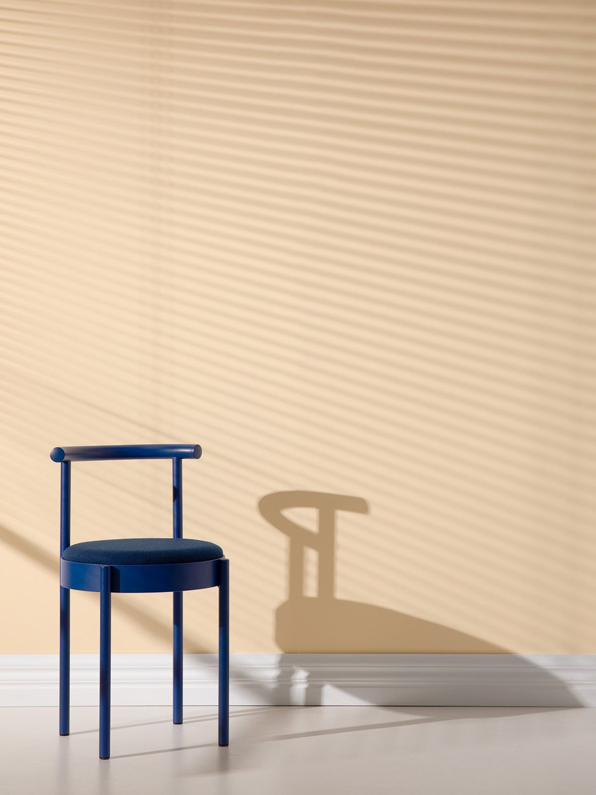
But that doesn’t mean that the original cooler tones don’t have their place: according to the Tint winter colour trends, in 2020 we will see lots of monochrome and tonal spaces elevating the darker, bolder colours. The combination of these colour ranges can tie a space together – creating a harmonious balance and a distinct aesthetic to the home. By introducing new colours to your space and celebrating the old with the new, there is a refreshed sense of depth and coolness to the walls.
“Just because colours are getting a little warmer doesn’t mean you can’t work them back with cooler hues,” says Alex. “Cool, crisp colours will bring balance and can have a great effect when juxtaposed against warm, cosy tones.”
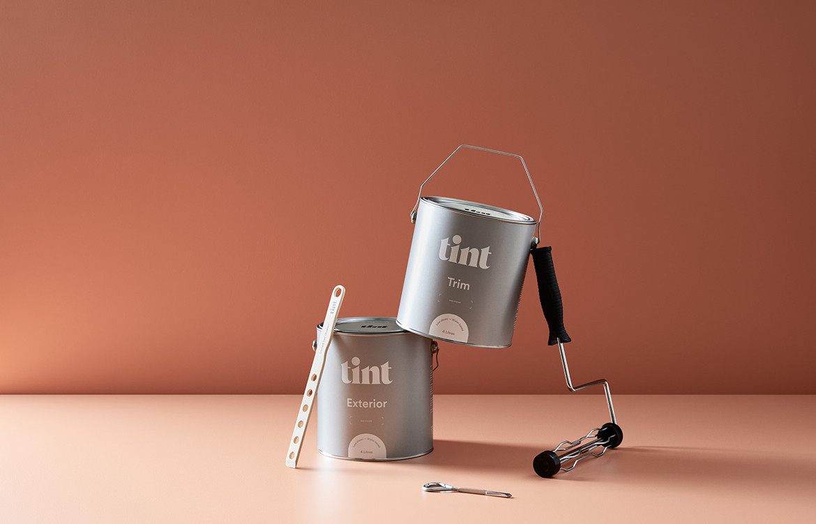
With a selection of 70 curated colours, Tint recognises the importance of our sense of place within beautifully designed and curated spaces. By providing premium, vegan, eco-friendly and low toxicity paints directly to your door, Tint is a human-centric brand focused on rejuvenating our everyday experiences.
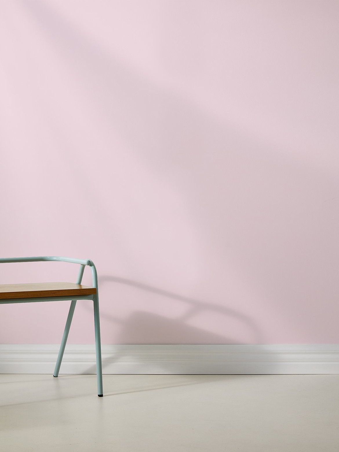
“These soft colours are easy on the eye and bring a sense of hygge to your space. The Danish term is used to describe the quality of cosiness and comfort that creates a feeling of contentment or well-being – it’s the inspiration to one of our paint names and is something everyone should seek,” says Alex.
During the cooler months we are naturally drawn to warmer hues that bring brightness and comfort into our lives. The kaleidoscope of Tint winter colour trends encourage you to illuminate this year’s winter season with a warmer, bolder and electrifying new personality for your home.
Tint
tintpaint.com.au
We think you might also like Hygge Life: The Danish Design Philosophy For Living Well