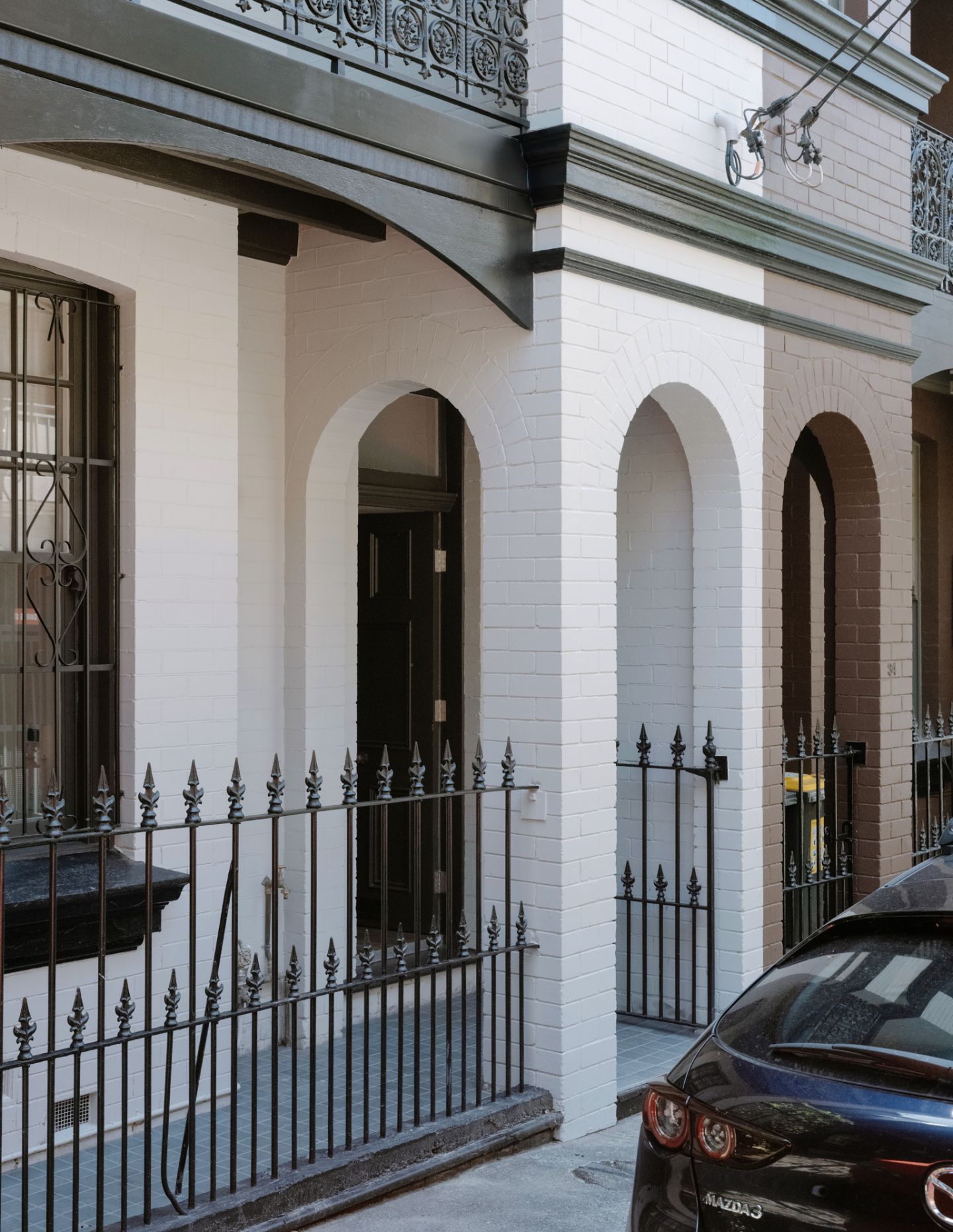
Sydney’s inner-city suburbs have an uncanny capacity to remain serene while only steps away from vibrant high streets. Close to Crown Street, House in Surry Hills II is in an enviable location, occupying one half of a semi-detached block with Federation-era façade detailing and a north-south orientation. Architect George has added significant new parts to the house, while reconfiguring the narrow floorplan to unlock new spatial qualities and using an elegant, restrained material palette throughout.
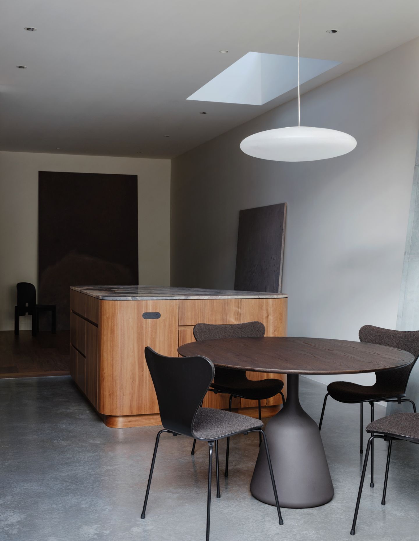
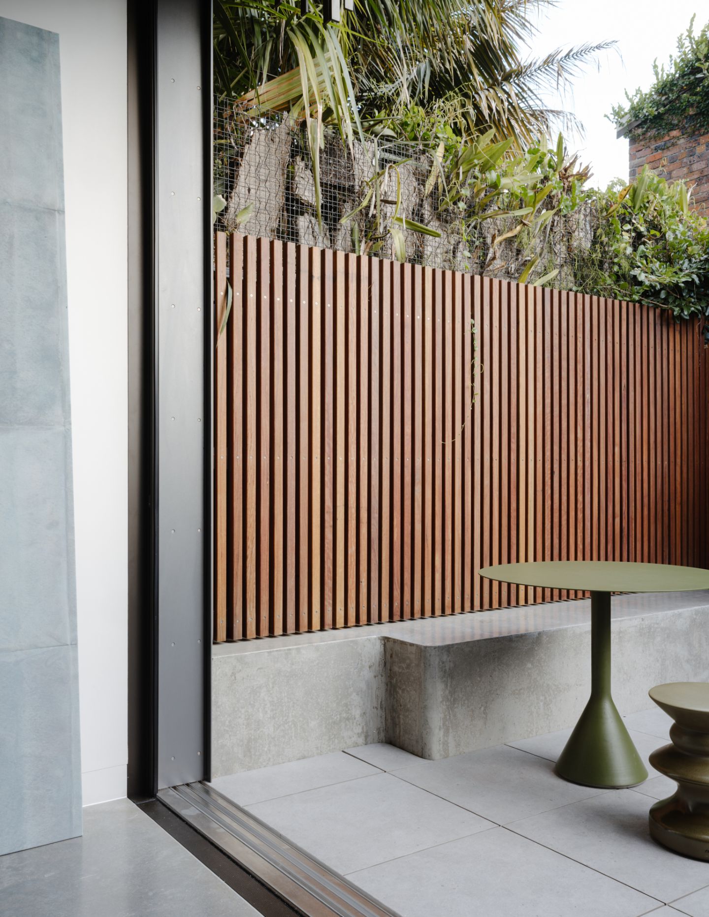
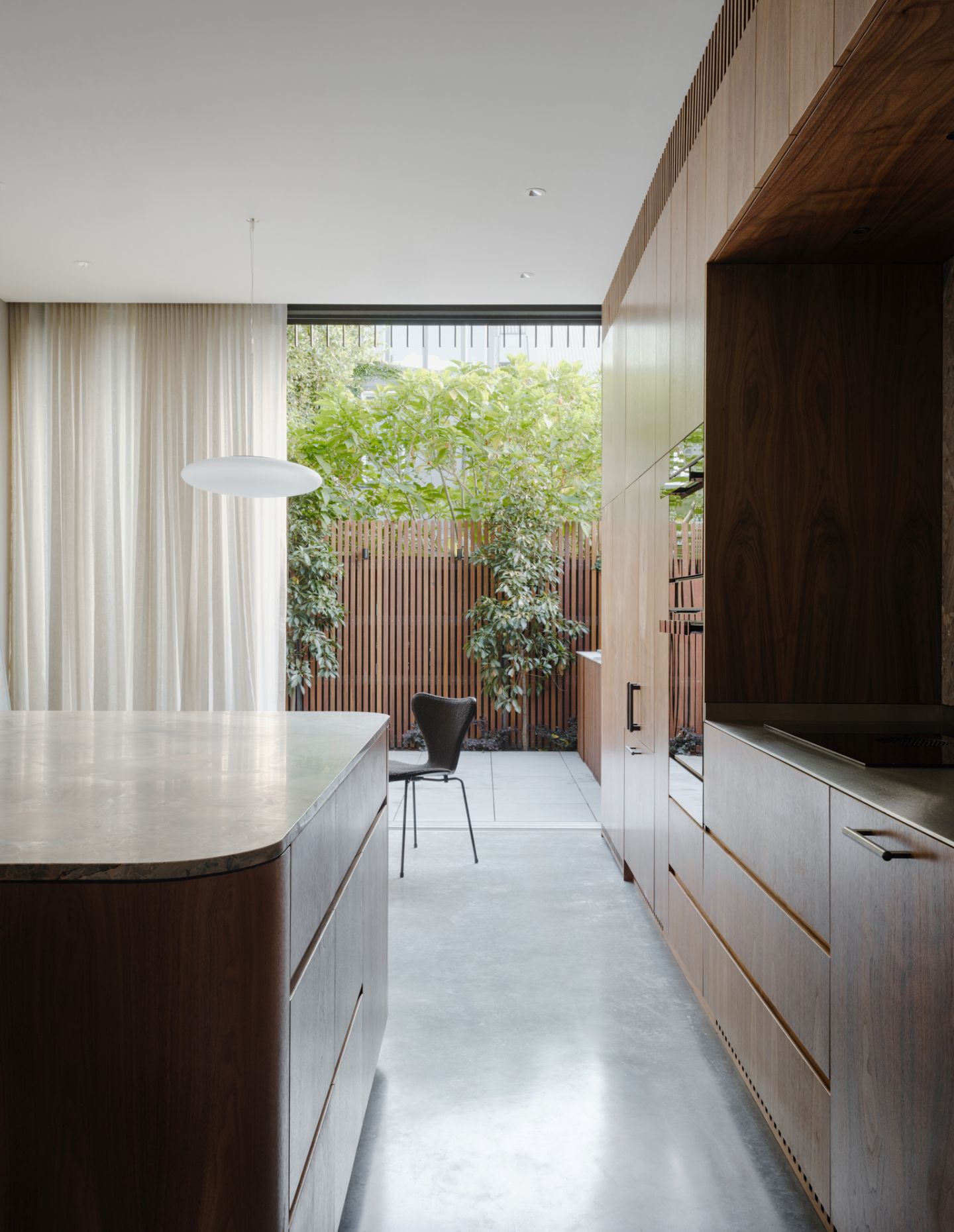
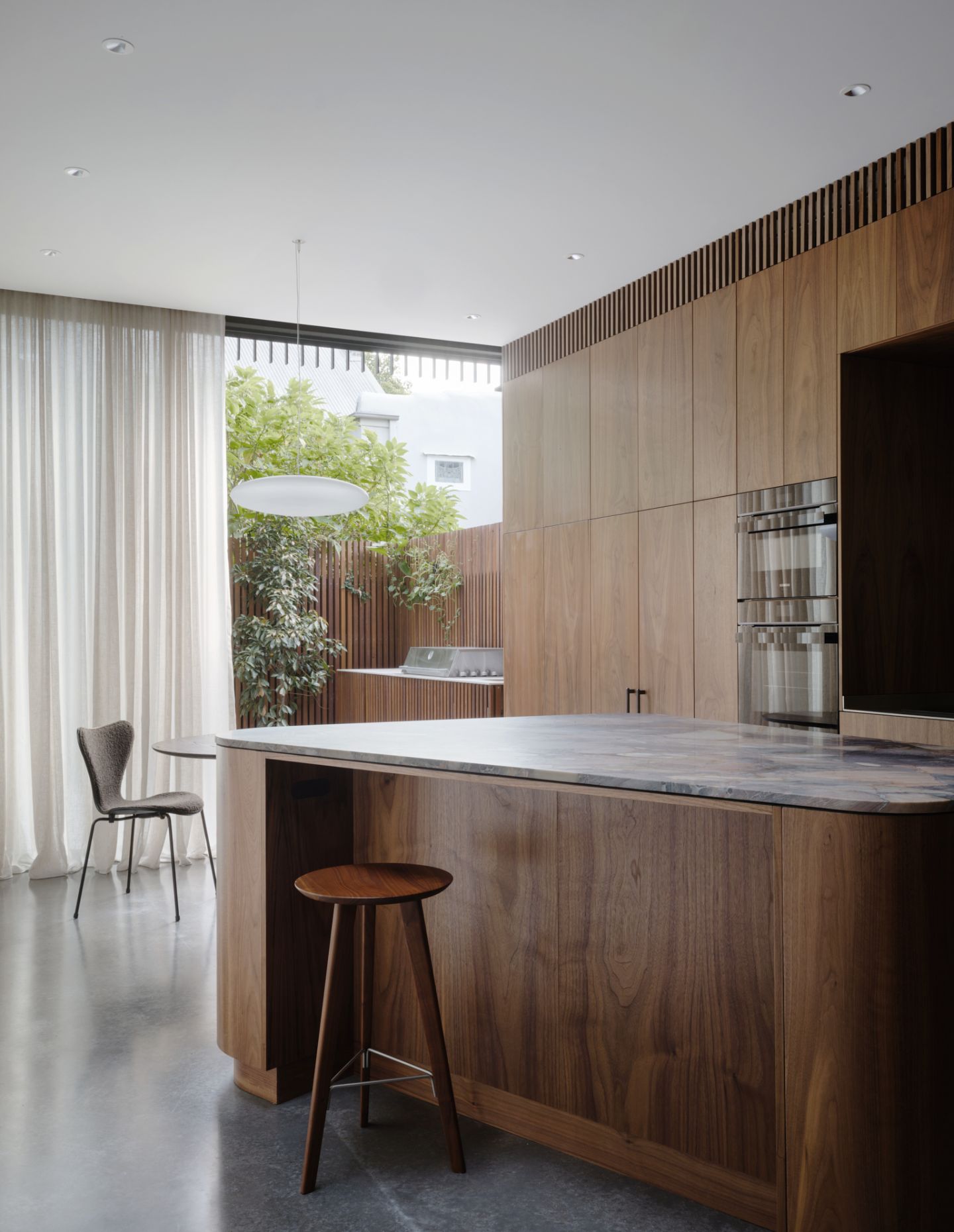
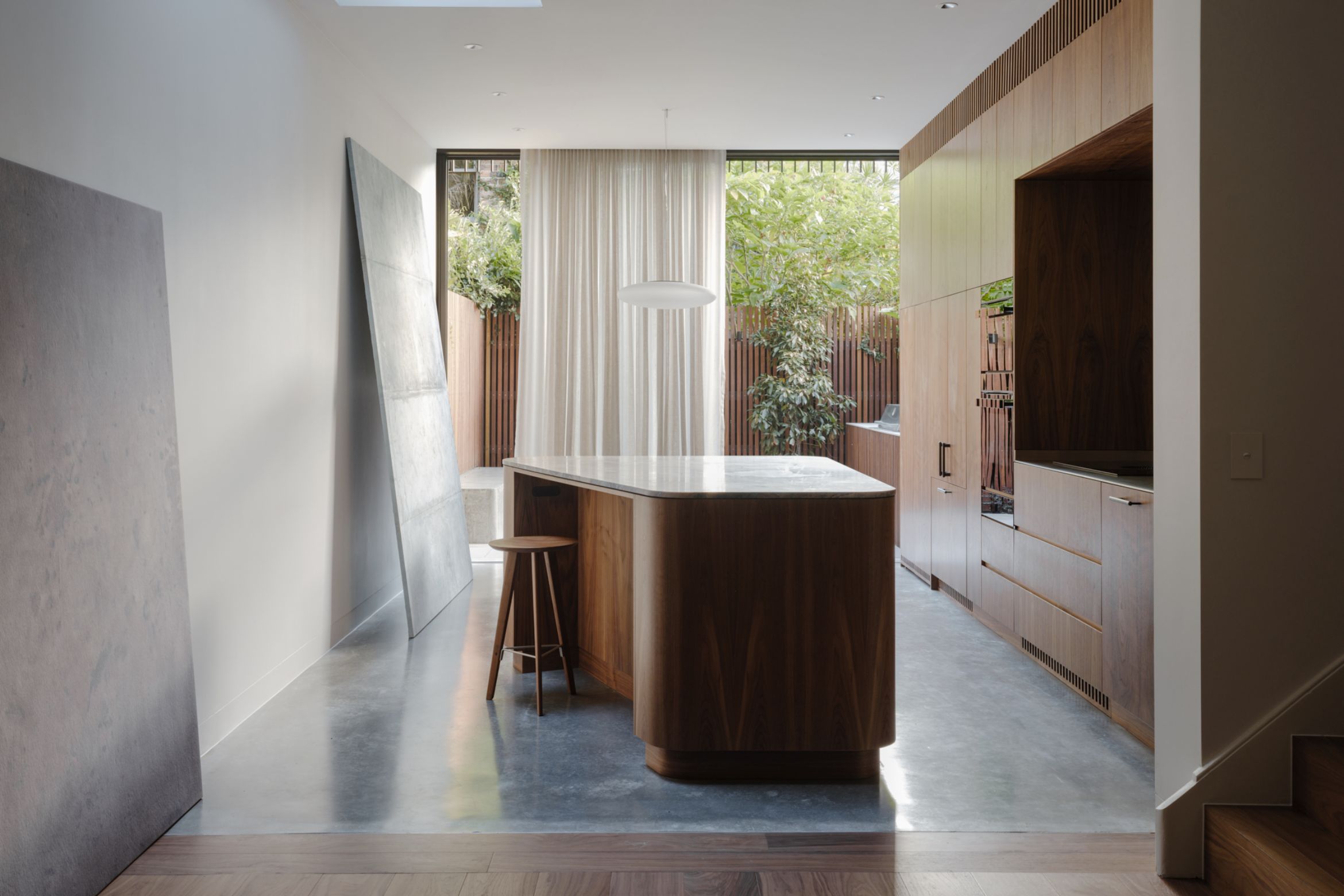
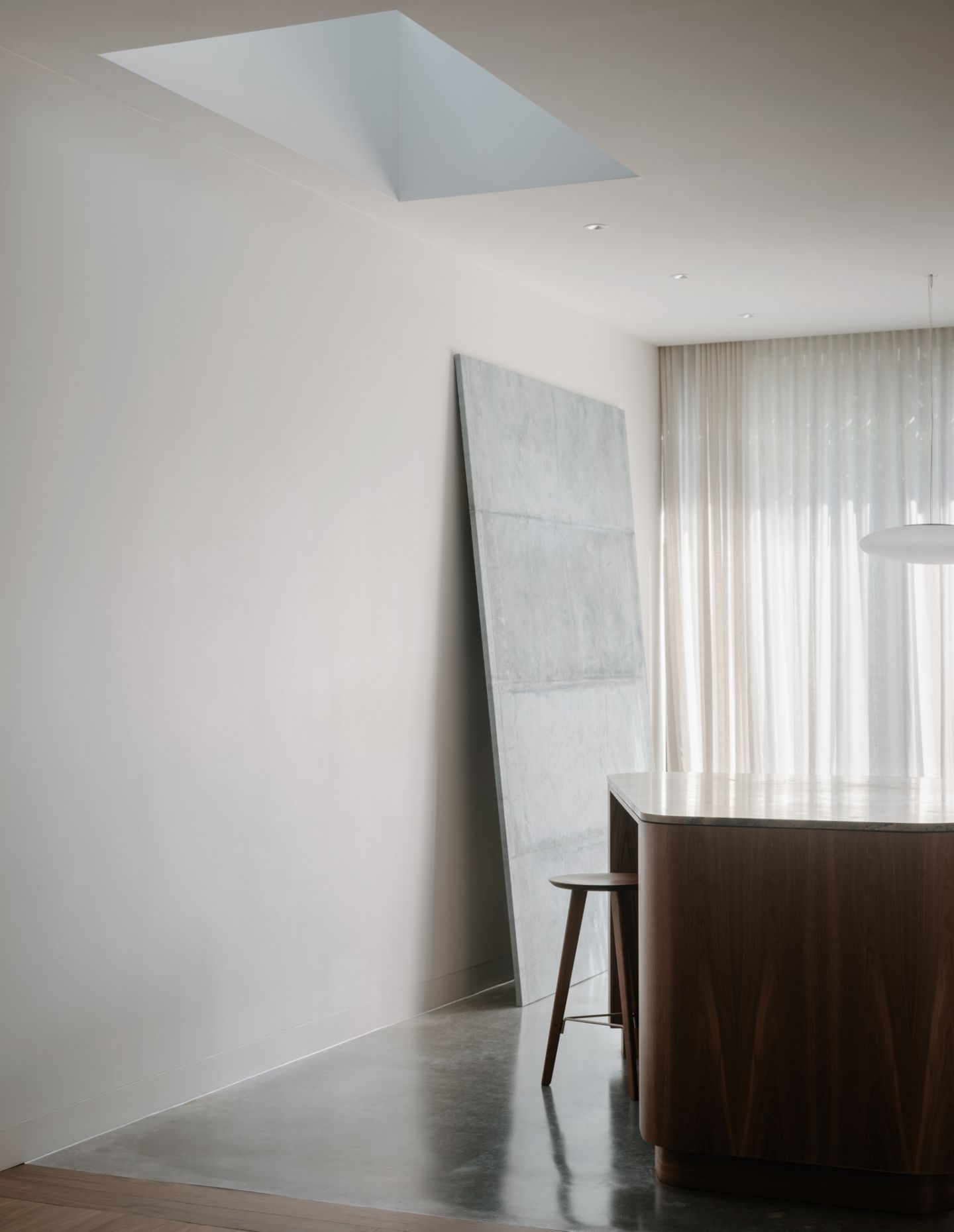
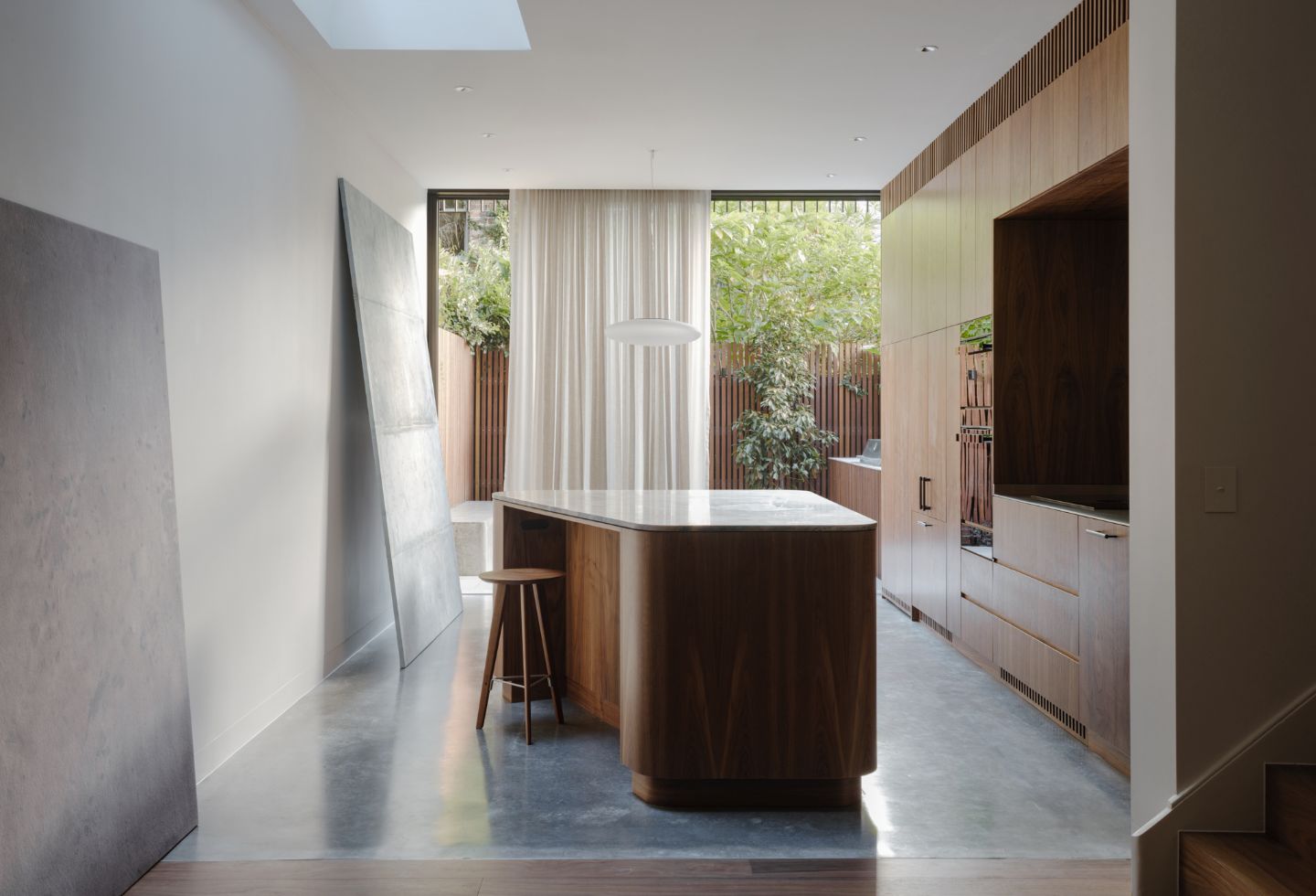
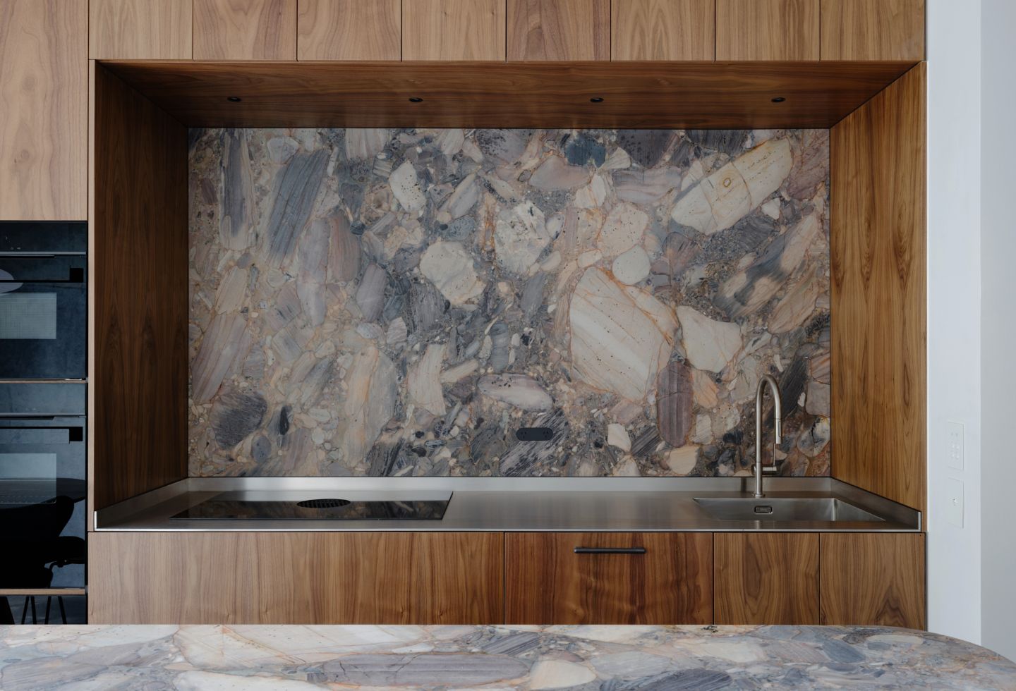
Moving through the house, two moments stand out in particular. First, there is the kitchen and dining area that opens out onto the rear, north-facing courtyard. A change in floor material at the kitchen threshold signals the move from old to new, with a dilapidated lean-to having been removed. Sliding glass doors frame the intimate outdoor space, with some help from neighbouring plants. The kitchen’s skylight, striking stone bench top and timber joinery – as well as the northern sunlight – combine to create a magnetic space fit for multiple uses.

“Bringing light into the urban, inner-city home was probably the most important aspect of our client’s brief,” explains Dean Williams, founder of Architect George. “We explored a quite expansive connection to the north-facing garden, with floor to ceiling glazing on both levels. Along with this, we created lightwells and opportunities for bringing light from above into many rooms of the home.”
The second highlight is directly above the kitchen, in the main bedroom. Working with a tight floorplan, it might have been tempting to simply maximise the room’s dimensions; instead, Architect George has cleverly manipulated the space to add functionality and moments of delight.
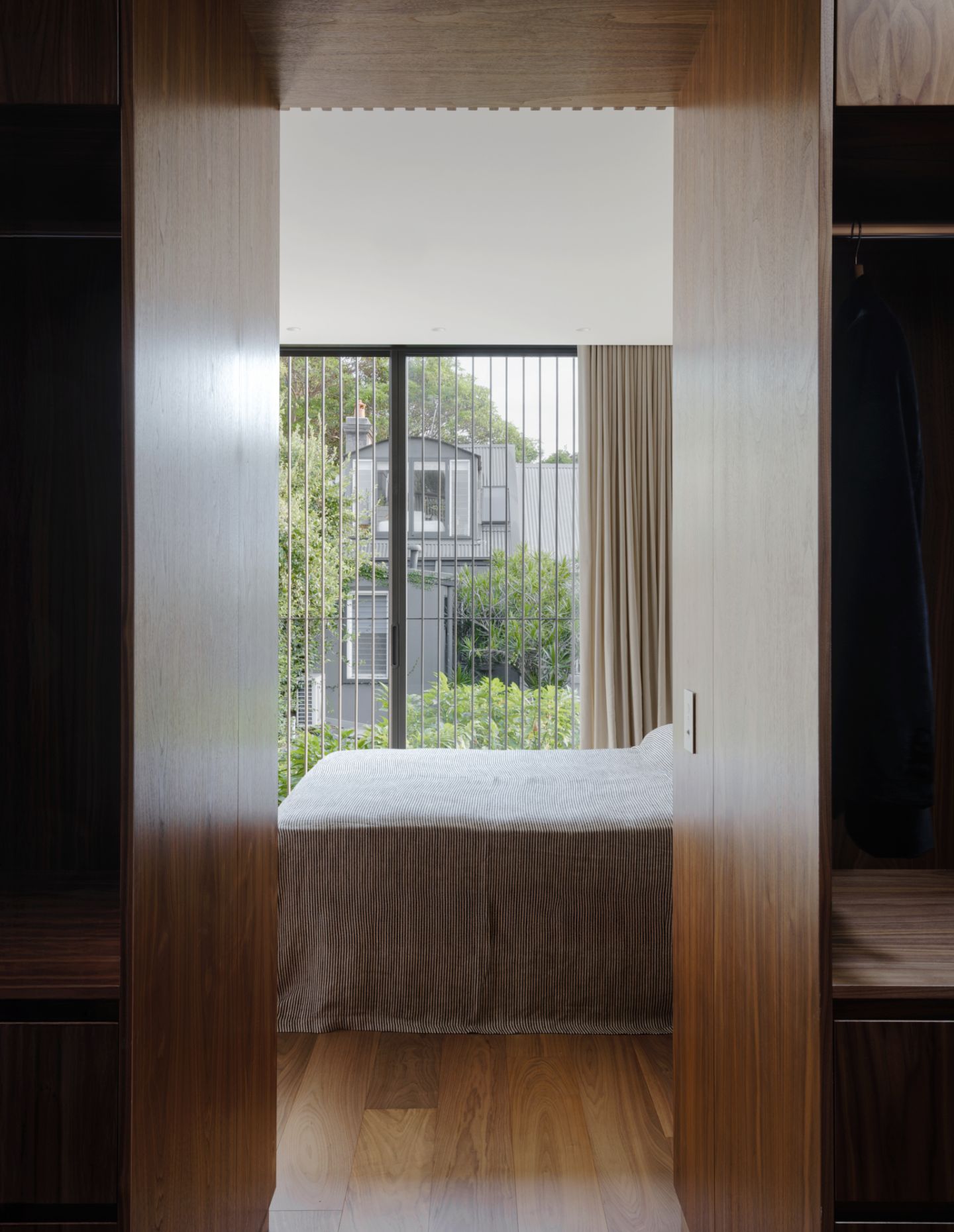
Again, it’s the northern aspect that does some of the work – or, more accurately, is allowed to do the work. The room generously opens up to outdoor views and fresh air, with full-height sliding doors. There is then an outside space, of sorts – neither terrace nor even really a balcony, but a 600-millimetre-deep mini-balcony.
“It’s not designed necessarily for occupation, but more so to control light and visibility from the bedroom and living spaces at the rear,” says Williams. “The visual extension offered from this ‘balcony’ provides an open sense of space and it can be occupied in a more transient way – the owners can walk outside from the shower to the bedroom, for instance.”
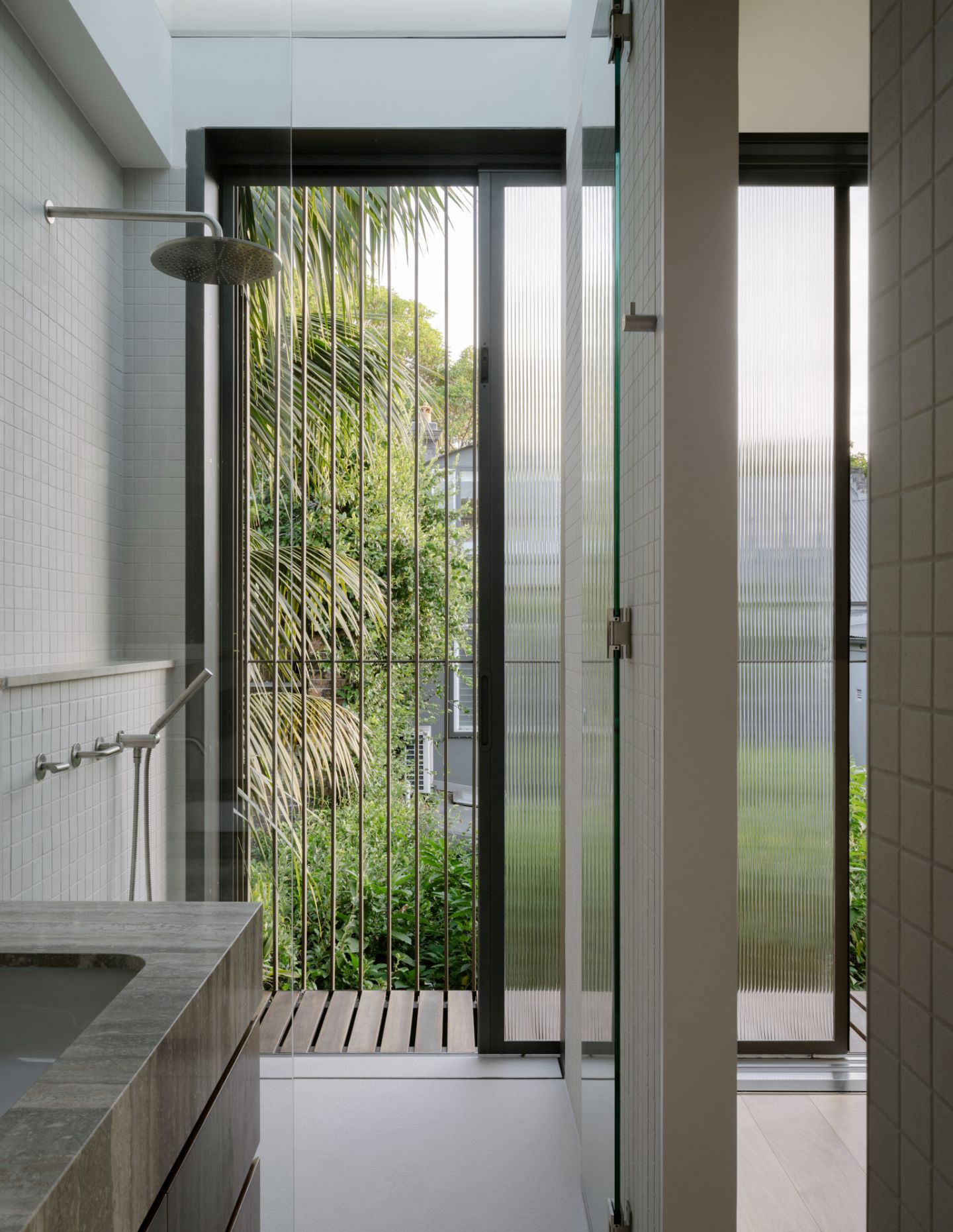
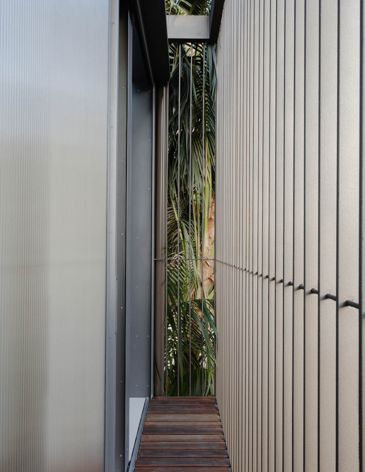
This thoughtful addition is also designed with the integration of planting in mind, and it succeeds in breaking up what could otherwise have been a simple box room. “The idea is that the steel ‘veil’ at the rear of the home provides a trellis for garden climbers. We love seeing architecture taken over by landscape. I really love Geoffrey Bawa’s Kandalama Hotel, the way in which the structure is disguised by landscape and the outlook from windows is onto a dangling vines that kiss the glass. Hopefully we can revisit this project of ours in a few years and it will have a similar landscape inhabitation – triumphant outcome for us,” adds Williams.
Entering the main bedroom also means passing through a walk-in wardrobe of timber and mirror as they enter the room. Along with the balcony, it’s another relatively small move that serves to combat the narrowness of the terrace house typology by differentiating its internal spaces.

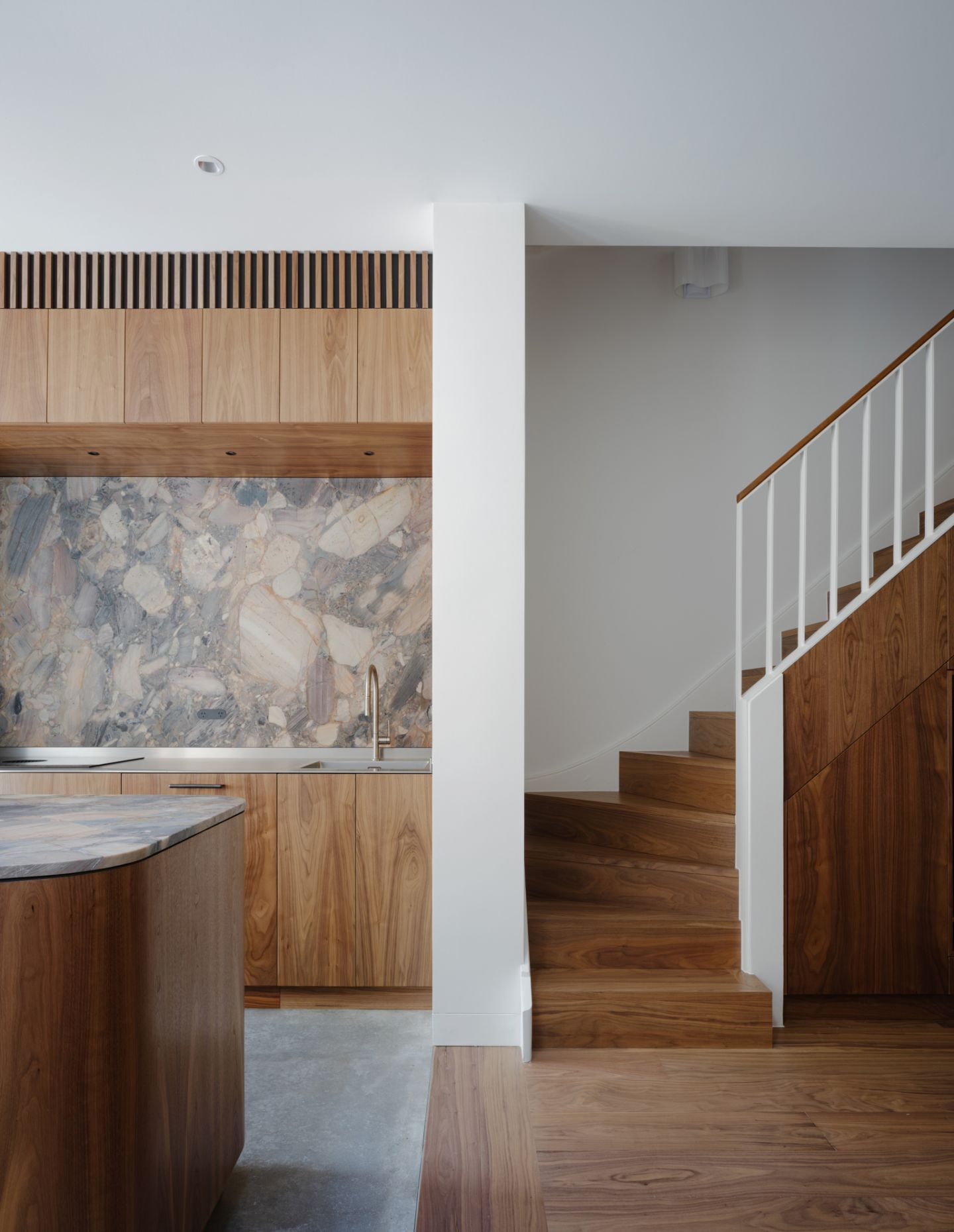
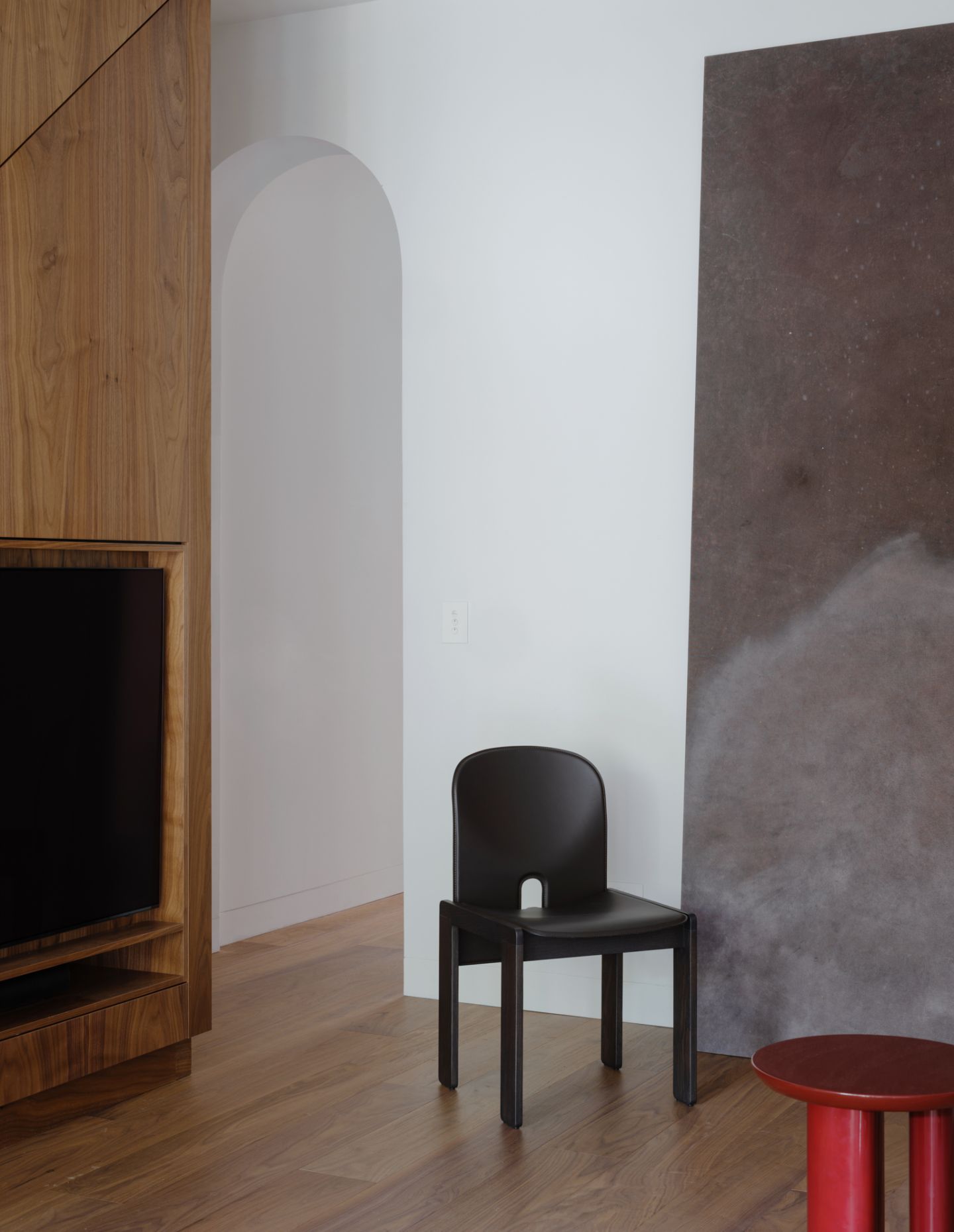
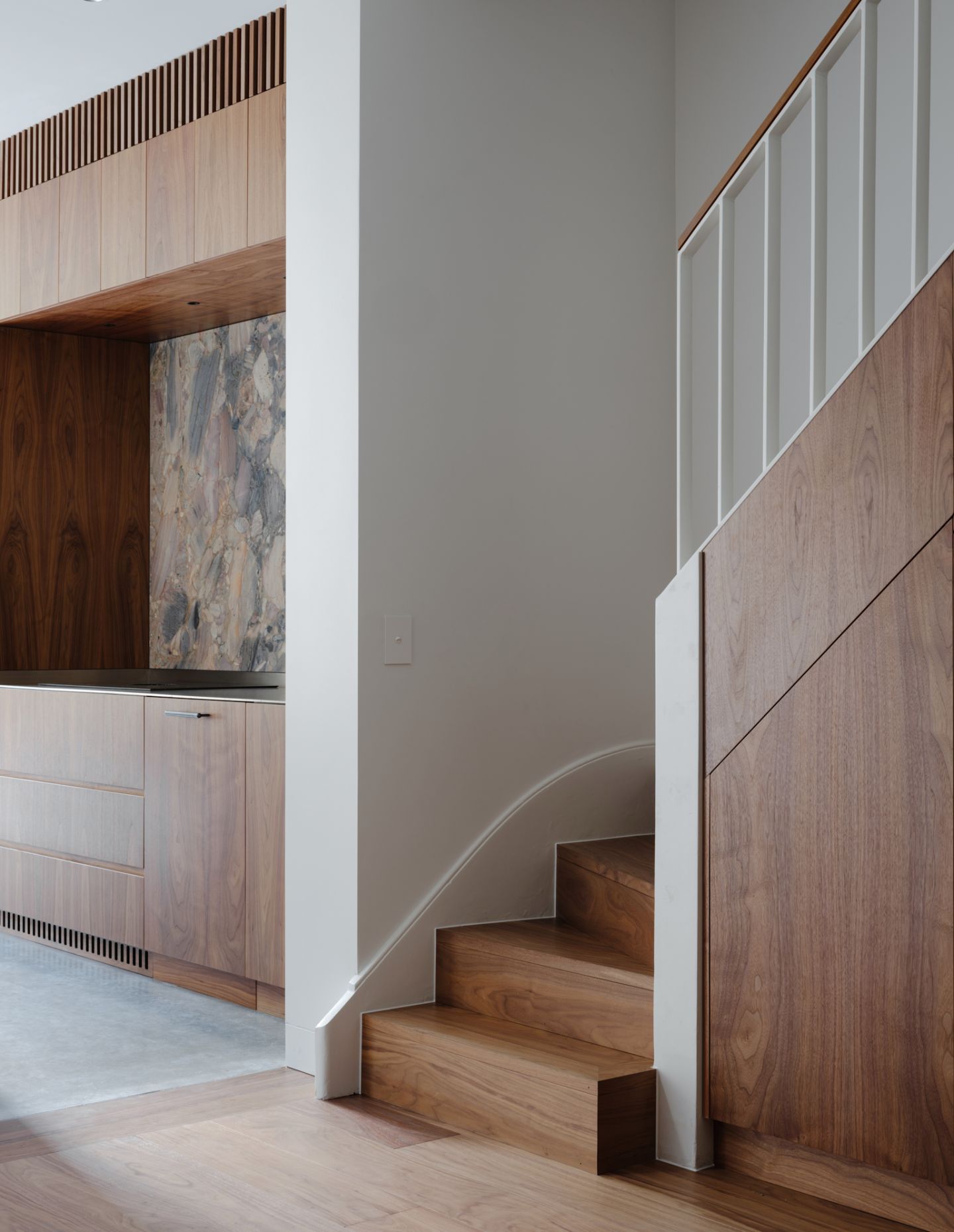
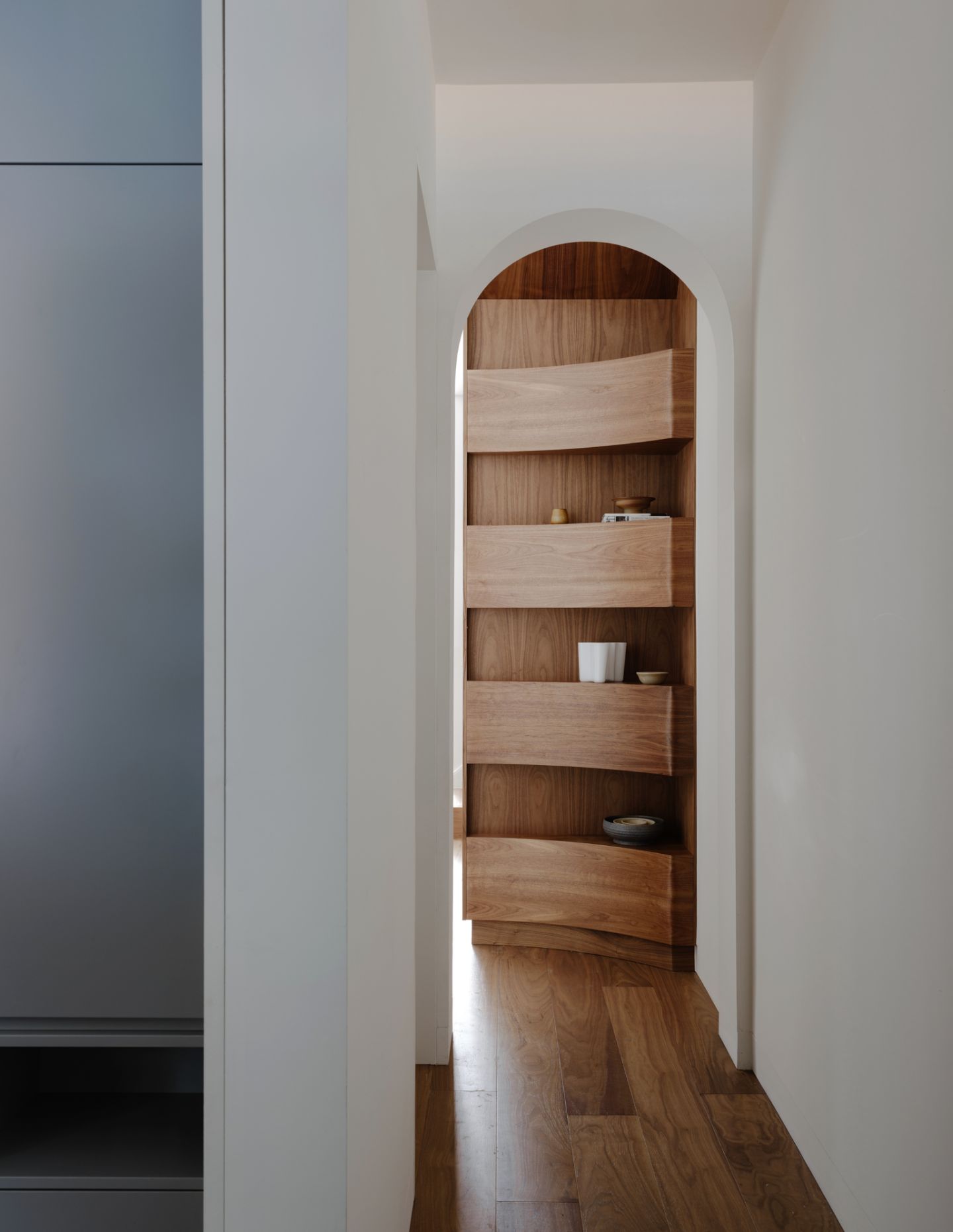
The timber joinery brings a sense of continuity and consistency to the house as a whole. A gracefully curved shelf marks the transition into the living area and is the first visual feature to catch the visitor’s eye as they enter through the front door. More timber, as well as stone, then dominates the kitchen and dining area.
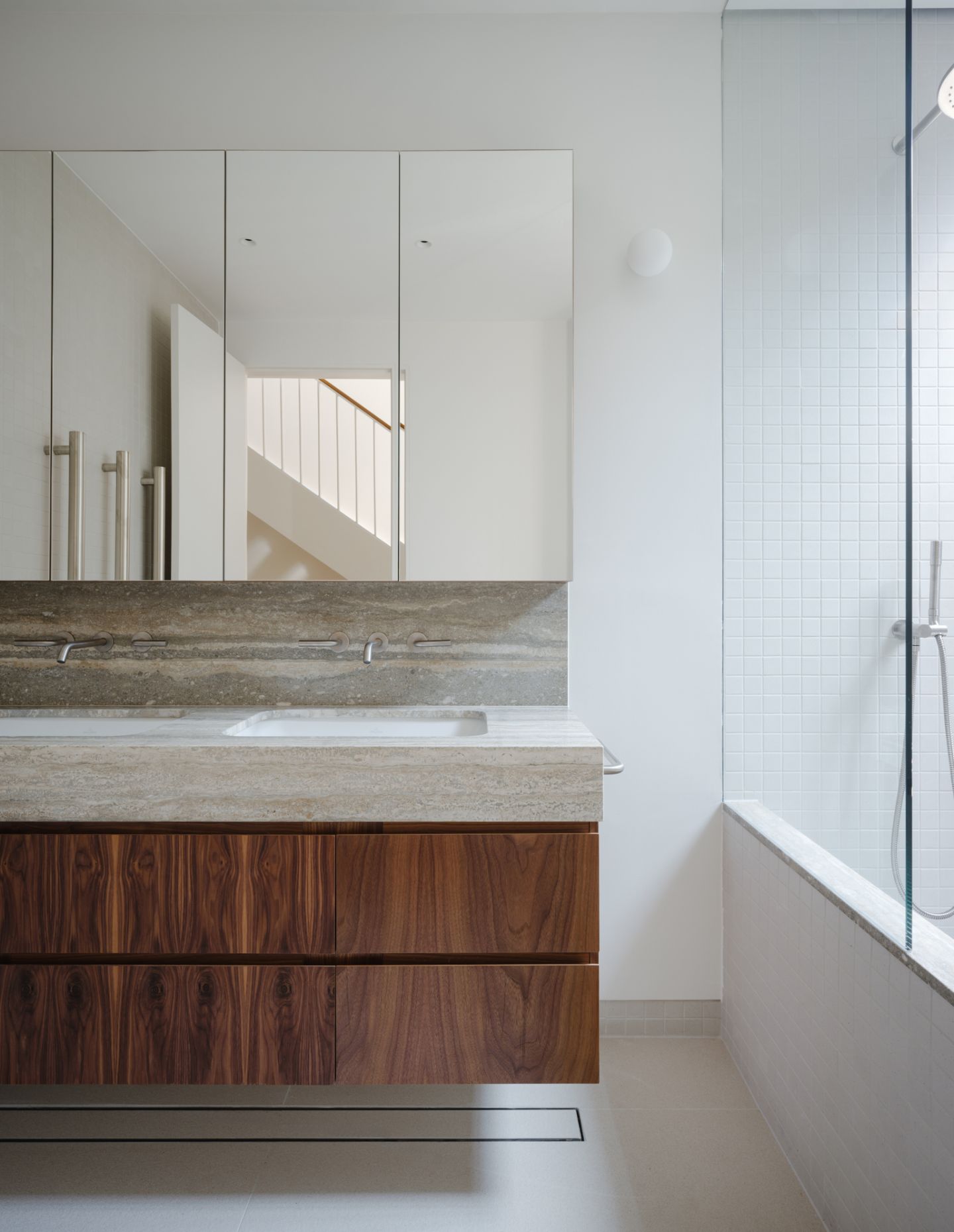
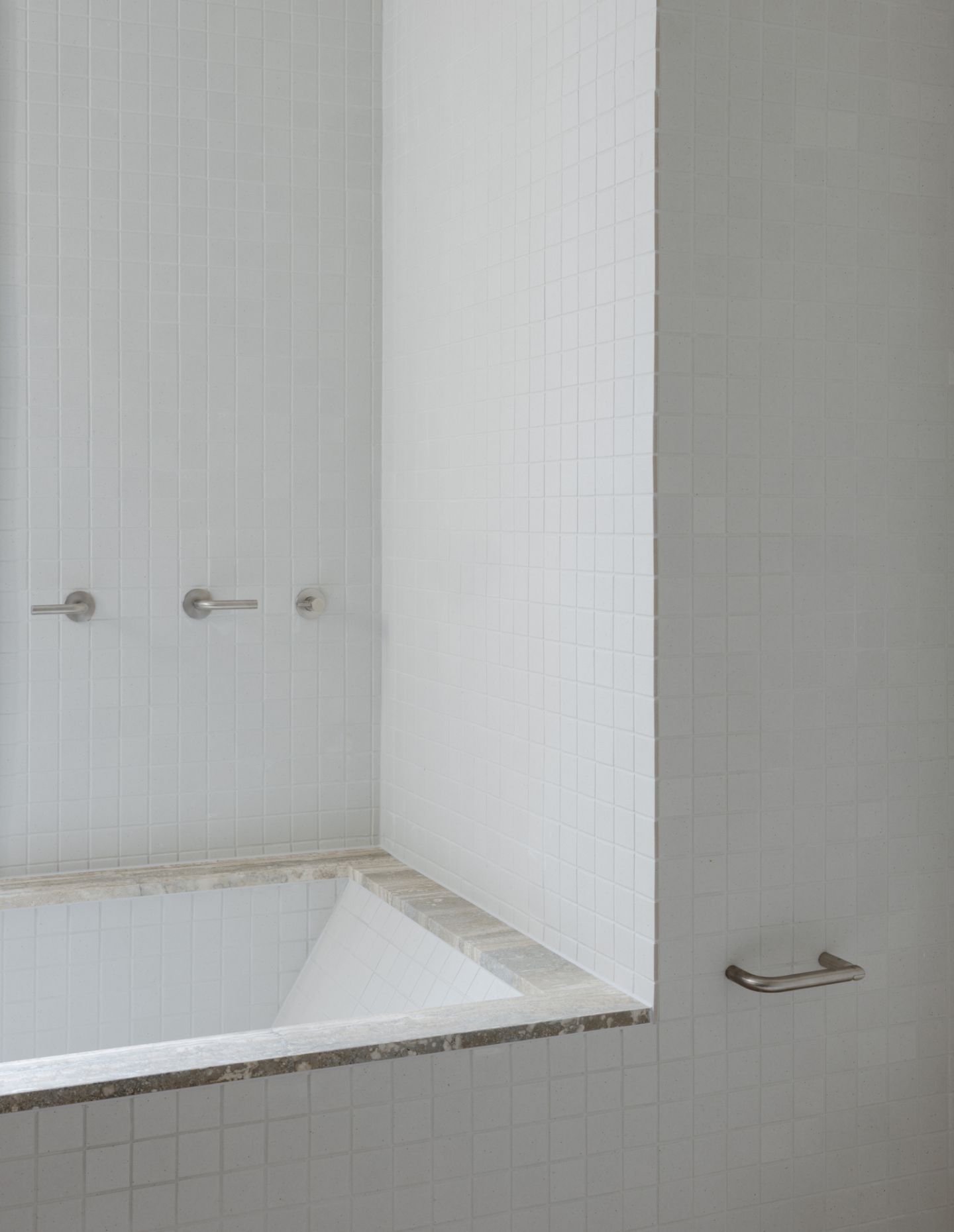
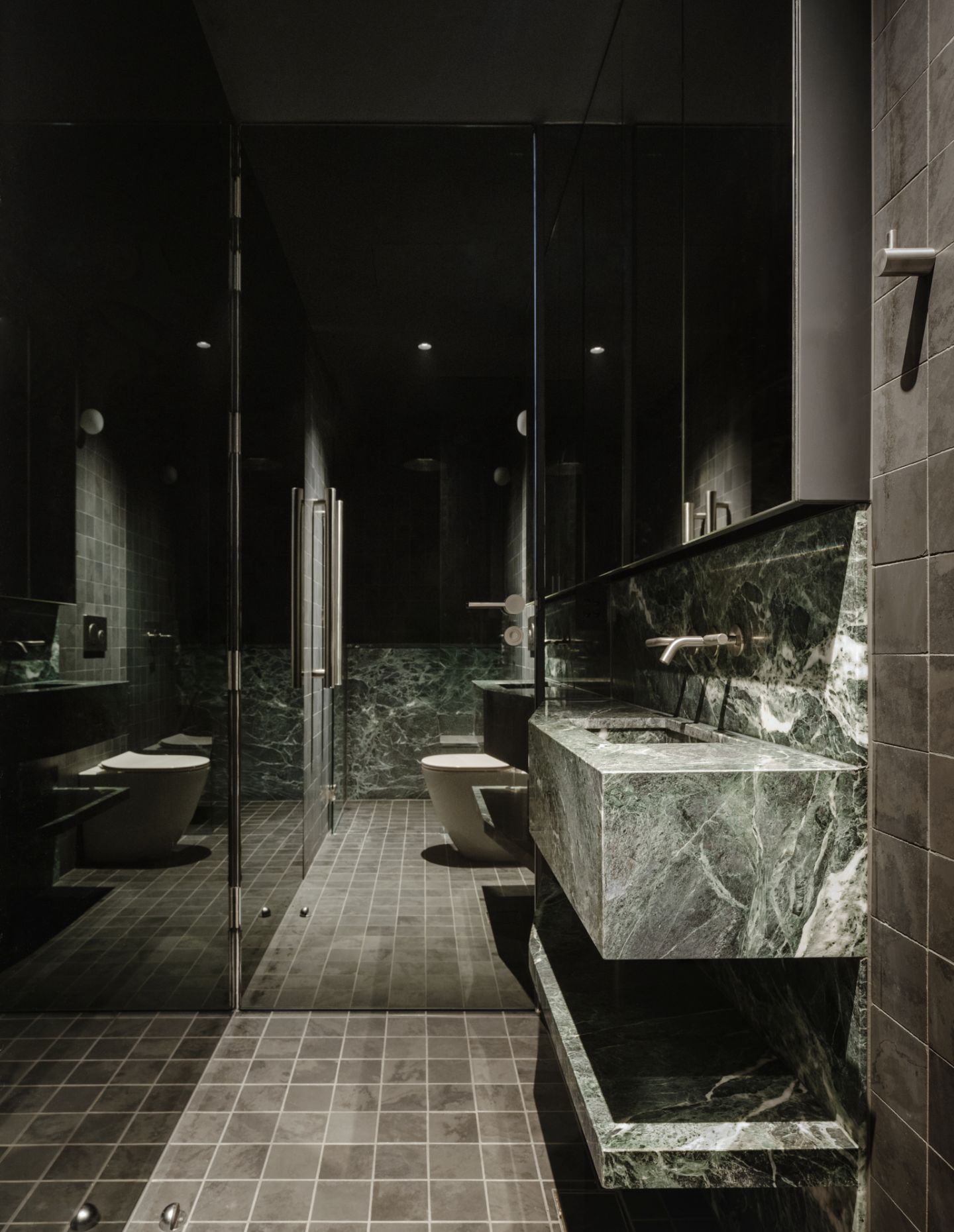
Meanwhile, two utility rooms without natural light make use of soft, diffused lighting as well as dark colours and textures. The guest bathroom is especially notable here, with its dark green slate tiles, black ceiling, mirrored walls and beautiful natural green stone supplied by Artedomus.
More bedrooms are fitted into the southern side of the floorplan on ground and first floor, and with multiple uses such as desk spaces. Finally, a usable ‘attic’ space occupies a top floor for further vertical differentiation and privacy.
House in Surry Hills II makes small but impactful moves in terms of spatial layout and materiality to create a finished home that simply feels larger and more varied than it probably should.
Williams concludes: “We explored a few tricks to make the house feel larger. Luckily, the original home had grand 3.2-metre ceiling heights. This provided structural bones to allow us to incorporate vertically generous proportions to all rooms of the house, giving the sense of larger spaces. We also defined the use of particular spaces with defined, segregated functions – the main bedroom, for instance.
“I really love the balance of refinement and robustness we have achieved in the design. Our clients wanted the home to be a robust canvas for family living where they didn’t need to be too precious about the space. Yet, we’ve been able to get a beautiful and elegant outcome through all of the refined details that we worked so hard to achieve.”