
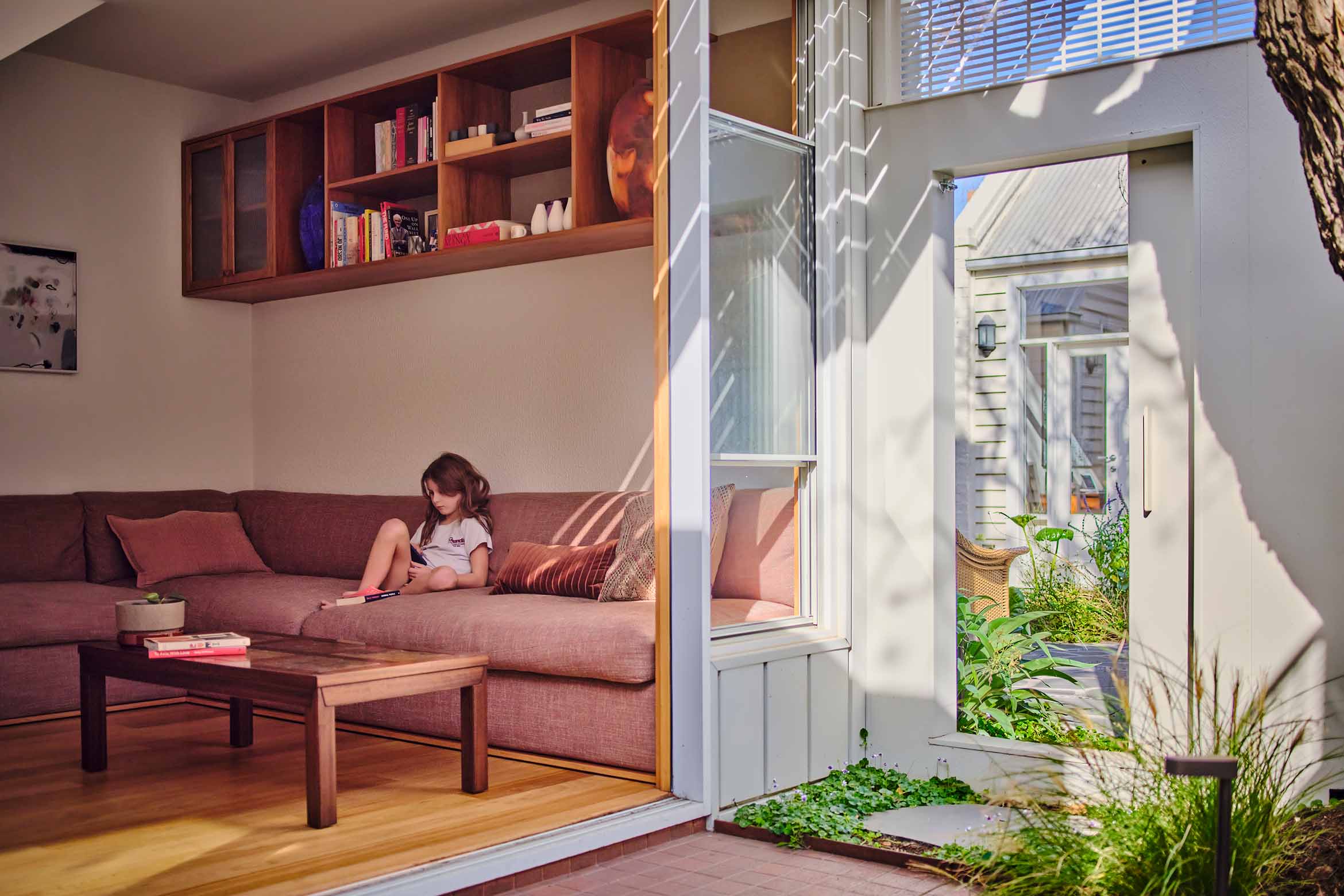
Fitzroy Duet is, in fact, two projects: a single-fronted Victorian terrace on the doorstep of Brunswick Street and an 1880s weatherboard cottage concealed behind it. Designed for members of the same family, each home has its own brief, personality and material language, while a discreet connection between their gardens allows the two households to remain close.
We spoke with Dan Gayfer of True Story about adapting the two properties, creating a dedicated printmaking studio and designing for independence without separation.
What did you find on the site?
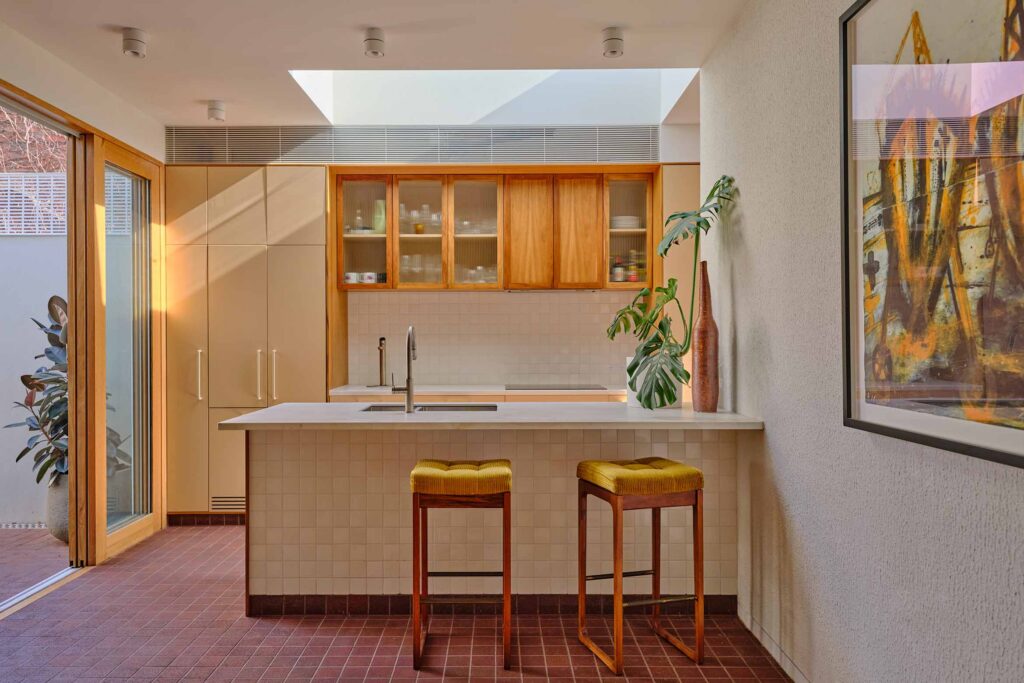
Fitzroy Duet Part 1 – the front house: The front house was a single-fronted Victorian brick terrace in a near-flawless location, literally on the doorstep of Brunswick Street, one of Melbourne’s best-known strips for shopping, dining and bars. It was charming and a little rugged in an enchanting way, almost the quintessential inner-city Melbourne terrace.
The floor plan, however, was tiny, with the living room, dining area, kitchen, bathroom and laundry all crammed into a tight footprint. Its energy efficiency was very poor, the cladding and roofing were due for replacement, and the existing design and amenity were barely adequate for two people.
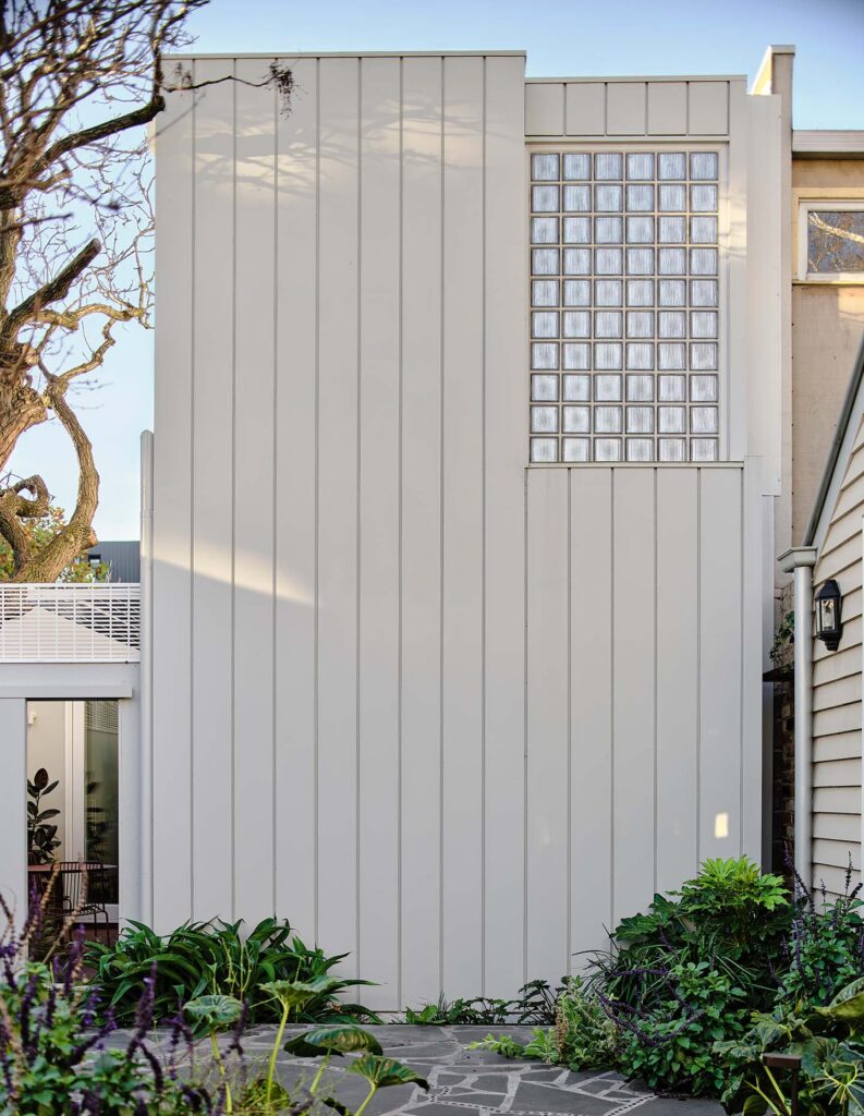
Fitzroy Duet Part 2 – the rear house: The rear house was an 1880s weatherboard farm cottage on a relatively large property, completely concealed from Kerr Street other than a largely hidden gate running up the side of the house. It is a genuinely hidden oasis, enclosed by tall old brick factory buildings on three sides. You would never know it was there unless you already knew of the property.
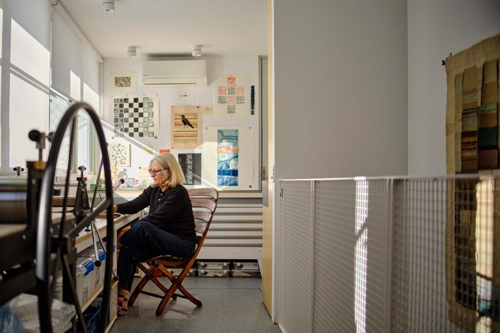
The rear lean-to was outdated and poorly insulated, with old skylights that made it freezing in winter and boiling in summer. There was no room for our client to practise her art or set up her tools and equipment: no space for the etching press she had wanted for years, nowhere for her artwork, supplies or drawings and no room for the plan drawer needed for her prints and etchings.
What did each household need from the project?
At the front house, the brief was essentially to demolish everything behind the two original front rooms while retaining their period features. The floor area needed to increase significantly to accommodate three bedrooms, including a first-floor main bedroom with an ensuite and a generous walk-in robe, with a makeup nook if possible.
Natural light needed to be maximised throughout. Rather than adopting the traditional open-plan arrangement common to single-fronted terraces, the clients wanted some separation between the living room and the dining and kitchen areas. As many spaces as possible were also to open onto an outdoor terrace.
Related: Carved from permanence
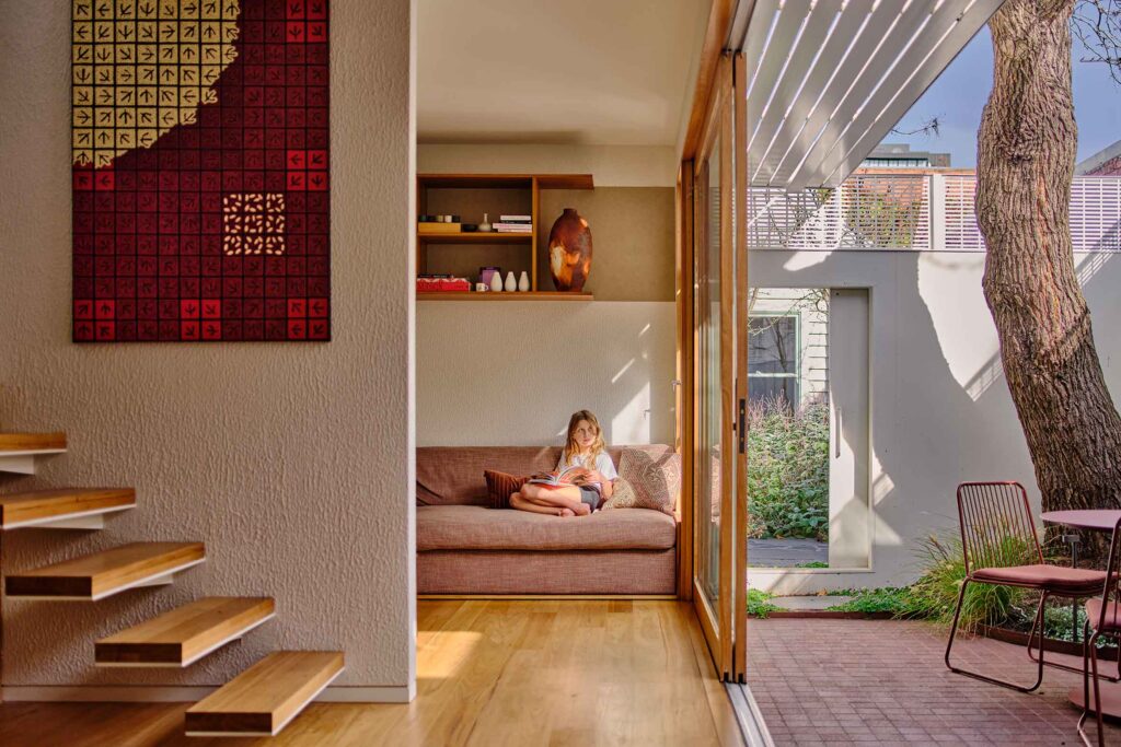
At the rear house, the brief was to remove the old lean-to while retaining the existing kitchen, living and dining space. The new addition would place our client’s printmaking and art studio across the entire first floor.
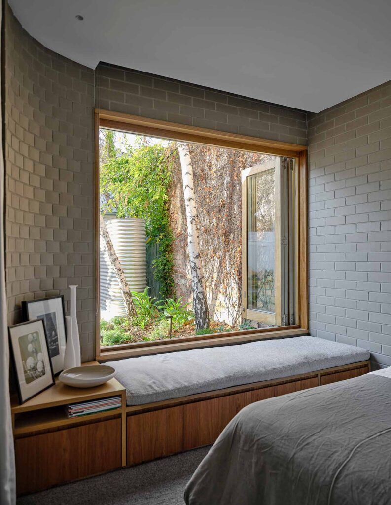
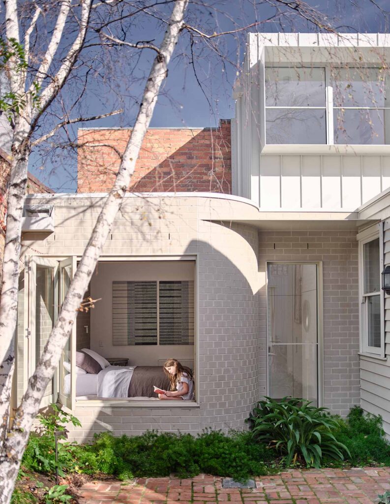
The laundry and storage needed to be fully concealed, while the main bedroom was to open directly onto the existing garden, a beautifully green space with mature birch trees that the design sought to capture and maximise. A bath was a must-have, which was a real challenge given the limited footprint.
Above all, the studio drove the brief. The whole first floor was given over to the rear-house client’s printmaking practice, with a small daybed at one end where she could rest from her work.
How did you give the two homes their own identities?
Each home has its own material language, reflecting the person who lives there.
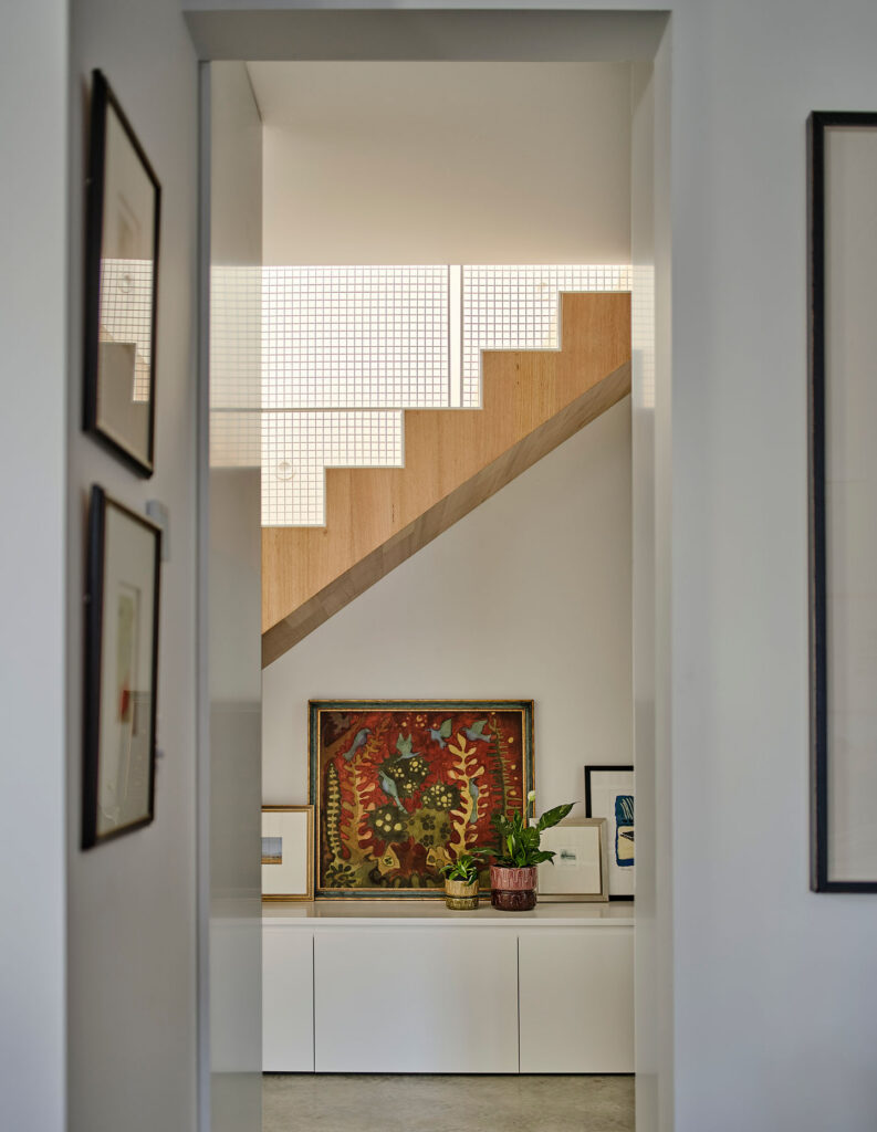
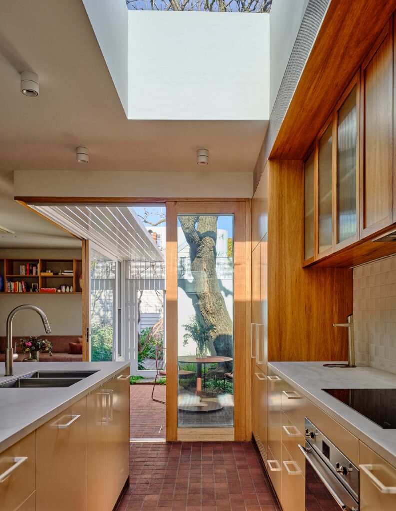
At the front house, timber runs throughout the joinery, flooring and custom stair balustrade. It is paired with a more eclectic and colourful palette influenced by mid-century modern design, while a steel-stringer staircase introduces an industrial, sculptural moment within the living room.
The ground floor of the rear house is more restrained, with burnished concrete floors and a neutral but textural palette that carries the exterior brickwork into the main bedroom.
Upstairs, plywood lines the studio. It was selected specifically to make the room feel warm and considered rather than clinical. This needed to feel like a proper artist’s studio, not a school art room.
How do the homes balance independence with family connection?
Beyond the obvious requirements of more space, better light and homes that function well from day to day, the real brief was about allowing two households to operate independently while remaining genuinely connected.
The front terrace needed to function as a complete, self-sufficient home despite its narrow footprint, while the rear cottage required a studio that would operate as a serious working environment rather than a spare room with a table in it.
Then there is the connection itself: a small sliding door tucked into the front house’s courtyard opens directly into the rear garden. It is a modest, almost playful element, but functionally it does a lot of work. It allows the family to move between the two homes without stepping out onto the street.
What are your favourite moments in the project?
There are a few moments we are particularly proud of. The natural light in the front house is stunning. The courtyard sits within the living, dining and kitchen zone, with floor-to-ceiling doors and windows drawing light into every part of the space.
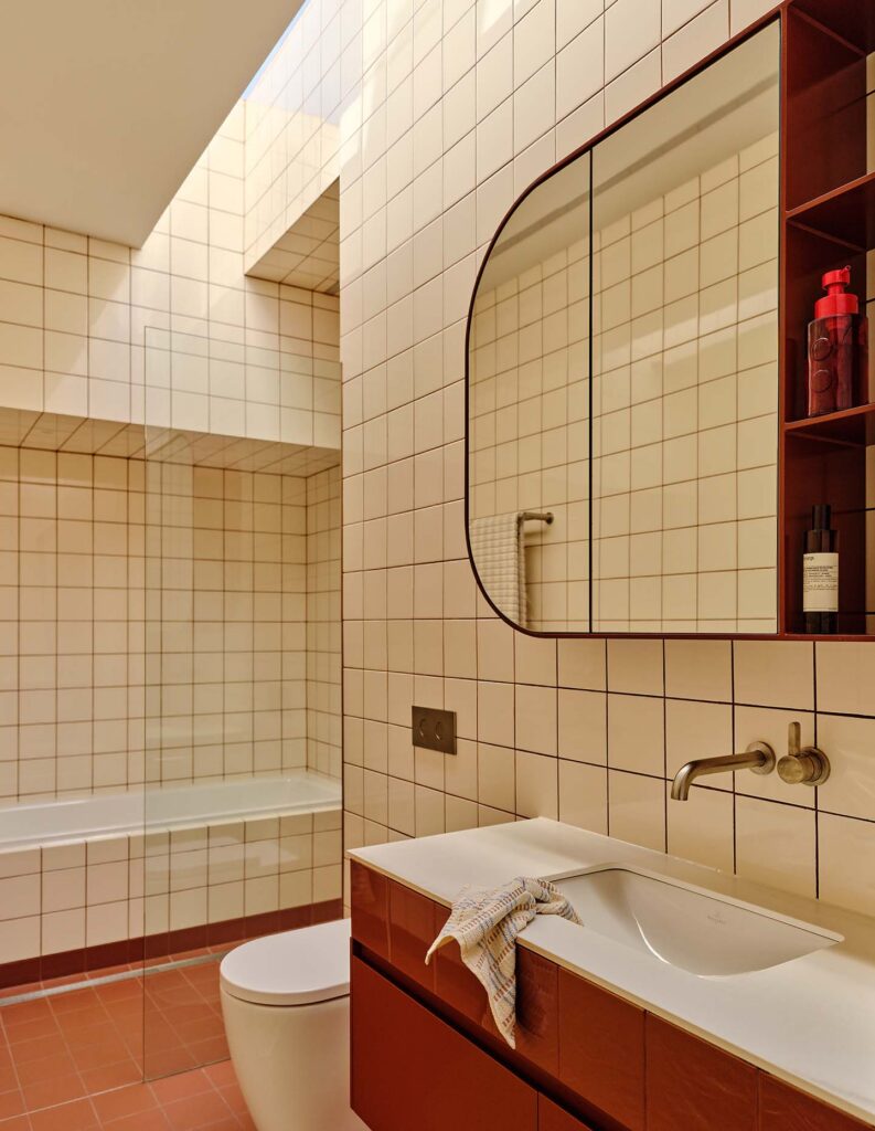
Then there is the front house’s bathroom, the truly unexpected surprise of the project, where a retro American diner character emerges through a striking combination of off-white and burgundy tiles.
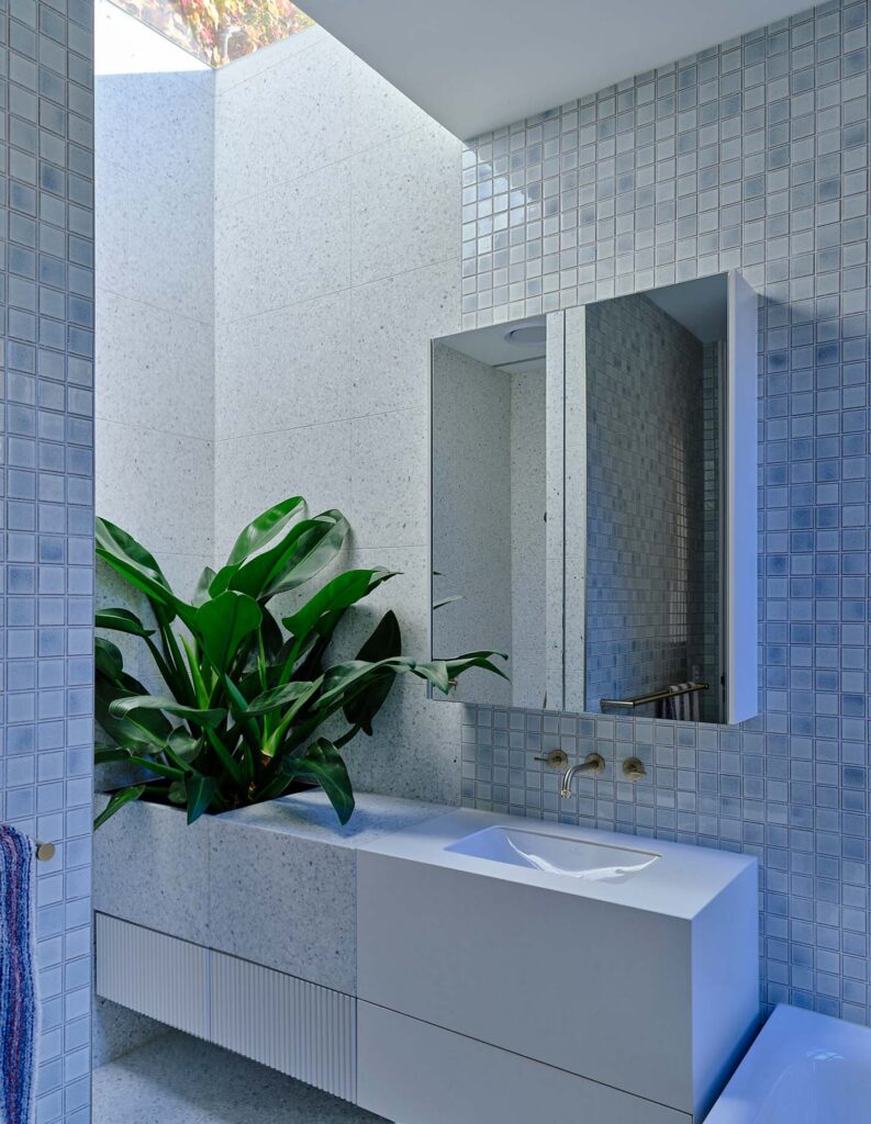
At the rear house, the indoor planter in the bathroom is a standout. It sits directly beneath a custom skylight and receives exactly the right light intensity for lush, subtropical planting.
But it is the studio that really gets us. You reach the top of the stairs and feel as though you have stepped into an entirely different building: a genuine professional art studio that feels nothing like the home below it.