
Timothy Alouani-Roby: Can you please first set out some context — where is the project and who is it for?
POCO Designs team: This is the Director of POCO Designs, Poppy Tzaneros’ former home. It is located in Bellevue Hill, Sydney.
Materiality seems to be really important. Let’s start with stone — how and why have these finishes been chosen?
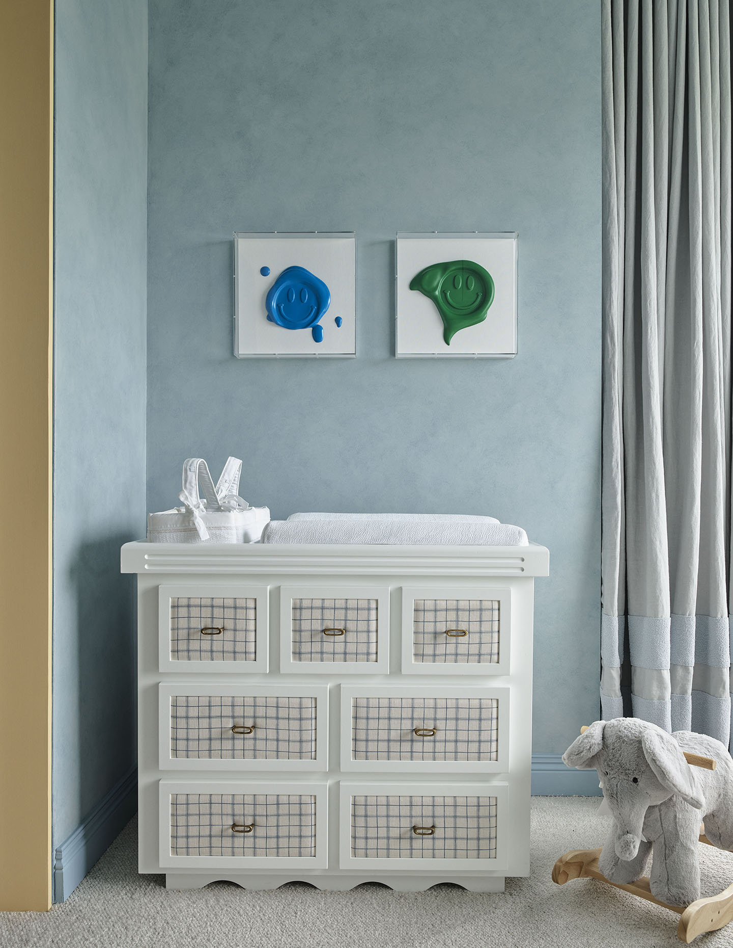
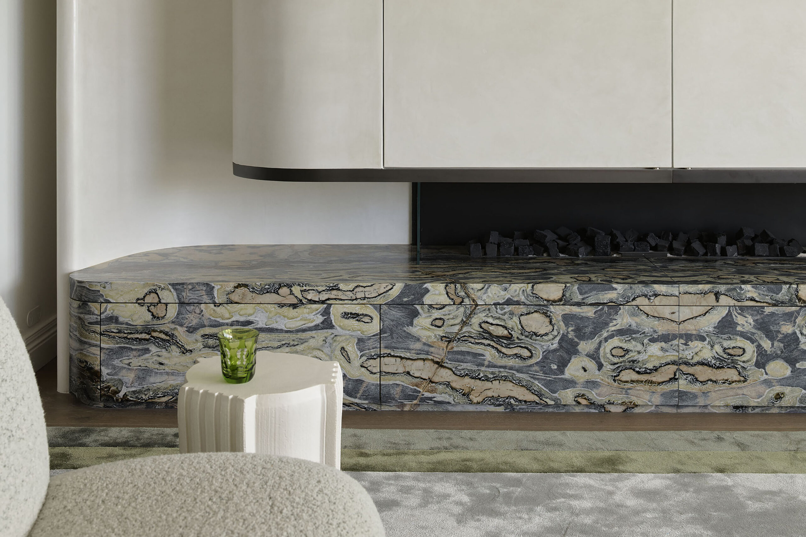
The base colour palette of this design was heavily influenced by Poppy’s favourite tones of blue and green. The bold and unique use of stones are an expression of Poppy’s personal style.
We started with blue and green as a base then built upon that, through the introduction of contrast burnt copper tones to add warmth and ground the scheme.
How do you decide which stone finishes are appropriate for which space/use?
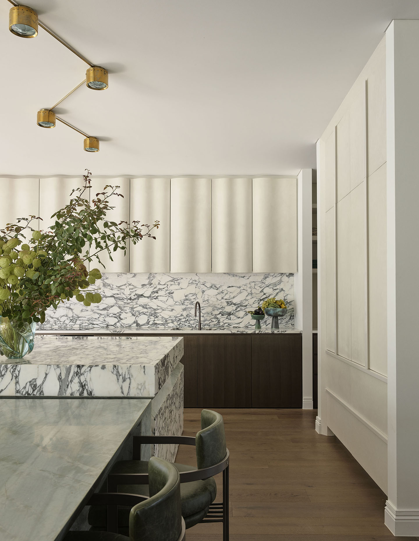
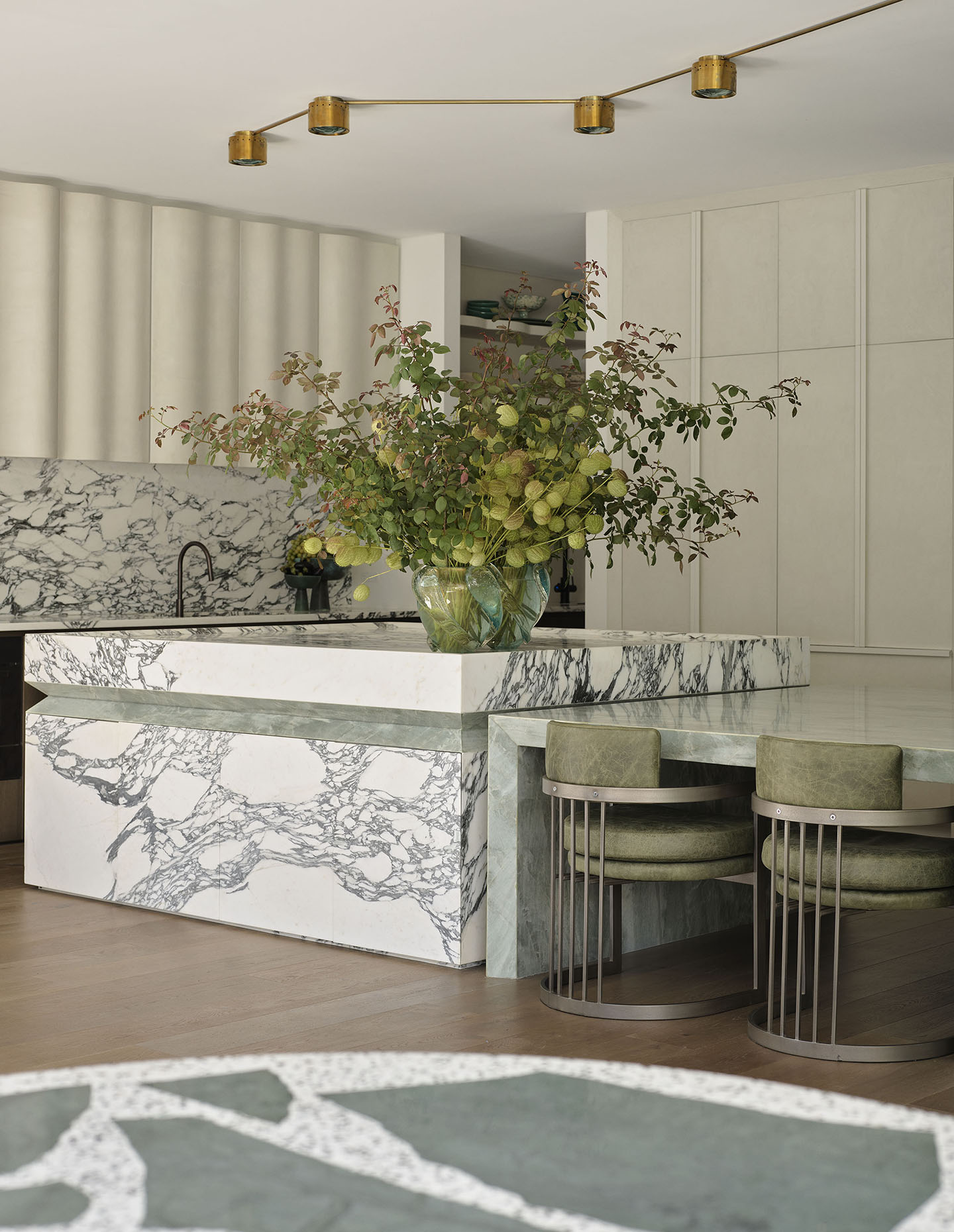
We used a classic Arabescato Vagli marble in the kitchen to add relief from the bold tones throughout. We then layered the soft green Esmeralda Quartzite in the casual dining, which added a durable element in a high use area, perfect for a growing family.
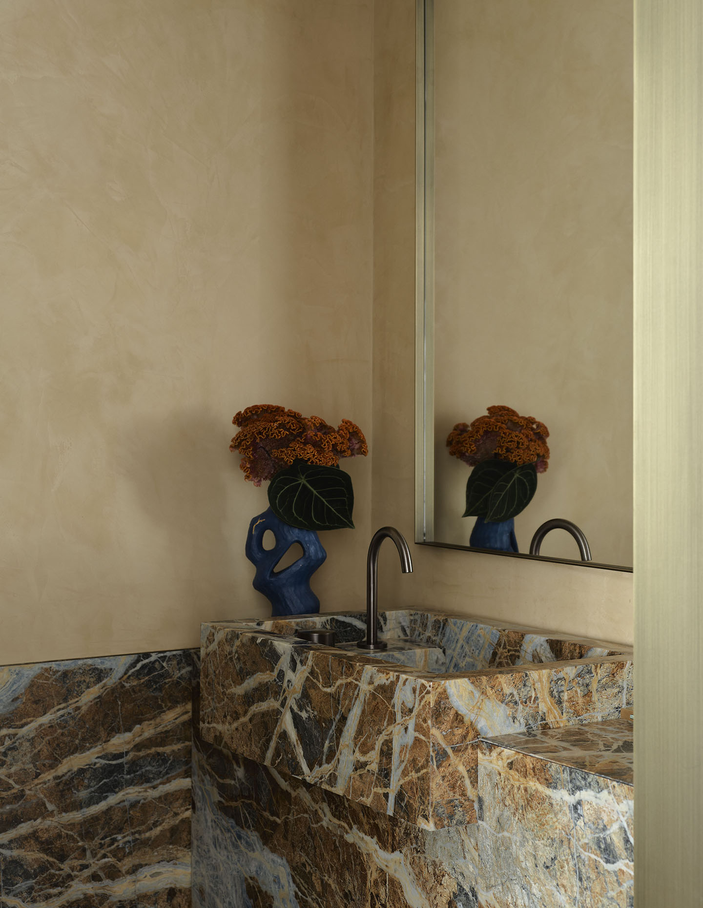
For the powder room we used Blue Dreams Marble to create an element of surprise. We then added a rich layer of butter yellow microcement to the walls, that wrapped up around the ceiling to add a cocoon-like feeling.
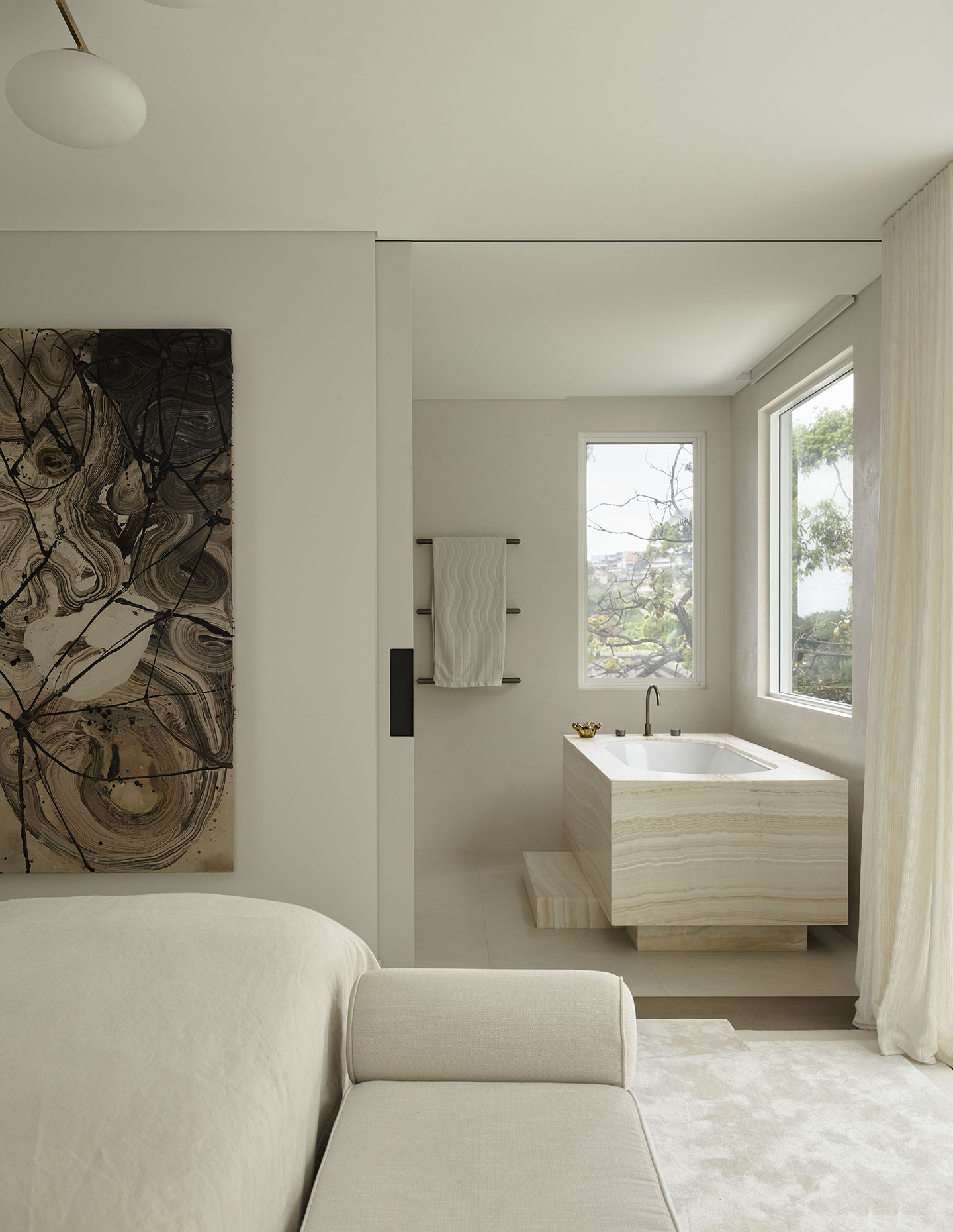
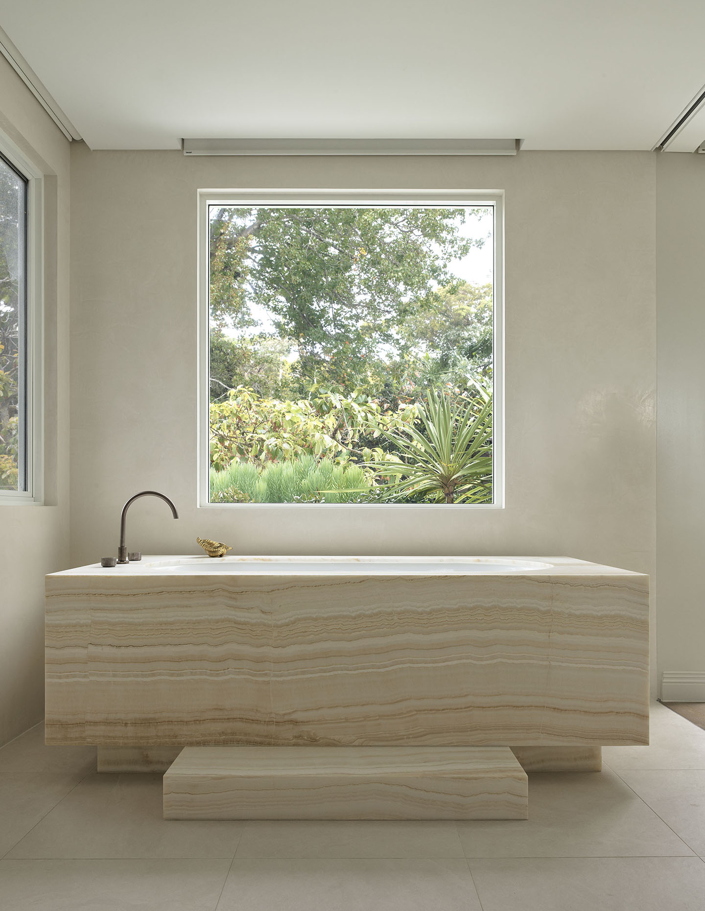
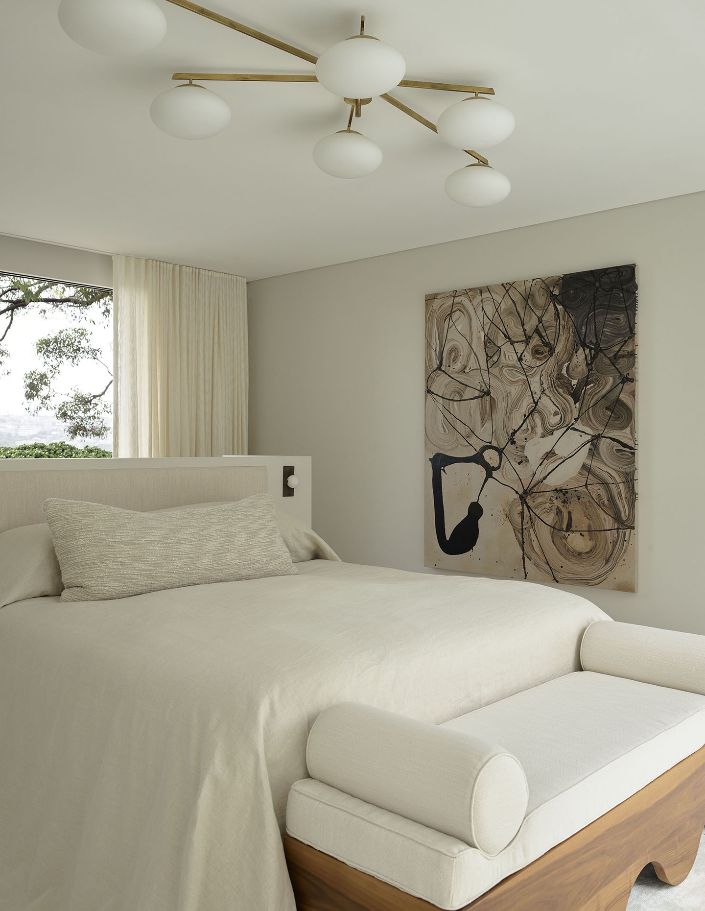
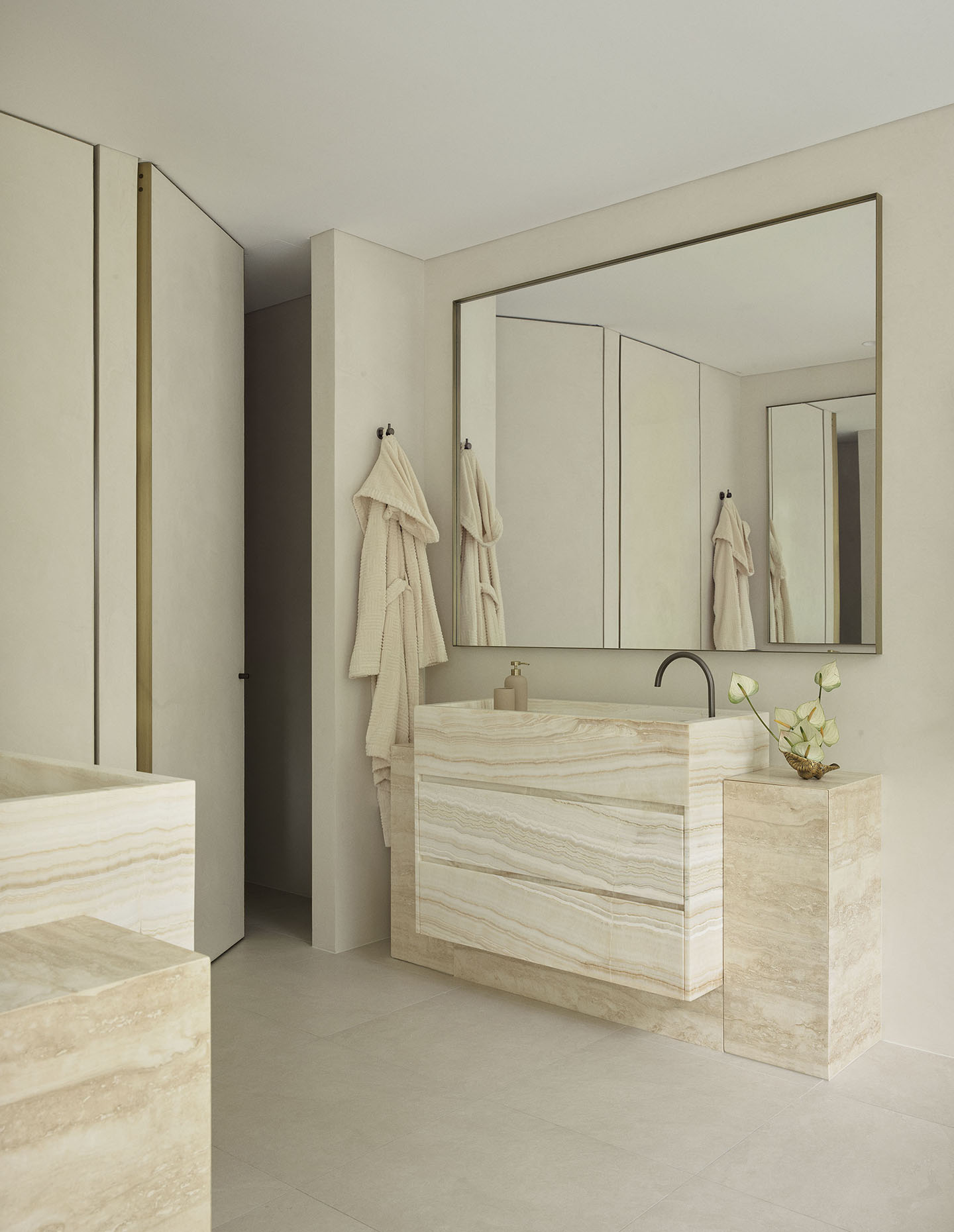
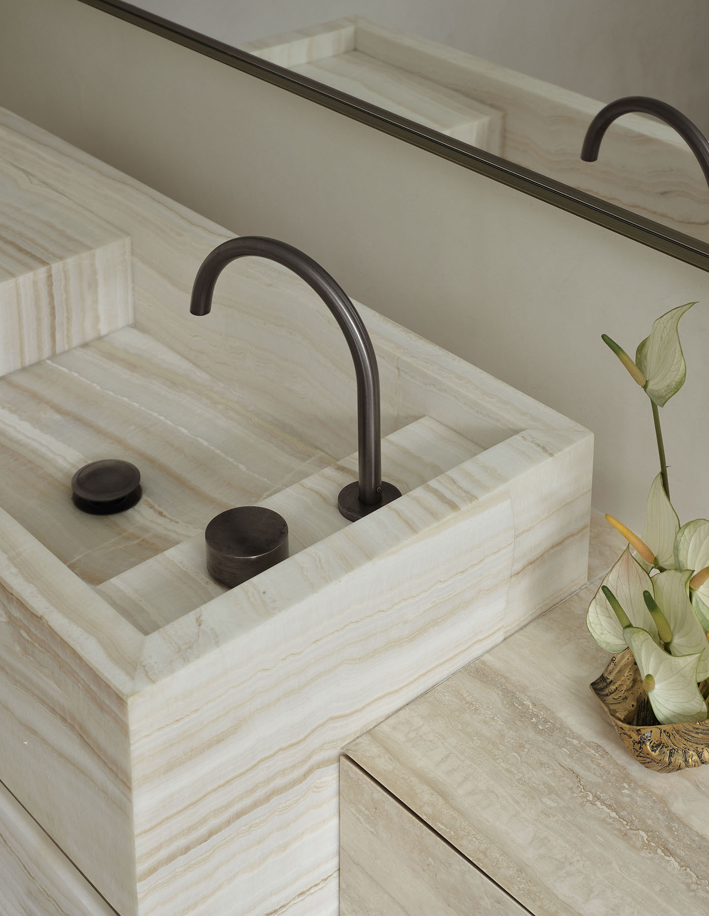
The master suite is a place of retreat. We went with a restorative palette, pairing Ivory Onyx with Travertine to evoke a sense of serenity.
Related: Another focus feature, with Mather Beere
How about colour and texture more generally?
Colour is the strongest element of the design, taking precedence over texture.
We used a restrained base palette, balanced with polished plaster which introduced subtle movement throughout. Each space was thoughtfully composed around intentional stone and colour selection to create visual interest and depth. Soft furnishings and bespoke rugs were the element of texture in the design.
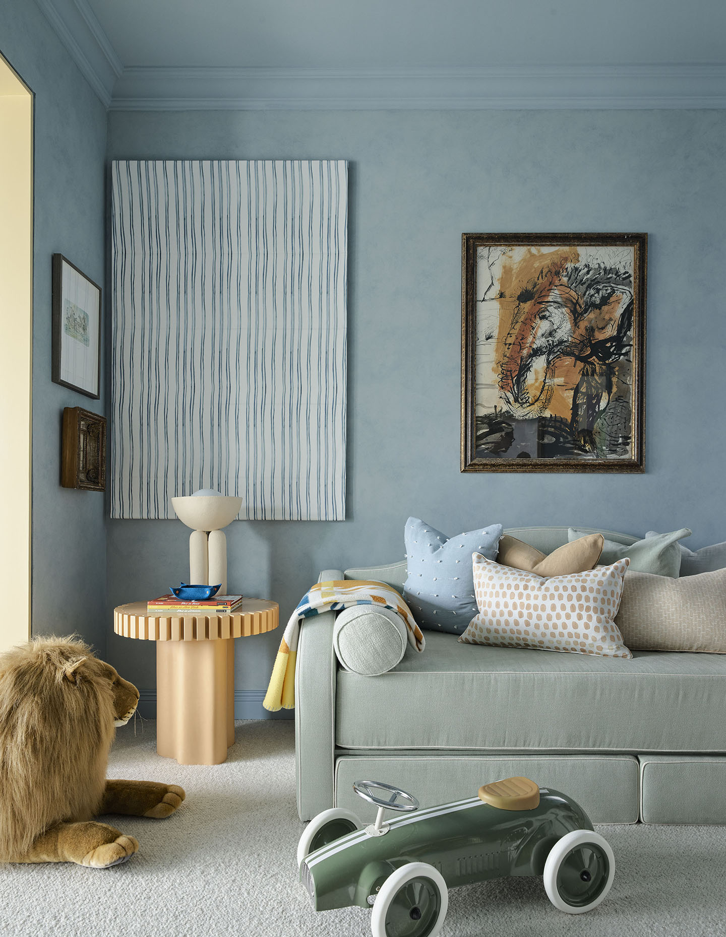
How do colour, texture and materiality relate to the overall architectural form?
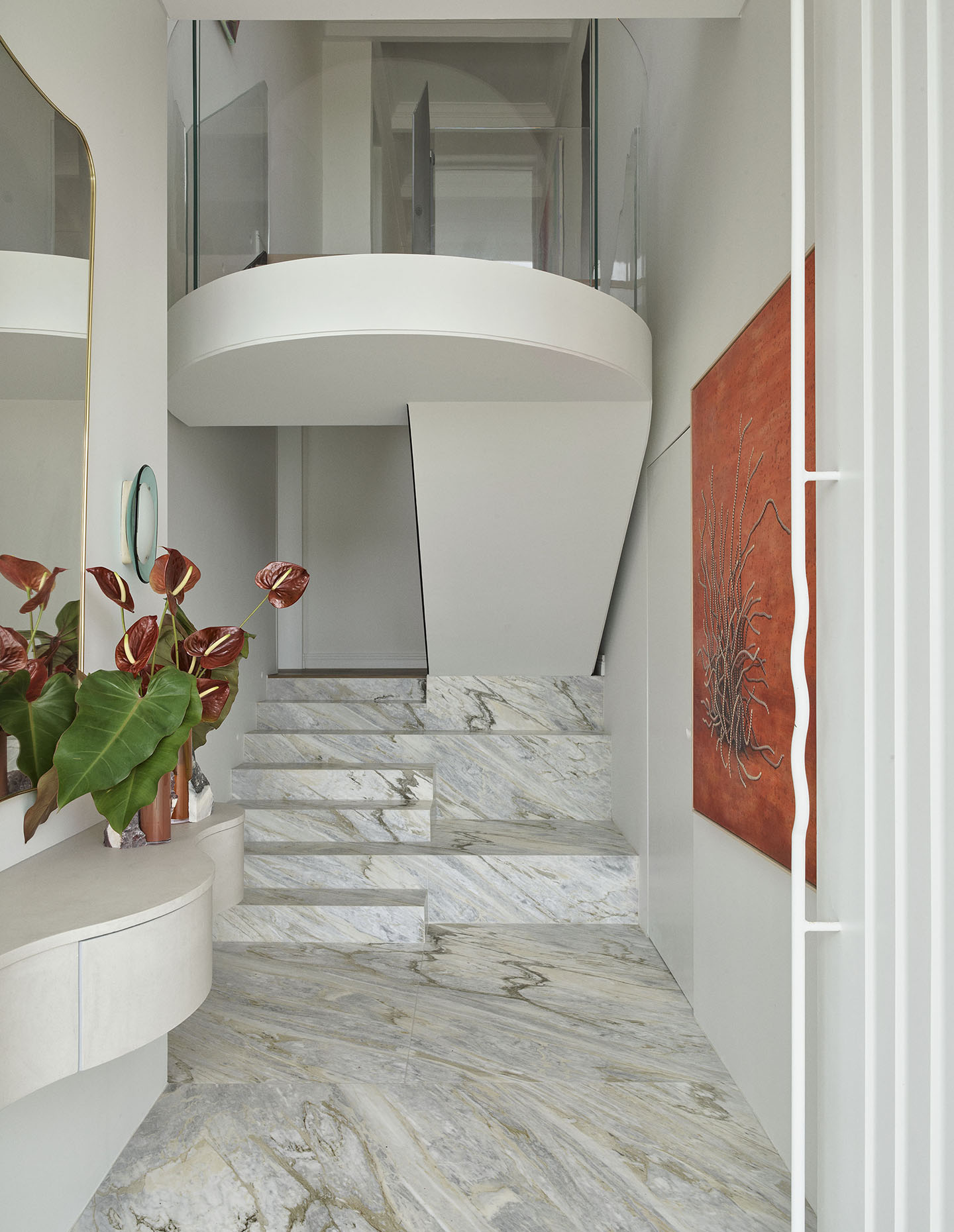
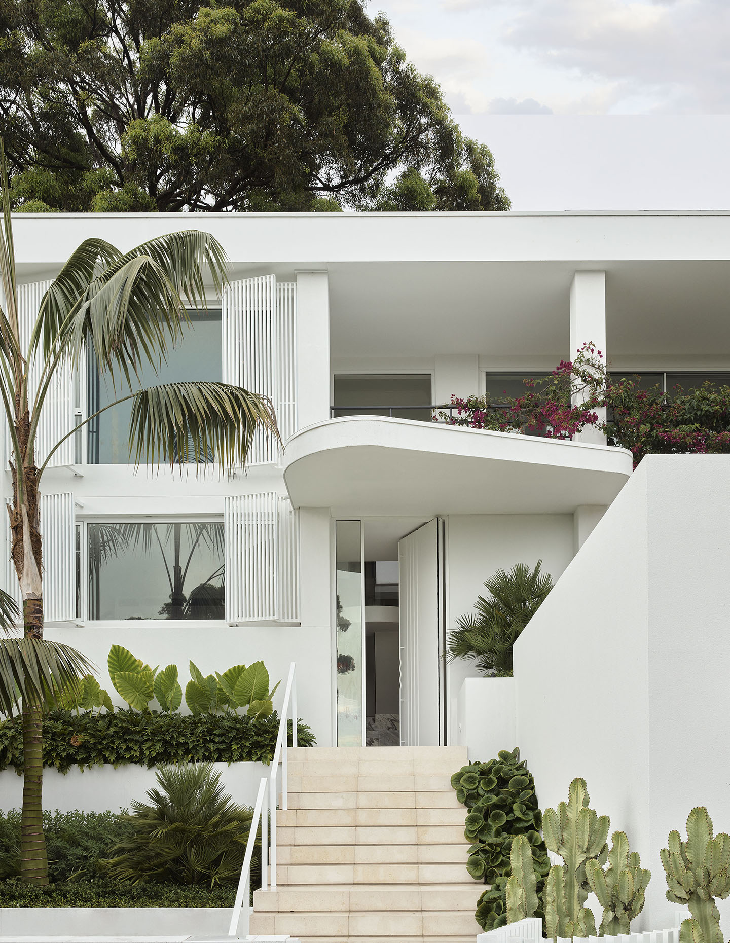
The organic curves and strong horizontal lines of the façade are echoed throughout the interiors, reflected through bespoke joinery details and custom-designed rugs. This subtle repetition creates a sense of continuity, allowing the architecture to flow effortlessly from the exterior to the spaces within.
Equally important was establishing a cohesive dialogue between the landscape and the interior palette. The colour selection was carefully considered to draw the outdoors in, creating a seamless transition between the built environment and its natural surroundings while reinforcing a calm, harmonious atmosphere.
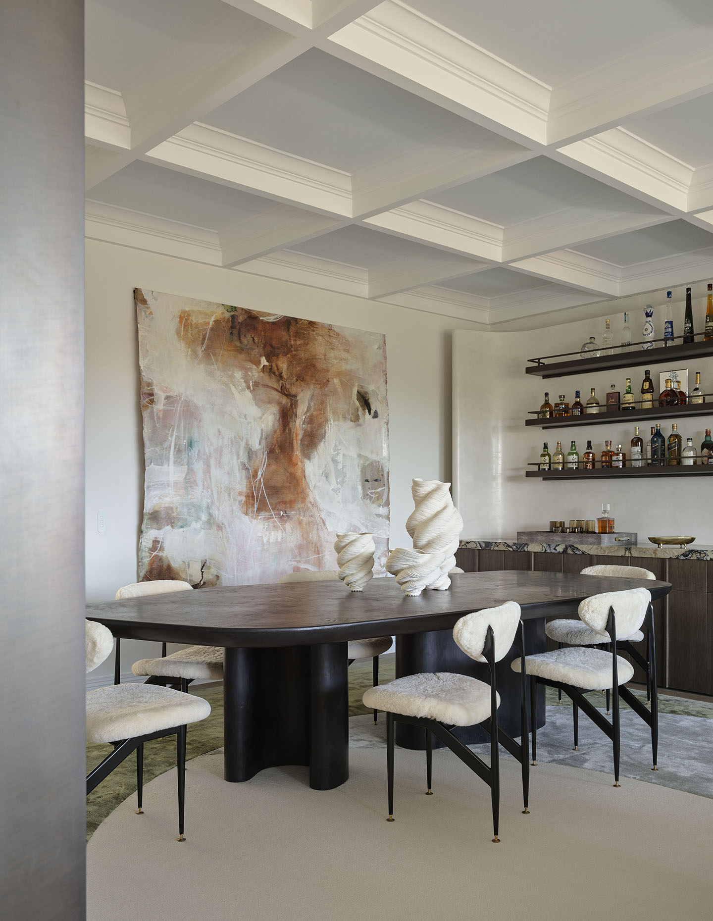
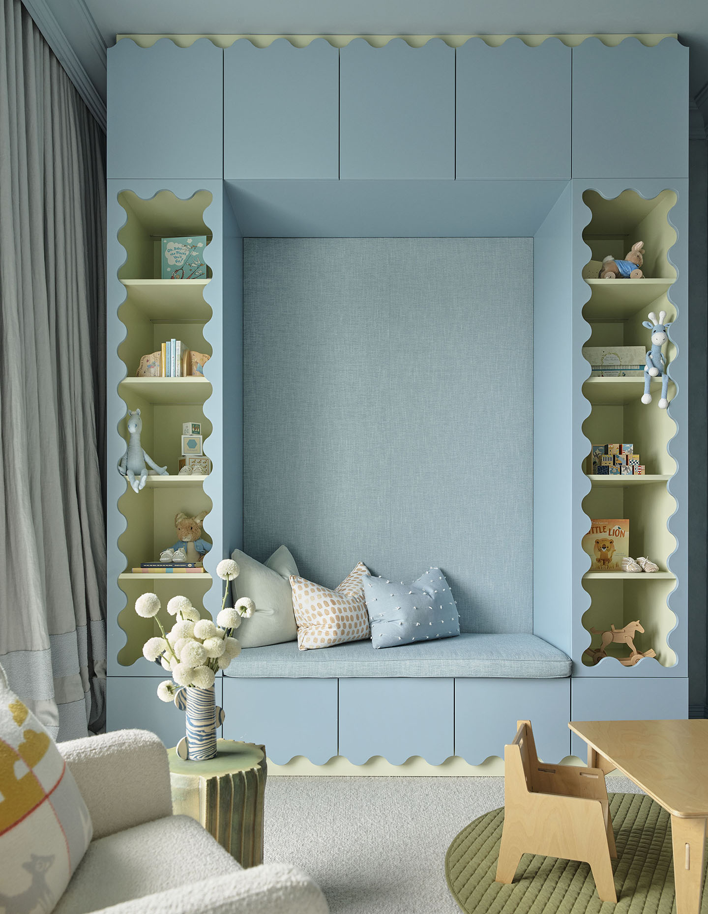
What are your favourite moments or parts of the design?
The oversized, multifunctional island stands proudly at the heart of the kitchen, seamlessly connecting to the casual dining area. As both a sculptural focal point and a functional worktop, it perfectly balances aesthetics and practicality for the everyday rhythms of family life.
Any special furniture mentions to finish?
A considered mix of vintage finds, bespoke pieces and iconic design classics were curated to create a home that feels both layered and timeless. Each piece was selected not only for its individual character, but for the way it contributes to the overall narrative of the interiors.
Some standout pieces include:
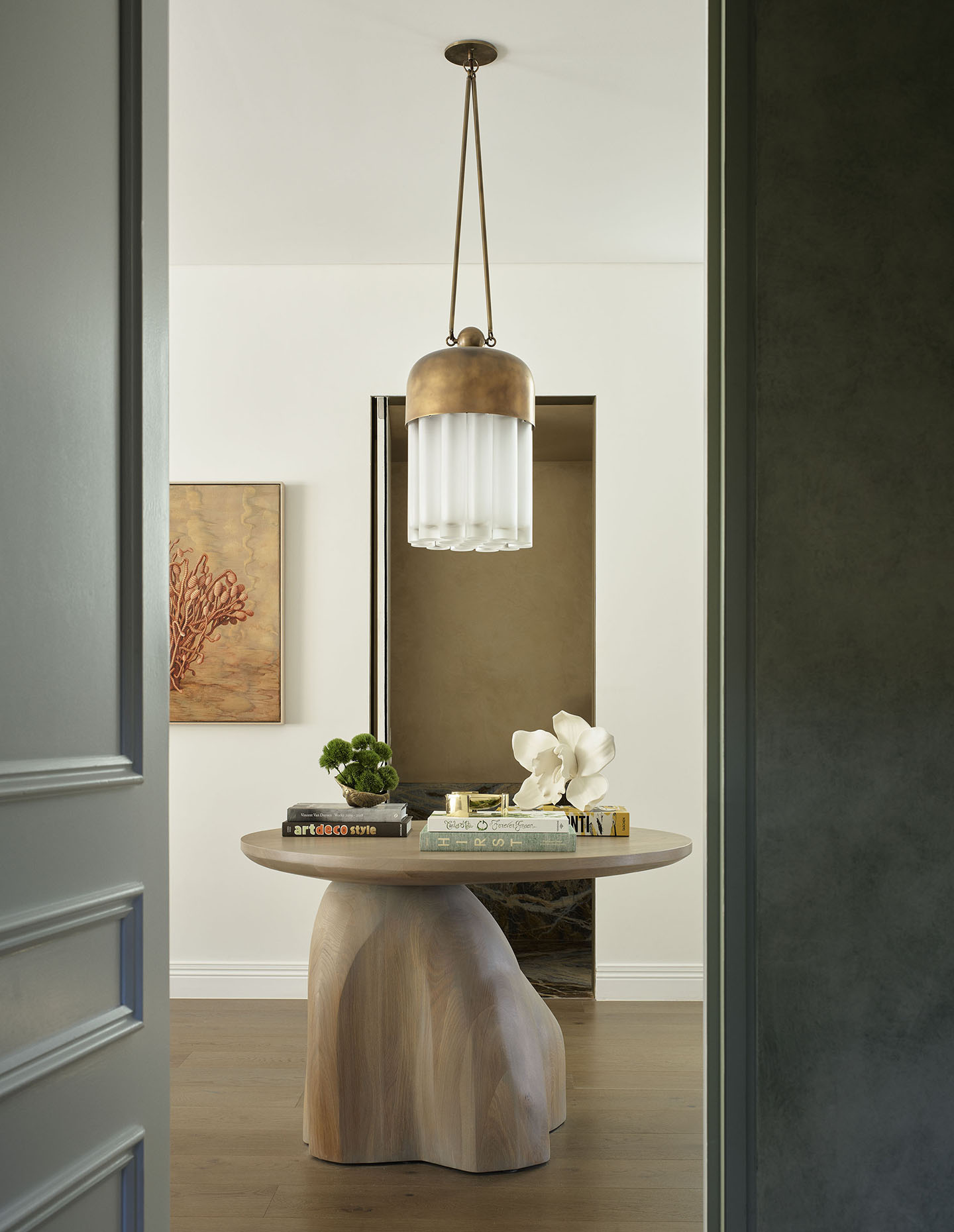
The entry hallway creating a striking first impression through the Alpha Occasional Centre Table by the talented Dimitri Vargas paired with the Tassel : 19 Pendant by Apparatus;
The iconic B&B Italia Camaleonda sofa, bringing both comfort and unmistakable design pedigree to the living space;
A vintage glass coffee table sourced from 1st Dibs, which adds a sense of history to the contemporary interiors.