With Guest Editor Yasmine Ghoniem, we are launched headfirst into the world of unique and eclectic design. From architecture to interiors, there is nothing that can’t be enlivened with bespoke interventions. Granted, a stunningly beautiful home can be made by simply shopping for the best, but when the artist’s hand is introduced, some pure magic is possible. Whether it is an artwork or a new upholstery, a built-in component or a mosaic inlay, these gestures, whether bold or subtle, are what make the home unique.
Heartly and Pryor State transform a modest Mitcham weatherboard into a layered family home, balancing minimalist architectural restraint with earthy colour, tactile finishes and carefully framed garden connections.
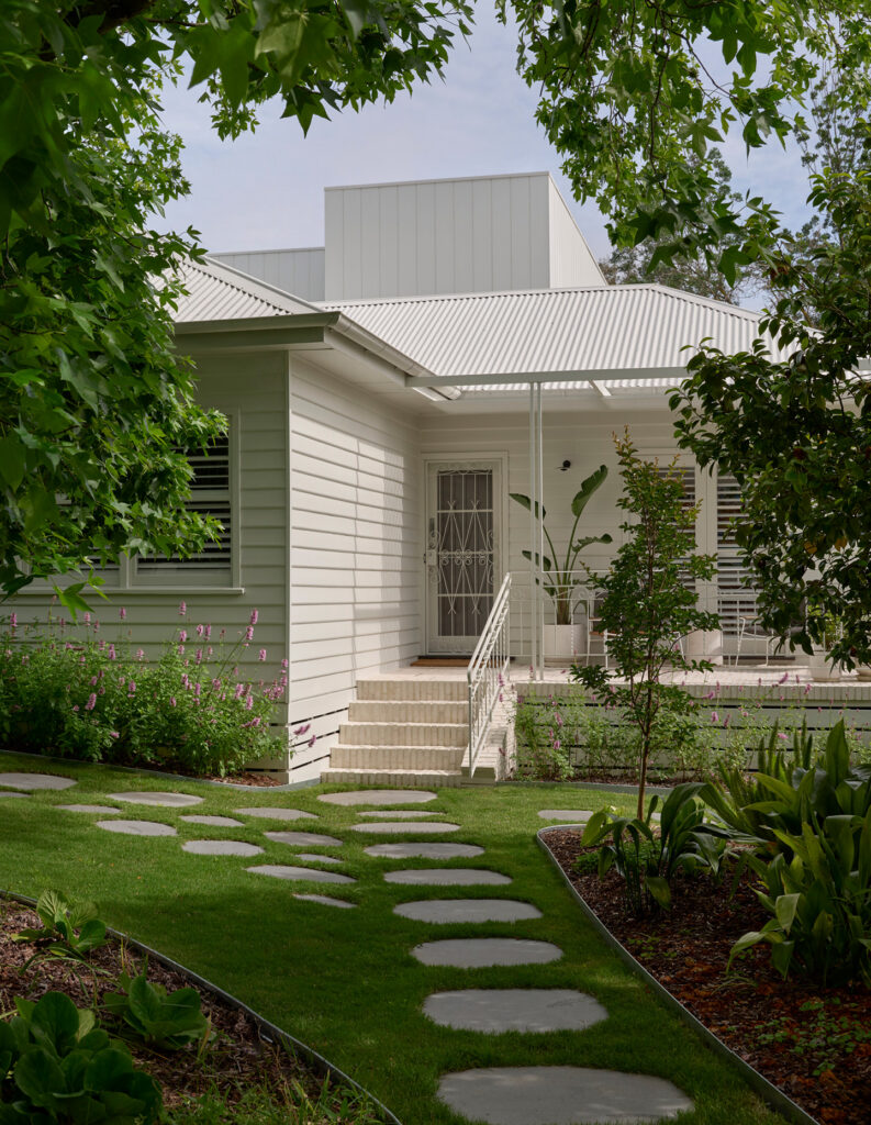
Set within an established residential street in Mitcham, Melbourne, McMaster House began as a quintessential 1950s weatherboard home with a deep garden and a strong local presence. Built by the McMaster family in 1950, the original house sits among a neighbourly streetscape close to the local primary school, with mature trees giving the site a sense of history.
For its new owners, Mitch and Corinne Pryor of Pryor State, the project was both personal and ambitious. Working in collaboration with Heartly, the brief was to create a home that felt cohesive, grounded and warm — but never ordinary. The result is a layered family home where the architectural language reflects colour, tactile materiality and moments of unexpected detail.
We spoke with Mikayla Rose, Principal of Heartly, and Mitch and Corinne Pryor, creative directors of Pryor State, about memory, material consistency and the value of pushing beyond the expected.
Can you tell us about the site context for McMaster House?
Mikayla Rose: McMaster House is in a neighbourly residential street, along with the local primary school, which is an important part of the community. Set back from the street with a large oak tree framing the deep garden, the original house was built by the McMaster family in 1950 and contributes to the historical context of the neighbourhood.
Mitch and Corinne Pryor: It is a reworking of a quintessential Australian 1950s weatherboard in Mitcham, Melbourne, set within an established suburban streetscape. The site has a relatively modest frontage but opens up through the depth of the block, which allowed us to focus on creating a strong internal connection between space, light and landscape.
What was the brief from the clients?
Mikayla Rose: Mitch and Corinne are experienced campaigners, having renovated a number of properties in the past. With this property, they wanted to create a carefully considered yet boundary-challenging home. They did not want ordinary.
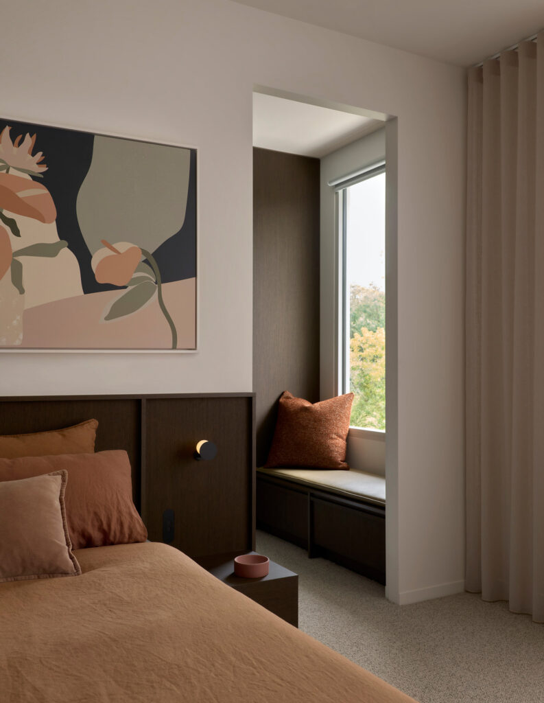
They embraced a consistent palette and minimalist restraint for the architecture, but wanted to see layered texture and rich, earthy colours in the interiors. I admire a lot about them, but mostly their intention to purposefully step outside the box and explore design possibilities — and their willingness to roll up their sleeves and do the hard work.
Mitch and Corinne Pryor: As both client and builder through Pryor State, the brief was inherently personal. The aim was to create a home that felt cohesive, warm and resolved, something that went beyond a new build and instead felt lived-in and grounded.
How did the collaboration between Heartly and Pryor State shape the outcome?
Mitch and Corinne Pryor: The brief evolved through ongoing conversations, centred around family living, material consistency and a desire to push beyond what we had achieved in previous projects. It was less about following a fixed idea and more about refining the outcome through collaboration.
What were the key material choices?
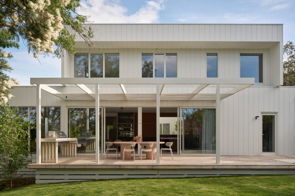
Mikayla Rose: Externally, cement sheet cladding was installed vertically with symmetrical spacing. It is economical, but architecturally striking.
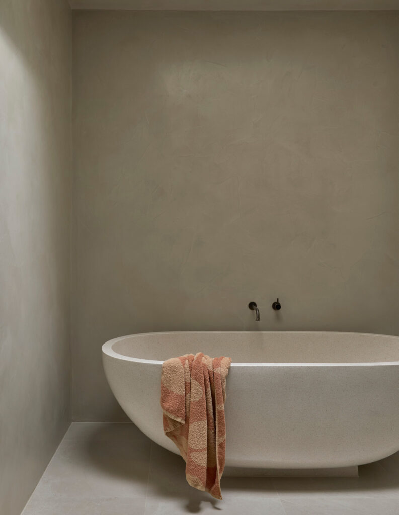
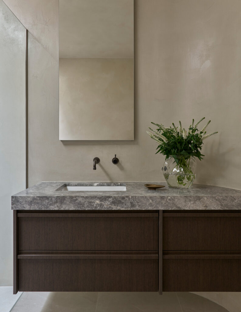
Inside, Venetian plaster and microcement are used in the wet areas. We have been using Venetian plaster for a long time because of the integrity, depth and character it adds.
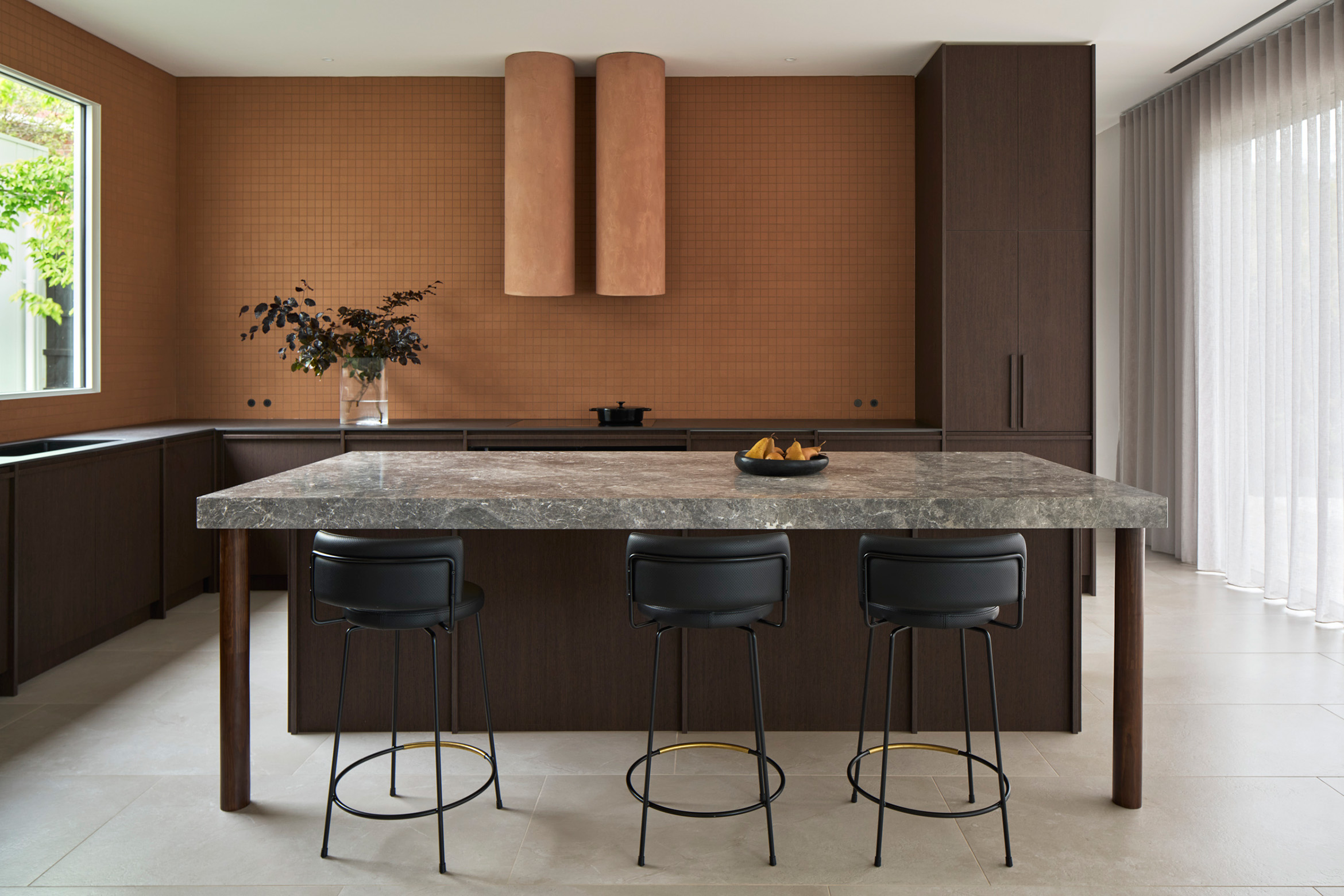
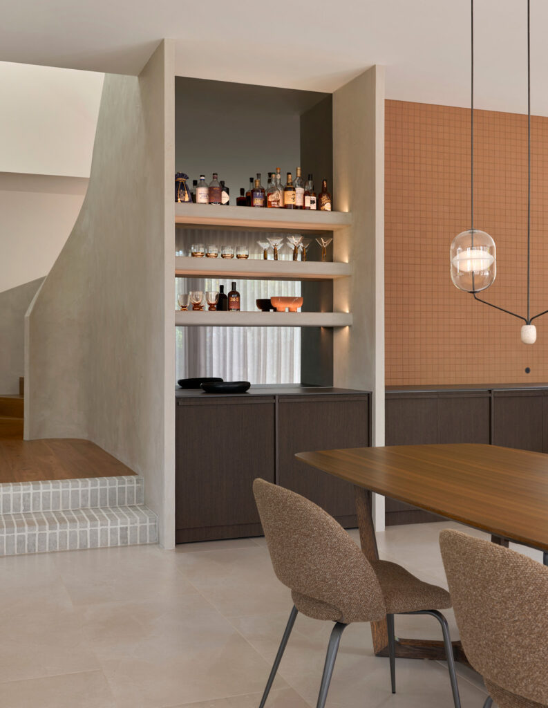
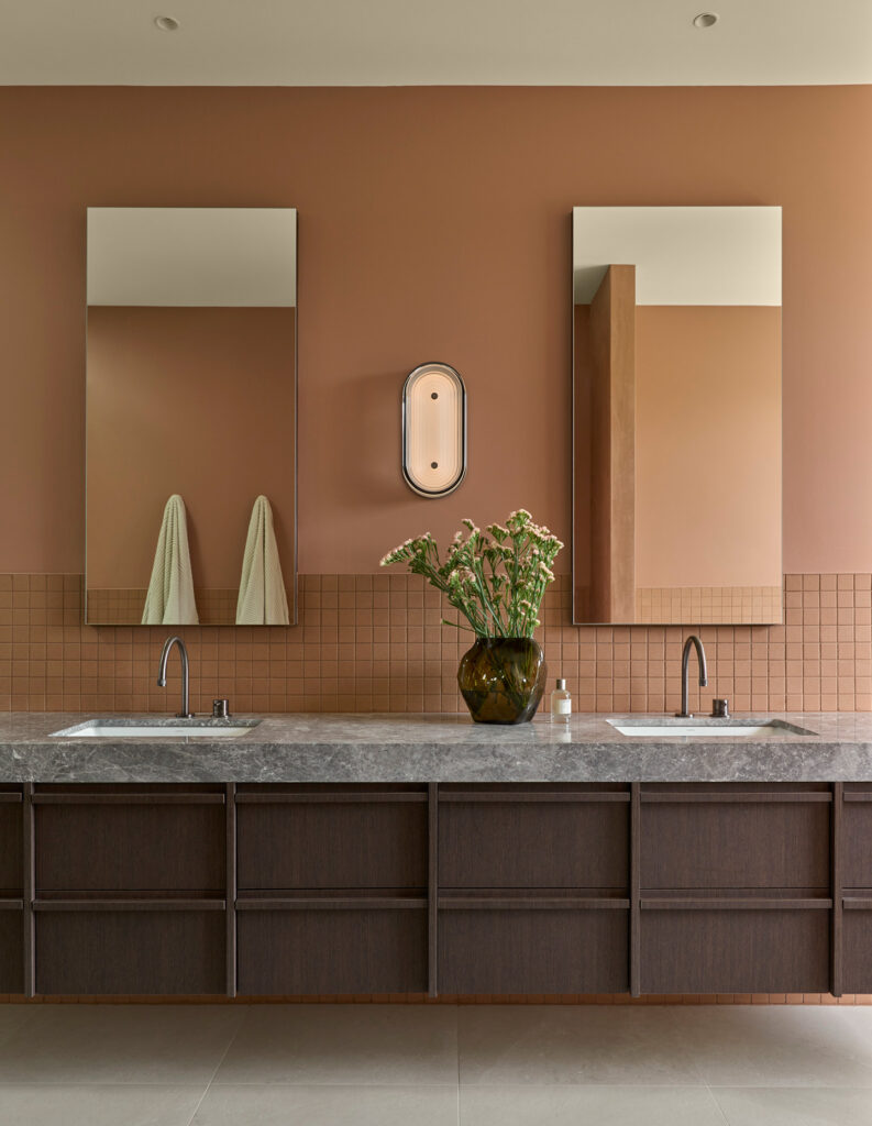
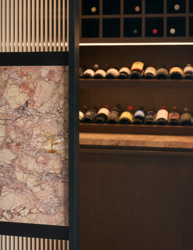
Japanese full-body textured mosaic tiles from INAX through Artedomus were also important. They are installed with consistently coloured grout to create colour blocking and textural delight.
Mitch and Corinne Pryor: More broadly, the home is built around a warm and grounded palette of natural stone, porcelain surfaces, microcement finishes and deep, dark timber joinery. Rather than feeling minimal or overly restrained, it leans into a rich brown tonal palette, creating spaces that feel inviting, layered and genuinely lived-in.
What functional requirements did the design need to address?
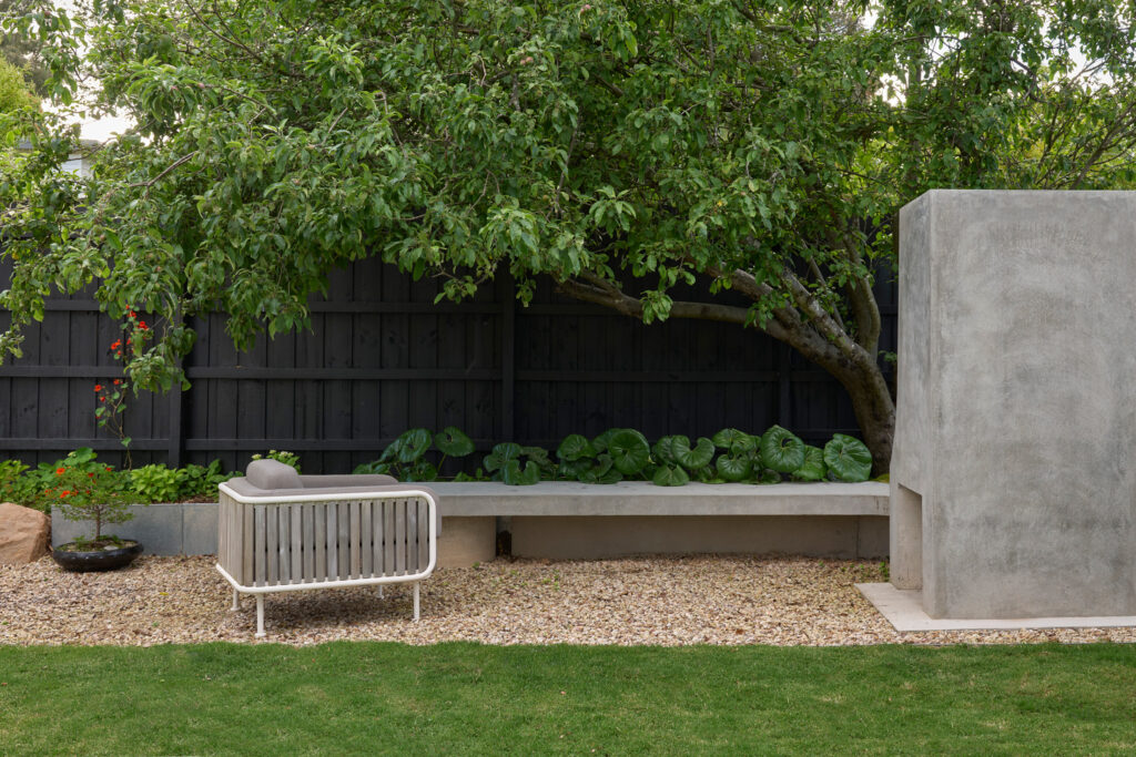
Mikayla Rose: The home needed to support modern family living while maintaining architectural clarity. Open-plan living was important, but so was creating multiple aspects to the garden.
Budget limitations meant that not every design recommendation could be realised, but there were a number of critical features we were able to get over the line that contribute to the success of the project. For example, while the open-plan living area is a simple rectangular shape, its connection to both the courtyard and rear garden sets the house apart.
I love the view from the kitchen across the courtyard back to the study. It helps make the spaces, across what is quite a large home, feel connected and grounded.
Mitch and Corinne Pryor: Functionally, the integration of lighting, automation and audio-visual systems plays a significant role, ensuring the home performs efficiently while maintaining a clean and minimal aesthetic.
How did the original house influence the new work?
Mitch and Corinne Pryor: Structurally, the project balances the retention of the original dwelling with a contemporary extension. Rather than creating a hard contrast between old and new, the focus was on making the transition feel deliberate and resolved.
Mikayla Rose: That sense of continuity was important. The home needed to feel calm and cohesive, with the architecture, interiors, lighting and material palette working together rather than competing.
Are there any particular moments in the design that stand out for you?
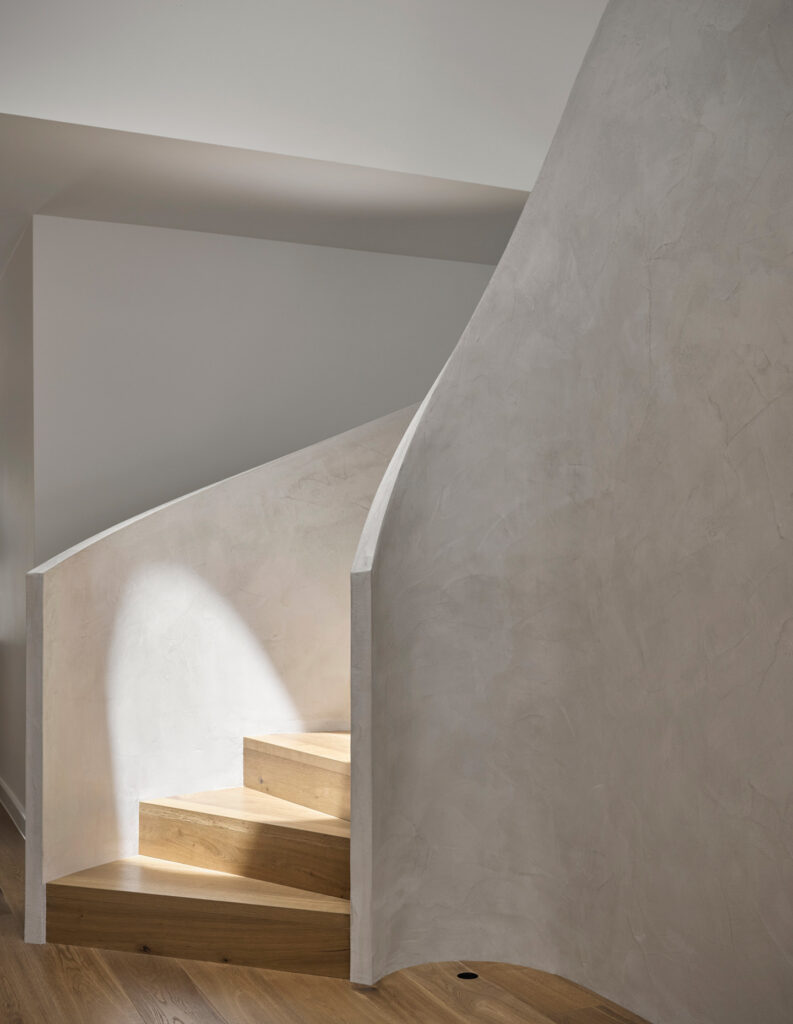
Mikayla Rose: I love the spiral staircase. That was Mitch’s idea, but at the top we added a simple curved inlay of natural stone in the floor to guide passage to the master suite.
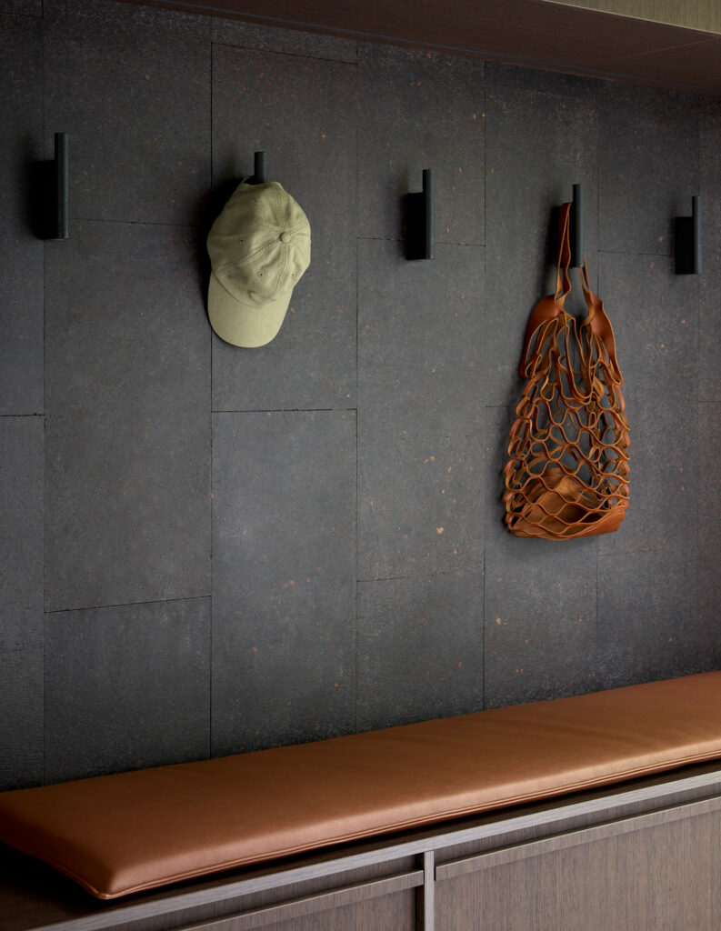
Another favourite moment is the cork lining the wall of the mudroom, as well as the precisely cut and inlaid stone flush plate for the powder room. We could not find a toilet flush plate that would do the room justice. Mitch asked what I would want it to be and, with such a broad invitation, I said stone cut from within the same slab — not realising he would actually be able to make that happen.
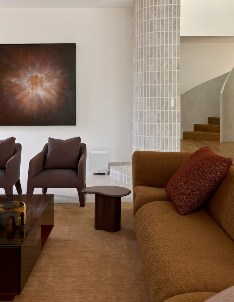
Mitch and Corinne Pryor: The red bathroom and powder room stand out as more expressive moments within an otherwise controlled palette, showing how colour and texture can be used in a very intentional way.
What gives the home its character?
Mikayla Rose: For me, it is the consistency. The materials, lighting and proportions all work together to create a calm and considered experience. There is restraint, but also richness. The home feels warm, tactile and grounded, with enough unexpected detail to make it feel personal.
With Guest Editor Yasmine Ghoniem, we are launched headfirst into the world of unique and eclectic design. From architecture to interiors, there is nothing that can’t be enlivened with bespoke interventions. Granted, a stunningly beautiful home can be made by simply shopping for the best, but when the artist’s hand is introduced, some pure magic is possible. Whether it is an artwork or a new upholstery, a built-in component or a mosaic inlay, these gestures, whether bold or subtle, are what make the home unique.