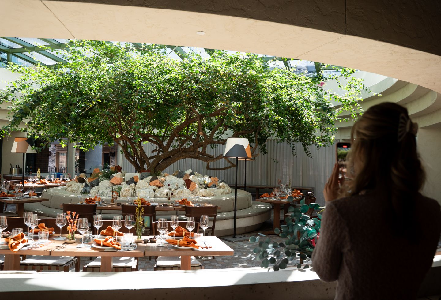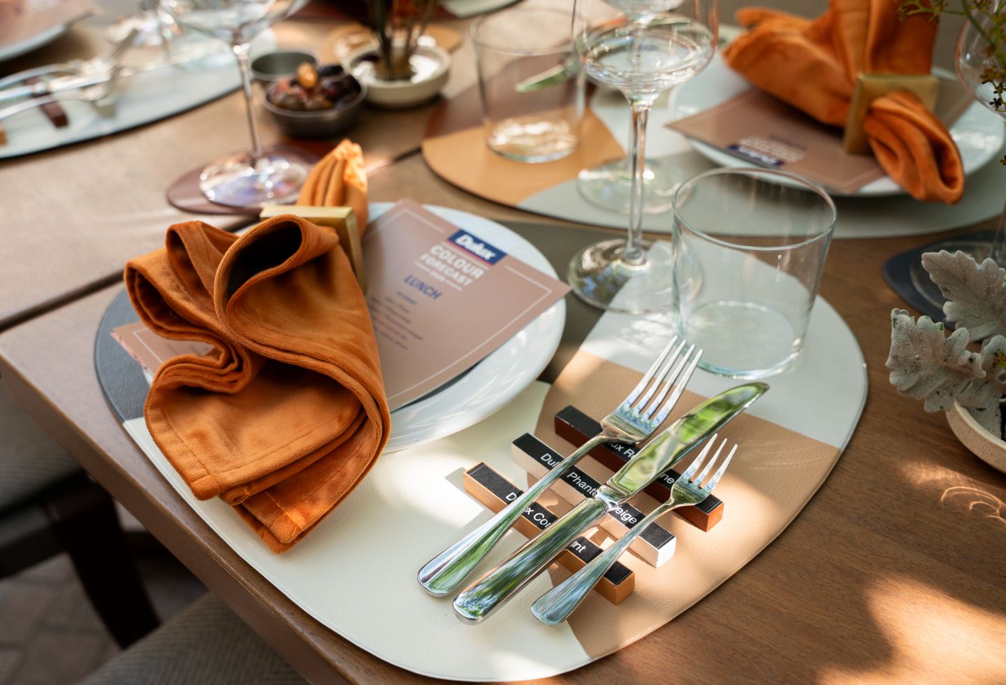
Since its inception in 1999, the Dulux Colour Forecast has provided a reference point for designers, architects and homeowners, drawing on global research and design insights.
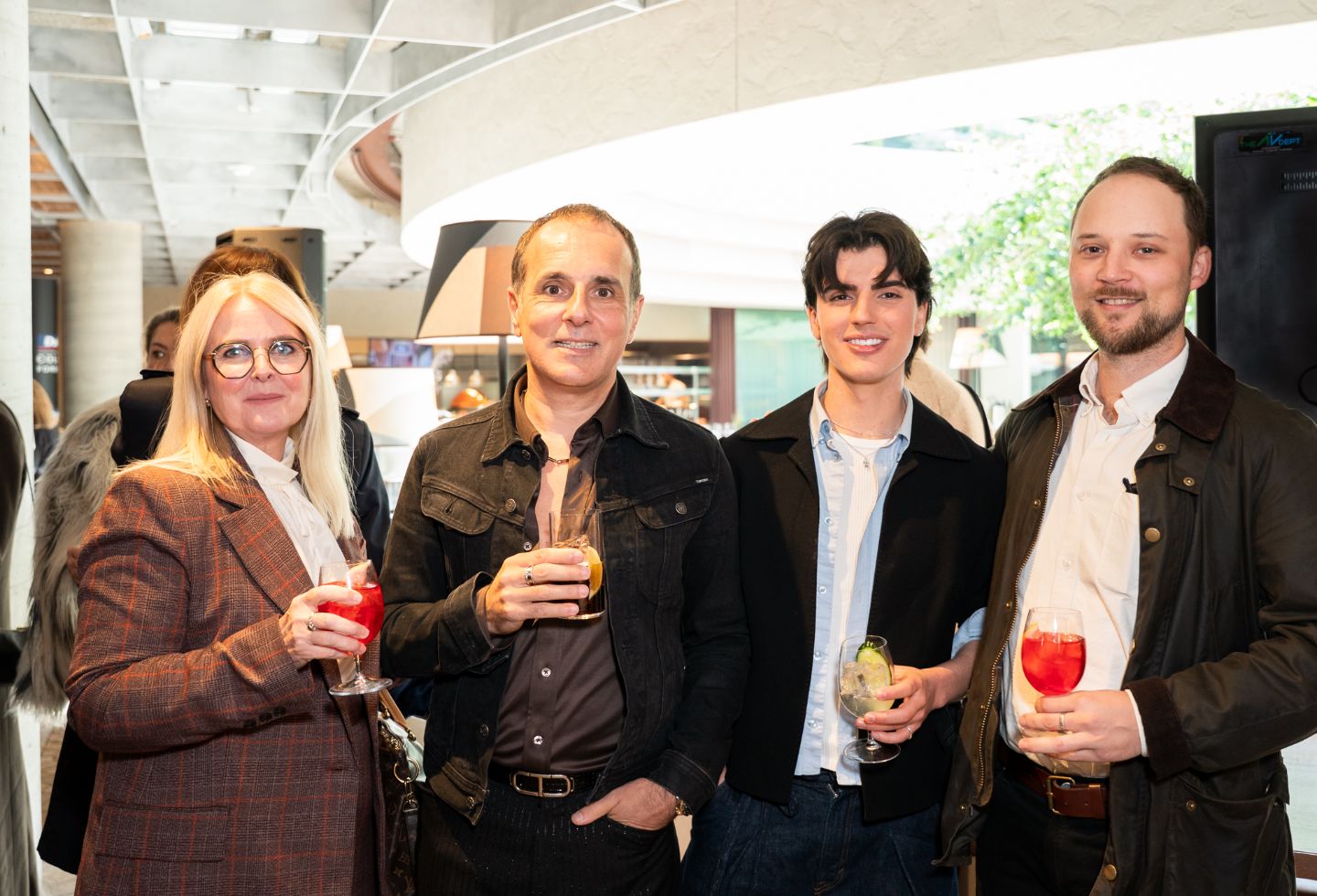
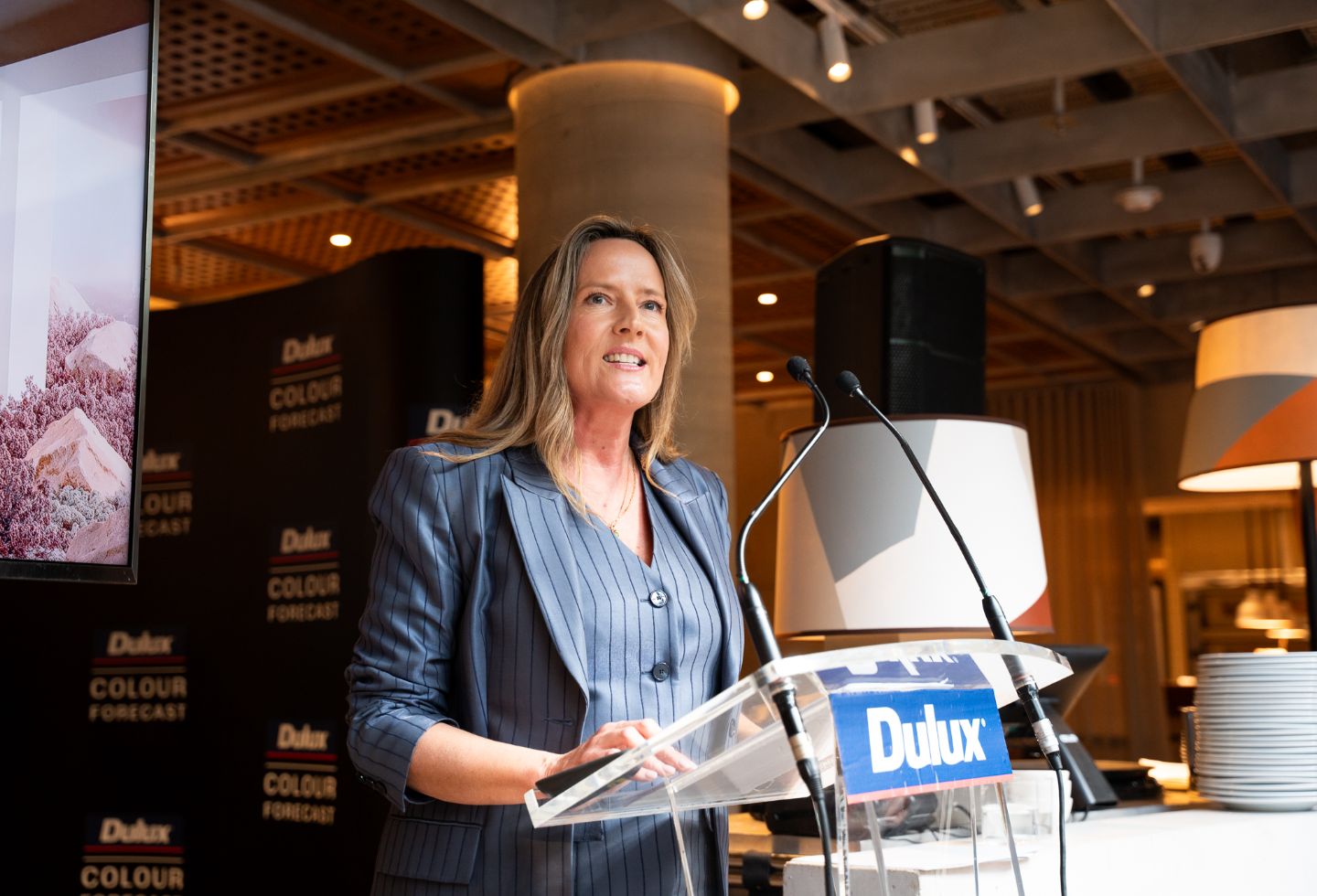
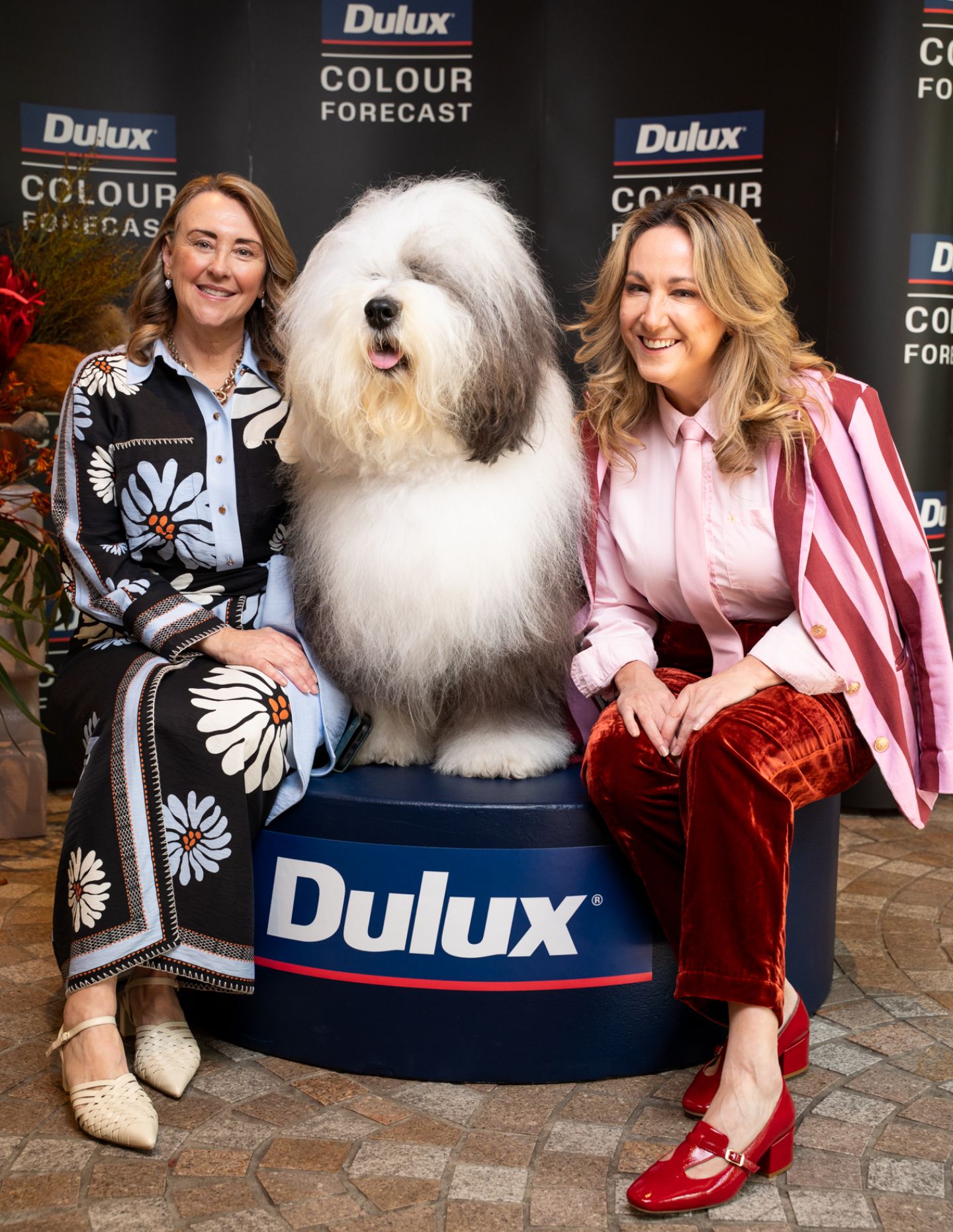
Led by Dulux Colour and Design Manager Lauren Treloar and Colour and Communications Manager Andrea Lucena-Orr, the 2026 forecast was presented as a response to contemporary pressures such as digital fatigue and cost-of-living challenges.
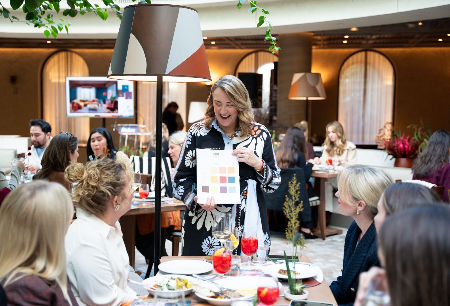
“Australians are feeling digitally overwhelmed,” says Lucena-Orr (pictured below). “There’s a strong shift towards emotional reconnection – with ourselves, with others and with nature. This translates into a need for warm, calming interiors that encourage reflection and joy.”
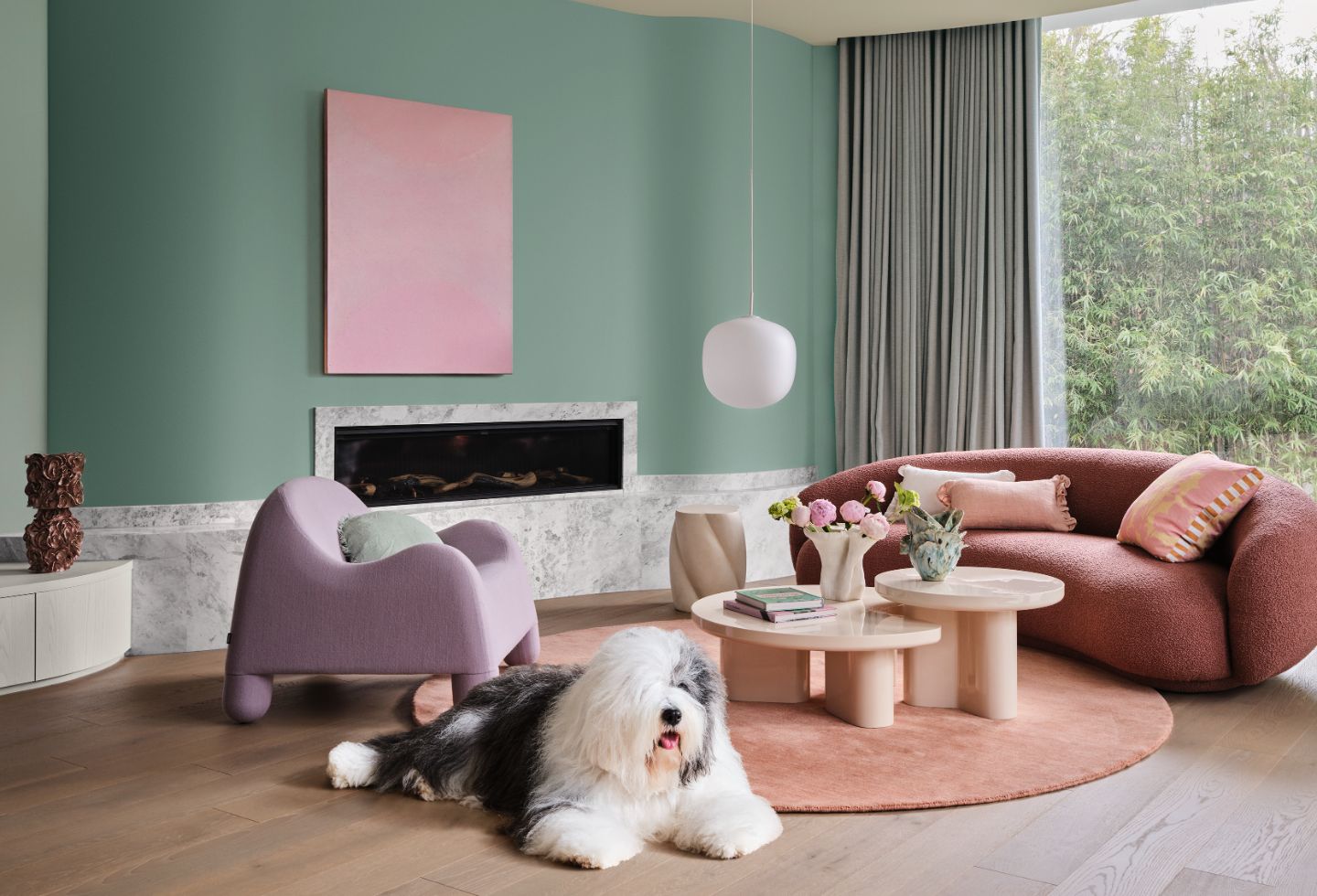
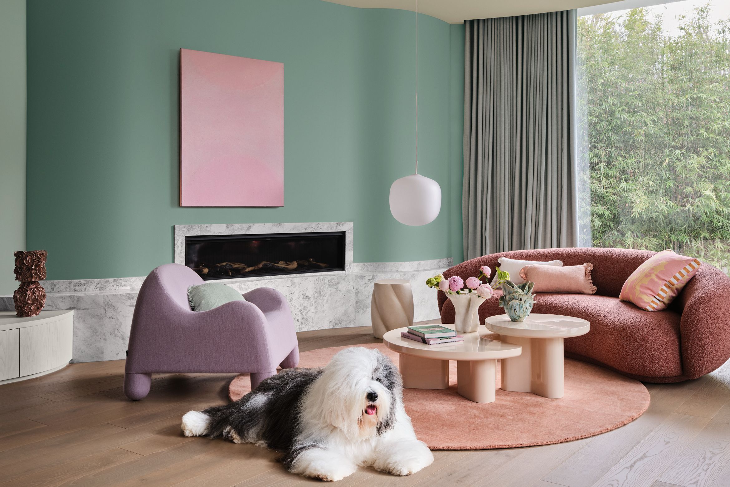
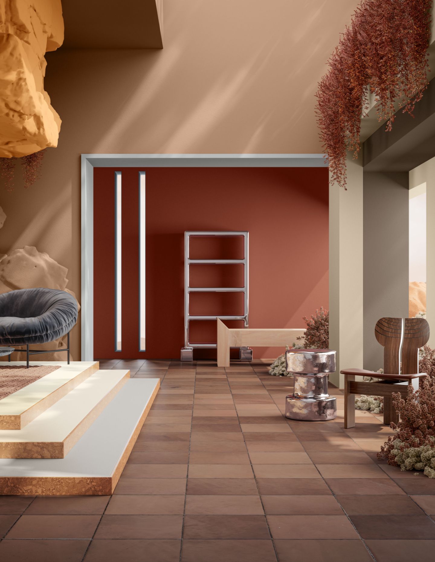
The first of the three schemes, Ethereal, is described as a soft and whimsical palette inspired by fantasy, nature and restorative rituals. Pastel greens, mauves and blush pinks such as Dulux Savin, Different Pink and Soft Fresco create a tender, romantic mood.
“Dulux Ethereal features a delicate pastel-like blend of soft and mid-tone hues – gentle greens, mauves, and blush pinks – that evoke a sense of serenity and joy,” notes Lucena-Orr.
Treloar adds: “The materials feel soft and inviting – like soft oak, bleached wood and plush fabrics with gentle botanical designs. Shiny surfaces like glass and chrome bring light, whilst sand-blasted textures soften the shine, creating a dreamy, layered look.”
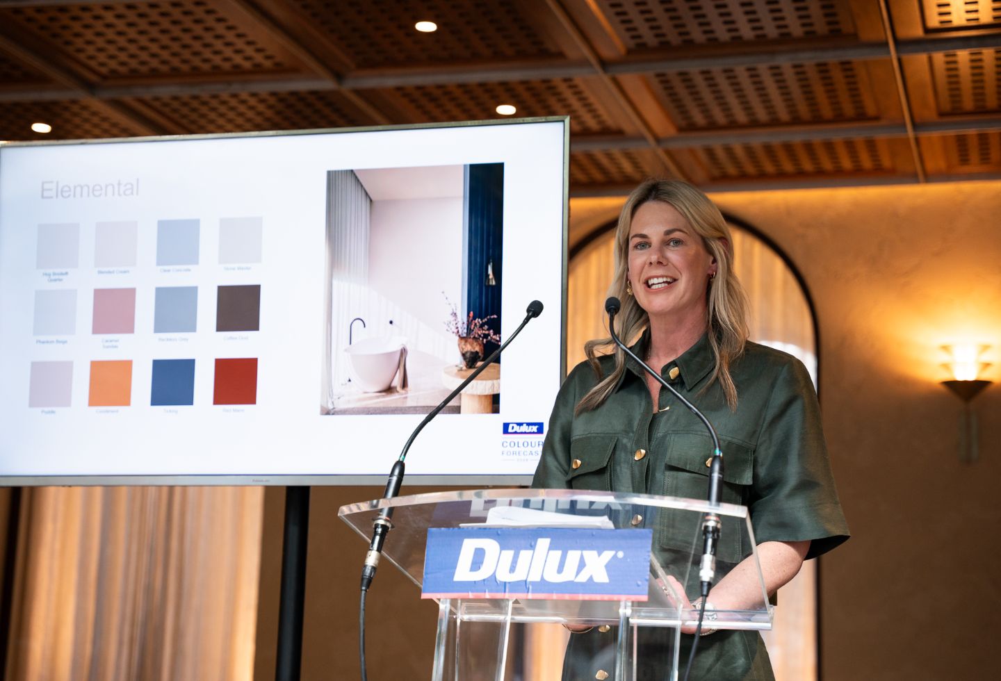
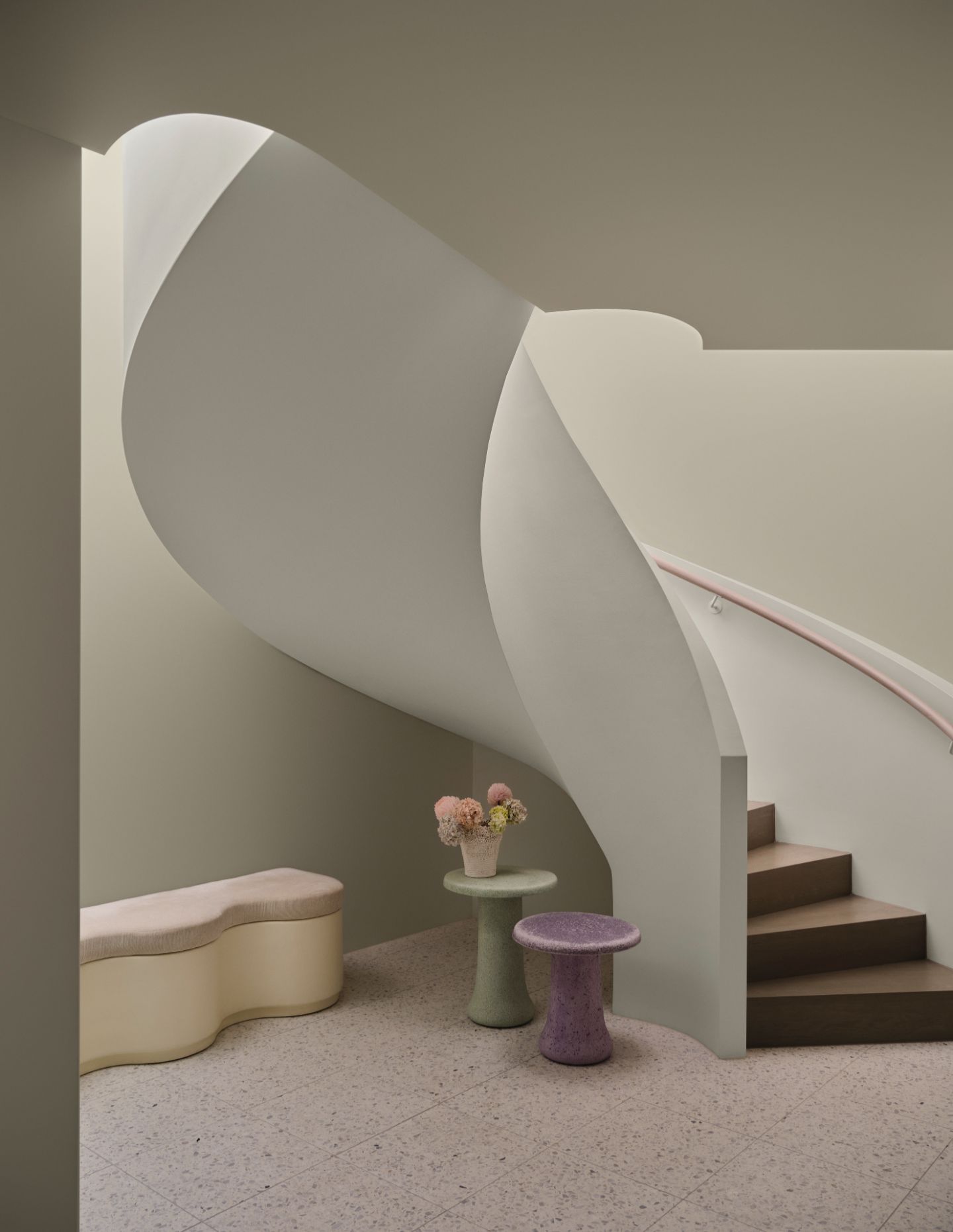
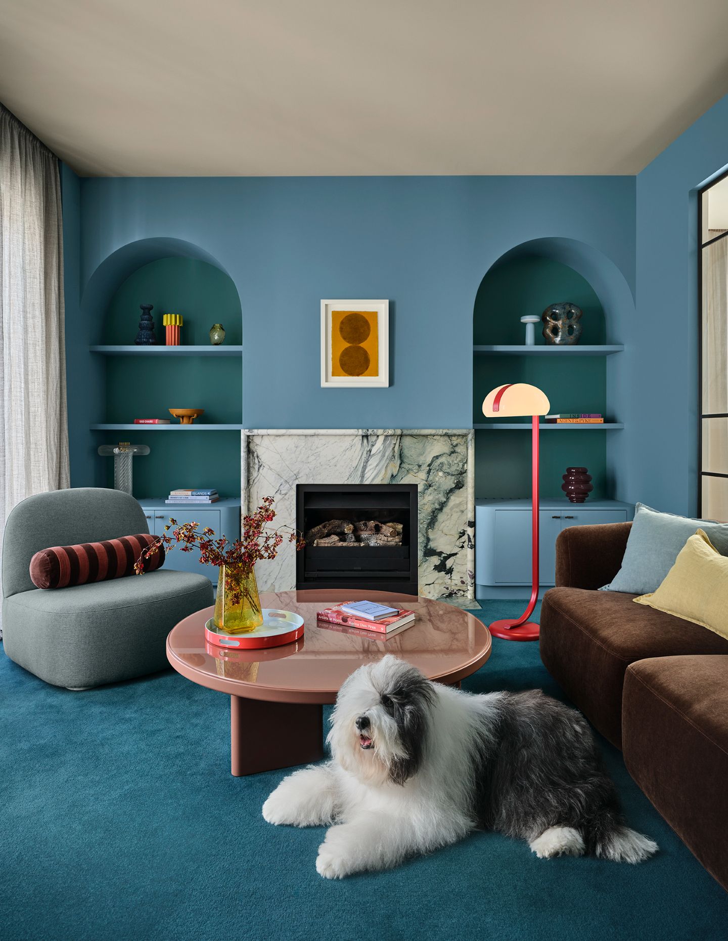
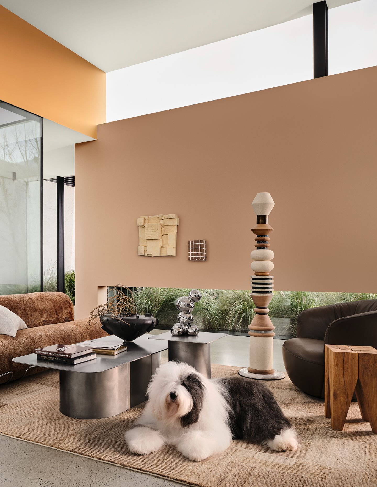
The second palette, Elemental, reflects slow living and anti-burnout culture, favouring warm neutrals and grounding tones. Shades such as Dulux Caramel Sundae, Coffee Dust and Clear Concrete provide a tonal base with layered greys and deep charcoals.
“Dulux Elemental is a tonal, grounded palette built around warm whites and neutrals such as Dulux Blended Cream and Dulux Hog Bristle® Quarter and enriched with golden brown hues such as Dulux Caramel Sundae and Dulux Coffee Dust,” says Lucena-Orr. “The result is a timeless, cohesive palette that feels quietly confident.”
Related: The 39th Dulux Colour Awards
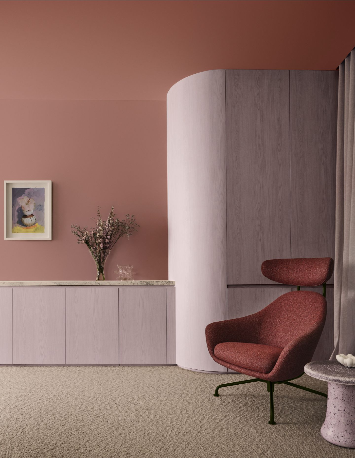
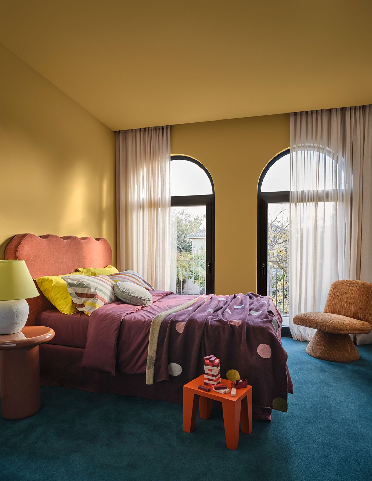
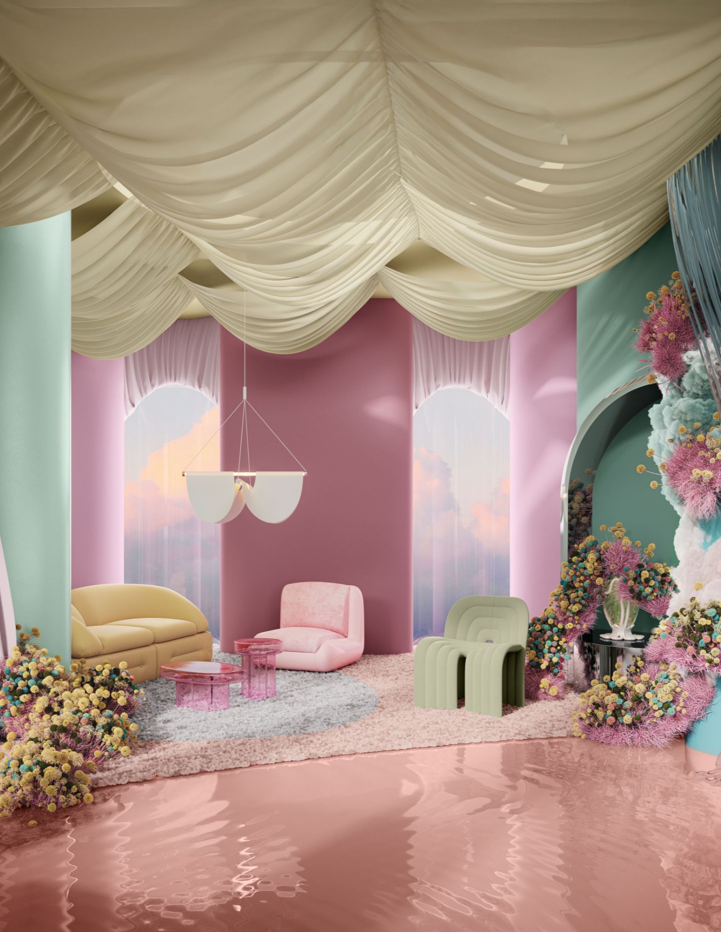
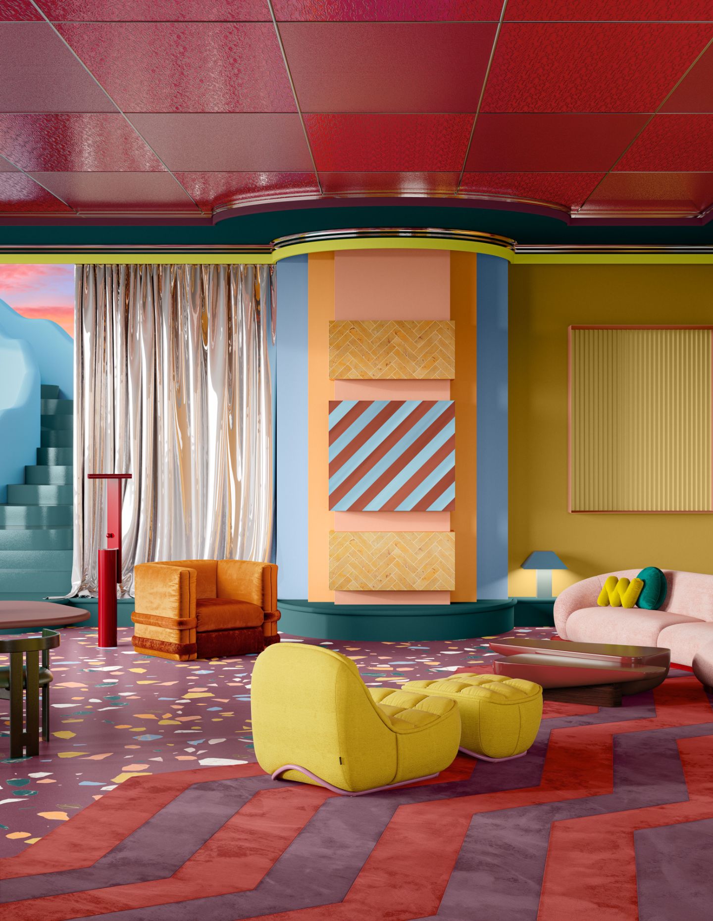
The third collection, Evoke, embraces maximalism and nostalgic styling, with colours that are bold yet comforting. Rich tones such as Dulux Misty Grape, Magic Melon and Germania combine with deeper hues to create layered and expressive interiors.
“Dulux Evoke is likely to be popular with home enthusiasts as the colours lean into deep, comforting tones rather than bright hues,” says Lucena-Orr. “It features vintage-inspired materials, handcrafted elements,and curated clutter making spaces feel alive and layered, adding to our collections over time.”
Summing up the flexibility of the three palettes, Treloar notes that “each palette has been thoughtfully designed allowing consumers to mix and match shades with ease by staying within the confines of each palette… This flexibility empowers people to personalise their spaces in a way that truly reflects their style and lifestyle.”