
The 15th volume of the Haymes Colour Library has arrived, and entitled Awakening, it stirs up bold creative ideas but also contains colours that engender calmness and wellbeing. It’s an apt and perceptive name for the latest update of colour trends and reads our moods correctly, translating them into a spectrum of colour to gladden any interior and indeed our hearts.
As the largest Australian made and owned paint manufacturer, Haymes Paint has established itself as a business with a grand reputation for quality products and service. Established in Victoria in 1935, the Ballarat-based company presents not only a fine product but in this new iteration of colour trends, there is choice to suit every palette.
As the overarching theme of the colour collection, Awakening speaks to our changing circumstances – from the challenges of the last year to the hope for the next. Through colour there is the opportunity to make a statement, to experiment and explore and yes, to awaken the creative soul that lurks within.
Speaking with Wendy Rennie, Concept Manager, Haymes Paint to find out just why Awakening is special she commented, “In one statement I can say it is the true power of colour!
“These colours are so timely and responsive to the mood and situation we are in right now. As a result of the pandemic each of us is having a different experience – some are showing such resilience and gratitude for their own circumstances, and may be more drawn to the soft warm comforting neutrals and tactility of the ‘In the Moment’ palette.
“Others are needing something to help break down the feeling of rules and regulations so really fun and unexpected colour palettes from the ‘Game Changer’ just add some joy and a sense of newness to spaces. While others may be looking for respite and escape, which can be found with calming and reflective hues offered in the ‘Clearview’ theme.”
The continuum between the three palettes of Awakening – ‘Game Changer’, ‘In the Moment’ and ‘Clear View’ – is the depth and cleanness of the colours. As each palette explores an emotional response in the viewer, the diversity between them encompasses all feelings but also allows for a multitude of applications.
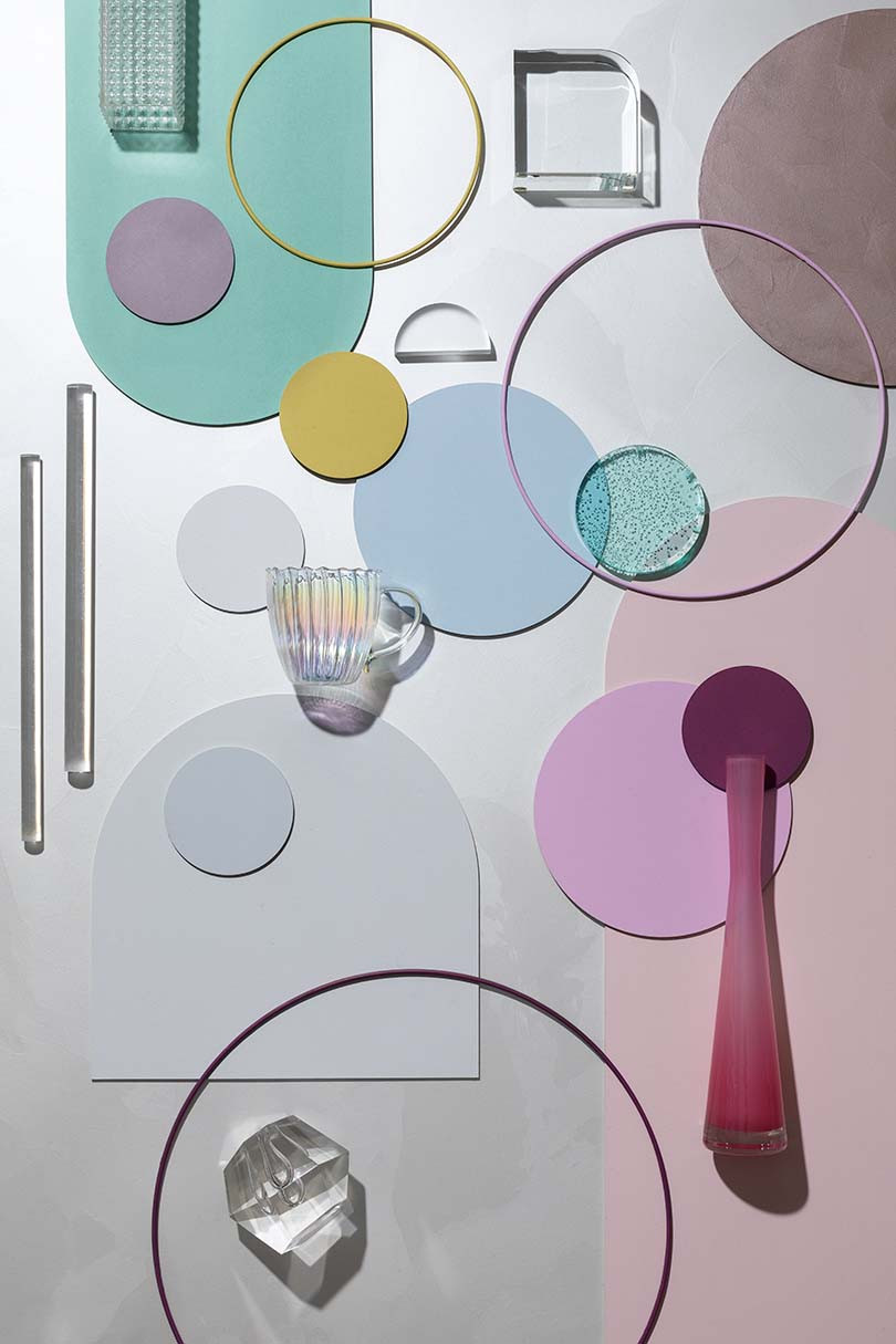
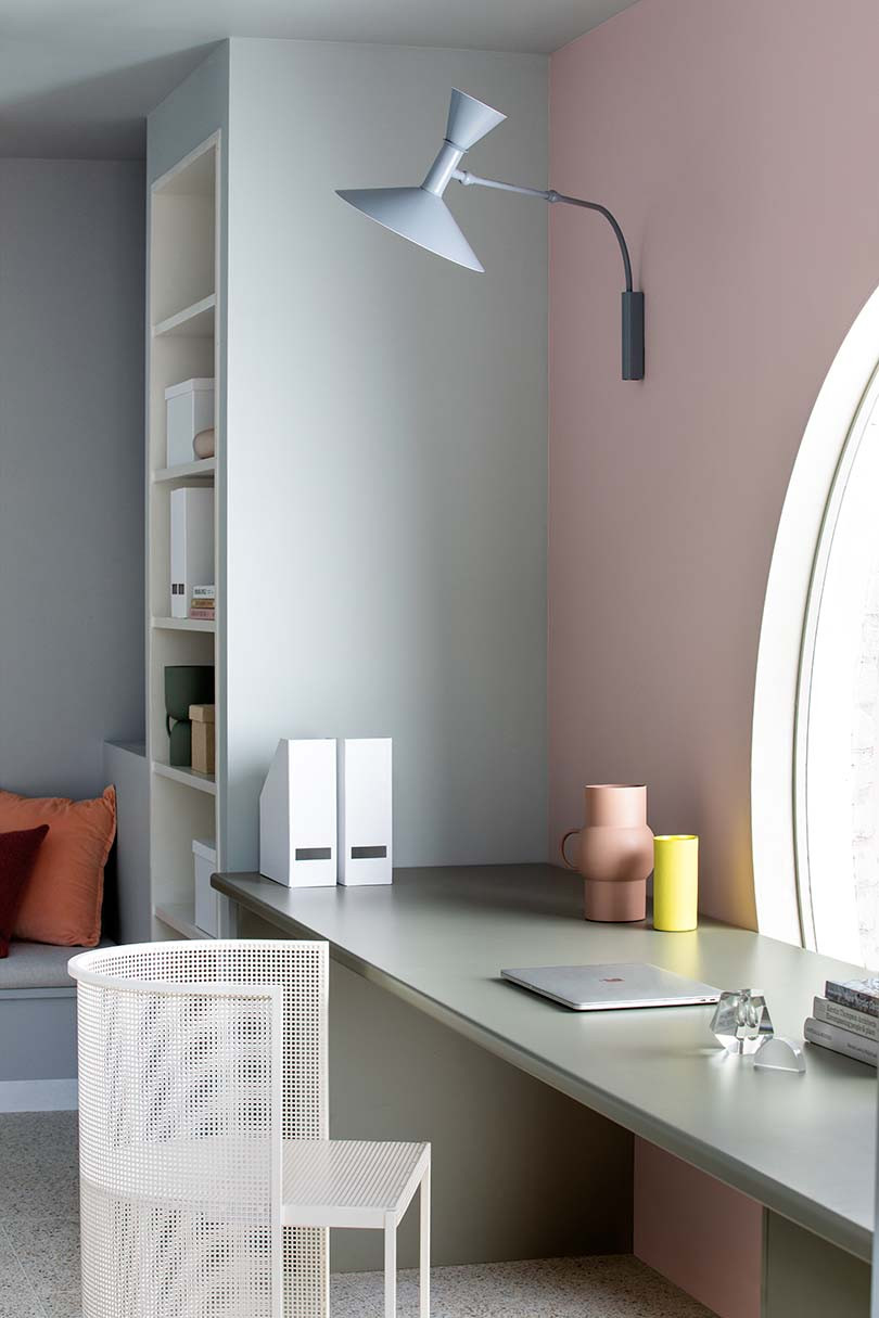
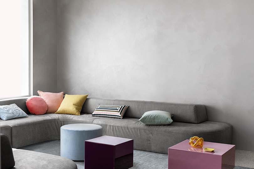
‘Game Changer’ encapsulates the idea of newfound freedom that offers the chance to challenge the old with fresh optimism. There are powdered blues, shades of sunset with pinks and aquas, greens and mustard yellow and there is an underlying softness to the palette that gives the creams and white a beautiful resonance.
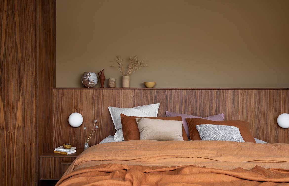
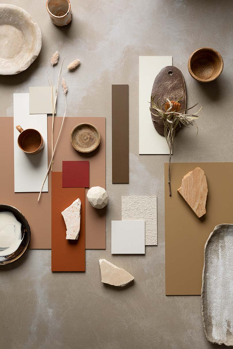
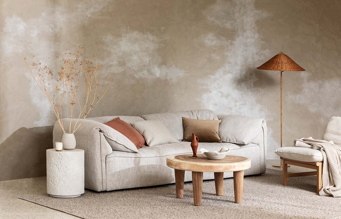
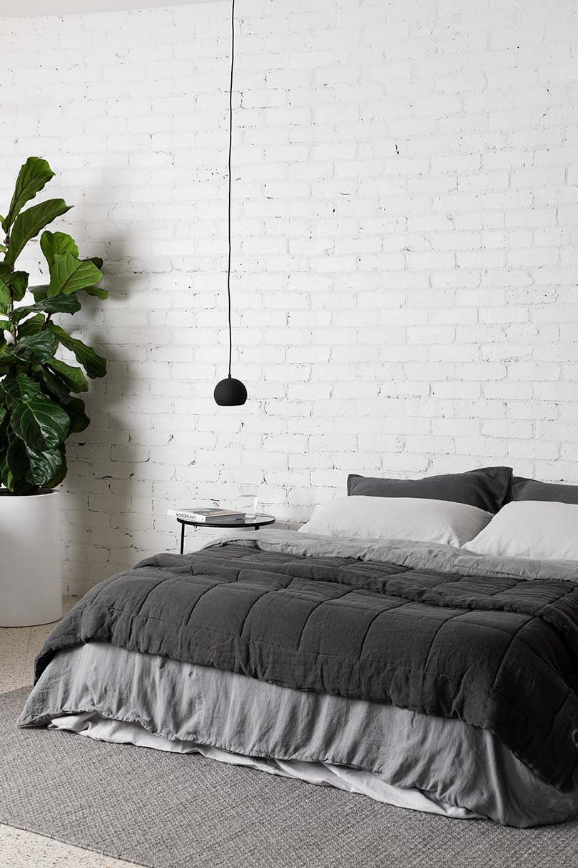
‘In the Moment’ celebrates nature in all its glory. Taking cues from the Australian landscape, this palette speaks of our environment with shades of rust, earthy browns, ochre and creamy greys and taupes.
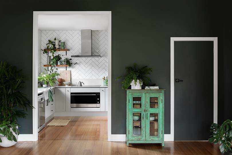
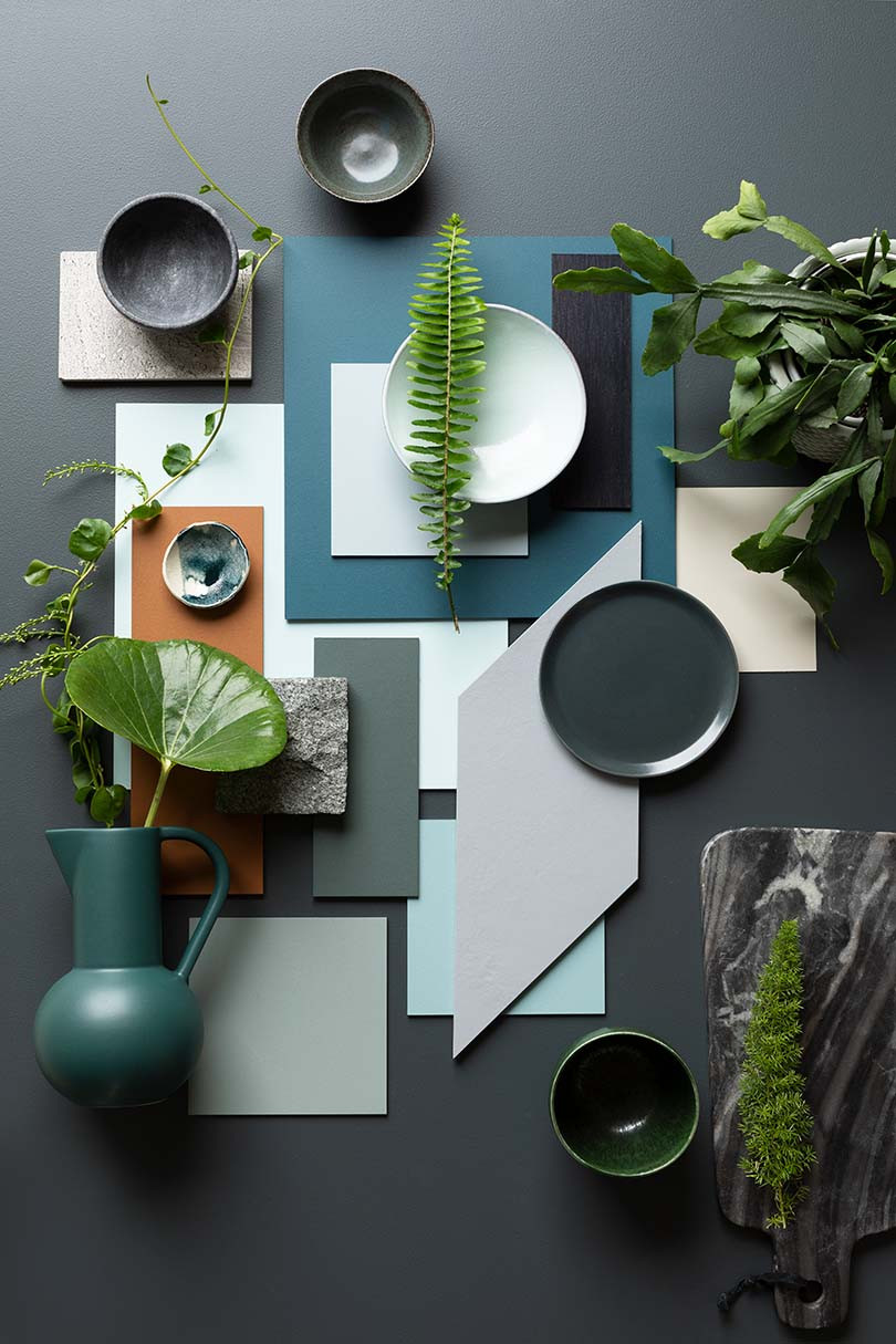
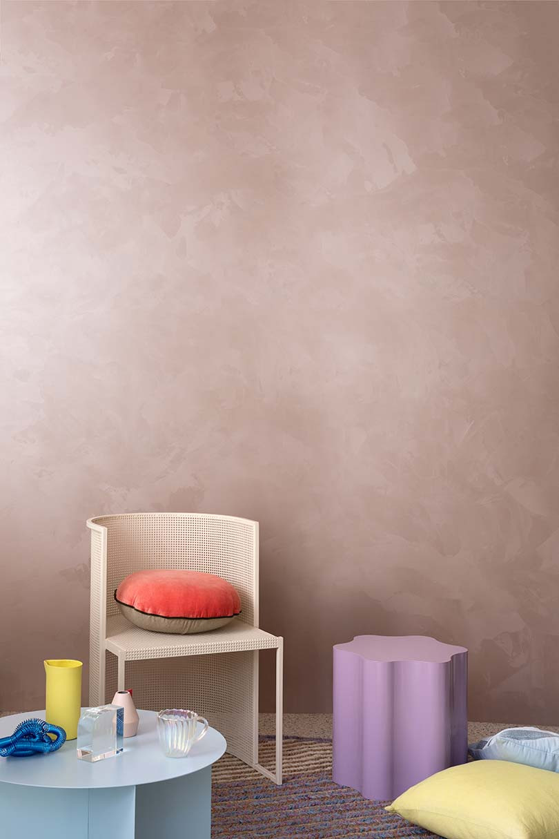
‘Clear View’ on the other hand is a sensational group of mostly blues some greens with a dash of brown. Transparent and pastel blues, opalescent teal, eau de nil and classic grey through to ink blue and forest green all represent a calm and relaxing vibe that contributes to a soothing aesthetic.
What defines these palettes is the strength and clarity of the colours. They are not loud but dense shades that are saturated and complex. These are colours that will make a statement on a feature wall or be a sensation painted throughout a room or house.
A favourite for me is the ‘Clear View’ palette as blue has been a dominant and much-loved colour, however, there is ample choice to find a new ‘go to’ colour with pinks and greens at the top of the list.
As everyone has a favourite colour, or family of colours – here are the choices from Awakening from some of the fabulous editorial team at Indesign.
Alice Blackwood, Editor Indesign
“I like the gutsy peacock blue of Haymes Awe Inspired – lots of power but still warm and rich. Also, I like the combination of Faded Blue through to In Bloom, playful, with personality, but not too pretty.”
Jarrod Reedie, Digital Content Writer
“I like the ‘Clear View’ palette. The Remote Green and Arboretum lay a strong foundation for the lighter tonalities to provide relief, with the blue nuances very much the salient feature.”
Aleesha Callahan, Editor Habitus
“I love the calming and textural palette of ‘In the Moment’ – all those soothing neutrals are just what we need right now.”
Emily Sutton, Design Product Editor
“Pick of the day: Game Changer. This collection of tones brings a muted vibrancy that instils a refreshed energy to our everyday spaces. With a playful mix of bold and subtle shades, the ‘Game Changer’ palette paves the way for artistic, colour-led environments.”
Laura Box, Digital Editor
“I love how the ‘In the Moment’ palette transports me to the Catalan countryside with its calm and warming tones, particularly Haymes Sand Haze and Haymes Clay.”
And lastly from Rennie, her pick of the stand out colours from this Forecast.
“Haymes Fuzzy is the new go-to neutral for me, which kind of feels like the best ever bone colour (not grey and not yellow) just somewhere between the two. Haymes Arboretum is a deep rich forest green – while green overall is still having a moment.
“Another colour we have featured but not talked much about yet, which is going to shine through is Haymes Gumleaf Green, a beautiful silvery green, capturing the beauty of the gum leaf with a just a bit more depth to it.”
Then colours like Paradise Pools, a soft clear aqua, not blue or green, has some kind of transformative effect in just making a space feel like you are wading through water on a deserted island.
Reviewing the 15th volume of the colour story from Haymes has added a little joy to working from home. It’s inspirational and shows that colour can indeed reflect and enhance our moods and awaken us to the possibilities and that’s just as it should.
Photography Martina Gemmola
We think you might like this story about colourful tapware by Vola