
This article is from Habitus Magazine #66. Find out more and subscribe!
Light-filled and charming is something all terraces aspire to, but few attain. The issue lies in the long, narrow nature of the original building and a propensity for a glass box at the rear being the go-to solution. Not so with Brace Design’s incredibly thoughtful and elegant response, which sees light introduced through a skylight and openings to a side passage, bringing both light and an added dimension into the home.
The renovation also rethinks how a terrace house is navigated. “The design challenge for me in these sorts of houses is that guests always troop past the bedrooms and all the laundry, bathroom etcetera, before they get to the social part of the house,” says Paul Brace, Principal at Brace Design. These elements remain; however, the corridor comprises a continuous expanse of crown-cut oak (George Fethers & Co.) timber joinery containing sliding doors to conceal all utility spaces and bedrooms, over an oak floor of the same hue (Tongue & Groove). “It’s a traditional modernist trope to put a box inside a space, but in this instance it’s more like a little art gallery corridor that you walk down as you enter the house,” says Brace.
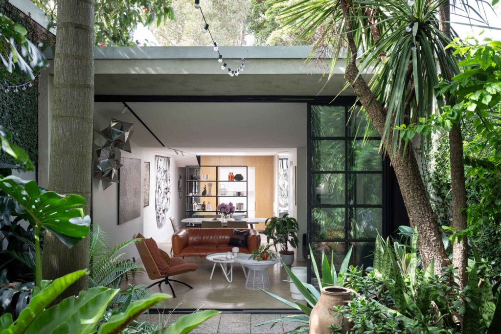
The art, like all elements of the home, was an important consideration, compounded by the fact that the clients are also friends with the designer. As Brace explains, “It’s an interesting dynamic working with people that you know quite well. You know their personal likes and dislikes. You’ll have a social base, but when you work with a couple, you are stepping into a relationship dynamic.” The owners, Matthew Allen (also the project architect) and Heidi Forbes, are no strangers to the design process, with Matthew a Bates Smart Director while Heidi has recently opened her own consultancy (Arthur Alley Studio) following a stellar career with the Museum of Contemporary Art and Sydney Opera House. As such, the placement of artworks was a considered process, with the house specifically designed to accommodate key pieces.
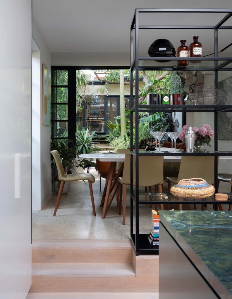
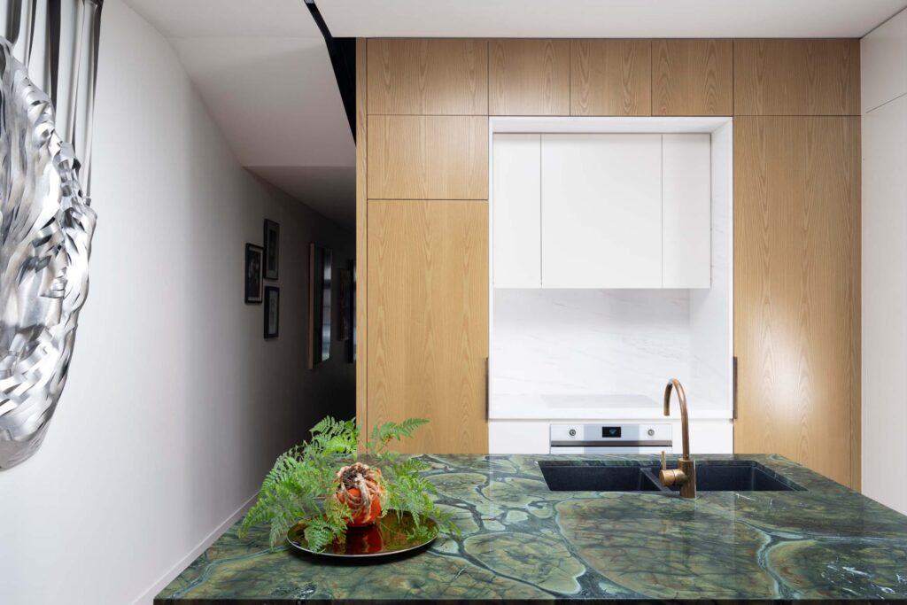
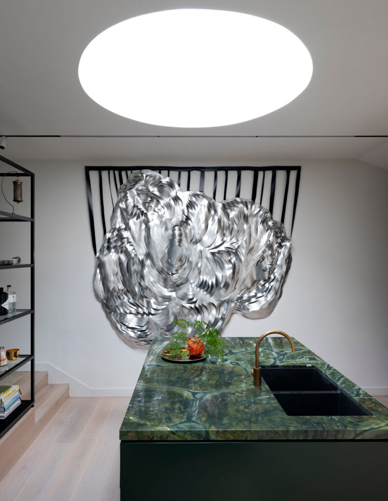
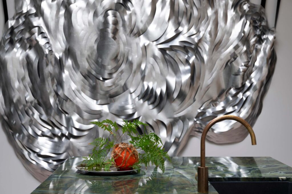
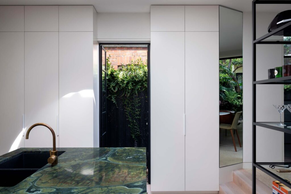
The large silver work Composition, 2014, by Caroline Rothwell, for example, required a space where it could breathe. By placing it in the largely white kitchen, with light coming from two sides and above, the work has a glowing presence that holds the space well. The kitchen itself is a brilliant take on modernism, with everything simplified to a grid of black against a white and oak backdrop. In doing so, the form of the kitchen has significantly changed from a long, narrow corridor style to an airy square that is contained while remaining visually connected to the rest of the home. Then there is the addition of an incredible piece of Vitoria Regia quartzite, which Brace has had for the past ten years, just waiting for the right owner to come along.
Related: Restraint atop Kookaburra Ridge
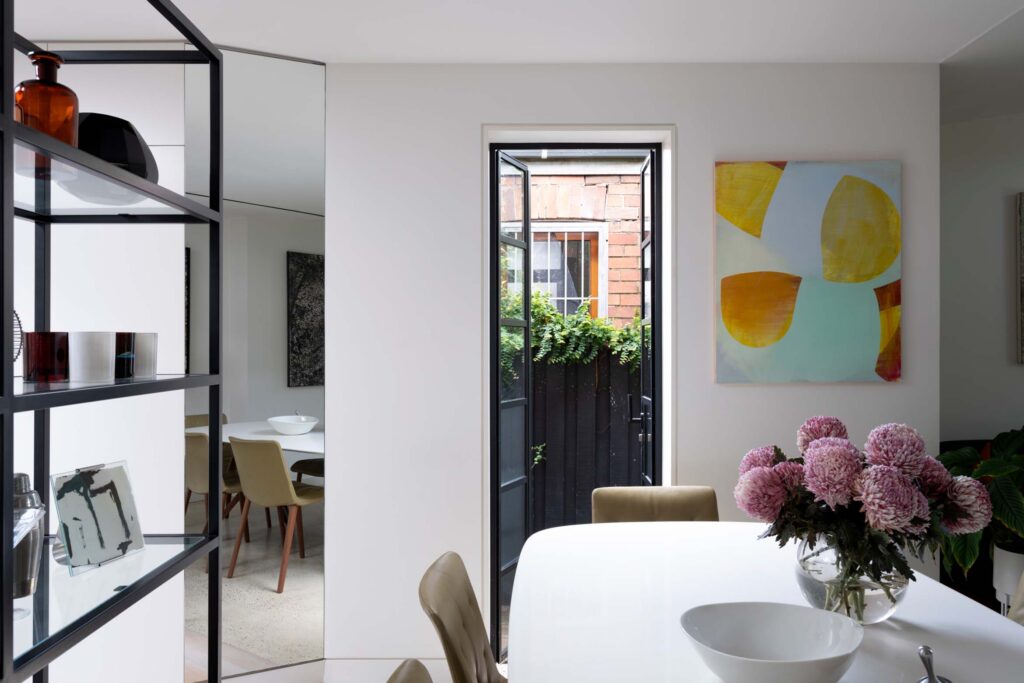
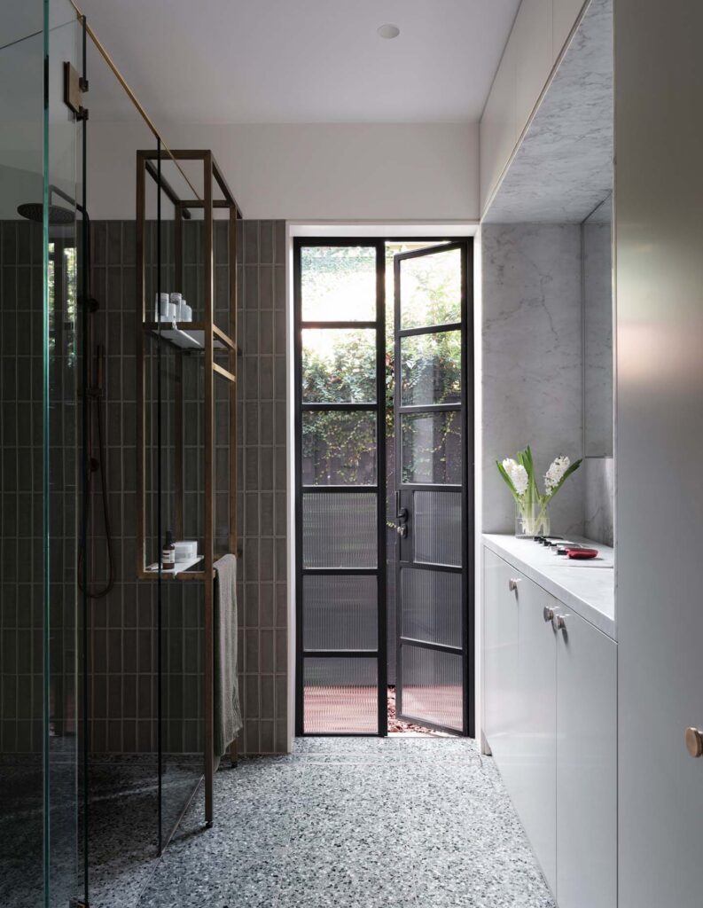
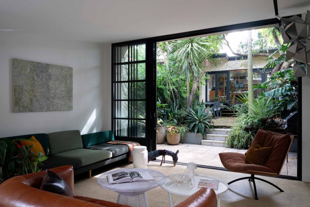
The grid is continued throughout the house, with glass doors and windows opening onto landscaped corridors. “A lot of terrace houses have a little residual corridor-of-doom down the side of them that really doesn’t do anything. I thought, let’s just create the illusion that there’s more out there,” shares Brace. Placing doors and windows in each of the rooms facing the corridor, including the bathroom and kitchen, introduces both greenery and light, as well as the sense that you could step out into a courtyard. It is a splendid illusion that adds exponentially to the feeling of space in the home.
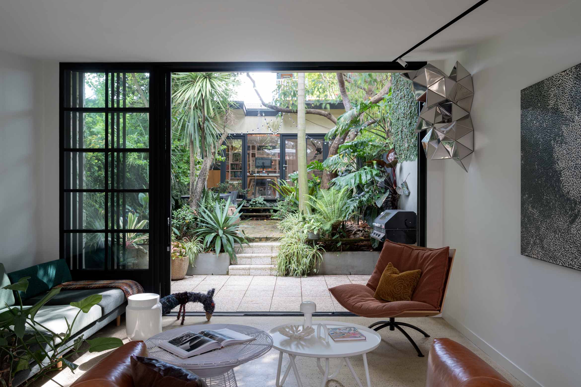
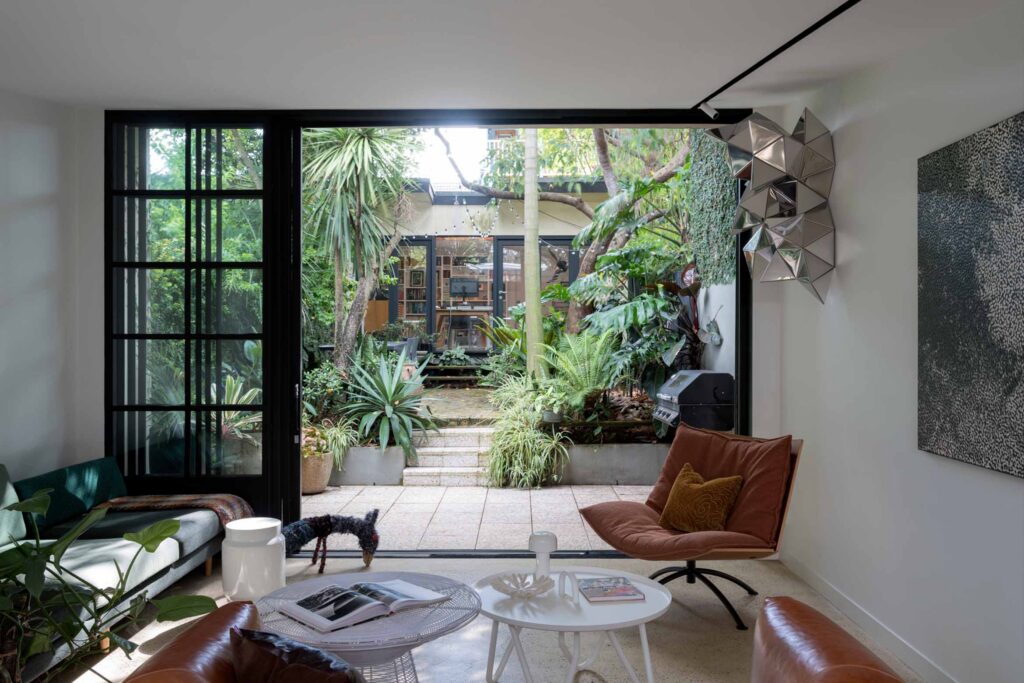
Two steps up from the kitchen takes you into the lounge area, where a simple palette of polished concrete flooring and white walls allows the artworks their own space. Finding the balance between being beautiful without competing with artworks such as Gregor Kregar’s Fragmented Simulations and Untitled, 2016, by Daniel Boyd, the furniture is classic mid-century chic, comprising a Seito dining table and Liz Wood dining chairs from Knoll and a leather Rondo sofa from Molinari. A small courtyard continues out from the lounge before culminating with a studio that will be rebuilt as part of stage two of the renovation. For now, it offers a charming outlook.
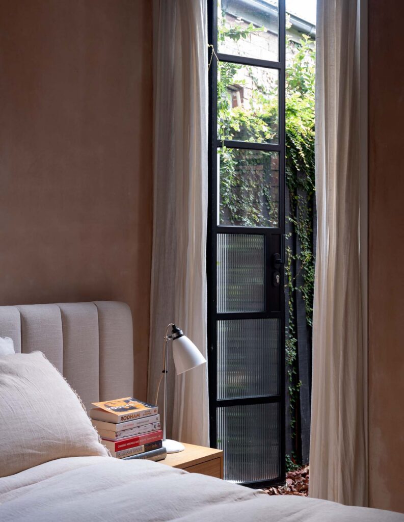
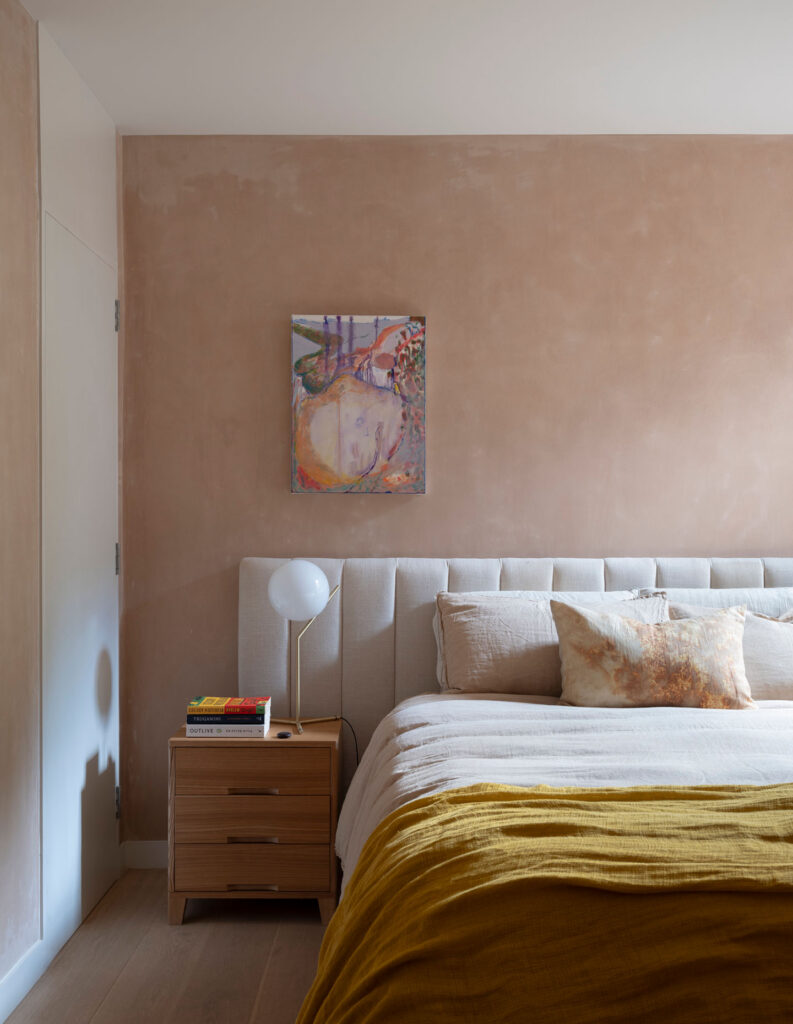
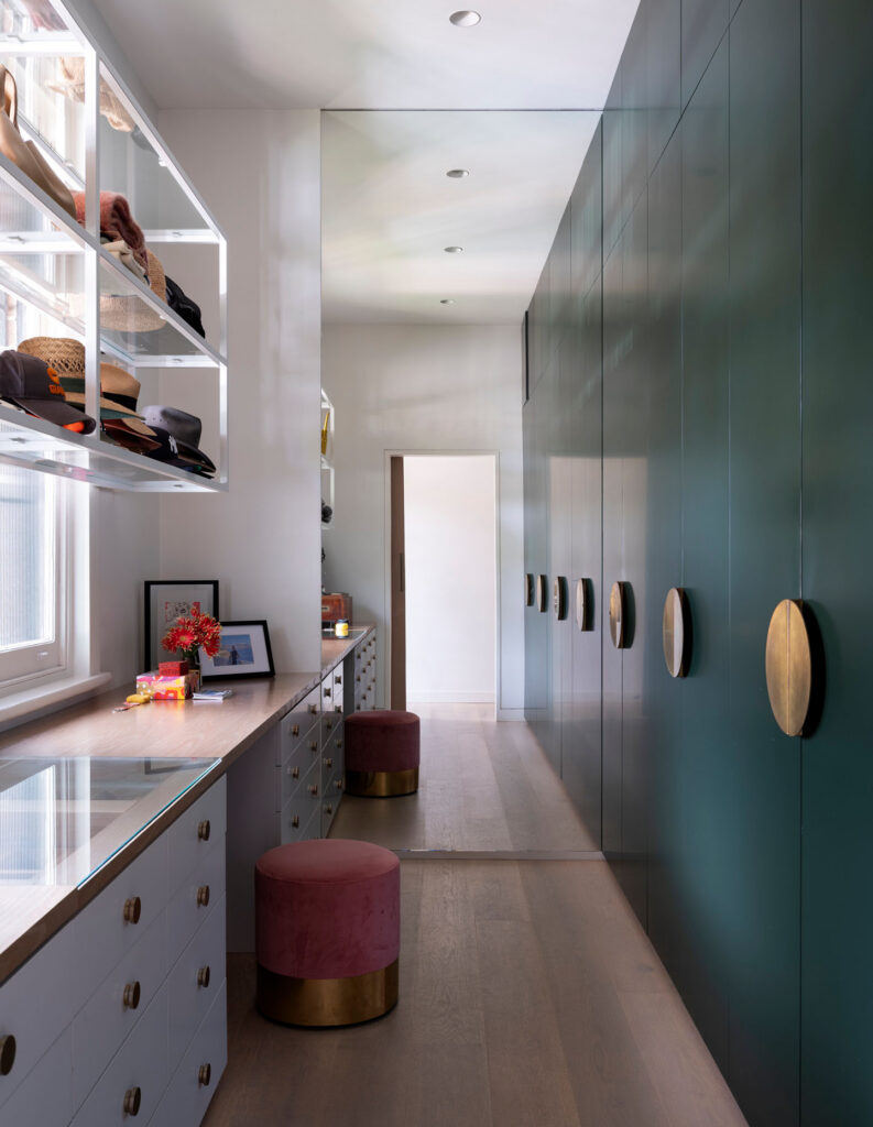
The bedrooms are scrumptious deliberations on colour. “And then in the fun section of the house, each of the bedrooms or the bathrooms is actually a different colour, so the house itself is quite white, and then the veneer acts like a separator,” says Brace. The primary bedroom is positively delicious in pale clay pink limewash, while the large walk-in robe pairs deep teal with large, polished gold disc-like handles and a pink puffy stool. Here, the illusion continues with carefully placed mirrors doubling the visual impact. Mirrors and colour are, in fact, used throughout the home to add depth and continuous sightlines. The green outlook of the bathroom, for example, is compounded by mirrors working with deep green tiles (Academy), a grey terrazzo floor (Fibonacci) and a vanity of Carrara marble.
It is a beautiful home, made all the more beautiful with its curated art selection and attention to how we live now. But it is also a home that stands alone as an exceedingly clever use of materiality and spatial manipulation to convey not just the space but also the feeling of a much larger home.