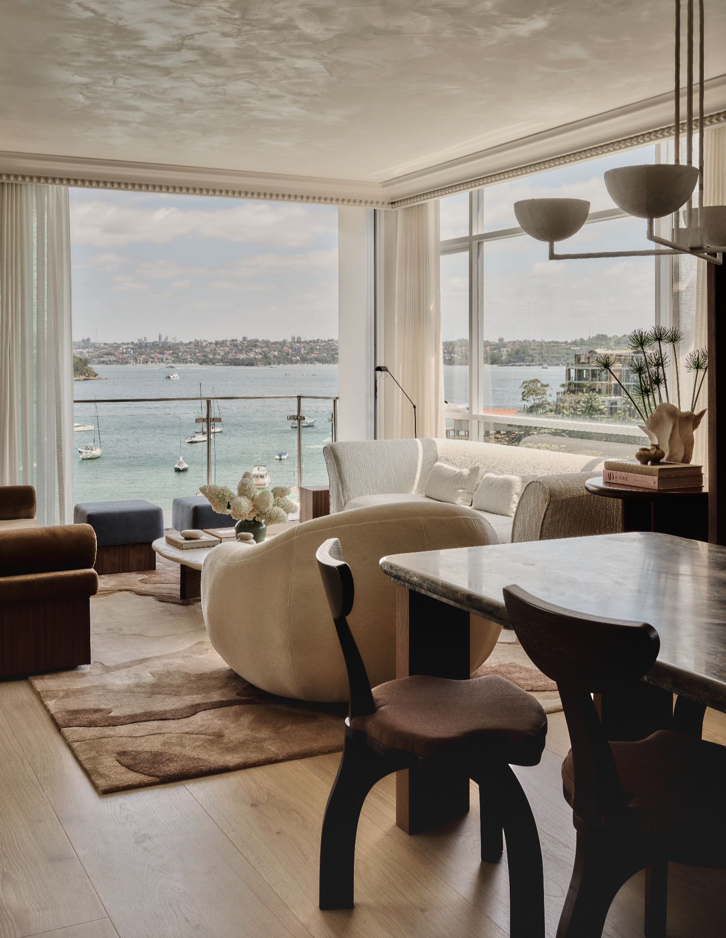
There’s a particular challenge in designing coastal interiors in Sydney. The setting does a lot of the work — harbour, sky, light — and it’s easy for interiors to either compete with that or lean too heavily into it. The result is often predictable: blue palettes, obvious references, a kind of shorthand for “coastal” that rarely holds up.
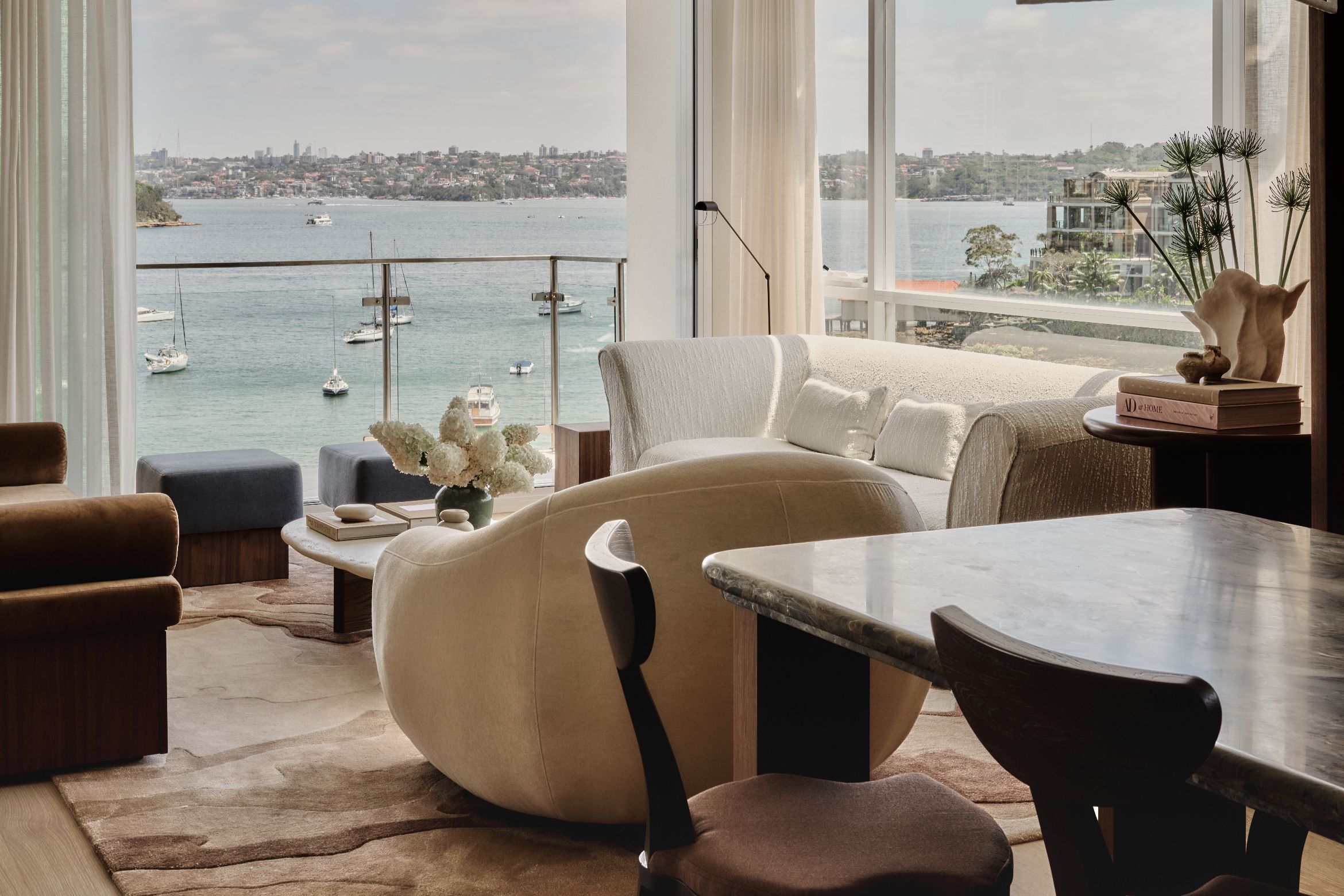
Harmonious Refractions Residence, a recently completed apartment in Point Piper by Studiojos, takes a different approach. Instead of replicating the view, it reads from it — translating what’s already there into something quieter, more embedded in the material language of the home. “The location influenced everything,” says STUDIOJOS director Joss Knight. “It wasn’t about choosing blue or green — it was about finding materials that could translate what we actually see outside, inside.”
The brief itself was relatively contained: a two-bedroom apartment, not a primary residence, but one that still needed to accommodate a family of six. That tension — between compact footprint and high expectation — becomes one of the project’s defining conditions. It’s not resolved through spectacle, but through planning and joinery.
“We had to be really deliberate,” Knight explains. “Everything needed to work hard — storage, layout, circulation. There wasn’t room for anything unnecessary.”
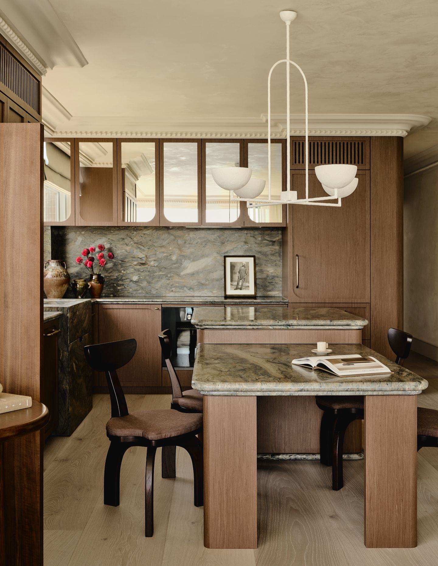
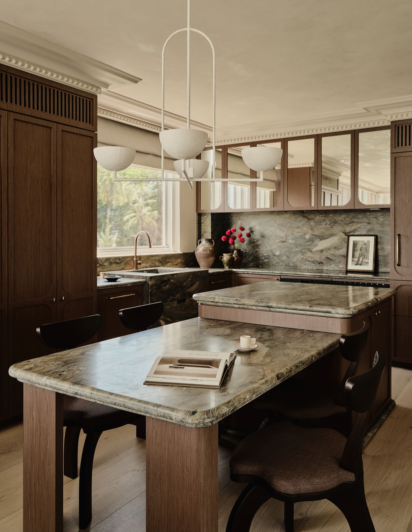
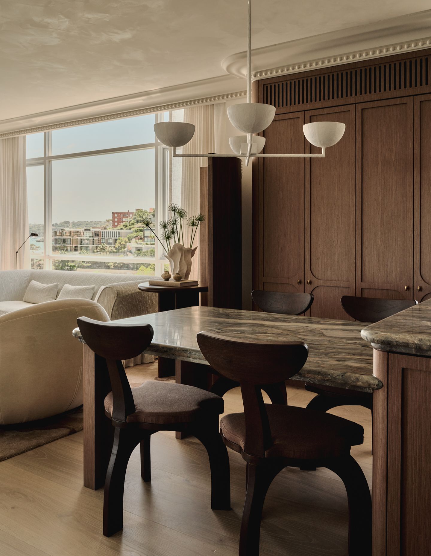
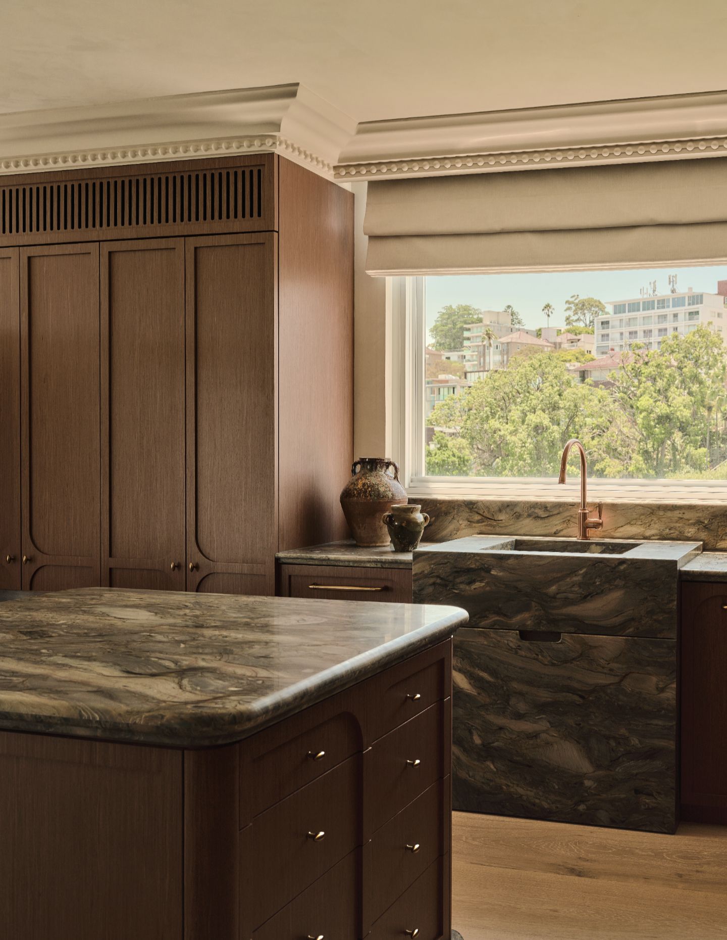
Space is made, rather than found. The original layout is opened up, particularly through the kitchen, which expands from a constrained footprint into a long, continuous element that anchors the apartment. It operates as kitchen, dining surface and gathering point, while also pulling light deeper into the plan.
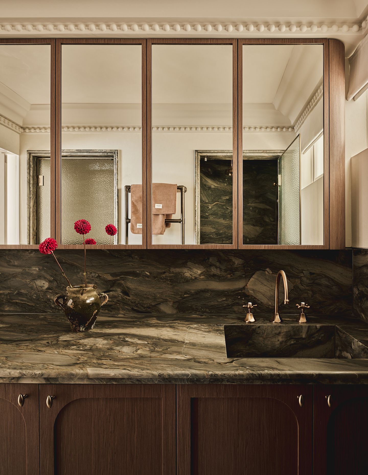
Mirrored surfaces catch fragments of the harbour — the Opera House, the bridge, the shifting light — but never fully frame them. Instead, they appear in pieces, slightly distorted, closer to how the water itself behaves.
“You see glimpses, not the full picture,” Knight says. “It’s more like how the harbour reflects things — broken and shifting.”
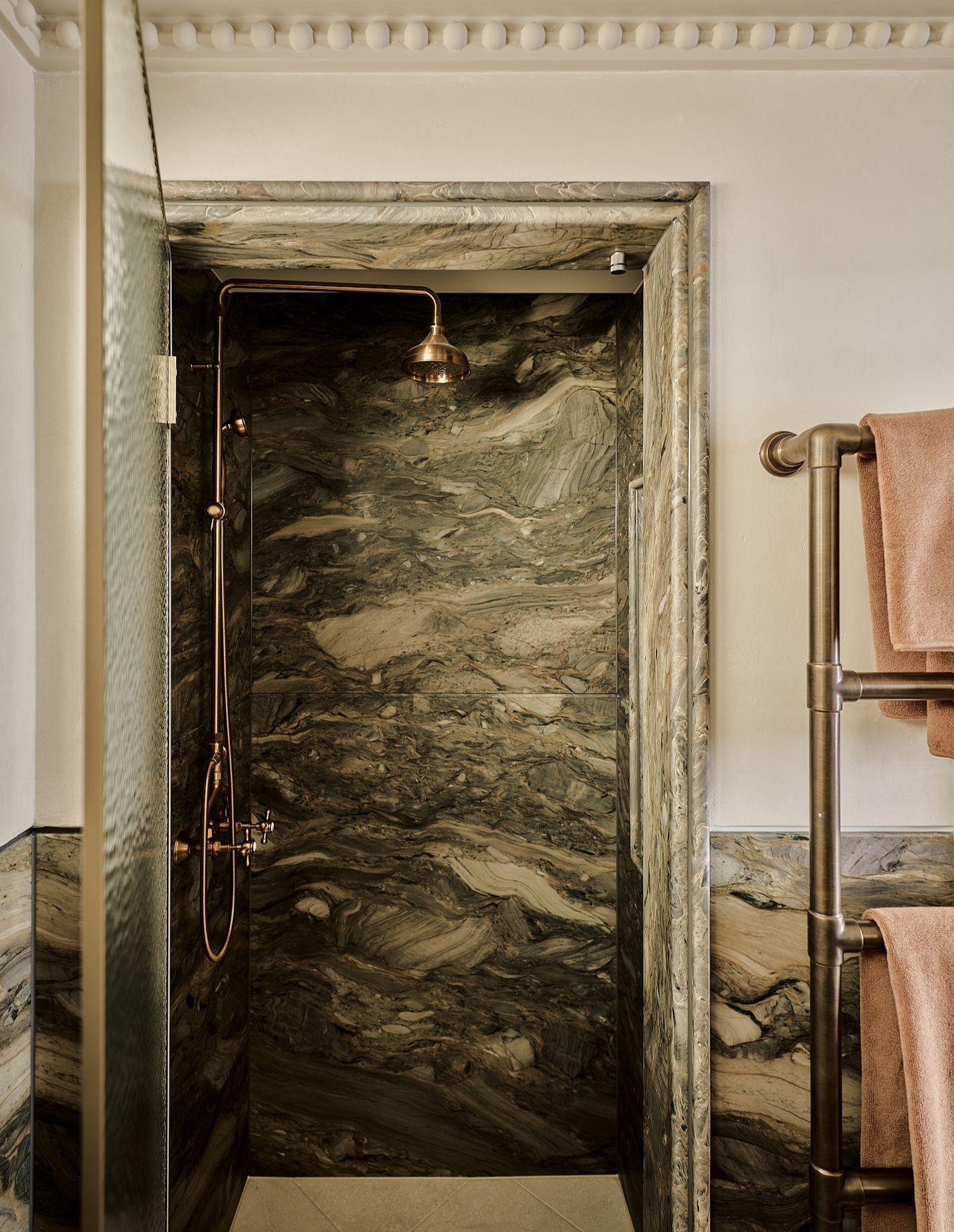
That idea — of reflection, but not quite — sits behind the project’s name. “Refractions” feels less like a concept imposed onto the space and more like something observed and then worked through. Stone selections carry veining that reads almost like movement, while finishes are layered rather than flat, allowing light to shift across them throughout the day.
“We started with the stone,” Knight notes. “Once that was right, everything else built from it — fabrics, finishes, joinery. It gives the project a kind of internal logic.”
Importantly, none of this is literal. There are no overt nautical gestures. The references sit in the grain of the materials, in the way surfaces meet, in the softness of edges.
Related: A mid-century reset in the high country
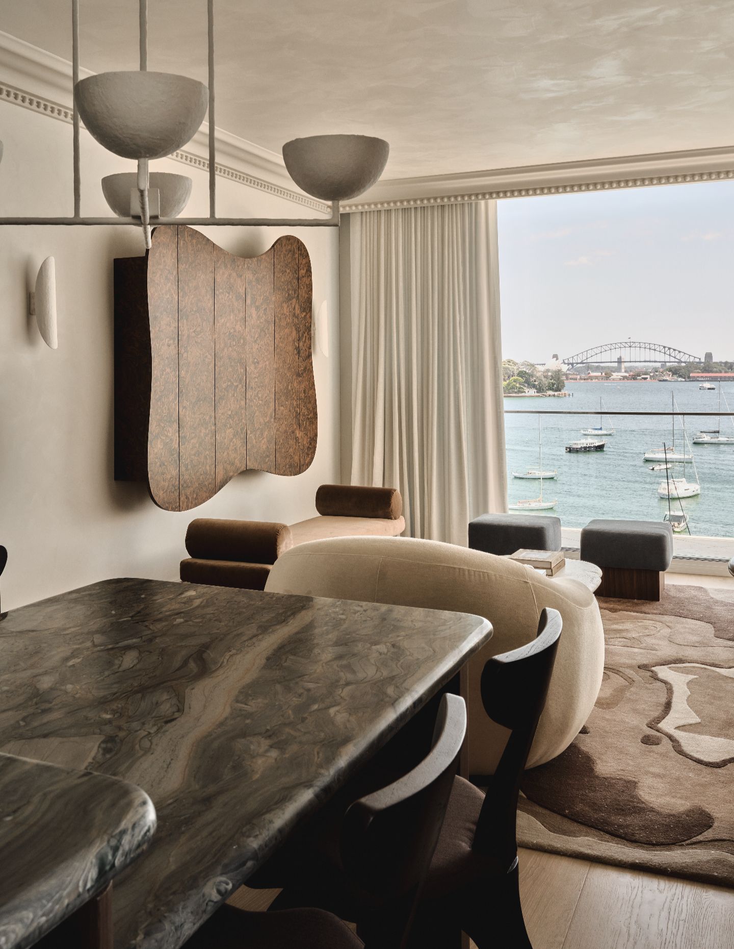
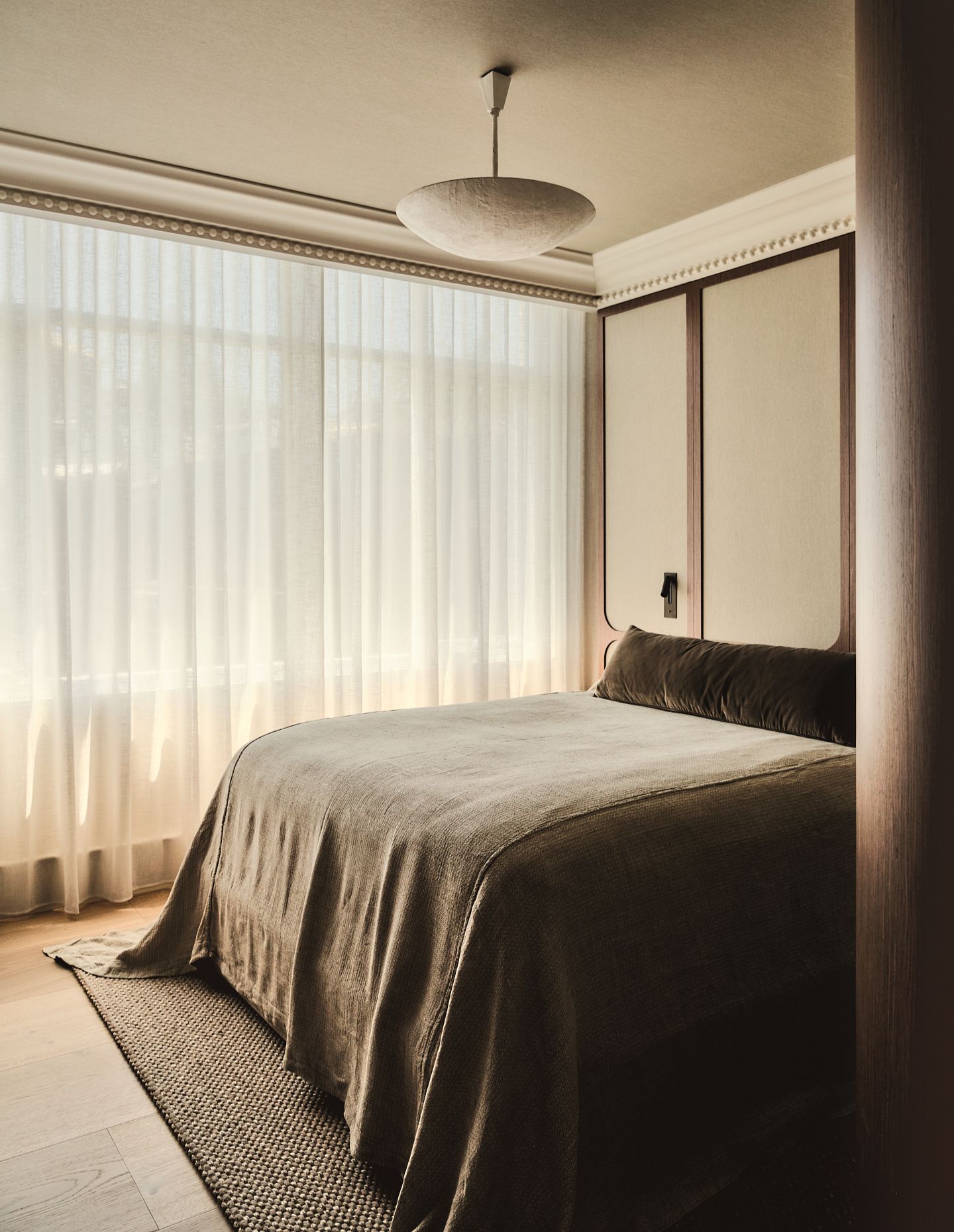
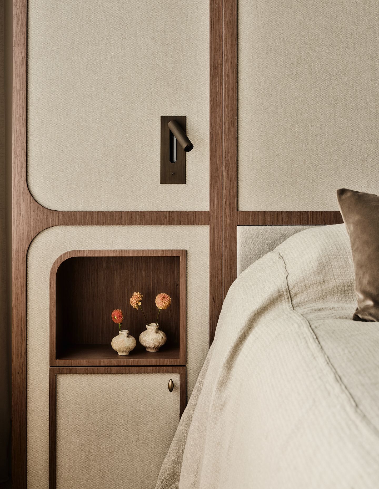
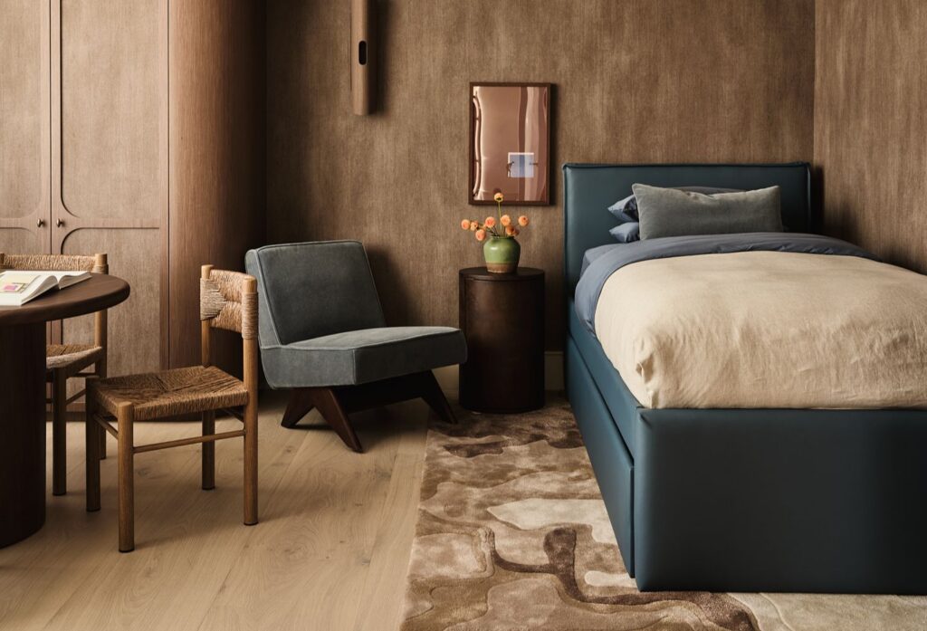
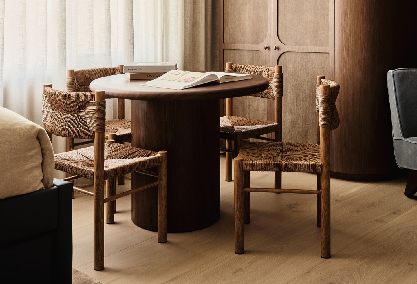
Curves play a central role here. Custom timber panelling and joinery wrap the apartment, easing transitions between spaces and softening what could otherwise feel tight or over-resolved. In a home shared by children, that softness is also practical — reducing hard edges, allowing circulation to feel more fluid — but it also builds a consistent visual rhythm across the interior.
“We didn’t want it to feel sharp or rigid,” Knight says. “The curves help everything connect, and they make the space feel softer to live in.”
Storage is embedded everywhere, but rarely obvious. Doors slide away, cupboards are concealed and elements are integrated into the architecture rather than applied to it. It’s the kind of detailing that doesn’t announce itself immediately, but becomes apparent in use — a quieter form of luxury that privileges ease over display.
“For us, that’s what luxury is,” Knight reflects. “When something is so well resolved that it just works — you don’t really notice it.”
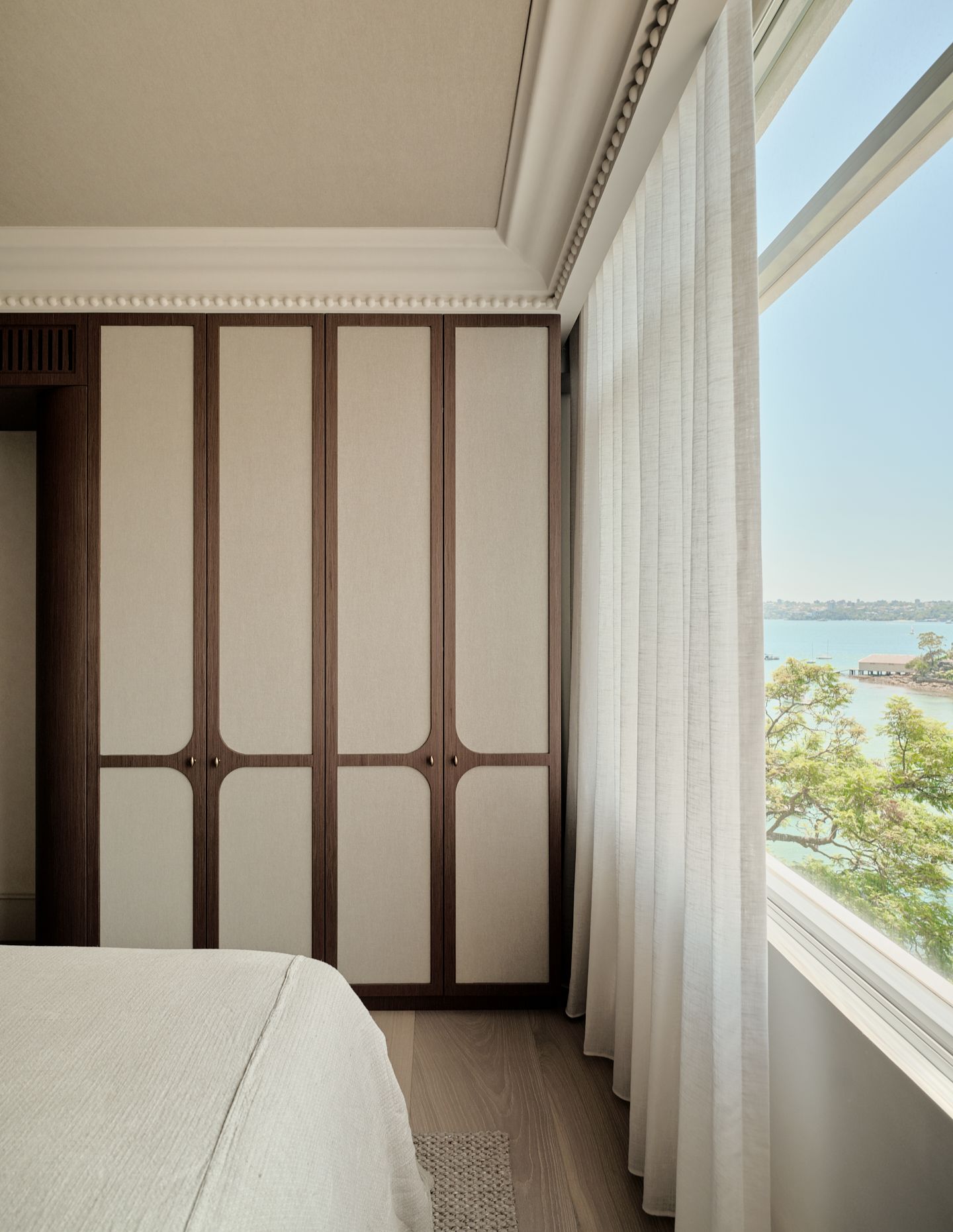
Materially, the palette stays controlled. Muted neutrals, pale blues and timber tones reflect the surrounding landscape, but only loosely. The approach wasn’t about recreating a coastal interior, but about building a relationship with what sits just beyond the glass.
There’s also an interesting dynamic in how the project came together, with the clients taking a step back from directing the design. “They basically said, ‘we’re not going to give you input — just do your thing,’” Knight recalls. “That level of trust changes how you design.”
The result is an interior that feels cohesive, not because it follows a strict concept, but because it hasn’t been pulled in multiple directions.
For STUDIOJOS, it’s a project that marks a certain point of clarity — not in scale, but in control.
“It was the first time we had full creative freedom,” Knight says. “You learn a lot about your process when you’re not being pulled in different directions.”
The apartment is relatively small, but tightly resolved. Decisions feel deliberate, not excessive. And while the harbour is always present, it’s never overplayed. Instead, it filters through the space in fragments — in reflections, in materials, in light — shaping the interior without defining it outright.